Month: April 2013

Norway Food Supply Sankey

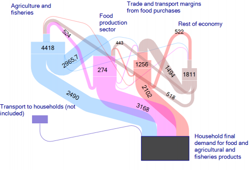
From a book ‘Environmental and climate analysis for the Norwegian agriculture and food sector and assessment of actions’ by John Hille, Christian Solli, Karen Refsgaard, Helge Berglann, Knut Krokann published on ResearchGate.

Download the full book on ResearchGate.

Not sure about the unit of flows.The unit of flows is kT CO2-eq./year (see comment by Christian Solli). The Sankey diagram shows embodied carbon in food and agricultural products and the overall carbon footprint caused by the demand of food in Norwegian households, and consequently along the supply chains in agriculture/fisheries sector. [Updated by phineas, May 06]

This is very similar to Jason Pearson’s Economy Maps for visualizing environmental impacts.
Sacramento/American River Sankey

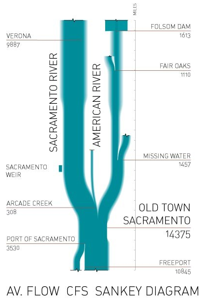
From the thesis of architect and designer Gabriel Guerriero comes this beautiful Sankey diagram. Labels show quantitites but I have no information on the unit of measurement.

Gabriel writes:

“[This Sankey diagram] illustrates the measures of capacity and exchange of water in the Sacramento/American river confluence. Sankey diagrams are an essential constructive framework to analyze the breaching processes and estimate the manipulated water flows. The work is supported with calculations derived from California Department of Water Resources measurements as a means to describe where flows become broken, crosswired, appropriated, or out of tolerance. While the Sankey should hold a useful matrix to describe a section of a closed system, the Sacramento/American River measurements describe a broken system of flows in which the input of 100% on the top end results in disrupted quantities of output.”

A similar diagram for the Colorado river catchement can be seen here.

New Energy City Issaquah

Have you ever heard of the city of Issaquah, WA? To be honest, I hadn’t heard of it until I read this post on the New Energy Cities blog.

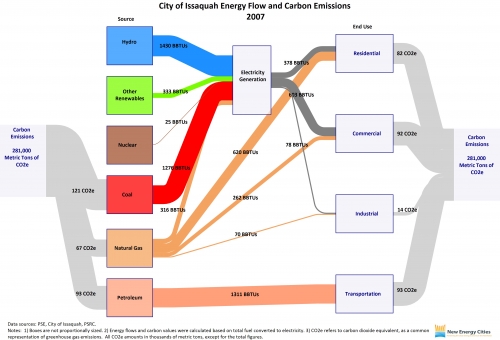
Issaquah is one of ‘New Energy Cities’ in the Northwest that has created an Energy Map and calculates the carbon emissions it is responsible for based on the fuels used. The role model for these Sankey diagrams are the ones published by the EIA.

Elizabeth, the author of the post, writes:

“Total carbon emissions are depicted in the gray flow lines, by both source and end use. The blue flow line represents hydropower energy used for electricity generation; the green represents non-hydropower renewable energy used for electricity generation; the brown represents nuclear energy used for electricity generation; and the red represents coal energy used for electricity generation. The orange flow lines represent natural gas used for electricity generation and direct heating. The pink flow line represents petroleum used for transportation. The dark gray flow lines represent electricity consumption by residential, commercial, and industrial user categories.”

Wow! I’ve seen those energy Sankey diagrams for the world, for nations and for federal states. But this one for Issaquah is definitely the one that covers the smallest geographical and administrative entity.

Leaked: Sankey Diagram Tablet

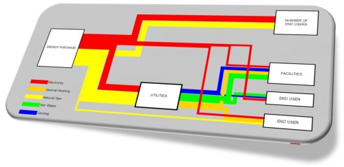
Phineas got hold of a design study through one of his informants… Looks as if at least one of the large manufacturers of tablets is working on a dedicated ‘Sankey Diagram Tablet’. It is expected that either Apple’s next iPad, the new Samsung Galaxy Tab, or possibly Microsoft’s tablet with Surface surface will be Sankey diagram enabled. Further details in regard to the technical specifications are unknown…

Well, I am waiting anxiously for this new product release, and have prepared my sleeping bag to camp out the night at the doors of the retail shop to be the first to get hold of it.

Happy april fools day! 😉