Month: May 2013

Video: 4see-TW Sankey diagram of economy, jobs and energy

Just came across this video featuring a “Sankey diagram of the Taiwan economy, jobs and energy in 2010” by ARUP (uploaded to vimeo by user Simon Roberts).

The underlying model is called “4see-TW” framework and has been created to “investigate the structure and function of an economy in a resource-constrained world”.

This is certainly exciting… howevever one must be warned that the Sankey diagram includes different “dimensions”: energy flows, value streams (money flows) and jobs. These three perspectives probably have different unit types and units (such as, e.g. TJ for energy, Euro or US$ or New Taiwan Dollar TWD for values, and persons or workplaces for jobs). Hence the width of the Sankey arrows mustn’t be compared to each other across the unit types.

Haven’t found the time yet to dig more into the 4see-TW model, but here is one starting point (edit: link doesn’t work any more) for those interested.
Colorful Energy Sankey Diagram

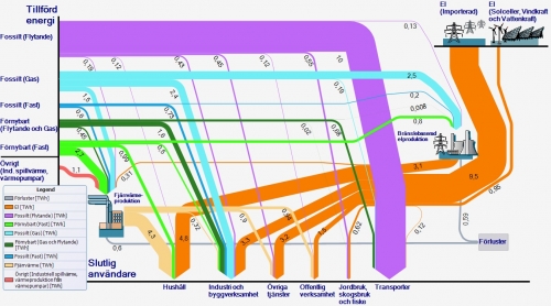
A colorful Sankey diagram for energy flows from Sweden. Found this one on the web page of Länsstyrelsen Skåne (please don’t ask me to read this out loud…) in an article titled ‘Skånska hushåll i fronten för mindre fossilberoende’

Unit of flows is TWh. The orange arrows are imports, the other arrows from the left apparently domestic production, with the majority of energy being from fossil fuels (“Fossilt”). Consuming sectors are at the bottom – in contrast to the typical layout of this kind of energy balance diagrams.

Anyone from Sweden who wishes to comment and explain a little bit?

Infographic: Arms Flows Sankey Diagram

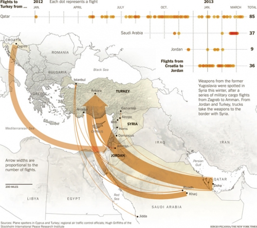
Found this one on the Coffee Spoons blog. It is originally from an infographic created by Sergio Peçanha of the NY Times.

The Sankey diagram shows cargo flights supposedly loaded with arms, from Doha and Riyadh (among others) to Turkey, and from Zagreb to Amman. All supposedly destined for onward transport to Syria. The “arrow widhts are proportional to the number of flights”.
An additional 2012/2013 time line shows the flight dates and their density. Interesting. One mustn’t confuse the Sankey arrows with number of arms being transported, as there might have been different planes and consequently different cargo loads.

Now I think I should also be looking for a “civil” version, with pax being transported on commercial airline flights.