Month: February 2016

South China Sea Oil/LNG Transport

South China Sea has recently garnered increased media attention due to China reclaiming land and building an airfield on Fiery Cross Reef. The territorial dispute regarding Spratly Islands has been simmering since the 1970ies when oil was discovered in the region. South China Sea is also “one of the busiest shipping lanes in the world” with “more than half of the world’s supertanker traffic, by tonnage, pass[ing] through the region’s waters every year” (Wikipedia).

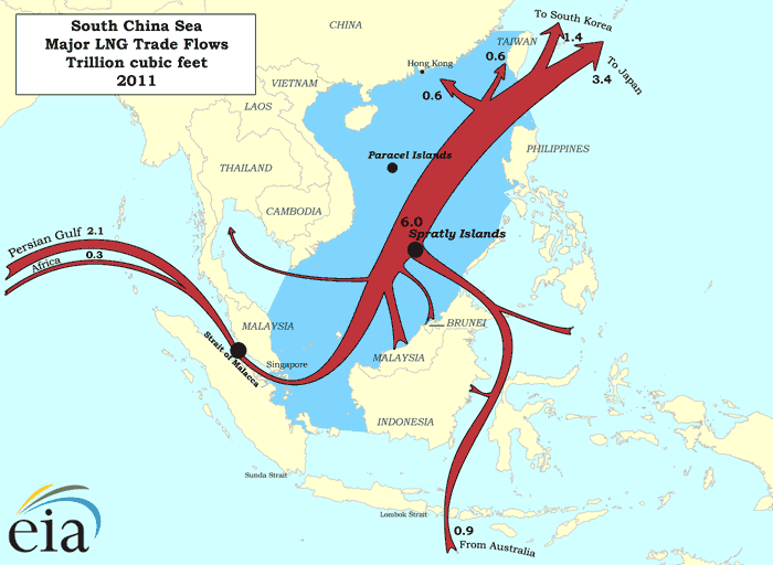
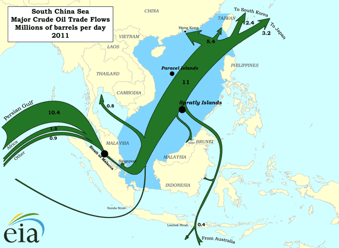
The Department of Energy has two interesting maps on their beta website showing LNG and crude oil transport for 2011.

Transport of liquefied natual gas (LNG) in trillions of cubic feet in the South China Sea:

Transport of petroleum in millions of barrels per day in the South China Sea in 2011:


(both maps from eia.gov website)

These are ‘Sankey-inspired maps’ rather than exact Sankey diagrams. Arrow widths are not maintained where the shipping routes pass through narrow straits. Nevertheless, transport volumes are generally on a correct scale.
Australian Energy Flows 2012/2013

After posting on Australian Metals Flows yesterday I realized I had never presented a Sankey diagram for energy flows in Australia.

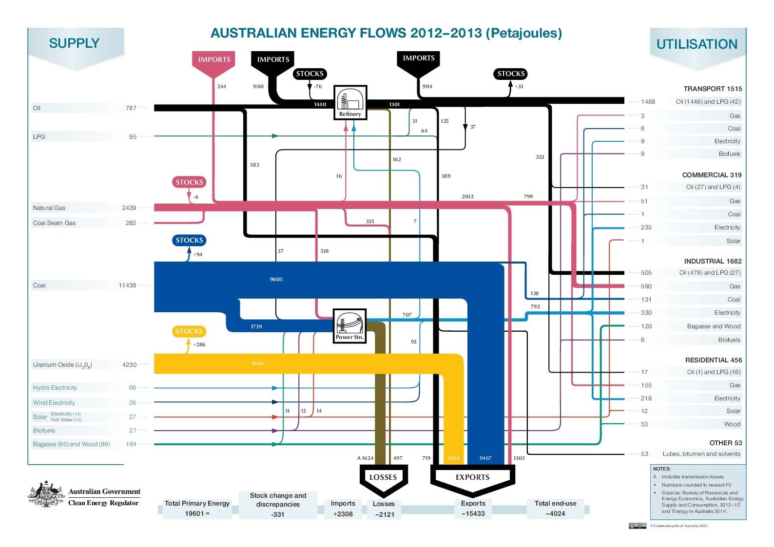
Well, here it is. From the Government of Australia, Clean Energy Regulator, Renewable Energy Target program website comes this beauty (CC-BY license Commonwealth of Australia):


One can really say that Australia is mainly exporting its energy. Flows in Petajoule (PJ) for the year 2012/13. Older energy flow diagrams available in the Australian Atlas of Minerals, Resources and Processing Centres here.

Australian Metal Flows

The Australasian Institute of Mining and Metallurgy (AusIMM) is an association of the minerals industry. In this AusIMM Bulletin article titled ‘From Waste to Wealth’ they talk about metal recovery and recycling in Australia.

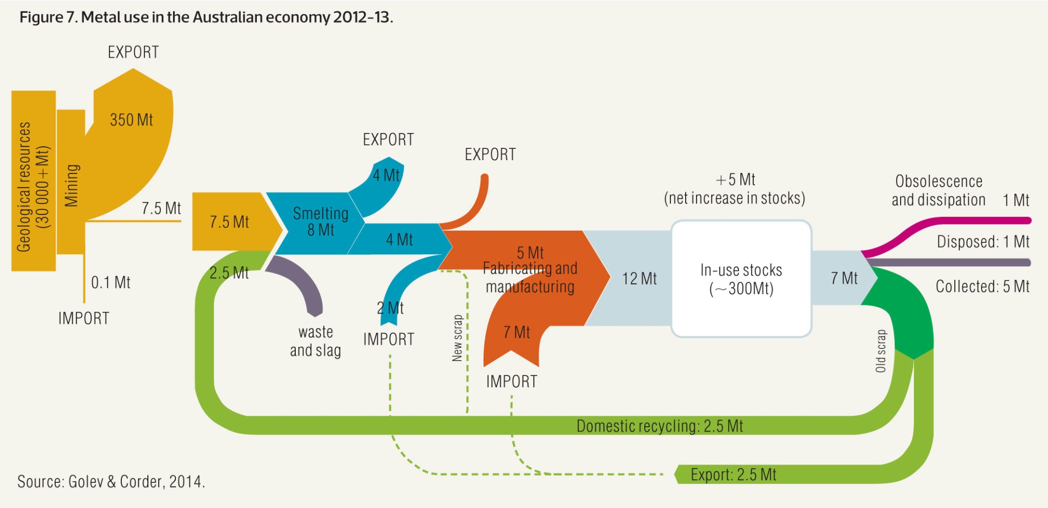
This Sankey diagram (actually two Sankey diagrams) from the article visualizes metal flows in Australia in 2012/2013 based on data from Golev & Corder (2014).

The smaller yellow diagram section on the left actually just shows mining activities in Australia and the fact that the largest portion of mining output (ores) are exported. Only 7.5 Mt are processed within Australia. This Sankey arrow is then blown up and corresponds to the yellow input stream into the second diagram [a similar solution to decouple diagrams with different scales was presented in yesterday’s post].

In the metal production process there are losses, and material is being exported and imported. The annual increase to the Australian ‘in use stocks’ (i.e. metals being used infrastructure, buildings and products) is 12 Mt, possible only thanks to 7 Mt metals imports. Some 7 Mt of metals are also released annually from ‘in use stocks’.

The dotted lines signal that there are possible routes, but either outside the scope of the Australian market or no reliable data is available (new scrap from the manufacturing step being fed back to the smelting).

Sankey Diagram of Sugar Production

An interesting Sankey diagram of sugar production can be found on p. 23 and p. 24 of the 2002 report ‘Möglichkeiten der Wertschöpfungssteigerung durch Abfallvermeidung (biogener Reststoffe) und Nebenproduktnutzung – Feasibilitystudy’ by Austrian researchers Herbert G. Böchzelt, Niv Graf, Robert W. Habel, Johann Lomsek, Susanne Wagner, Hans Schnitzer (all of Joanneum Research).

Why interesting? Because the diagram wouldn’t fit on one page in the report the authors decided to cut it in two parts. Two streams of the first diagram are continued in detail in the second Sankey diagram shown on the next page.


All flows are in mass percent based on an input of 100% sugar beets (‘Rübenschnitzel’, with -schnitzel apparently meaning ‘chips’). The output of 16 mass-% ‘Presschnitzel’ (pressed beet pulp) and 4.18 mass-% ‘Melasse’ (molasses) is further detailed in the second diagram.

Mind that arrow width is different in the two diagrams, so that they two can not be compared directly. Because water dominates the first diagram, the smaller mass flows of the second diagram would be barely visible, if the two were at the same scale.

Building Thermal Energy Model, Sankey Fail

A Swiss software company features a screenshot on their website, depicting a thermal energy model for a building. I’m not mentioning the source, because it is a bit embarassing…

Despite the general good impression of the diagram and the tech labelling of the arrows, the width of these arrows seems completely arbitrary. Well, to be fair … they don’t call it a Sankey diagram.

Europe Energy Flows 2013

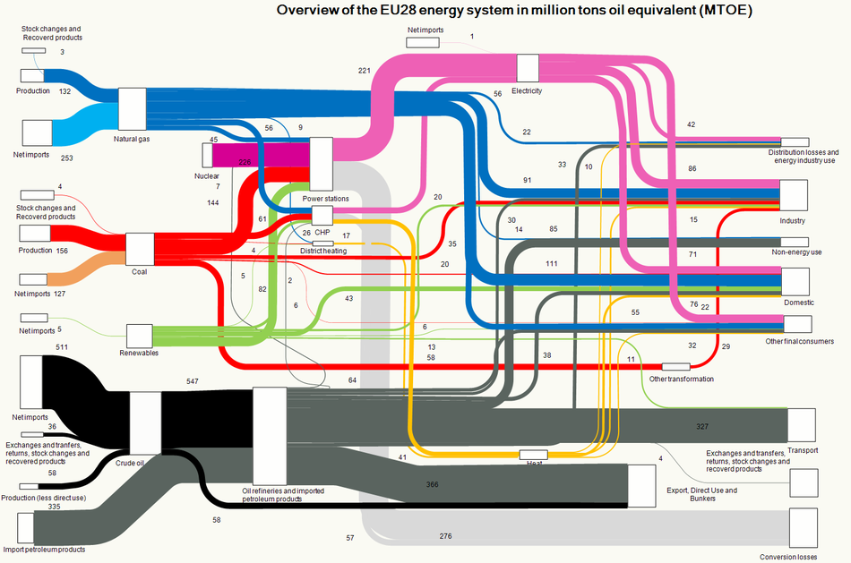
An updated Sankey diagram for the energy flows in Europe (EU-28 countries) is available on the website of the European Environment Agency (EEA).


Copyright holder: European Environment Agency (EEA).

I have reported previously about the energy picture with data for 2012. The Sankey diagram structure is almost identical, just the values have been updated to reflect 2013 data. Minimal changes only, compare for yourself…

World Petrochemical Balance, Sankey

The International Energy Agency (IEA) is a good source for reports on energy, both with a focus on global energy, but also breaking it down to the national level. I have featured their Sankey diagram website that allows to access national energy balances for many countries in this post back in 2013.

Browsing through their reports also sometimes reveals Sankey diagram gems. In their report on ‘Tracking Industrial Energy Efficiency and CO2 Emissions’, however, I found the diagrams on aluminium, steel, pulp/paper and petroleum not particularly sexy.

This is a schematic block diagram. Arrows are labeled with the quantity in Mt/year.

I decided to redo this as a Sankey diagram, maintaining the general structure of the original diagram. The width of the Sankey arrows immediately exhibit where most of the mass (crude oil) is…

I chose three colors: blue for the actual products from petrochemical industry, yellow for recycling streams and losses, purple for the precurors or feedstock (I actually thought I should do away with these, since the ‘hydrogen energy’ flow gave me some headache…). Also decided that the head of the arrow representing 115 Mt/year of post-consumer waste leading towards (!) net additions to stock in the original diagram is erroneous and thus turned the arrow around.

Didn’t spend much time on graphic aspects or fine tuning. I am sure this can be done quite nicely. But even like this I think a Sankey diagram is the better way to get the message across.