Category: Samples

World Energy Flows in 1937

The below Sankey diagram from 1949 depicting world’s energy flows in 1937 is shown in this blog post by Michael Hohmann | LMH Design.


Flows are in TWh.
Michael says: “When I first saw this, I was reminded of seeing an octopus and called it an Octopus Diagram, with the octopus’ head at the input end at left, and the tentacles on the right, in between digesting and distributing everything that the various mouths at the head can gobble up”, asking himself “[w]here does all this Input energy disappear to with so little Output energy ending up as useful for us humans?”.

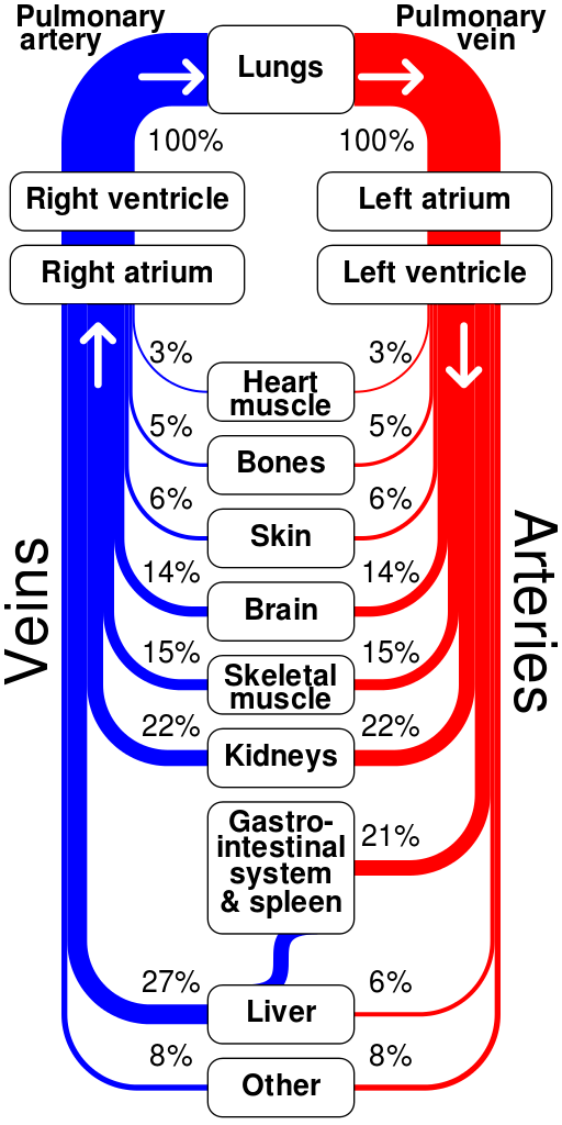
Human Circulatory System Sankey

Liked that Sankey diagram of the human circulatory system (blood flow in the human body) made by CMGlee. This image is part of the Wikipedia article on the circulatory system. Oxygenated blood (red) runs through the arteries, and back to the heart through the veins (blue). Flows depict the “approximate relative percentages of cardiac output delivered to major organ systems”


by CMGlee on Wikicommons (license CC BY-SA 3.0)

Didn’t know my brain only required 14%, but well…

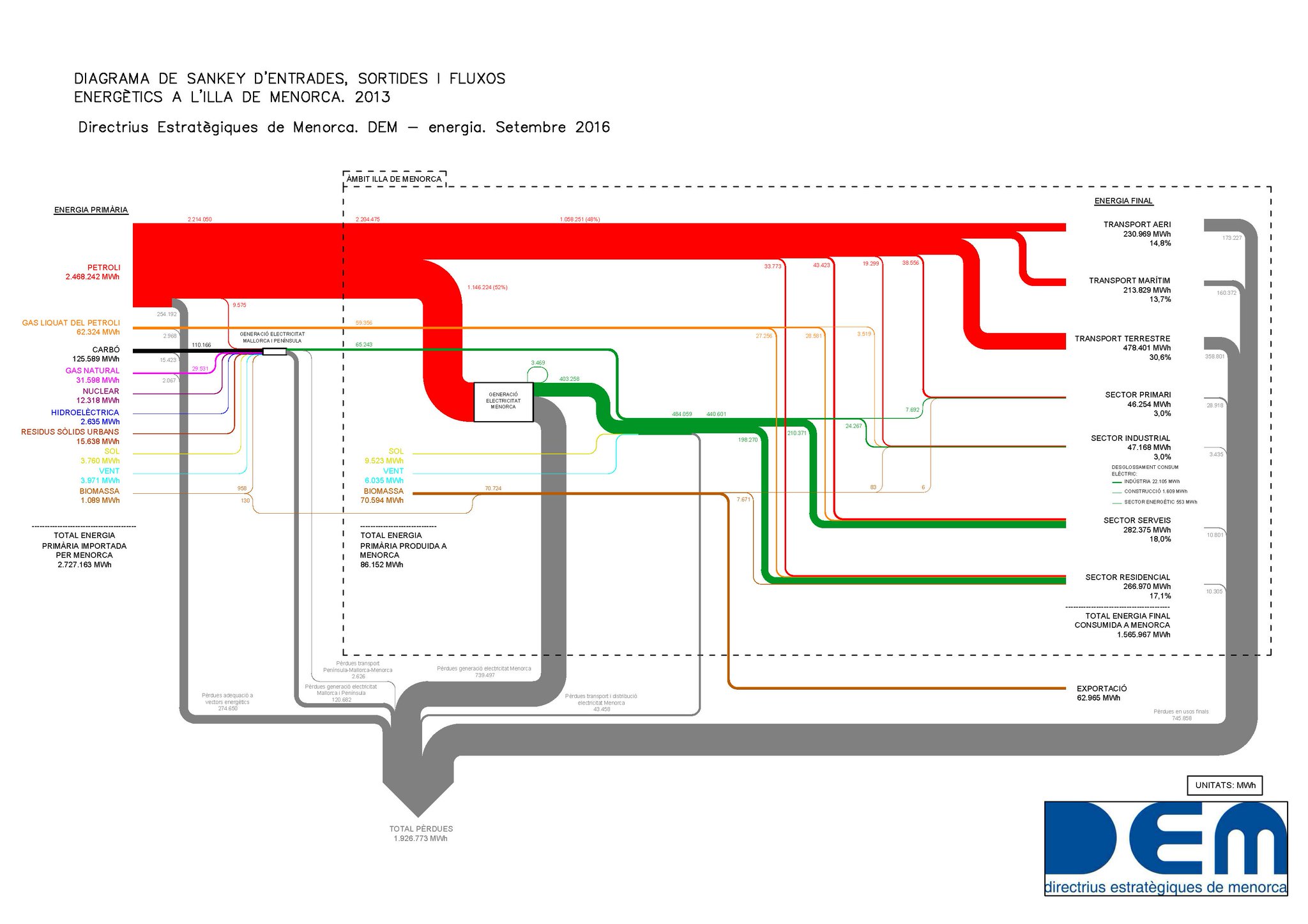
Energy Sankey Diagram Menorca

The Spanish island of Minorca (Spanish: Menorca) is part of the Balearic islands archipelago in the Mediterranean Sea. Less crowded than Mallorca, and more tranquil than party location Ibiza, this island is popular for family holidays.

The Strategic Directorate of Menorca (Directrius Estratègiques de Menorca, DEM) has recently published this Sankey diagram depicting the energy flows of the island in 2013.


(via DEM Twitter)

Flows are in MWh. Primary energy input was 2.72 mio MWh in 2013, of which 1.56 mio MWh were used, while 1.92 mio MWh were losses. (difference was exported). Labels are in Catalan.

The energy visual is different from others that I have shown on this blog before: The island is almost entirely depending on petroleum as energy source. Maritime and air transport consumes a large part, as does the services sector (hotels). Industry sector is a rather small consumer.

You can find a report in Spanish with a similar Sankey diagram here.
Process Sankey: Pressure Water Scrubbing

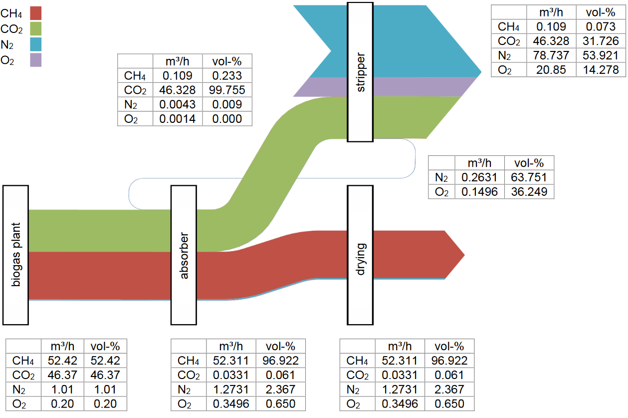
A Sankey diagram of O2 contamination during pressure water scrubbing from a paper on ‘Oxygen Removal during Biogas Upgrading using iron-based Adsorbents’ by Toni Raabe of DBI – Gastechnologisches Institut gGmbH Freiberg in Germany.

Flows of methane, carbon dioxide, nitrogen and oxygen are shown in vol-%. The flow rate (in m³ per hour) is given in a small table at each stage of the process chain (biomethane-process chain via pressure water scrubbing).