Category: Samples

Food Waste in Germany

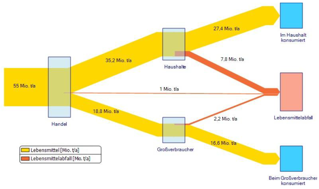
A rather simple Sankey diagram. It can be found on p. 195 of a study on Food Waste in Germany by ISWA, Stuttgart University comissioned by the Federal Ministry of Food and Agrriculture (BMEL). Flows are in million tons per year (averaged for the five-year period 2003 to 2007).


The yellow streams represent food delivered to individual housholds (“Haushalte”) as well as to commercial (large scale) users (“Grossverbraucher”) such as restaurants. The orange arrows show food waste (10 mo. tons p.a.). Note that individual households have a higher reject rate.

Cogeneration system Sankey diagram

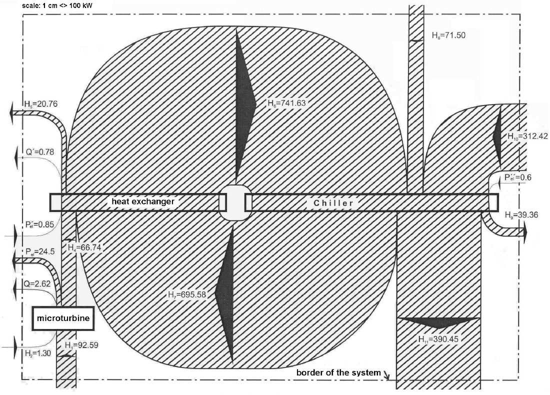
Just another quick Sankey diagram before the weekend. This beautifully crafted black&white diagram is from a scientific article ‘Exergy assessment of a cogeneration system with micro-turbine and absorption chiller’ by Martínez Reyes et.al. published in Proceedings of COBEM 2005 (18th International Congress of Mechanical Engineering).

This is for a cogeneration system with a 30 kWe gas micro-turbine and a 35 kWt absorption chiller. Flows are in kW with a scale of 1 cm = 100 kW in the original size. Good handling of the loop flow.

Iran GHG Emissions from Energy Sector

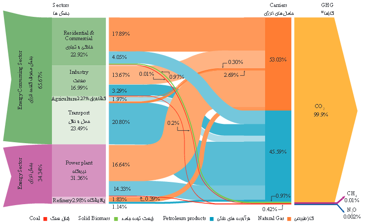
Following up to my two previous posts on Iran’s Energy Flows and Iran’s Energy production and consumption, here is the third Sankey diagram I could find in the report ‘Iran and World Energy Facts and Figures, 2012’ published by Ministry of Energy (MOE) of the Islamic Republic of Iran.

It is on greenhouse gas (GHG) emissions caused by the energy sector in the country


This is interesting, as the setup is reversed in comparison to the typical energy flow diagrams we all know. Here, the consuming sectors are on the left, alongside the energy generation sector itself. The middle section of the diagram sorts the arrows by energy carrier that causes the GHG emissions: natural gas contributes 53% (orange) and petroleum products 45.6% (blue). The third column shows a breakdown into the gases CO2, CH4 and N20.

No absolute values are given in the diagram, the magnitude of the flow amount to 100%. However the detailed values can be found in the accompanying tables in the report: carbon dioxide with 556,866,000 tons, methane 57,000 tons and nitrous oxide 11,600 tons (all values for 2012). Mind that these are absolute values, so in order to understand the impact on climate change one would have to multiply with the respective emission factors for methane and laughing gas and normalize them to kg CO2-equivalents.
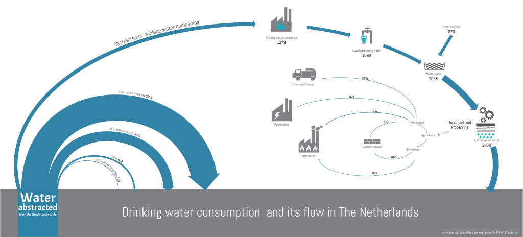
Water Cycle in the Netherlands by G Singh

Just a quick post before the weekend: Visualization of the water cycle in the Netherlands by Gunjan Singh. See initial sketch and some comments here.


Quantities are in billion kg (=million tons). “The weight of the arrows depict the proportions most of the time”, exceptions are in the thin arrows at the right which would otherwise be fine hair lines only and almost invisible.

South China Sea Oil/LNG Transport

South China Sea has recently garnered increased media attention due to China reclaiming land and building an airfield on Fiery Cross Reef. The territorial dispute regarding Spratly Islands has been simmering since the 1970ies when oil was discovered in the region. South China Sea is also “one of the busiest shipping lanes in the world” with “more than half of the world’s supertanker traffic, by tonnage, pass[ing] through the region’s waters every year” (Wikipedia).

The Department of Energy has two interesting maps on their beta website showing LNG and crude oil transport for 2011.

Transport of liquefied natual gas (LNG) in trillions of cubic feet in the South China Sea:

Transport of petroleum in millions of barrels per day in the South China Sea in 2011:


(both maps from eia.gov website)

These are ‘Sankey-inspired maps’ rather than exact Sankey diagrams. Arrow widths are not maintained where the shipping routes pass through narrow straits. Nevertheless, transport volumes are generally on a correct scale.

Sankey Diagram of Sugar Production

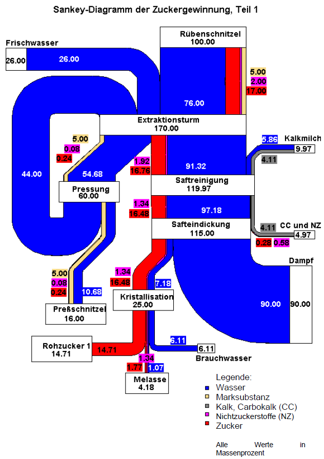
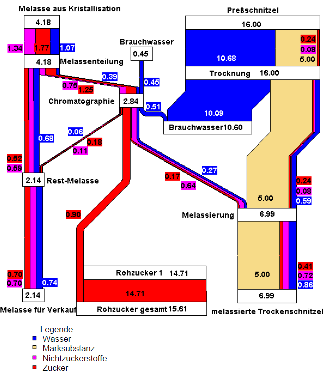
An interesting Sankey diagram of sugar production can be found on p. 23 and p. 24 of the 2002 report ‘Möglichkeiten der Wertschöpfungssteigerung durch Abfallvermeidung (biogener Reststoffe) und Nebenproduktnutzung – Feasibilitystudy’ by Austrian researchers Herbert G. Böchzelt, Niv Graf, Robert W. Habel, Johann Lomsek, Susanne Wagner, Hans Schnitzer (all of Joanneum Research).

Why interesting? Because the diagram wouldn’t fit on one page in the report the authors decided to cut it in two parts. Two streams of the first diagram are continued in detail in the second Sankey diagram shown on the next page.


All flows are in mass percent based on an input of 100% sugar beets (‘Rübenschnitzel’, with -schnitzel apparently meaning ‘chips’). The output of 16 mass-% ‘Presschnitzel’ (pressed beet pulp) and 4.18 mass-% ‘Melasse’ (molasses) is further detailed in the second diagram.

Mind that arrow width is different in the two diagrams, so that they two can not be compared directly. Because water dominates the first diagram, the smaller mass flows of the second diagram would be barely visible, if the two were at the same scale.

Europe Energy Flows 2013

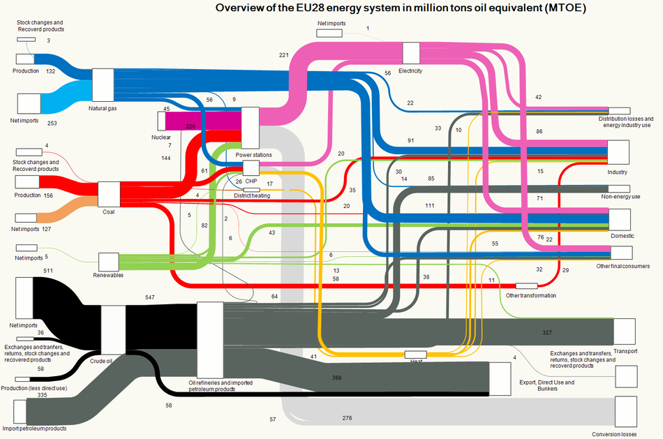
An updated Sankey diagram for the energy flows in Europe (EU-28 countries) is available on the website of the European Environment Agency (EEA).


Copyright holder: European Environment Agency (EEA).

I have reported previously about the energy picture with data for 2012. The Sankey diagram structure is almost identical, just the values have been updated to reflect 2013 data. Minimal changes only, compare for yourself…