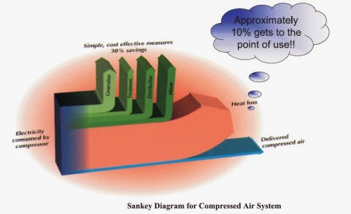
This 3D Sankey diagram for a compressed air system from a Mechanical Engineering blog post is taking it somewhat over the top…
It shows energy efficiency of a compressor. Only a fraction of the energy (electricity) to power the compressor is converted and delivered in compressed air, while the largest chunk is wasted as off-heat.
Yes, the 3D-look is fancy (see other samples of the 3D species here). The elliptic orange backdrop makes it look more dramatic, but doesn’t really contribute to conveying the information. No units are given.
The green arrows represent “simple, cost-effective measures” that could probably increase efficiency of the compressed air system if implemented. The blue arrow that stands for the energy delivered as compressed air is supposedly “approximately 10%” of the energy input, but he height is much less than 1/10th of the stacked arrows.
