Tag: 3D

Circular Zinc Flows

While some were indulging in an extended spring cleaning (this year labeled ‘quarantine cleaning’) I decided to take on some of the hard disks sitting on my desk.

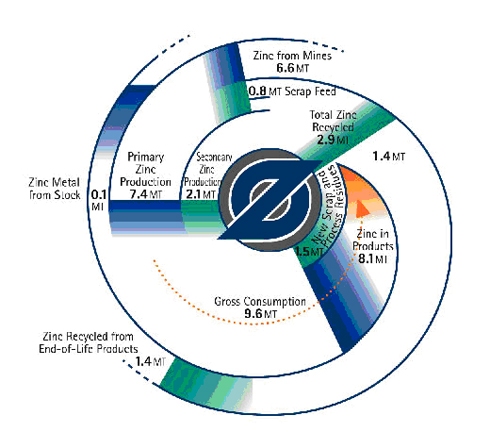
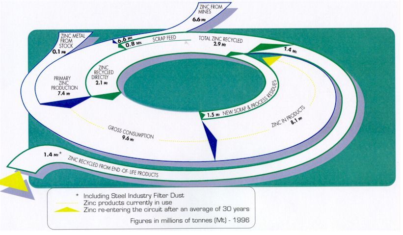
These circular zinc flow diagrams from 2011 survived the cleaning and are getting a new life here on the blog. They are more or less two versions of the same diagram, apparently with a Sankey diagram in mind.

The first is a top view and shows zinc flows in the economy (U.S. or world? … sorry, but I don’t have the accompanying text any more). Flows are in millions of tonnes (Mt) in 1996. The second one has the same numbers, but adds a 3D perspective…

Some tricky issues here: The ‘zinc in products’ stream of 8.1 Mt narrows down to zero, as the zinc sits in products, from where it later might be released into the cycle again. This does not help the attempt to draw them in a circle (to associate circularity of zinc flows). As a consequence the streams are not to scale (compare, for example the 0,8 Mt scrap feed flow right next to the 6,6 Mt flow for zinc from mines). The 3D perspective and the shadow effect don’t help in any way here…

Check out some more Sankey diagrams with the tag ‘circular’ and this post on radial Sankey diagrams.
1913 public transport 3D map

Leafing through Brinton’s 1914 book ‘Graphic methods for presenting facts’ I found this example of a 3D map that has elements of a Sankey diagram.

This map (photo taken from an exhibit at a 1913 exhibition) shows passenger numbers on the Frankfurt streetcar lines (back then when trams were still called streetcars!)


Brinton explains that “we have a map presentation in which quantities are represented by building vertically above the various routes laid out on the map … made by strips of wood, alternately black and white, glued carefully above each one of the street-car routes. Each of the strips of wood represents 4,000 passengers carried on the street-car lines in 24 hours” (page 224).

The built up flows showing passenger numbers would, if laid sideways, indeed make a Sankey diagram. Building them up using the third map dimension avoids the issue of dealing with wide Sankey arrows in a dense city center, where passenger numbers are highest.

Brinton’s book, although over 105 years from its publication still makes for a great read (as does his 1939 book on ‘Graphic Presentation’, which is basically a sample book for doing infographics).

Compressed Air System

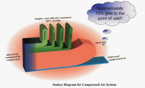
This 3D Sankey diagram for a compressed air system from a Mechanical Engineering blog post is taking it somewhat over the top…

It shows energy efficiency of a compressor. Only a fraction of the energy (electricity) to power the compressor is converted and delivered in compressed air, while the largest chunk is wasted as off-heat.

Yes, the 3D-look is fancy (see other samples of the 3D species here). The elliptic orange backdrop makes it look more dramatic, but doesn’t really contribute to conveying the information. No units are given.

The green arrows represent “simple, cost-effective measures” that could probably increase efficiency of the compressed air system if implemented. The blue arrow that stands for the energy delivered as compressed air is supposedly “approximately 10%” of the energy input, but he height is much less than 1/10th of the stacked arrows.

1970ies Energy Time Series in 3D

The Energy Education References Wiki has a page on Sankey diagrams. It features many samples, snippets and links directed at teachers.

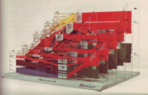
One image in particular caught my attention. This is described as “Energy Display System” created by CSIS in the 70s


(via Energy Education References Wiki)

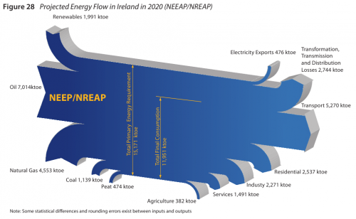
You all know those national energy flow Sankey diagrams I show here regularly? Now imagine the same type of image as a series consecutive frames for several years. This would produce a kind of animated gif or movie showing changes over time.

The above must be an early 3D version of this. The diagrams are mounted on what seems to be acrylic glass…

A day in the life of… Victor Hugo

I admire architects for their visionary ideas, for being able to transcend established limits, for pushing things beyond the common … at least when still in early phases of a project.

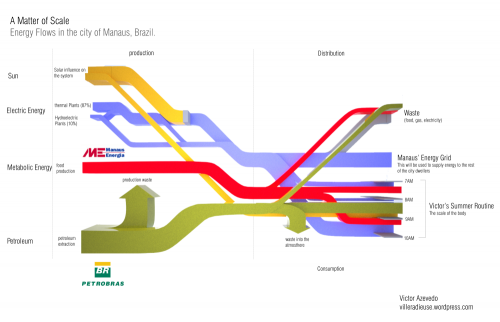
Victor Hugo Azevedo’s blog is called ‘La Ville Radieuse’ (The Radiant City) after a concept by Le Corbusier. It has all kinds of architectural stuff. By mere coincidence I discovered the following Sankey diagram he did in 2011 as class assignment on energy flows…

“This time we were asked to trace the energy flow that directly affect us. I traced the beginning of a common day during my summer in the city of Manaus Brazil. The following diagram shows how the larger infrastructure shape my routine.”

This looks at first sight like one of the classic ‘national energy flow’ Sankey diagrams with fuels (production) on the left, distribution and consumption on the right. But this is only partly true. Look at the right part where the energy flows stack and have a vertical time line.

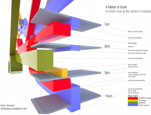
“The next diagram is nothing more than a closer look into one of the ends of the diagram, which is my own routine on a four hour span (from 7AM to 10AM on a regular weekday in June)”

So forget about scale and units here … this is a concept diagram! The Sankey diagram links an individual’s consumption patterns with the bigger picture, thus stressing everybody’s personal share and responsibility in energy consumption (and the possibility to take action). Kudos for this idea!

Apart from that it is of course a fancy 3D rendering, and I love the rotation and close-up of the morning routine. Make sure you post a comment directly at Victor’s post, if you like it as much as I do!

Note: Somewhat related, check out Molly Eagan’s ‘Where is Petroleum in our Daily Lives’ here.

Cool! Cyclifier 3D Sankey Diagram on Food

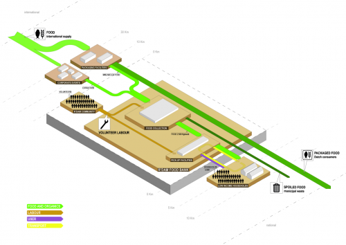
Found on cyclifier.org, a project run by Dutch 2012Architecten: This 3D Sankey diagram by Anna Brambilla visualizes flows of food from producers to the Rotterdam foodbank and onto low income households.


Source: http://www.cyclifier.org/project/foodbank (License: Share-Alike)

The image is explained as follows:

“Processes and actors are identified by labeled platforms with sub-processes shown as stacked platforms. The system boundary is shown as an extruded block indicating that it is one piece within a larger network. Starting from the edges of the cyclifier, distances are marked in intervals to indicate the distances traveled by inputs and outputs. Flows are scaled by mass as in sankey diagrams and are color-coded per flow type. Flows to and from the atmosphere are represented as traveling vertically.”

So, we have ‘Food and Organics’ flows (green), transport (yellow), users (purple) and even volunteer labor (brown) represented in the diagram. No numbers or units given though. Since cyclifier.org is interested in promoting “innovations that contribute to local exchange and production”, distances of producers to the foodbank and to the consumers are indicated on a somewhat logarithmic scale.

I just doubt that roughly a third of the output flows from food production is received by the foodbank. This is probaly to be taken symbolically and not for real…

Very cool Sankey diagram, kudos!

3D circular Sankey ugliness

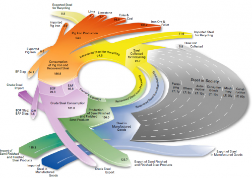
You might remember the radial Sankey diagrams “invented” by Visio guy (here). This 3-D version below left me speechless… I hope the guys at junkcharts dedicate a critical evaluation to it….


(view the original diagram here)

This is from EUROFER (The European Confederation of of Iron and Steel Industries) and shows steel flows in fifteen European countries (EUR-15) in million metric tons. Values are for 2004. The grey area is supposed to represent steel accumulated in capital goods (machinery, buildings, …) over a certain life time.

Whooo woah, that’s a merry go round, I feel dizzy already!