In this post on rare earths I have recently featured an alluvial diagram depicting rare earths use from a presentation by T.E.Graedel (Yale). That same presentation also lead me to another article by X. Du & T.E. Graedel titled ‘Uncovering the Global Life Cycles of the Rare Earths Elements’ (open access) that has a number of circular flow diagrams I would call “REE wheels”.
The article describes how quantitative data on rare earths is available for mining and processing, but “very little quantitative information is available concerning the subsequent life cycle stages”. Also, data is mostly available for the overall REE production, but not individually for every single rare earth element. They therefore aim to estimate and approximate the quantities for ten REEs, based on sources from China and Japan.
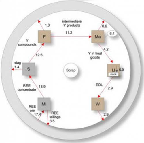
Here is the REE wheel for Yttrium (element Y) from the article:
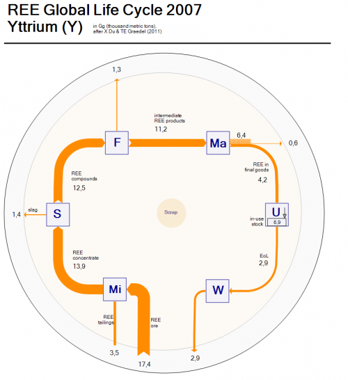
The diagram can be read from 7 o’clock to 5 o’clock in a clockwise direction. The processing steps are “Mi” (mining), “S” (separation), “F”(fabrication), “Ma” (manufacturing), “U” (use) and “W” (waste management), thus showing the flow of the rare earth element through the economic cycle.
I did a Sankey diagram version of the above Yttrium REE wheel to have the arrow magnitude representing the quantities. Flows are in Gigagrams (million metric tons) per year.
Due to the fact that the arrows connect horizontally and vertically to the node (and do not run diagonally like in the original) my remake looks less “circular” somehow… in fact it resembles more one of those retro indoor AM/FM loop antennas you would hook to your HiFi. So I am not fully satisfied with the outcome. Would it be better if the nodes were tilted 45°?
What’s nice is that the extraction of ore (17.4 Gg) can be directly compared to the 2.9 Gg Yttrium release to the environment. I switched ore input and tailings output at the mining node to have them side-by-side.
Comments and improvement suggestions welcomed.

