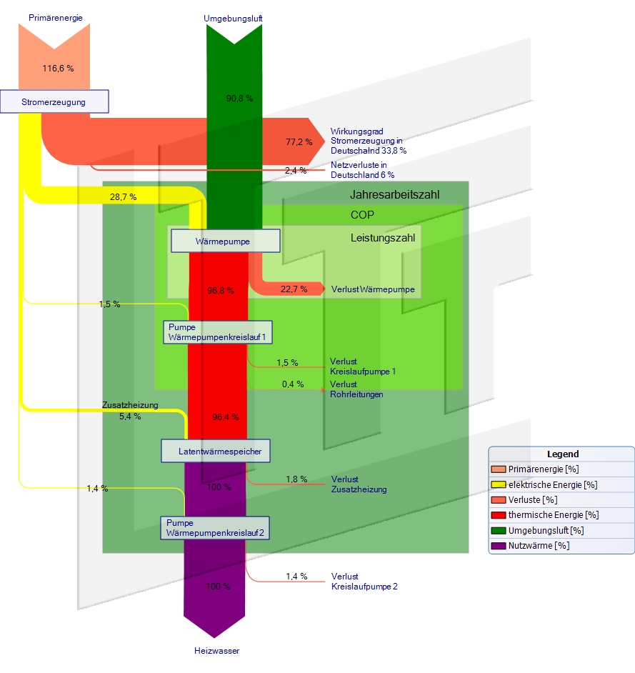
Water and Energy Flows in Production

Dutch tech consulting firm ‘Water and Energy Solutions’ looks at optimization opportunities and cost saving potential in industrial production sites.

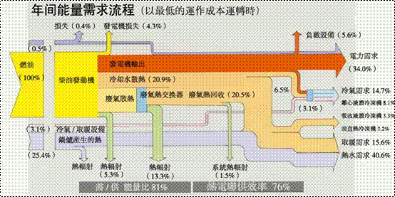
Their services offer is advertised with this sample Sankey diagram.

Their approach called “Flux Technology” is a methodology that “first considers a production site at the largest possible scope, focusing primarily on intersecting process and utility streams. At different scope levels we analyze site, plant(s), unit operations, equipment and general operations both qualitatively as well as quantitatively.”

China Energy Balance, Air Pollution

Air pollution in Beijing, with orange alerts and high health risks made the news (again) recently.

One measure discussed to reduce pollution levels is to issue a partial ban for cars on the streets. This would certainly reduce some of the pressure, however, I am not quite sure whether this would significantly help improve the situation.

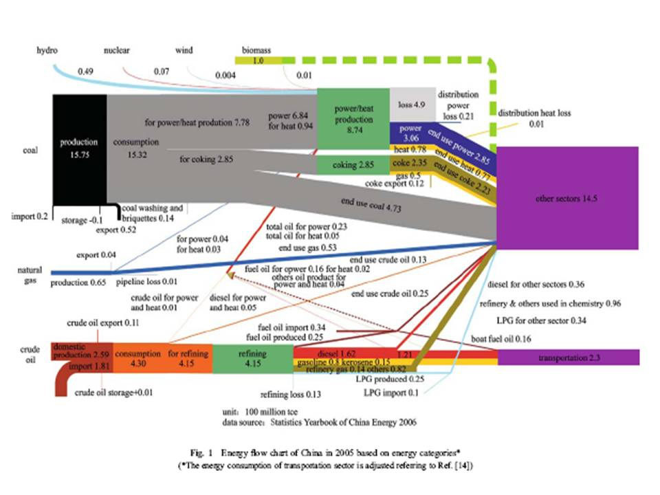
Looking at this 2005 energy flow Sankey diagram for China from World Resources Sim Center, one notices that the largest chunk of energy produced in China is from coal.

The energy from coal consumed in 2005 (purple boxes) was seven times higher than the energy consumed in the transportation sector (1.450 million tonnes of coal equivalent vs 230 million tonnes of coal equivalent, if I interpret this correctly). That is without counting losses that occur both at power stations as well as in vehicle engines.

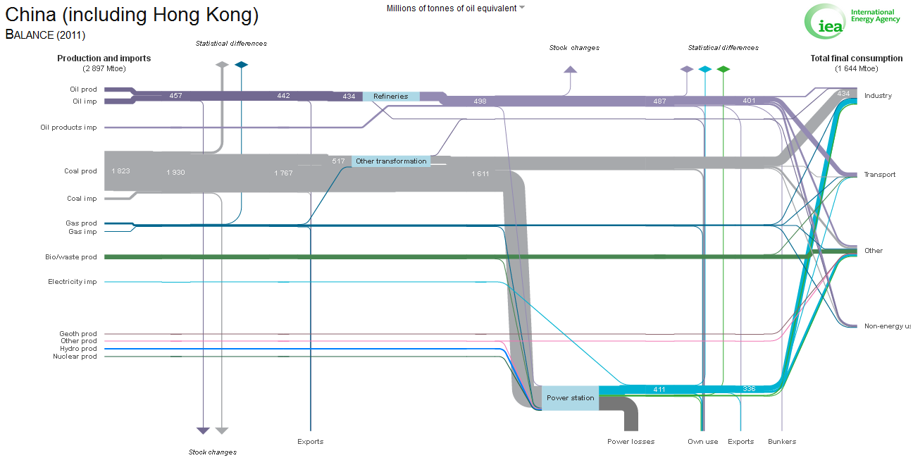
Of course one might argue that traffic probably has risen enormously since 2005. I checked the latest available data for China (2011) at the International Energy Agency (IEA) website where you can access the national energy flow diagrams for more than 100 countries.

It confirms that both coal and petroleum consumption have risen, but coal is still predominant. Transportation makes up for “only” roughly 200 Mtoe (Millions of tonnes of oil equivalent) out of 1644 Mtoe final consumption, while the significant consumption is in industry and ‘other’ (probably private home heating).

So, even if burning of coal and gasoline has different levels of pollution (e.g. through efficient filtering technolgy), my guess is that the main reason for the smog in China are the coal-fired power plants and industrial furnaces. Reducing vehicle traffic will not lead to reduced coal-burning.

Anyone has data on GHG emissions from different sources in China? (preferably as a Sankey diagram….).
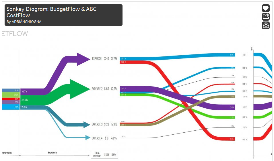
Student Videos on Sankey Diagrams

Found the below two videos while browsing for the keyword “sankey diagrams” on youtube.com.

This seems to be the output of a student assignment at Universidad Nacional de Colombia. Note that the narrative is in Spanish.

In the first video Marcela Rojas explains the basics of building up Sankey diagrams and how to create a national energy balance diagram.

In the other, longer video Paola Cifuentes shows us how she created the ‘balanco energetico minero de Colombia’.

Enjoy!

Energy Balance Comparison

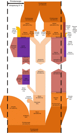
The summary of a research project under participation of Kempten University of Applied Sciences is presented on a project webpage. It also features this comparison Sankey diagram.

These are in fact two Sankey diagrams “mirrored” at an imaginary horizontal center line. The bottom one facing upwards is the diagram for the baseline representing convential energy systems. The upper one with flows pointing downwards has the same amounts of useful energy (trigeneration 30 % electricity, 47 % heat und 23 % cold), but using 31% less primary energy (see black dashed lines).

Careers in Science, Diagram Remake

Merian who runs the Boreal Perspectives blog posts on a Sankey diagram that visualizes academic career paths.

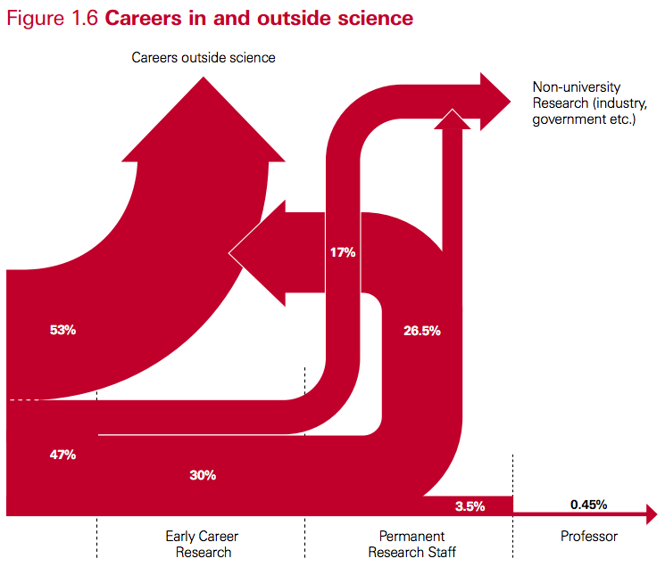
This was originally shown in a 2010 Royal Society policy report entitled “The Scientific Century: securing our future prosperity”. Merian raises concerns about the quality of the diagram. She goes: “So what’s so bad about the chart? Some obvious issues:

  • It is unclear what goes in on the left and to a lesser degree what is covered by the end points. The report indicates in a footnote that the term “science” is used “as shorthand for disciplines in the natural sciences, technology, engineering and mathematics,” but the three documents used for input categorise the fields in different ways, and there is no indication which fields exactly would have been selected.
  • Line thickness is not proportional to percentage weight. The 26.5% and 30% streams have the same thickness, and the 17% stream is much less than half the thickness of either. The 3.5% stream is more than half the thickness of the 17% stream.
  • Why does “Permanent Research Staff” not end in an arrow? And why does the arrow from “Permanent Research Staff” to “Careers Outside Science” bend backwards (to suggest it is a step back in one’s career, that is, an implicit value judgement?) and then not even merge with the output stream?
  • Does it really mean to suggest that no one goes from “Early Career Research” (that is, a post-doc) to “Career Outside Science” (or to industry research)? In my experience, watching post-docs, that is quite a common choice for post-docs precisely because non-academic jobs may be offering better pay and conditions, or because they don’t have a choice at that stage.”

She then presents a remake of the above diagram made using the Sankey plugin for d3.js

Indeed, the distribution diagram without the arrow heads seems to be better suited. The overall appearance is much more calm.

Merian, however, concludes “no graph would have been more useful”.