Energy Efficient Technologies, Cogeneration

The following Sankey diagrams are from a report published in 2005 by Austrian Environment Protectionn Agency (UBA). The report is on energy efficient technologies and measures to increase efficiency and features practical examples from industry.

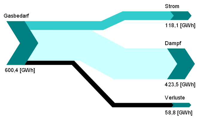
Both Sankey diagrams are from the section on cogeneration (chapter 5, p. 105 and p. 106). The first one shows how natural gas is being used to create 118 GWh electricity and 423.5 GWh steam with an efficiency of 90%.
The second diagram is the breakdown of fuels used in another industrial cogeneration plant. It only features percentage values.

Both sets of data could also be displayed in pie charts, but the Sankey diagrams with directed arrows make an allusion to the output from gas, and to the input feed (in the second diagram).

Energy Balance for Guatemala

The research institute with the hard-to-pronounce acronymic name INCyTDE (Instituto de Ciencia y Tecnología para el Desarrollo at Universidad Rafael Landívar in Guatemala) has published a Sankey diagram with the energy flows for their country for the year 2011.

In regard to design the diagram has many issues: Apparently it was created using a drawing tool that supports primarily horizontal and vertical arrows and Bezier curves. But the diagram loses a lot with branching and joining of arrows almost non-existent.

Flows are more or less to scale. The unit is not shown in the diagram itself, but explained in the text (kilo barriles equivalentes de petróleo, KBEP = kilo tonnes of oil equivalent, ktoe). Data is from national statistics published by the Energy and Mining Ministry.

The content of the energy balance diagram is quite interesting, especially if you compare it to similar diagrams of other countries or the world average.
Wood is the most important energy in Costa Rica (green arrow ‘Leña’, 37.251 ktoe in 2011). Bagasse from sugar cane (dark green arrow ‘bagazo de caña’, 8.696 ktoe in 2011) is used for almost half of the electricity generation. Petroleum and derivates (dark pink arrow, 24.903 ktoe in 2011) however do play an important role for vehicles (transportation).

Waste Sorting Sankey

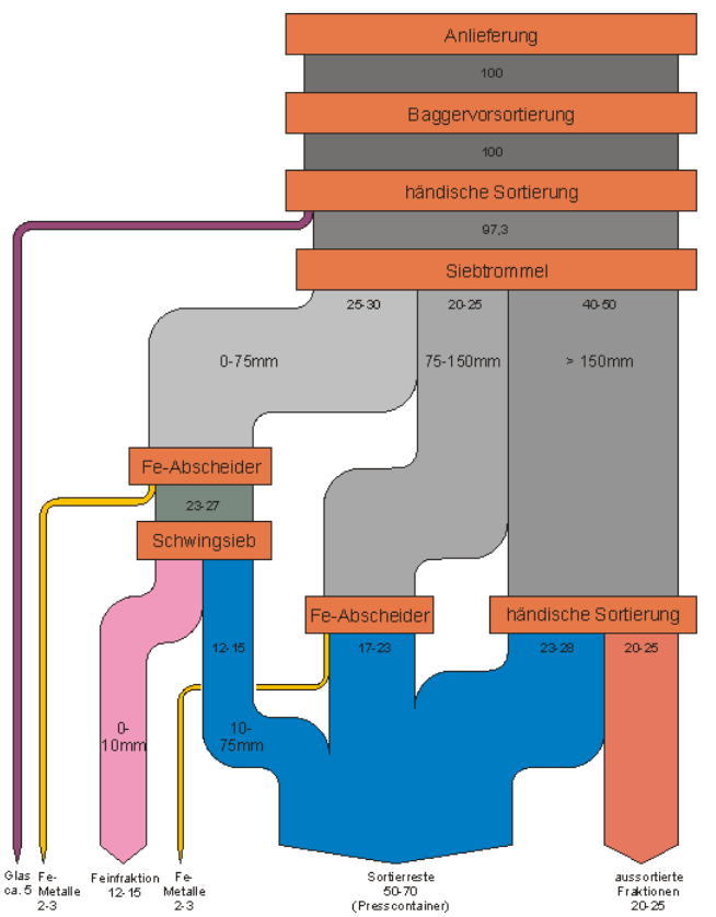
From this presentation by Berlin-based consulting firm UEC comes the below Sankey diagrams on sorting of waste in a waste treatment facility in 2003.

No absolute values are given, only a percentage breakdown of the waste that is being treated.

After the first steps, the drum sieve (‘Siebtrommel’) splits the waste flow in three main fractions based on the size of the shreddered waste. The blue arrow are unsorted remains, the colored ones are recovered materials.

Only apparent flaw of this Sankey diagram is that the arrow labels show ranges for values. An accompanying table in the presentation has the minimum and maximum sorting quotas. Not clear which value was used for determining the arrow widths.

Where does a family’s tax money go?

From Katie Nieland’s early bird desgin blog, this Sankey diagram shows an average US family’s tax burden.
Income tax goes to the national budget that is further broken down to show spendings.

More than half of the tax load is social security tax, another 1,016 US$ us medicare. Out of the 9,983 US$ taxes some 1,016 US$ go to national defense.

Data for this average Joe Taxpayer is from ‘Your 2010 Federal Taxpayer Receipt’ by whitehouse.gov

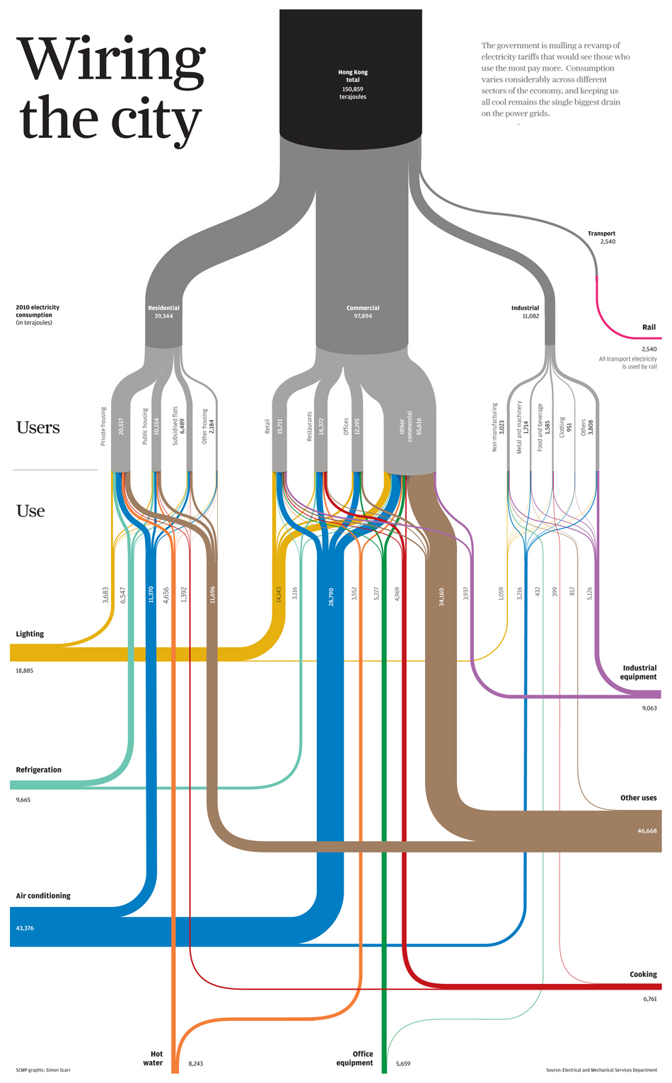
SOPA 2013 Award: Wiring the City

Simon Scarr has won a SOPA 2013 Award for Excellence in Information Graphics (PDF, see p. 13) with this Sankey diagram titled ‘Wiring the City’ originally created for the South China Morning post.

It shows energy flows and energy use in Hong Kong

On his blog he writes: “… we took a look at Hong Kong’s power consumption. Who uses all the electricity in our city and what is it used on? (…) Data set was provided by the government’s Electrical and Mechanical Services Department. (…) This type of chart is known as a Sankey diagram. The thickness of each line reflects a value. In this case, an amount of electricity in terajoules. All of the lines add up to give subtotals and totals by users (grey) and end use (coloured).”

Congratulations, Simon!

Teachers, don’t use these in class

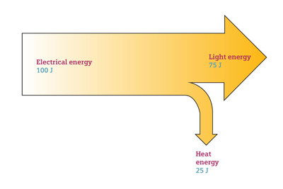
I have nothing against large companies providing free didactic materials like videos and images to support education. But the below Sankey diagram samples from the image bank of a large multinational company are a fail!

Teachers should better not use them in class, as their smarter students may identify the fundamental error in them:

Can you spot the error?

Building Energy Measuring and Modelling

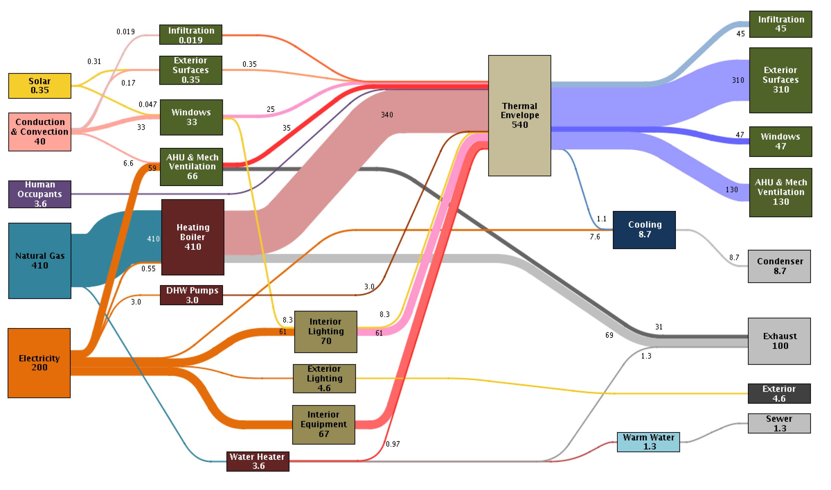
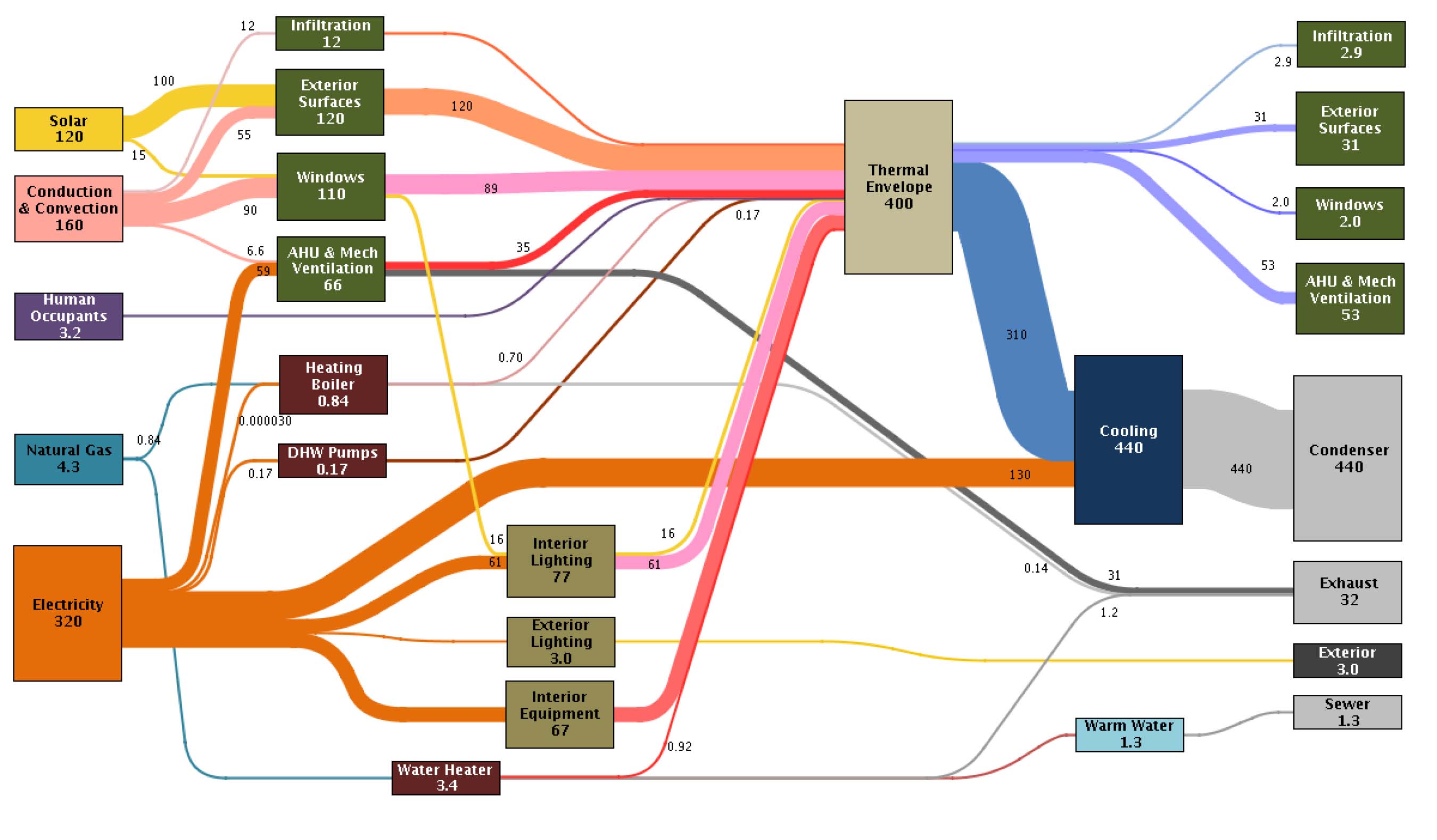
This article on ‘A Pilot for Measuring Energy Retrofits’ describes how researchers from the EEB Hub used an old navy building in Philadalphia to “determine detailed system performance”.

EEB Hub researchers outfitted Building 101 with sensors and a data acquisition system to determine detailed system performance, building energy loads, indoor environmental quality (IEQ), and a detailed operation of the building control system. … The sensors read data from 509 sensing points, collecting 1,048 pieces of data at one-minute intervals. These data points track indoor air quality, occupant comfort, and building energy use.

The result of that “inverse modelling” (i.e. measuring) approach are presented in Sankey diagrams and are used “to identify discrepancies in the predicted versus actual energy balance”.

There are significant differences between the January energy use…

… and the energy picture in July

While in winter mainly natural gas is used for heating, the gas consumption in summer is down. In July electricity consumption is significantly higher due to air conditioning.

Unfortunately no unit of measurement is given (it could be kWh), but nevertheless proportions of the energy flows are correct.

Read full article.