Economy Maps – visualizing environmental impacts

Following up to yesterdays post on the supply chain visualization by TRUTHstudio. Imagine the concept described for the meat production sector blown up to cover the all sectors of the U.S. economy, and showing all the links between these sectors. There you are: Economy Maps, “an interactive visual map of the United States economy and its environmental impacts” by Jason Pearson.

In the first version the economy maps covered 24 major sector groups, and were apparently “static”. However, they already were beautifully designed Sankey-style maps of the environmental impacts caused directly or indirectly by these sectors of the economy.

Here is an image from that first edition of Economy Maps:

Jason comments: “The CEDA database (from which Economy Map derives its data) was developed by Dr Sangwon Suh at UC Santa Barbara, and that image … was actually an illustration for an academic article by Dr Suh.”

Development has continued and today in Economy Maps 2.0 beta is available as a fully interactive browser based Java application or a downloadable file for Mac or Win. It allows to view the environmental impact for several categories (such as global warming protential, ozone depletion, acidification, land use, freshwater aquatic exotoxicity potential and so on). Each diagram is presented in a different color but with the same structure: The first column are the goods obtained from the different sectors. The middle column contains all sectors that have an exchange of goods. The right column represents the consumers, both private and governmental. For each impact category users can visually grasp the relative contribution of each sector to an environmental impact category represented by the width of the band. Each sector is profiled according to three distinct perspectives on environmental impact as explained in yesterday’s post.

I have included a video of Jason explaining the economy maps below, it is wortwhile watching to fully understand the details.
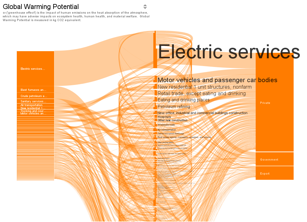
The diagrams are based on statistical financial data and makes use of the economic input-output life cycle assessment (EIOLCA) method. “Financial data are drawn from ‘use’ tables published by the Bureau of Economic Analysis (BEA) at the US Department of Commerce. Environmental data are drawn from Sustainable Materials Management: The Road Ahead, a report from the US Environmental Protection Agency (US EPA). The report includes an economy-wide study that identifies the relative contribution of each industrial sector to major environmental categories. The study makes use of output from the CEDA 3.0 Life Cycle Assessment (LCA) Economic Input/Output (EIO) database”.

It should be noted that there are a lot of assumptions built into the methodologies used to calculate environmental impacts, and some of these methodologies are quite controversial. Also, the data is from 1997, and financial interaction between the sectors has most likely changed since. According to the author, Economy Maps at present should be considered a prototype, and users “should be careful in relying on Economy Maps for ‘answers’ at this point…”
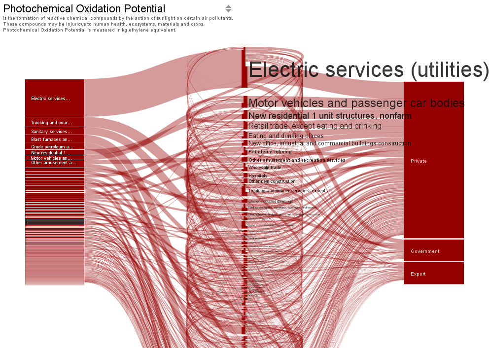
Users can pull the nodes of the middle column apart and sort them in order to untangle the spaghetti and get a clearer picture of the economic interactions between the sectors and their associated direct and indirect environmental impacts in the different categories. The height of the economy sector node represents the magnitude of the environmental impact, the font size of the node name corresponds to the node size. The nodes move with a nice soft scroll effect as we love it. Try the online version of Economy Maps 2.0 or download the desktop version.

Economy Maps are “work in progress” and we can expect updates as data for more recent years become available.

Here is the 60 second video of Jason explaining the Economy Maps. For a longer video visit economymap.org.
Supply Chain Visualization @ TRUTHstudio

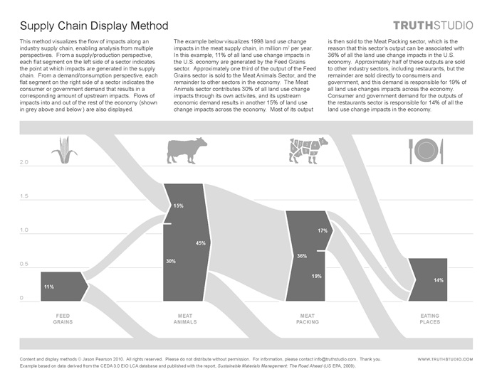
I recently discovered Jason Pearsons fantastic visualizations at his TRUTHstudio website. TRUTHstudio is a consultancy that provides research, analysis, strategy, visualization, and communication support. In the projects presented, Jason focuses primarily on direct and indirect environmental impacts along industrial supply chains. In the below example he features a segment of the food supply chain with the sectors “feed grain”, “meat animals”, “meat packing” and “eating places”.

The above supply chain is displayed with its land use change impact (such as transformation of forest to pasture). The unit is million square metres per year. The scale is shown on the left and the nodes are stacked on the bottom zero line. Hence the height of the node indicates the magnitude of land use change (in Mio m²) caused by this particular segment’s activities. Additionally the nodes have a flat side on the right, for the percentage of their activities that are directly delivered to consumers or government, and an arrow shaped exit when the services are delivered to another sector of the economy.
On the left edge the flat bottom segment indicates the environmental impact caused directly by the activities of this segment, while the connected arrow represents the environmental impacts caused by this segments activities in other sectors across the economy. The grey bands at the top and at the bottom represent all other sectors of the U.S. economy.

So we have three persepctives with in one Sankey diagram: direct sector impacts, indirect (or intermediate) impacts, and final consumption impacts.

This is a fascinating concept, which is used by Pearson to create an overall map of the U.S. economy, or, to be more precise, maps of environmental impacts caused directly or indirectly across the nation by industrial activities. These so-called “Economy Maps” are featured in my next blog post.

In the meantime, please watch Jason’s explanation on the ‘Three Perspectives of the Economy Map’:

Yet another Sankey map overlay

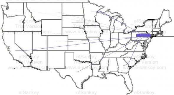
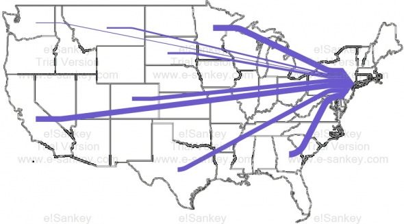
John Cochran blogs about his coursework at University of Virgina. His project on ‘Urban Metabolisms’ has this Sankey diagram of food being transported to New York City. Data is from The Federal Highway Administration (USDOT) Freight Analysis Framework.

The first Sankey diagram shows transports to New York (excluding the Northeastern States and transports within NY). The food supplied by other US states becomes relatively insignificant:


The second one includes food transports within NY state (still excluding the Northeastern States):


John, however has not been satisified with the results of his work. He writes (scroll down to his September 21, 2011 notes):

“Neither produced effective graphics, but what they did demonstrate was the inability of the information to be able to represent food going to New York. (…) As a result, the data “revealed” that we already have a very local food system, when in reality this is not the case; instead, it does indicate how many extra miles are traveled for food around the location of purchase. (…) The images below demonstrate just how disproportionate the amount of miles traveled in New York are to the miles traveled bring food to New York from the rest of the country.”

It remains unclear whether the flows displayed in the diagram are for payload (e.g tonnes of food) or payload distance (e.g. tonne-kilometres). Also, it is not mentioned, whether, for example, water and drinks (typically sourced locally) are included.

I think the idea of thie Sankey map overlay is great, but the issue of spatial representation of (dense) data points has not been adequately adressed. A zoomed NY state would maybe help.

Block Type Sankey Diagram

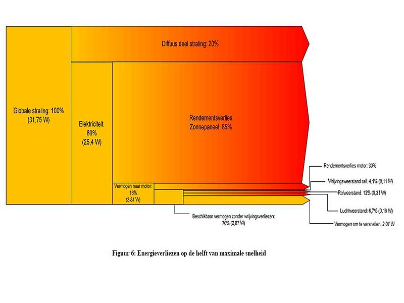
Another Sankey diagram type I have come across several times are the very compact ‘block-type’ Sankey diagrams. They basically consist of stacked rectangles, like in the below example from Wikiversity dealing with a solar vehicle project. A left-to-right flow orientation is indicated by the arrow heads peeking out of the stack on the right side.


The diagram shows a breakdown or use of the 100% (31.75W) of solar energy (‘globale straling’). The percentage values always refer to the previous block. This one also has a nice color gradient.

Cool! Cyclifier 3D Sankey Diagram on Food

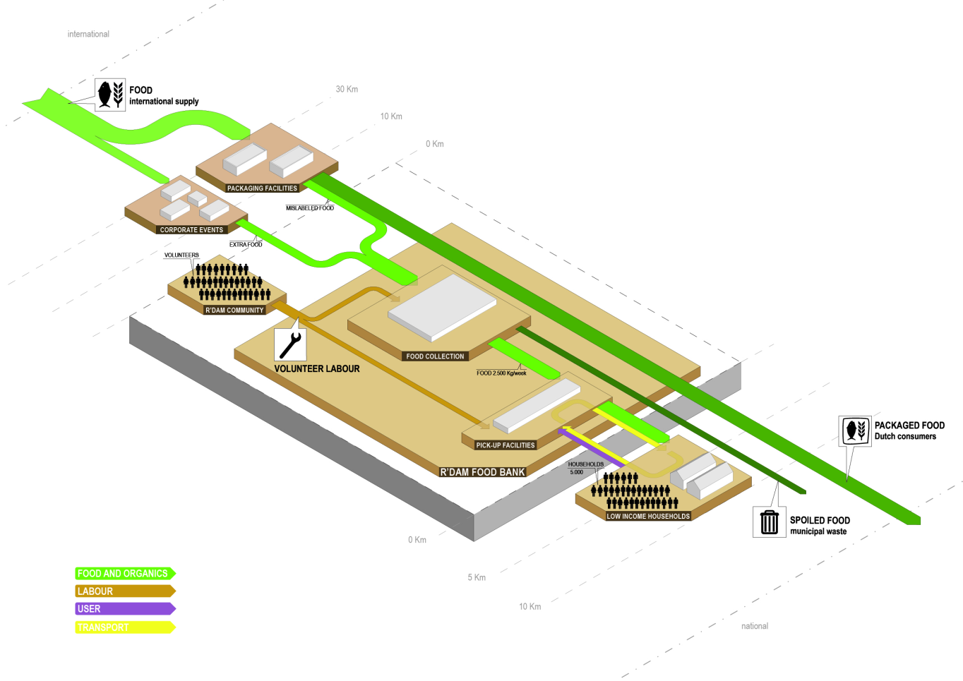
Found on cyclifier.org, a project run by Dutch 2012Architecten: This 3D Sankey diagram by Anna Brambilla visualizes flows of food from producers to the Rotterdam foodbank and onto low income households.


Source: http://www.cyclifier.org/project/foodbank (License: Share-Alike)

The image is explained as follows:

“Processes and actors are identified by labeled platforms with sub-processes shown as stacked platforms. The system boundary is shown as an extruded block indicating that it is one piece within a larger network. Starting from the edges of the cyclifier, distances are marked in intervals to indicate the distances traveled by inputs and outputs. Flows are scaled by mass as in sankey diagrams and are color-coded per flow type. Flows to and from the atmosphere are represented as traveling vertically.”

So, we have ‘Food and Organics’ flows (green), transport (yellow), users (purple) and even volunteer labor (brown) represented in the diagram. No numbers or units given though. Since cyclifier.org is interested in promoting “innovations that contribute to local exchange and production”, distances of producers to the foodbank and to the consumers are indicated on a somewhat logarithmic scale.

I just doubt that roughly a third of the output flows from food production is received by the foodbank. This is probaly to be taken symbolically and not for real…

Very cool Sankey diagram, kudos!

Book: Sustainable Materials with Open Eyes

Following up to my Aug 25, 2011 post on Global Steel and Aluminium Flows, I would like to recommend the follwing book that has just been released: Sustainable Materials – with Both Eyes Open: Future Buildings, Vehicles, Products and Equipment – Made Efficiently and Made with Less New Material by Julian M. Allwood and Jonathan M. Cullen.

I’m hardly a hundred pages into reading, but I already love it. The book is very graphical (to say the least), well illustrated, with many graphs and photos, infographics and even historic images. Plus – and this is why it deserves to be presented here on the blog – it features a great number of Sankey diagrams.

I really enjoy the lego bricks in the steel making flow chart (pp. 121-127). You’re also going to love the ‘WhatsApp’-style chat between Henry Ford and the Wright Brothers (p. 181).

This book “faces up to the impacts of making materials in the 21st century. We’re already making materials well, but demand keeps growing and so we need to start using them well to.” (from the back cover)

Sustainable Materials with Open Eyes by Julian M. Allwood and Jonathan M. Cullen can obtained from Amazon and – I am pretty much sure – from your local book dealer. Here is the book’s website.

Casual Friday Sankey Post: Wykres Sankeya

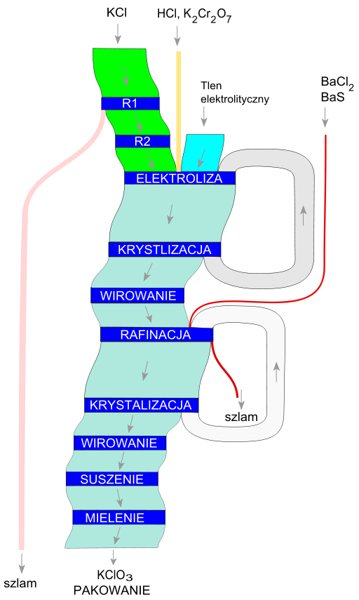
Just before I kick off for a short weekend trip, here is another Sankey for you to enjoy. It is from the Polish language Wikipedia and shows production of KClO3.

This is more of a schematic flow diagram, as it doesn’t show any quantities. The blue boxes are processing steps. Two nice recycling loops in there from the crystalization step back to the electrolysis and from the other crystalization step back to the refining. ‘Szlam’ seems to be sludge. The individual Sankey arrows don’t show an arrow head, but little gray arrows indicate the flow direction from top to bottom.

The whole Sankey just looks kind of odd, because the main product flow is not aligned vertically. But then again, that’s up to the designer. After all, it is a fine sample of a process flow Sankey diagram.

Kelsey Bixler’s personal Sankey diagram

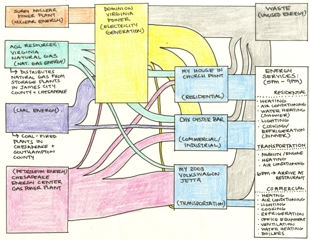
Probably inspired by one of the many energy flow Sankey diagrams, such as the one shown in my last post, Kelsey Bixler of the ‘This blog is a system.’ blog has decided to make her own, quite personal hand-drawn diagram. This seems to have been part of an assignment. Kelsey “analyzed the various activities that involved the consumption of energy in a four hour period” of a typical weekday, including her activities at home, the trip to work, and her job at Chick’s Oyster Bar.

She writes: “Below is a “Sankey Diagram” inspired diagram of the networking between the extractors, distributors and users of energy, myself including, that I have described above.”

Now, who still says that we can’t do a Sankey diagram that shows the energy consumption caused by an individual?

Of course, the actual quantities are not shown in Kelseys diagram, but it would be safe to say that this image is more or less true for an average American, who has a car, lives in a house and uses industry products. As a rough estimate I would just divide the 98 quads (mentioned as the overall primary energy demand in the 2010 U.S. Energy Sankey diagram) by the roughly 308 Mio. citizens. The proportions of the Sankey arrows would most likely stay the same.

“From the body to the world” … every single one of us contributes to the big picture, and it is up to each of us to make this picture look different.