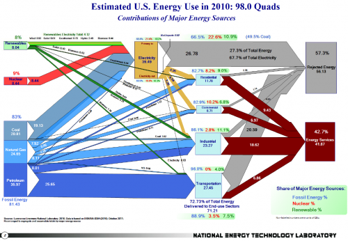
Check out NETL January 2012 newsletter. It features a Sankey diagram with the 2010 data on U.S. Energy Flows. Publication details are here.
Download high res version of the Sankey diagram (large PDF) here.
This was prepared by Eric Shuster and is an update to the Sankey diagrams published annually by LLNL. It has the energy carriers on the left, energy conversion in the middle, and energy use sectors on the right. Primary energy consumption in the U.S. in 2010 is estimated to have amounted to 98 quads (quadrillion BTUs).
“NETL energy analysts have produced for the public a set of Sankey diagrams based on data obtained from the Annual Energy Review 2010 recently released by the U.S. Energy Information Administration. Graphically representing both quantity and direction, the diagrams place in perspective the relative contributions of major domestic energy sources as well as the flow of fossil fuels around the world.
The “Estimated U.S. Energy Use in 2010″ flow diagram shows the quantity of fuels used to drive each of the sectors in the United States. Overall, 83 percent of the primary energy consumed in the U.S. is from fossil fuels and downstream, due to conversion efficiencies, 89 percent of the total energy delivered to the end-used sectors is derived from fossil fuels.”
The news item also has a link to another presentation ny NETL featuring global coal and gas related flows as Sankey diagrams. These are interesting as will and I will present them here in the near future. Update: Coal is here, natural gas still to come.

3 Comments
Comments are closed.