Haven’t seen many Sankey diagrams dealing with urban metabolisms. So I was happy to stumble across this one for Paris, France on Nels’ blog.

Grey and one color seems to be en vogue for Sankey diagrams these days… 😉
A Sankey diagram says more than 1000 pie charts
Haven’t seen many Sankey diagrams dealing with urban metabolisms. So I was happy to stumble across this one for Paris, France on Nels’ blog.
Grey and one color seems to be en vogue for Sankey diagrams these days… 😉
David Yanofsky from the Bloomberg Newsroom advised me of a Sankey Diagram he did on U.S. Energy Flows. The diagram is based on the well-known Lawrence Livermore National Laboratory (LLNL) diagrams and shows the 94.6 quads (1 quad = 1 quadrillion BTUs) estimated energy use in the United States in 2009.
The Sankey diagram has a nice mouse over effect, that let’s the user explore the stream as they are highlighted in different colors. The nodes show the contribution from different carriers. Additional information is available when positioning the mouse over the orange bullets. This makes the diagram fun to explore…
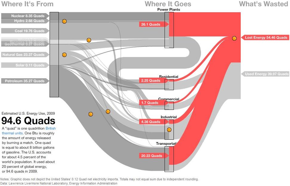
In this image the lost energy is highlighted in red.

In the above screenshot the energy flows based on petroleum are shown in brown color, all other flows in light grey.
These are only two static screenshots, please go over to the Bloomberg site to see more.
A recent report prepared by Kumar, Subramanyam and Kabir of the Department of Mechanical Engineering at the University of Alberta in Edmonton describes “Development of Energy, Emission and Water Flow Sankey Diagrams for the Province of Alberta Through Modeling”. Canada has been underrepresented with Sankey diargams on this blog, I feel. But the numerous Sankey diagrams on water and energy really compensates for this lag: I counted 12 more or less beautiful Sankey diagrams. Here is an example:

This is for the energy consumption in Alberta. Flows are in PJ (not sure which year they refer to). There are also several Sankey diagrams in this report for the water catchment areas of rivers (pp. 27-34).
Download the full report here (caution 6.5 MB PDF)
Found this very simple online Sankey diagram drawing application developed by Jan Stępień. It is a very very basic interface where you can define nodes (“Processes”) and streams (“Reagents”) between source and sink nodes. The whole thing is in black and white and you will get outputs like these:
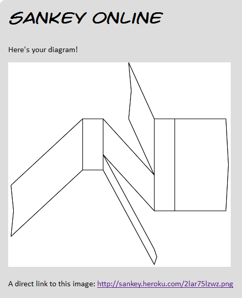
I played around a bit with the tool, but didn’t quite manage to do my own Sankey diagram. See for yourself. The code is open source, so if anyone wants to contribute… I updated my software list.
Featured on Jo Abbess’ blog on ‘Energy Change for Climate Control’ recently was this Sankey diagram. It appears in his recent post on ‘The Waste of Power’. It was originally published in Annex H of the 2009 Digest of United Kingdom Energy Statistics (DUKES) published by Department of Energy and Climate Change (DECC).
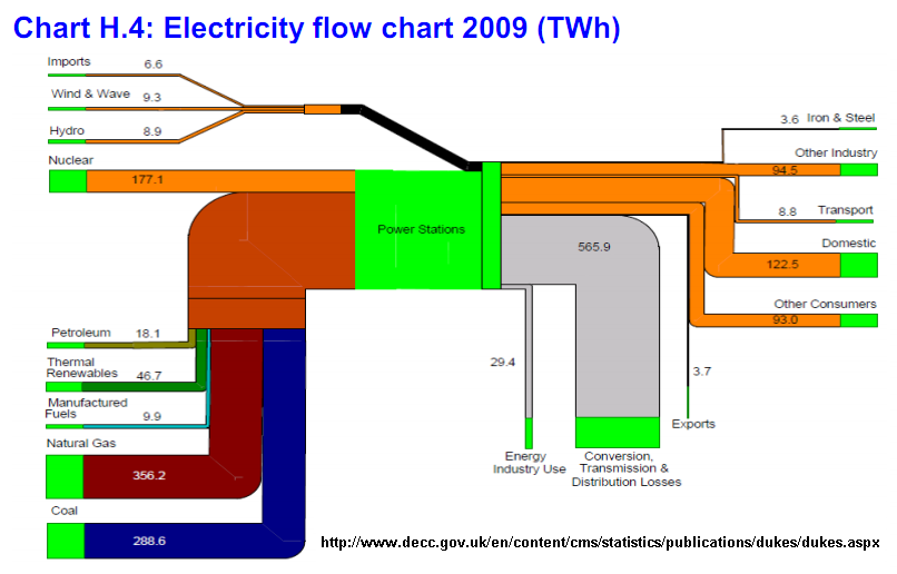
The report has numerous other Sankey diagrams like this one, similarly structured. They show energy use of coal, petroleum, natural gas, and renewables.
Below is the one on petroleum flows in 2009 in millio tons. A lower threshold has been introduced, so that small quantities don’t fall below a minimum width (see, for example, the flow of 0.7 mio tons to “Rail”, compared to the one of 4.9 mio tons to “Industry”, which would in principal be 7 times wider if it was to scale.

Nice and colorful!
Molly Eagan’s ambitious project ‘100 Days Without Oil’ got some attention in the blogosphere, and even from traditional media. Molly’s dedication to living one hundred days without oil fascinated me, but by putting up the below Sankey diagram on her blog she fully convinced me …
Molly is an Architecture/Sustainable Design graduate student at the University of Minnesota. From August 15 to November 22, 2010 she tried to live a fully-no-oil life style.
By using myself as a research tool I can easily document all aspects of my life and how they might be affected in this not-to-distant world. I’ll be tracking my life in seven categories: Transportation, Food, Waste, Water, Electricity, Health/Hygiene, and Communication/Entertainment.
Her self-set rules were quite strict, and I personally think that the water use part is the hardest constraint. Read more about the criteria of this experiment.
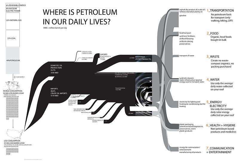
The Sankey diagram is based on data from the Energy Information Administration Annual Energy Review 2008, but has been expanded on the right side with examples for the seven categories she identified for her project.
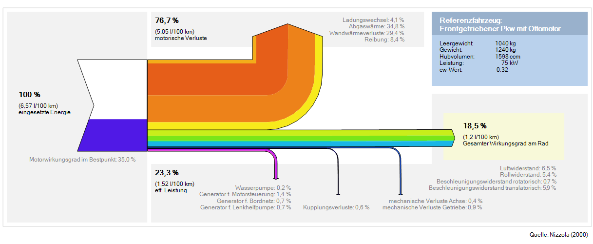
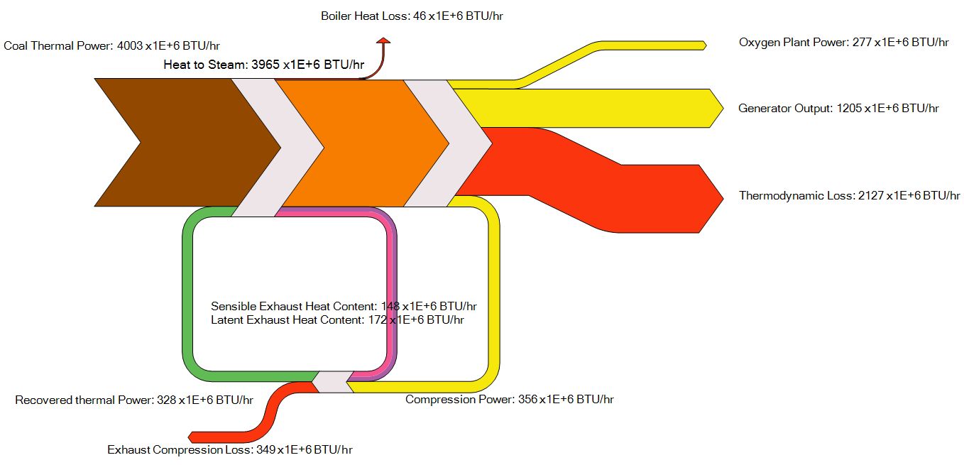
A new version of e!Sankey has been released recently. e!Sankey 3.0 comes with a series of new features, such as reconnecting arrows to another node, alignment of elements, definition of unit types, or the long awaited multiple element edit. According to their forum they have also implemented a number of features suggested by the e!Sankey user community.
The below are two new samples shipped with the test version. The first is for the efficiency of a car engine, in German…
The price has gone up a little for the new version. I have updated my Sankey software page accordingly.
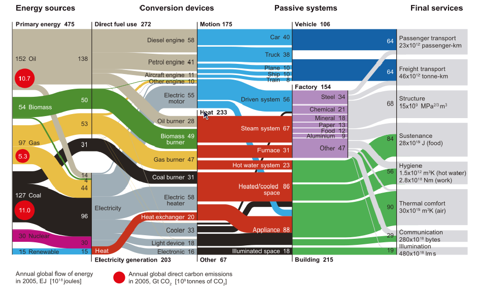
From the same blog post I used as source in my previous post comes this interesting diagram, originally by Cullen & Allwood 2010.
I have presented several similar Sankey diagrams here on the blog for different countries (see Spain, Italy or Austria or browse the tag ‘energy’)
This is a neatly structured and nicely designed example of a energy flow Sankey diagram that could serve as a role model. Primary energy broken down by energy carrier is on the left. Conversion steps are shown in the second tier, as two alternative breakdowns (direct fuel use/electricity generation and motion/heat/other). The line where these two tiers touch don’t always have direct connections, but the overall arrow magnitide matches. The next tier (passive systems) is broken down into vehicle, factory and building. The final services on the right side distinguishes eight different energy use fields.
Flows are in Exajoules (10E18 joules) and values are for the year 2005.