Misc Sankey Diagrams Uncommented 01

I was busy with work, so hardly published any Sankey diagram related posts in the last two weeks. My cache of diagrams on my hard disk is very large, but the problem is to find time to discuss them and show them here. I have therefore decided to launch some miscellaneous Sankey diagram findings without much commenting…

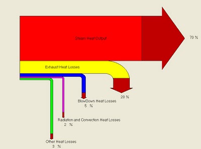
Notes: Boiler Efficiency Sankey Diagram. Uncommon arrow head colouring. Percentage breakdown. Source: Energy Efficiency Analysis and Practices Blog. This Sankey is apparently produced by a software on boiler efficiency (BIOEFF v1.07), further analysis needed.

Water Flows – before and after

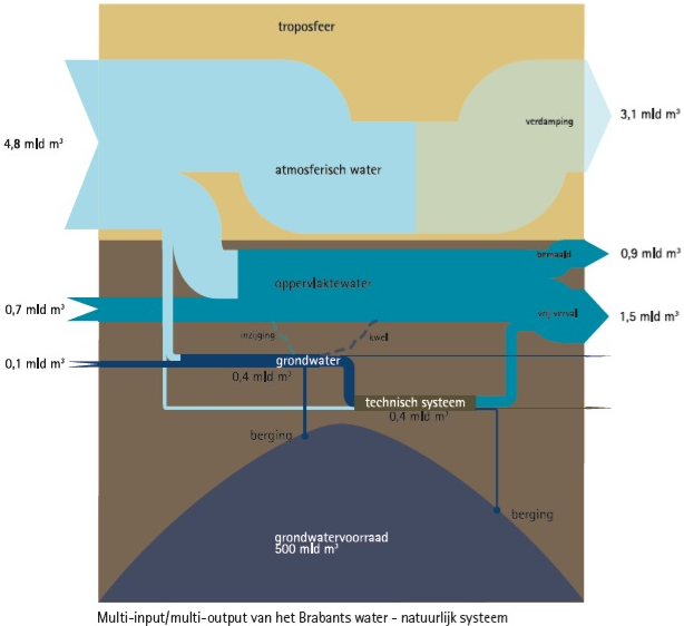
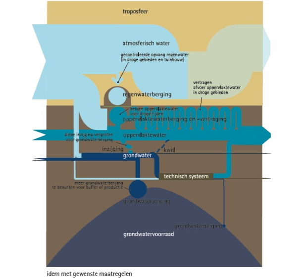
A reader of the blog, submitted the below Sankey diagrams on waterflows in the province of North Brabant in the Netherlands.

Wies writes about these:

The left chart is the actual Multi Input – Multi Output analysis. There are some irregularities and inefficiencies. Therefore we made the chart on the right showing some design proposals. These are not really related to exact quantitative in or output, it’s a bit more freeminded, so no numbers are included here.
We also tried to combine the actual flows of water with the bodies of water (troposphere in the air, the bulk of ground water in the ground)

The report that contains the two diagrams can be found here. Check out p. 22 of the PDF.

Thanks for sharing this!

Carbon Footprint Sankey of Wine Transport

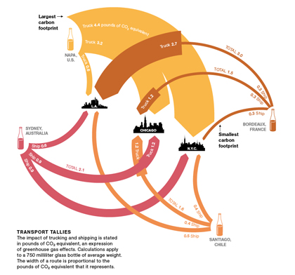
Dr. Vino on his blog presents a Sankey diagram of wine that was originally shown in National Geographic. To be exact, it is a diagram of greenhouse gas emissions associated only with the transport of wine from certain wine producing areas (Australia, Bordeaux, Napa Valley, Chile) to consumers in three U.S. cities (Los Angeles, Chicago, and N.Y.C). So the title should rather read as “Carbon Footprint of Wine Transport”. Neverhteless, an interesting Sankey diagram:
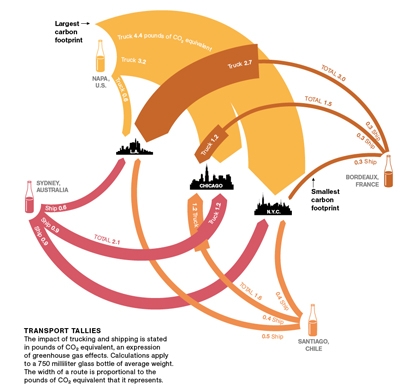
The rounded Sankey arrows are definitely not very common, but are used nicely here. The arrow magnitudes represent weighted emissions potentially contributing to climate change, measured in pounds of CO2-equivalents. The values are for an average 0.75l bottle being shipped. When an arrow get’s wider at a certain point (e.g. Bordeaux to L.A.), this means a change in transport mode (e.g. from ship to truck). The comments to Dr. Vino’s post are well worth reading to understand the diagram better. I am not sure whether it has been taken into account where the wine, typically being shipped in tanks, is filled into glass bottles (adding to the weight, and consequenty to the transport related emissions).

So from this Sankey diagram we can learn that Californian wine being consumed in New York has the highest (transport) carbon footprint, while the French rouge being savoured in the same city comes with the smallest footprint.

BTW, I heave heard that there are studies that look into the life cycle assessment and carbon footprint associated with wine production, e.g this one. Would be interesting to find a carbon footprint Sankey Diagram that combines both wine production, transport, and end-of-life climate change impacts, in order to compare the different phases and their carbon footprint.

Santé!
Energy Transparency with Sankey

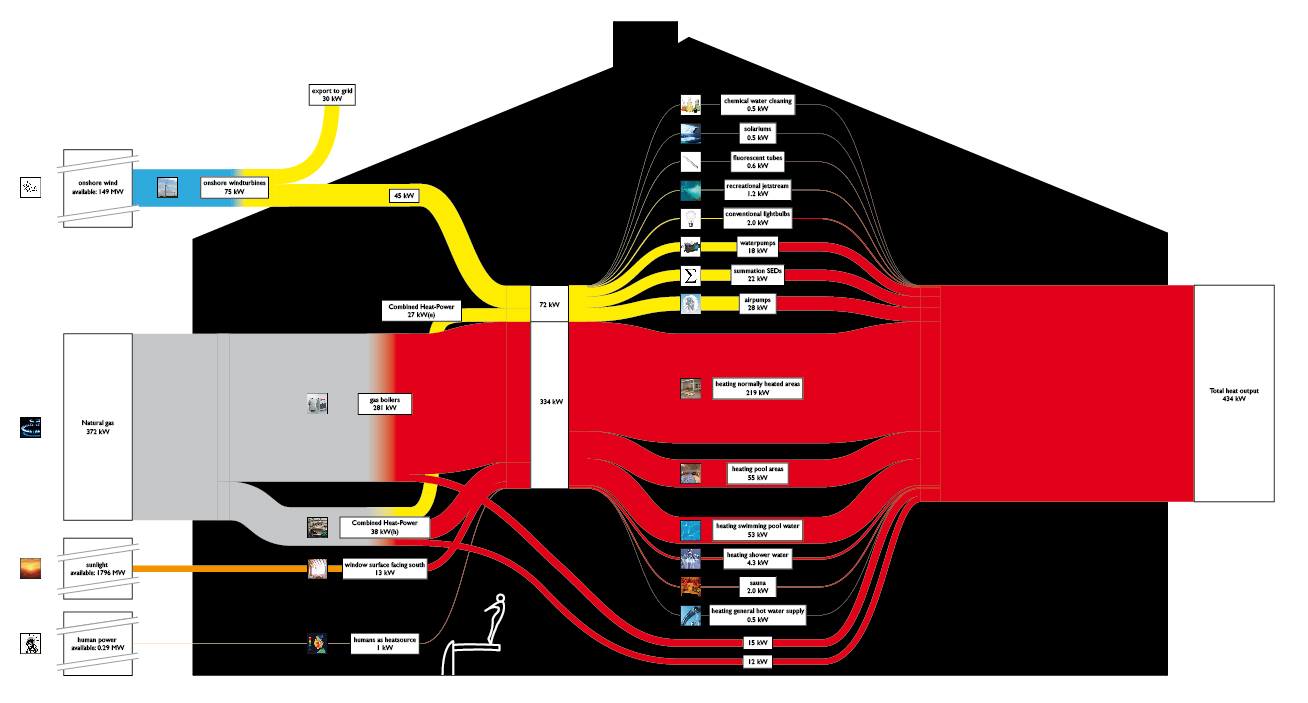
Found five beautifully made Sankey diagrams on the Dutch website Energy Transparency. They all show the energy balance of indoor swimming pools. One of these diagrams is shown below.

Electricity is shown as yellow streams, heat in red. Natural gas is the main source of heat, but they also seem to have wind power. Even solar radiation entering through the south-faced windows and human heat is accounted for. In the middle tier we can see the consumers of heat and electricity.

Another one of the Sankey diagrams on this page differentiates the losses of heat (through chimney, doors, windows, …) too. Definitely one of the best Sankey diagrams I have seen recently.

Micro-grid model Sankey

Found the below Sankey diagram in the article ‘Plug-in Electric Vehicle Interactions with a Small Office Building: An Economic Analysis using DER-CAM’ by Ilan Momber et al. from Berkely National Lab published in Proceedings of the 2010 IEEE PES General Meeting, Power Systems Engineering in Challenging Times, 26-29 Jul 2010, Minneapolis MN.

The Sankey diagram is for illustration only, and consequently shows no numbers. Yellow arrows represent electricity, blue arrows heat. The red Sankey arrows show where losses occur. The article itself is mainly on plug-in vehicles (PEV), that’s why the ‘alternative fuel vehicles’ are emphasized on the right side in the uses section.

The underlying model DER-CAM “solves a commercial building’s microgrid problem of investment and operation optimization given its end-use energy loads, energy tariff structures and fuel prices, as well as an arbitrary list of equipment investment options. … [It] can report a cost, carbon footprint, or combination minimizing equipment choice and (typically hourly) optimal operating schedule for the microgrid, including CHP and renewable sources.”

Exergy Sankey diagram

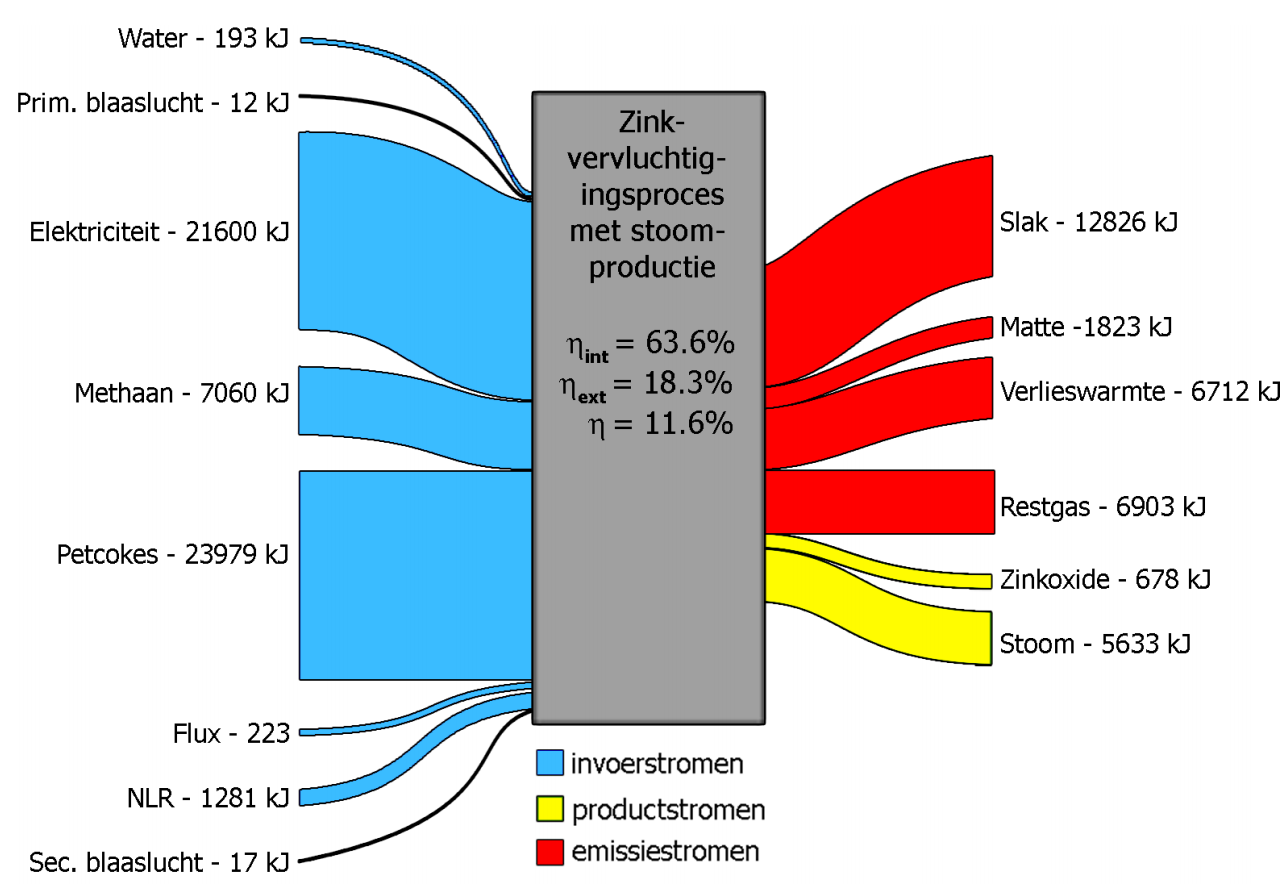
Found the Sankey diagram below in an article on ‘Exergetic efficiency analysis of pyrometallurgical processes’. It is from a master thesis by Bart Klaasen (PDF file), that contains several Sankey diagrams.

The main diagram is titled ‘Exergetic Sankey diagram for a zinc recycling process’. Input streams are in blue, emission streams are in red. Internal flows are colored green, while yellow represents the actual product.

The flows don’t show arrow heads, but a general left-to-right direction can be assumed. No values in the above overall Sankey diagram, but for each process step individual input/output Sankey digrams can be found that feature exergy data in KJ. They look like this one:

In contrast to Sankey diagrams that represent energy flows, the input output flows into a process node don’t have to have the same magnitude. Exergy is synonymously called “available energy”.

“Energy is never destroyed during a process; it changes from one form to another (see First Law of Thermodynamics). In contrast, exergy accounts for the irreversibility of a process due to increase in entropy (see Second Law of Thermodynamics). Exergy is always destroyed when a process involves a temperature change. This destruction is proportional to the entropy increase of the system together with its surroundings.” (Wikipedia)

So it is understandable that the exergy represented by the flow magnitude at the output of the process is less than the one of the flows on the input side.

NB: Bart’s article reminded me of some bookmarks to exergy diagrams I have, will try to post these in the near future too.

Energy Flows Spain 2009

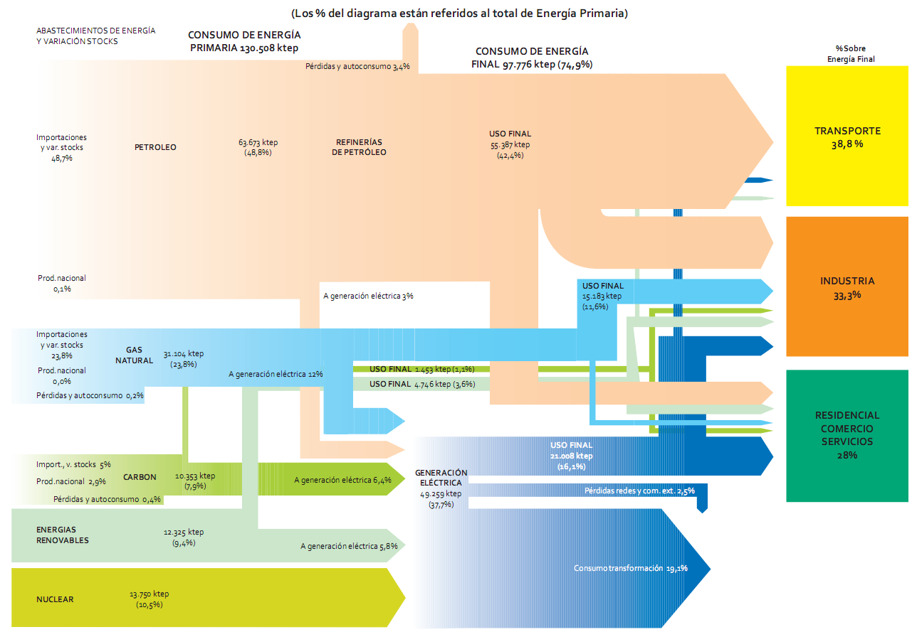
Another example of a national energy flow Sankey diagram, this time from Spain for 2009. To be found on page 40 of the recently published ‘La Energía en España 2009’ (large 10 MB PDF!) downloadable from the Ministry of Industry, Tourism and Commerce (MITYC) website. This is somewhat more advanced than the one from Spain I showed in this post.

Flows are in ‘ktep’ (ktoe, ‘kilo tonnes of oil equivalent, in Spanish), and percentages given are in relation to the total primary energy (130.508 ktep primary energy in 2009).

Nice and colorful, indeed. But again a good example of how to make mistakes (i.e. violate the basic rules) in drawing Sankey diagrams. So, here is the Sankey didactics part….

a) Arrows should be (no: must be!) to scale. Example: See blue arrow ‘USO FINAL’ with 16.1 % in comparison to blue arrow ‘consumo transformación’ with 19.1%
b) The same arrow should not change its width …
… while it runs in the same direction. Example: light green arrow ‘USO FINAL’ gets narrower as it runs vertically before branching to the sectors ‘Transporte’ and ‘Indústria’. Very weird!
… when it changes the direction. Example: pink arrow from the petroleum arrow going to the sector ‘Residencial’ is much wider on the vertical segment than on the horizontal segment.
c) An arrow should not maintain its magnitude …
… as it splits into two different flows. Example: green arrow ‘USO FINAL’ splits into two flows of the same width leading to the sectors ‘Residencial’ and ‘Industria’.
… as other flows branch off. Example: blue arrow ‘USO FINAL’ continues with the same magnitude to the sector ‘Residencial’, even though a considerable portion branches off to ‘Industria’.
d) It would be nice to have labels on all flows. Many negative examples, especially on the right hand side of the Sankey diagram.

Anyone care to do a better version?

Waste management plan uses Sankey

Austrian consulting and engineering company Intergeo offers site investigation and remediation as well as waste management services. In a reference project for the city of Bourgas a waste management plan was developed. It shows the following Sankey diagram:

From what I understand despite the small print in the diagram, it is a breakdown of household waste in the city by waste types, and the different treatment paths (recycling, composting, landfill, etc.). Values are in ton/year refering to 2007. Waste fractions are color-coded.