Breakup Sankey

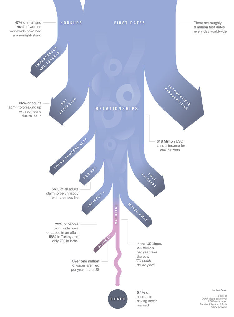
Found this breakup Sankey on Cliff Kuang’s blog, originally created and posted by Lee Byron.

Another very creative use of Sankey diagrams to show how couples split up. No absolute data given, and no percentages either, it is basically a decision graph with Sankey arrows. Some percentages given in the annotations.

Reminded me of this Sankey diagram for focussing on a societal topic.

Has the designer Lee Byron been inspired by his famous namesake’s poem?

When we two parted
In silence and tears,
Half broken-hearted
To sever the years,
Pale grew thy cheek and cold,
Colder, thy kiss;
Truly that hour foretold
Sorrow to this.

Ship engine efficiency visualized

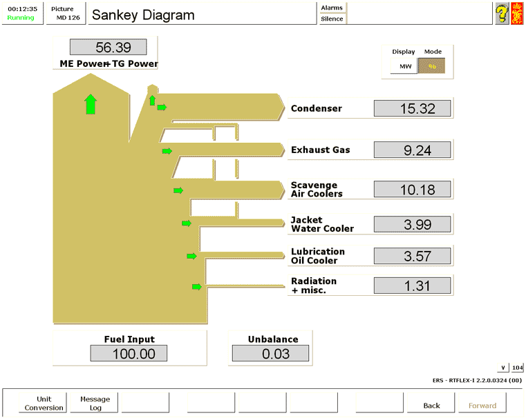
Kongsberg Maritime has developed a ship engine room simulator that also features a Sankey diagram visualization.

The Sankey diagram is a simple bottom to top breakdown of the energy contained in the fuel input. Useful energy on the power train is shown as a vertical flow to the top, while losses branch out to the right. The display can be toggled between “MW” and percent.
This visualization is one of the “approach[es] Kongsberg Maritime has towards enabling the Green Ship”.

Pimp my nitrogen Sankey

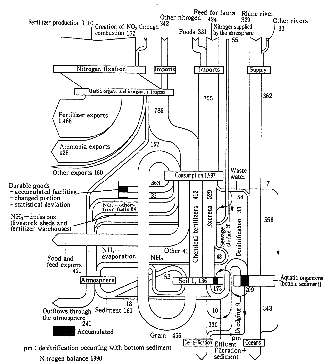
Below is an example of a Sankey diagram showing a nitrogen metabolism. The original diagram is from a Japanese publication (‘White Paper on Quality of the Environment in Japan 1994’), even though the diagram represents nitrogen loads (in 1000 tons N) in the Netherlands in 1990.

A pimped version of this diagram can be found in the e!Sankey download gallery. I don’t like the color very much, but the overall aspect of the diagram is much better than in the b/w version, I think.


They seemed to have struggled with inconsistencies in the original diagram, as an annotation suggests. Also the denitrification due to accumulation in the bottom sediment, or nitrogen ending up in durable goods (shown in black in the original) are not represented in the remake. For the rest it pretty much sticks to the original.

Thinking about a new tag “pimp my Sankey”…

Superimposed Sankey diagrams

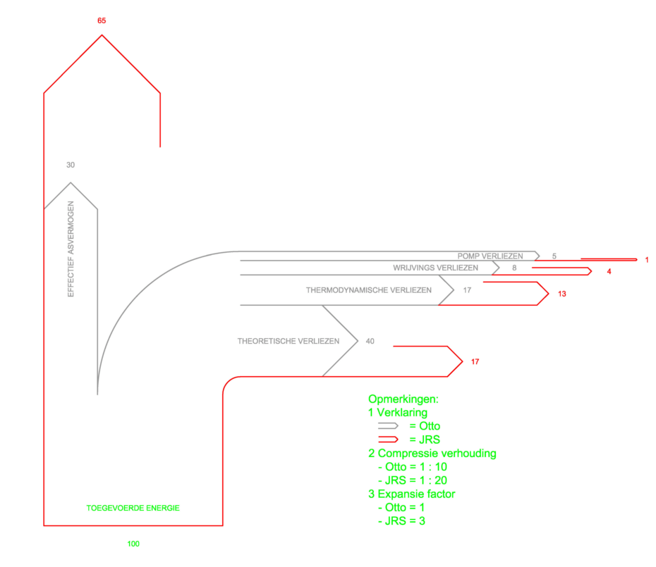
The below Sankey diagram from the JS Systems homepage tries to show the differences between a normal Otto engine and the “JS Motor”. The prototype JS rotation motor, from what I grasp, has different compression and expansion parameters and could prove to be twice as efficient.

To show the difference in efficiency, two Sankey diagrams have been superimposed. The diagram with the grey outline is for the Otto engine, the one with the red outline is for the JS engine. The diagram shows energy losses branching off to the right (e.g. thermodynamic losses 17% in a typical Otto engine, 13% only in the JS motor). Useful energy is represented by the flow to the top.

I am not endorsing this motor, nor have I seen it work. But I like the idea of presenting a comparison in one Sankey diagram instead of two separate Sankey diagrams.

Also, please check out this previous blog post on Sankey diagram overlay.

Back for good

I neglected the followers of sankey-diagrams.com for almost two months … had a surgery done, but now I am back for good.

Just to get started without any further delay, here is a Sankey diagram I dug out from my collection.

Not sure on which website or in which article I found this, but it is still hosted on imageshack.

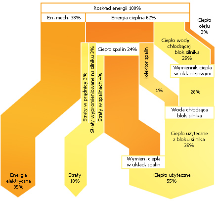
The diagram is from Poland and seems to show cogeneration. Flows represent percentages and are not always to scale (compare 10% flow ‘Straty’ and 35% flow labeled ‘Energia elektryczna’). The label “1%” on the flow for ‘Kolektor spalin’ must be a mistake, I reckon it should read “7%”.

More postings in the next days…

Largest Sankey Diagram ever?

I was asked what the largest Sankey diagram I have seen so far was? Not sure about this. The Swiss biomass flows diagram I featured in January 2009 would be a candidate, but I think the following one is much larger, both in the actual diagram size, as well as in respect to the number of nodes and arrows.

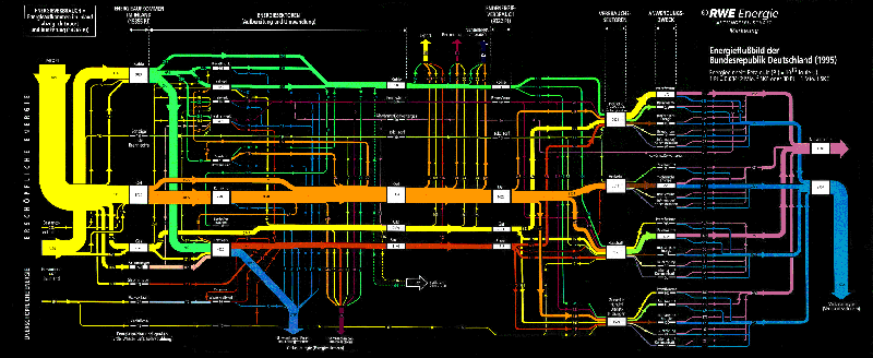
It was created by the marketing department of RWE AG, one of Germany’s big four electricity providers. It shows the energy flows in Germany for 1995. The image file I have is 2588 x 1062 pixels, so when you click on the image below, you won’t be seeing the full image, but only a thumbnail… (also because I don’t want to get sued by their legal department!)
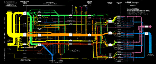
The clear structuring of the diagram is what might be called “very German”: energy sources are at the left, with non-renewables at the top and renewables at the bottom. The second section shows energy conversion, the third section the energy use sectors. These are further broken down, before the arrow join again to show useful energy and energy losses (a 50:50 relationship). Losses in the conversion phase are shown as arrows that branch out vertically to the bottom. Exports and bunkering, on the other hands, is shown as vertical flow leaving to the top. Color coding is very clear, and flows are labeled with figures on each arrow. The unit is petajoule (PJ)

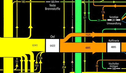
Even the black background goes well with the bright colours. Here are two close-ups of two sections from this energy flow diagram. Enjoy the beauty…
Sankey Diagram Function in R

I am always getting excited when I have a new e-mail with a Google alert for Sankey diagrams. This time I was directed to this blog post.

SankeyR is a function for the R open source statistical computing and graphics package based on the drawSankey routine for Matlab developed at EPFL. Aaron Berdanier at Colorado State adapted it to work with R. It produces simple left-to-right Sankey diagrams like this one:

The routine creates a plot in R, or can be outputed to bmp or pdf format. “Inputs do not need to equal losses. Any difference will be displayed as a discrepancy in the height of the left and right sides of the diagram. This capability enables the developer to examine imbalances in flows.”

Get the source from Aaron’s blog.

I have added SankeyR to the Sankey software list. Thanks Aaron for sharing this with the R community. I am just not sure how what to make of the blog name…

Worldcup 2010 final Sankey

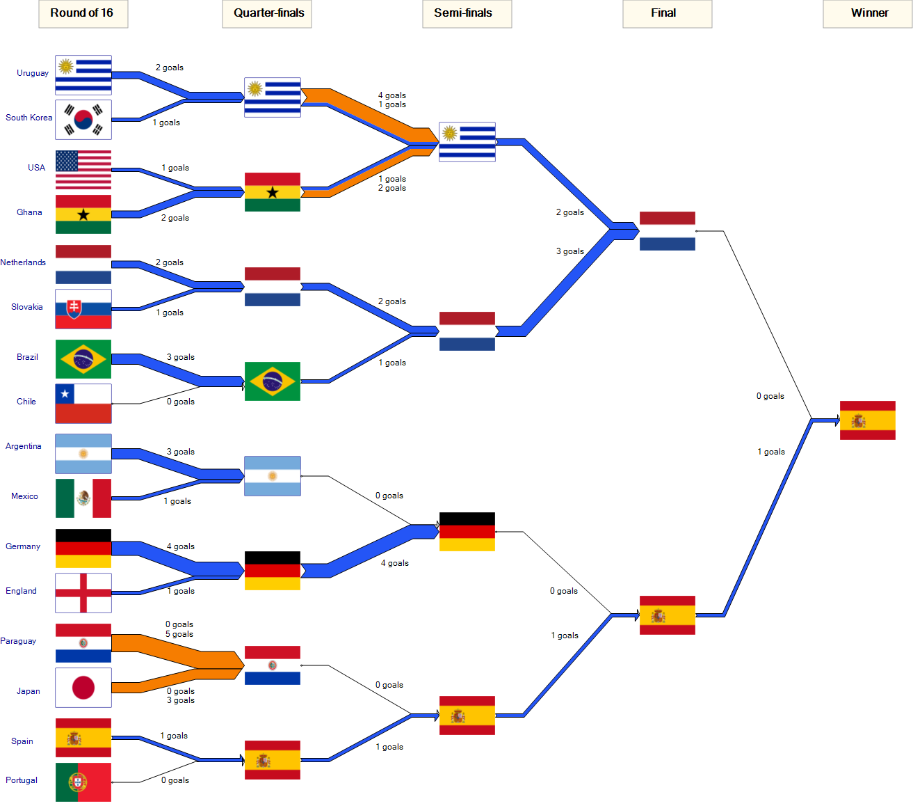
Following up to my last post after the knockout of the 2010 FIFA world cup. Well, things have cooled down a bit now, so here is the completed Sankey diagram showing the tournaments goals.

As one commenter put it, you can “see that Spain’s road to success is a rather boring one (a thin line of 1:0 wins) while Germany was pretty inefficient (big lines, no gain).”

Drawing this was fun, although I was not happy to see my favourite team drop out in the quarter finals already…

In doing the Sankey diagram I found it difficult to handle null flows (that is, explicit zeros, not “no value”) in a Sankey diagram. Also I am not happy with the differentiation of regular goals and penalty goals (brown Sankey arrows). Maybe I’ll come up with a different presentation in time before the 2014 worldcup in Brazil…. 😉