Tag: energy

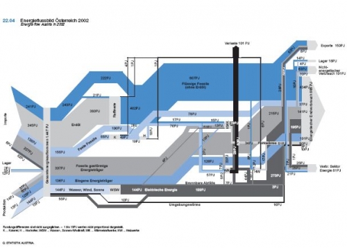
Energy Flow Austria 2002

Found this Sankey diagram displaying the energy flows in Austria in 2002 on a web page with didactic material from that country.

Unfortunately this copy of the diagram isn’t very large, and I have trouble reading and translating everything. Flows are in petajoule (PJ), source given is Statistics Austria.

On the left are imports, withdrawl from stocks, and domestic production. Losses branch off in black to the top. The diagram differs fundamentally from the ones I have presented for other coutries (such as for New Zealand, the United Kingdom, or the U.S.) in two ways:
First, it doesn’t show the energy use by sectors, but instead a breakdown by energetic end use (985 PJ), non-energetic end use (101 PJ), exports (150 PJ), stock increase (18 PJ), as well as energy use within the energy sector itself (81 PJ).
Second, the colors of the flows are used to differentiate between liquid fossil (dark blue), gaseous fossil (medium grey) and solid fossils (light bluegrey) rather than specific energy carriers. Furthermore biogenic energy flows are shown in medium blue, renewables in very light blue. Converted electric energy is in dark grey.
Energy Efficiency Analysis in Finland

Motiva is a state owned limited company from Finland offering energy efficiency analysis and energy audit for companies. Motiva also developed audit guidelines and models, and engages in training and authorisation of the energy auditors.

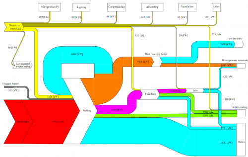
In their energy audit reports, they always include a Sankey diagram in the very first chapter. Here is an example:

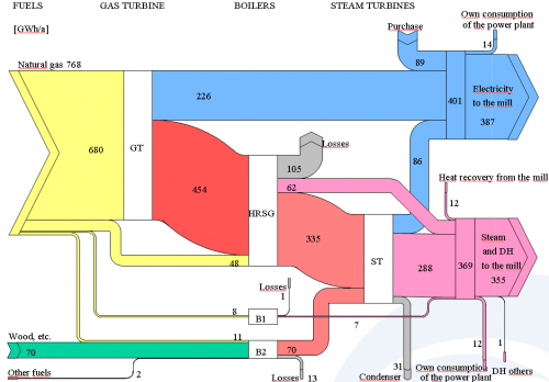
Other consulting companies, such as Pöyry (not sure how to pronounce this) haven taken on their approach and are also producing Motiva style Sankey

Both Sankey diagrams designed in PowerPoint. Not bad at all, but probably quite a time-consuming task.

40 years from now: UK 2050 energy flows

A reader of the blog alerted me about a new report that contains Sankey diagrams for the United Kingdom’s 2007 and 2050 energy flows. Thanks, Neil!

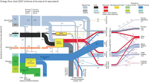
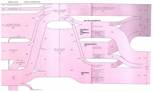
The report is about heat demand and CHP (Building a roadmap for heat. 2050 scenarios and heat delivery in the UK) and was prepared by University of Surrey and Imperial College for the Combined Heat and Power Association (CHPA). [Account is dead in 2018, access the report here instead]. On p. 18 it has the following Sankey diagram. I have shown a similar diagram for the UK in this post.

Data is from the Digest of UK Energy Statistics. All flows are in millions of tonnes of oil equivalent (MTOE). Primary energy demand in 2007 was 237 MTOE.

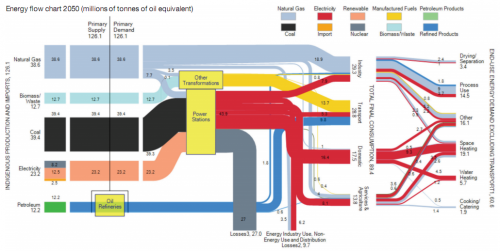
The second Sankey diagram presented (on page 23) is a scenario for 2050. It was calculated using the MARKAL model.

One must read all the assumptions made for the model to be able to interpret it, but you can see immediately that the “energy system in 2050 is signifcantly altered under the common assumptions presented in all-electricity scenarios. In particular, final energy consumption in 2050 will be reduced by 46% against 2007 figures under the assumptions used in the CCC 80% CO2 reduction scenario”.

I invite you to read chapters 3.3. and 3.4 of the report to better understand the 2050 Sankey diagram. Note that the overall primary energy demand is significantly lower, but power generation almost doubles compared to the current situation. Losses from oil refineries are omitted in this scenario due to lack of data.

A great Sankey diagram by the research group made up from researchers from ICEPT (Imperial Centre for Energy Policy and Technology) and Centre for Environmental Strategy at the University of Surrey.

Sankey diagram for mountain refuge PV-diesel hybrid system

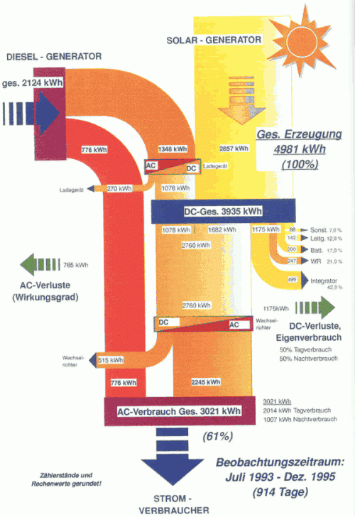
An interesting project summary can be found on the energyech.at pages, “a virtual exhibition and information platform” by the Federal Ministry of Traffic, Innovation and Technology (Department for Energy and Environmental Technologies) and the Austrian Energy Agency”. A PV-diesel hybrid energy generation system was installed at mountain refuge “Klagenfurter Hütte” in southern Austria to secure power supply and reduce dependency on diesel fuel, and to bring down energy costs.


The Sankey diagram shows the energy flows over a 30-month test period from July 1993 to December 1995. Out of the 4981 kWh of energy, 2124 kWh were produced by the diesel engine, while 2857 kWh came from the 18 sqm installed PV modules. A storage battery is installed, and the diesel generator can be used to recharge it if there is no sunshine. The overall efficiency of the system was 61% over the testing period, but could be higher after the energy measuring equipment (consuming 499 kWh itself) was removed after the testing period.

The Sankey diagram shows actually measured values in kWh. It has a top-to-bottom orientation. Diesel is on the left side, the photovoltaic system on the right. Losses branch out horizontally. The battery is the blue box labeled “DC-Ges.” in the middle.

Mes chers amis: ‘How not to Sankey’

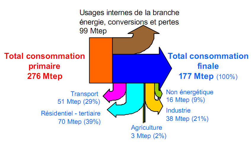
A presentation from 2005 on the French energy flows included the Sankey diagram below (I prefer not to name the author or the link to the original source, in order not to embarass anybody).


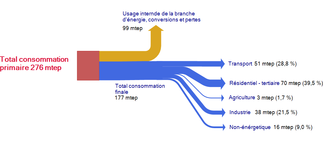
This Sankey diagram is pretty much messed up, and definitely a candidate for the “Worst Sankey Diagram Contest” that has already been called for. It took me a few seconds to understand that the flows dangling vertically below the blue arrow are actually a breakdown of the 177 mtep consommation finale. Vraiment … j’ai vu mieux que ça!

This is more or less how I would do it. Less colors, a breakdown of the blue flow into the five consumption sectors.

The Beauty of Sankey Diagrams

End-of-year cleanup of my bookmarks and saved diagrams. There are more goodies, and enough in stock for a couple of posts next year…

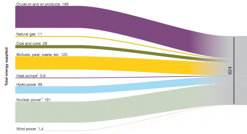
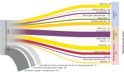
Below are three image sections of a Sankey diagram showing Swedish energy flows in 2007. These were published on p. 54/55 in the report ‘Energy in Sweden 2008’ by Swedish Energy Agency (Energimyndigheten). Numbers are in TWh, source for the diagram was Statistics Sweden data.

The first diagram (which is the left part of the diagram) shows the total 624 TWh energy supplied and the energy sources. The second one is the breakdown of energy produced by sectors, and also shows the losses in energy conversion. The third on is a different breakdown of the 404 TWh by energy carrier.

Nothing more to add. They are simple, clean, beautiful.

West Virginia Energy Flow Sankey

The Mountain State saw the annual Governor’s Energy Summit in Roanoke on Dec 9, 2009. West Virginia relies heavily on coal, and is a net energy exporter to other U.S. states.

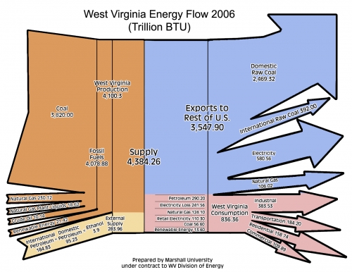
The energy flow Sankey diagram below (created by Marshall University for WV Energy Division) was presented at last year’s energy summit, and is available along with the other presentations here.

Figures are for 2006 in trillion BTU. Energy carriers used in WV are displayed as flows entering from the left. Domestic energy sources are in orange, while imported supplies are in sand color. Overall energy in 2006 was 4,384 trillion BTU. The state exported 81% of the energy (blue) and consumed 19% within (836 trillion BTU). A breakdown of doemstic consumption by sectors is shown in pink.

This Sankey diagram looks nice, but violates the basic rule for Sankey diagrams: flows have to be to scale among each other. The magnitude of the stacked orange arrows (representing 4100 trillion BTU West Virginia production) should be 14.5 times larger than that of the sand color flow (representing 283.86 trillion BTU), however it is only about 9 times larger, overemphasizing external supply (or underrepresenting domestic energy supply).

Or, compare the two arrows fro “crude oil” (10.14) and “natural gas” (230.12). The latter should have 23 times the width of the other… The blue arrow for “international raw coal” (392) looks approximately as wide as that of the blue “natural gas” (106). The scale might still be somehow OK for the base of the arrow, but as the arrow becomes thinner towards the head, the 4:1 ratio is definitely not supported any more.