Tag: energy

Italy Energy Flows 2004

Came across the below Sankey diagram showing the energy balance for Italy in 2004. This diagram is from the website of the Italian company InterEnergy.
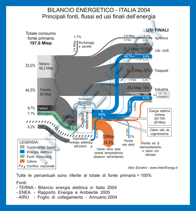
The setup of the Sankey diagram is similar to the other national energy flow diagrams I have shown in previous posts here on the blog, such as this one for Spain, these two for the United Kingdom, or here for the United States.

The breakdown on the left side shows the fuel types: natural gas (‘Metano’), oil (‘Petrolio’), coal (‘Carboni’), and the renewable energy sources in green. The separate grey flow shows energy imports. Both, percentage values in reference to the primary energy content, as well as absolute figures (in Mtep – million tons of petroleum equivalents, ‘milioni di tonnellate equivalenti di petrolio’ in Italian) are given. Part of the fuels is consumed directly in the different final use sectors (‘usi finali’), a part is used to generate electric energy (blue), and heat (orange). Some of the heat is used through cogeneration, but the major part is lost.
Misc Sankey Diagrams Uncommented 01

I was busy with work, so hardly published any Sankey diagram related posts in the last two weeks. My cache of diagrams on my hard disk is very large, but the problem is to find time to discuss them and show them here. I have therefore decided to launch some miscellaneous Sankey diagram findings without much commenting…

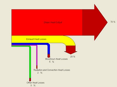
Notes: Boiler Efficiency Sankey Diagram. Uncommon arrow head colouring. Percentage breakdown. Source: Energy Efficiency Analysis and Practices Blog. This Sankey is apparently produced by a software on boiler efficiency (BIOEFF v1.07), further analysis needed.

Energy Transparency with Sankey

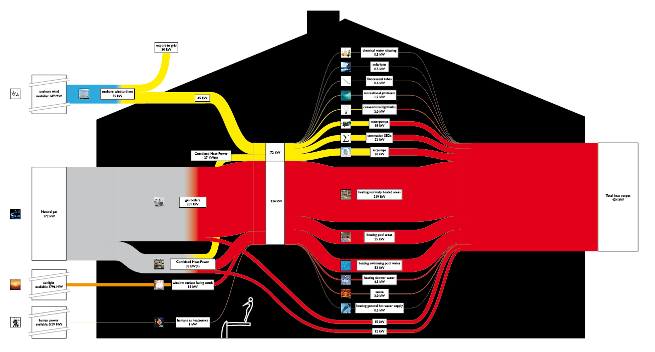
Found five beautifully made Sankey diagrams on the Dutch website Energy Transparency. They all show the energy balance of indoor swimming pools. One of these diagrams is shown below.

Electricity is shown as yellow streams, heat in red. Natural gas is the main source of heat, but they also seem to have wind power. Even solar radiation entering through the south-faced windows and human heat is accounted for. In the middle tier we can see the consumers of heat and electricity.

Another one of the Sankey diagrams on this page differentiates the losses of heat (through chimney, doors, windows, …) too. Definitely one of the best Sankey diagrams I have seen recently.

Micro-grid model Sankey

Found the below Sankey diagram in the article ‘Plug-in Electric Vehicle Interactions with a Small Office Building: An Economic Analysis using DER-CAM’ by Ilan Momber et al. from Berkely National Lab published in Proceedings of the 2010 IEEE PES General Meeting, Power Systems Engineering in Challenging Times, 26-29 Jul 2010, Minneapolis MN.

The Sankey diagram is for illustration only, and consequently shows no numbers. Yellow arrows represent electricity, blue arrows heat. The red Sankey arrows show where losses occur. The article itself is mainly on plug-in vehicles (PEV), that’s why the ‘alternative fuel vehicles’ are emphasized on the right side in the uses section.

The underlying model DER-CAM “solves a commercial building’s microgrid problem of investment and operation optimization given its end-use energy loads, energy tariff structures and fuel prices, as well as an arbitrary list of equipment investment options. … [It] can report a cost, carbon footprint, or combination minimizing equipment choice and (typically hourly) optimal operating schedule for the microgrid, including CHP and renewable sources.”

Energy Flows Spain 2009

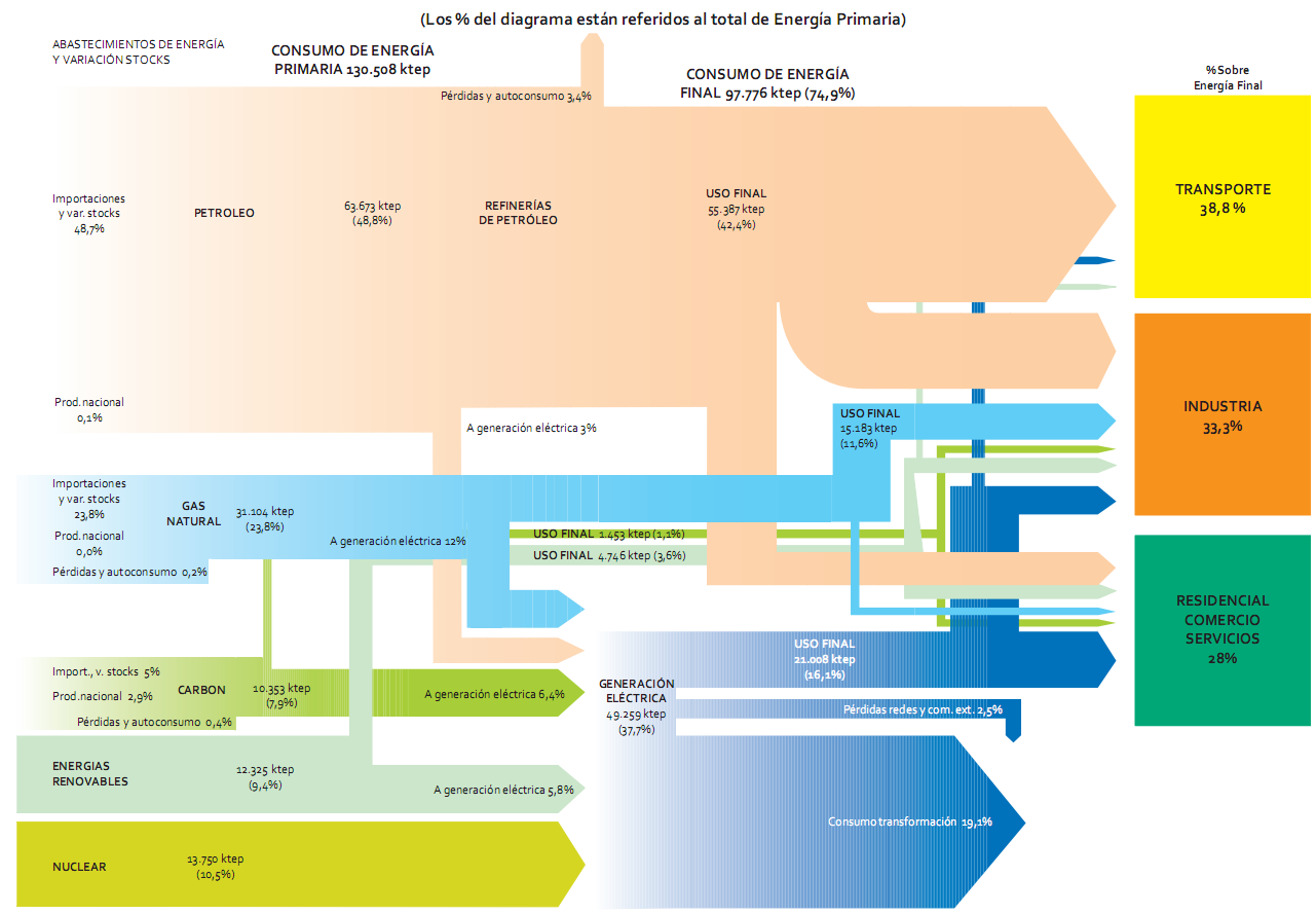
Another example of a national energy flow Sankey diagram, this time from Spain for 2009. To be found on page 40 of the recently published ‘La Energía en España 2009’ (large 10 MB PDF!) downloadable from the Ministry of Industry, Tourism and Commerce (MITYC) website. This is somewhat more advanced than the one from Spain I showed in this post.

Flows are in ‘ktep’ (ktoe, ‘kilo tonnes of oil equivalent, in Spanish), and percentages given are in relation to the total primary energy (130.508 ktep primary energy in 2009).

Nice and colorful, indeed. But again a good example of how to make mistakes (i.e. violate the basic rules) in drawing Sankey diagrams. So, here is the Sankey didactics part….

a) Arrows should be (no: must be!) to scale. Example: See blue arrow ‘USO FINAL’ with 16.1 % in comparison to blue arrow ‘consumo transformación’ with 19.1%
b) The same arrow should not change its width …
… while it runs in the same direction. Example: light green arrow ‘USO FINAL’ gets narrower as it runs vertically before branching to the sectors ‘Transporte’ and ‘Indústria’. Very weird!
… when it changes the direction. Example: pink arrow from the petroleum arrow going to the sector ‘Residencial’ is much wider on the vertical segment than on the horizontal segment.
c) An arrow should not maintain its magnitude …
… as it splits into two different flows. Example: green arrow ‘USO FINAL’ splits into two flows of the same width leading to the sectors ‘Residencial’ and ‘Industria’.
… as other flows branch off. Example: blue arrow ‘USO FINAL’ continues with the same magnitude to the sector ‘Residencial’, even though a considerable portion branches off to ‘Industria’.
d) It would be nice to have labels on all flows. Many negative examples, especially on the right hand side of the Sankey diagram.

Anyone care to do a better version?

Largest Sankey Diagram ever?

I was asked what the largest Sankey diagram I have seen so far was? Not sure about this. The Swiss biomass flows diagram I featured in January 2009 would be a candidate, but I think the following one is much larger, both in the actual diagram size, as well as in respect to the number of nodes and arrows.

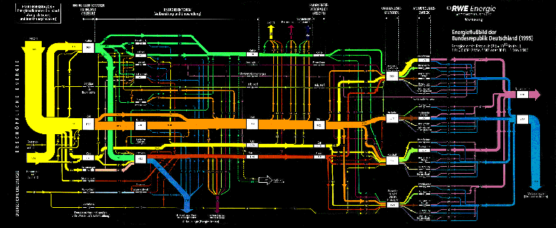
It was created by the marketing department of RWE AG, one of Germany’s big four electricity providers. It shows the energy flows in Germany for 1995. The image file I have is 2588 x 1062 pixels, so when you click on the image below, you won’t be seeing the full image, but only a thumbnail… (also because I don’t want to get sued by their legal department!)

The clear structuring of the diagram is what might be called “very German”: energy sources are at the left, with non-renewables at the top and renewables at the bottom. The second section shows energy conversion, the third section the energy use sectors. These are further broken down, before the arrow join again to show useful energy and energy losses (a 50:50 relationship). Losses in the conversion phase are shown as arrows that branch out vertically to the bottom. Exports and bunkering, on the other hands, is shown as vertical flow leaving to the top. Color coding is very clear, and flows are labeled with figures on each arrow. The unit is petajoule (PJ)

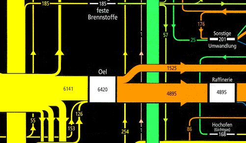
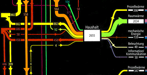
Even the black background goes well with the bright colours. Here are two close-ups of two sections from this energy flow diagram. Enjoy the beauty…


Extended LLNL Sankey diagram

Blog reader Johan Land submitted the Sankey diagram below. “As I am interested in the energy field I especially was fascinated by the LLNL graph over US energy consumption. I spent the weekend on further enhancing the LLNL graph using a trial version of e!Sankey (and data that I have gathered the last few years). I’m attaching the PNG-file for this graph. Feel free to share it if you like the graph!”


(click image to enlarge)

The typical LLNL graph has been extended by the red section on the left that shows a world energy breakdown. Only the U.S. energy consumption is traced further.
The second extension is the pink section. Here, Johan has broken down the energy use sectors ‘Residential’, ‘Commercial’, ‘Industrial’ and ‘Transportation’ in one or two further steps.

All flows are in TWh, data is from 2005 to 2009. The author used several additional data sources and recompiled the data, so that “figures may differ from Lawrence Livermore Laboratory estimations”. See notes for further information.

Good Sankey diagram, and definitely a great job Johan did here. The only suggestion I have, is to add percentage figures to the regional energy breakdown (red section on the left). Unfortunately, the watermark spoils the overall impression, but this is owed to the fact that he used a free trial version.

Johan also mentioned that he is working on forecasts up to 2050, and an animated GIF “running it over time since 1950 up until 2008”. Hope to be able to show you these here on the blog someday.

More Austrian Energy Sankey

Kris commented on my last post, that there is an updated version of the Sankey diagram on energy flows in Austria in 2006 to be found in the Statistical Yearbook Austria 2009 on page 360 (page 6 in this PDF).

I also checked out some other Austrian sites and found one for Austrian Energy Flows 2005 (Energieflussbild Österreich 2005) on the Austrian Energy Agency website. It is a little more colorful, and has more information too.

Flows are in TJ. The diagram is divided into four sections, namely “Aufkommen” (emergence?), “Umwandlung” (transformation), “Sonst. Verwendung und Verluste” (other uses and losses), and “Endenergieeinsatz” (final energy use). The color code for the energy types is as follows: oil (pale orange), electric energy (red), coal (dark grey), gas (yellow), renewables (dark green), distance heating (light green), hydro (blue). On the right side useful energy is shown in purple, and losses are displayed as light grey arrows. (Thank you to my friend Leo for the translations…).

Yet another national energy flow Sankey diagram, and indeed a very beautiful one. Hope to see updates of it every year.