Tag: energy

Balmenach Whisky Distillery Energy Sankey

Here is a tasty one … The Scottish whisky distillery of Balmenach has worked with the Energy Systems Research Unit at Strathclyde University in Glasgow to investigate the potential energy production from Whisky distillation co-products (such as draff, pot ale and spent lees). More information on this case study can be found here. Here is the Sankey diagram from this case study.
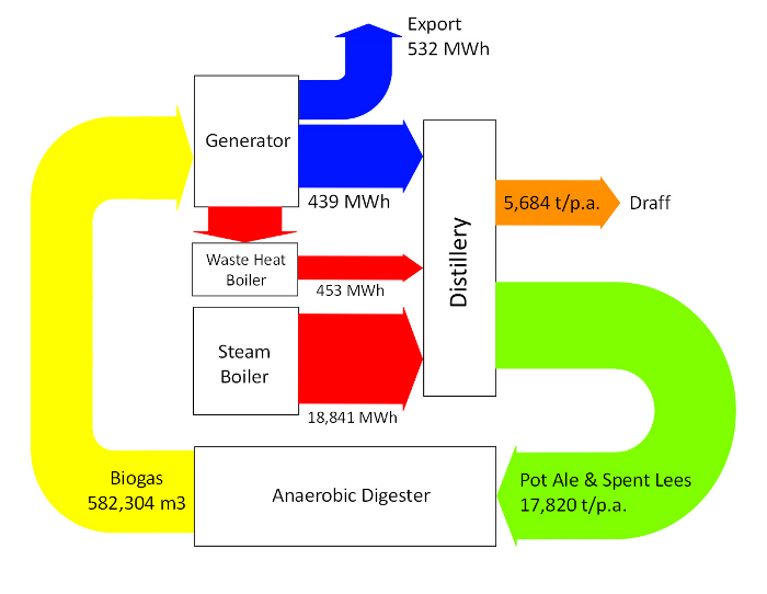
The study concludes that it would be advisable to feed the liquid co-products to an anaerobic digester to produce methane. A power generator can use this fuel to meet the electricity demand of the distillery, the surplus could be fed to the grid. Exhaust gases from the generator can be utilised by a waste heat boiler to offset the steam requirements of the stills. This would result in an annual economic benefit of £178,450 and a payback period of 5 years.

The Sankey diagram shows electric energy in MWh, co-products in tons per year, and biomass in cubic metres. Hence, these flows must not be compared to each other. I am unsure about the red arrow from the steam boiler to the distillery, which is labelled ‘18,841 MWh’ as it doesn’t seem to be to scale with the other energy flows.

Anyways. I like this one. Here’s tae us, wha’s like us? Damn few, and they’re a’ deid.

Sankey Diagram in ISO 13579-1 Draft

Typically it is quite difficult (read: expensive) to get hold of official ISO standards. It is by chance that I discovered the draft version of ISO 13579-1 on ‘Industrial furnaces and associated processing equipment — Method of measuring energy balance and calculating efficiency — Part 1: General methodology’ on the website of AFNOR, the French body of standards. The draft is open for comments as part of a public hearing process.

The draft standard ISO 13579-1 talks about energy balance (‘bilan énergétique’). Part 4.2 shows a sample Sankey diagram and explains that this is a tool that allows to represent the in and out flows of energy (‘outil permettant de représenter le flux d’entrée et de sortie de l’énergie’). In section 9 f on reporting the draft standard recommends that the report shall include a Sankey diagram (‘Il convient que le rapport de mesure du bilan énergétique contienne … Diagrammes de Sankey.’).

Didn’t have the original English version at hand, so I hope this is pretty much what it says in French.

Anyone aware of other ISO standards that mention Sankey diagrams?

Explore U.S. Energy Flows on Bloomberg

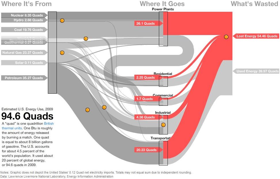
David Yanofsky from the Bloomberg Newsroom advised me of a Sankey Diagram he did on U.S. Energy Flows. The diagram is based on the well-known Lawrence Livermore National Laboratory (LLNL) diagrams and shows the 94.6 quads (1 quad = 1 quadrillion BTUs) estimated energy use in the United States in 2009.

The Sankey diagram has a nice mouse over effect, that let’s the user explore the stream as they are highlighted in different colors. The nodes show the contribution from different carriers. Additional information is available when positioning the mouse over the orange bullets. This makes the diagram fun to explore…

In this image the lost energy is highlighted in red.

In the above screenshot the energy flows based on petroleum are shown in brown color, all other flows in light grey.

These are only two static screenshots, please go over to the Bloomberg site to see more.

Energy Flow Charts UK 2009

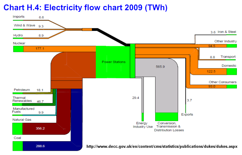
Featured on Jo Abbess’ blog on ‘Energy Change for Climate Control’ recently was this Sankey diagram. It appears in his recent post on ‘The Waste of Power’. It was originally published in Annex H of the 2009 Digest of United Kingdom Energy Statistics (DUKES) published by Department of Energy and Climate Change (DECC).

The report has numerous other Sankey diagrams like this one, similarly structured. They show energy use of coal, petroleum, natural gas, and renewables.

Below is the one on petroleum flows in 2009 in millio tons. A lower threshold has been introduced, so that small quantities don’t fall below a minimum width (see, for example, the flow of 0.7 mio tons to “Rail”, compared to the one of 4.9 mio tons to “Industry”, which would in principal be 7 times wider if it was to scale.

Nice and colorful!

Primary-to-Use World Energy Flows

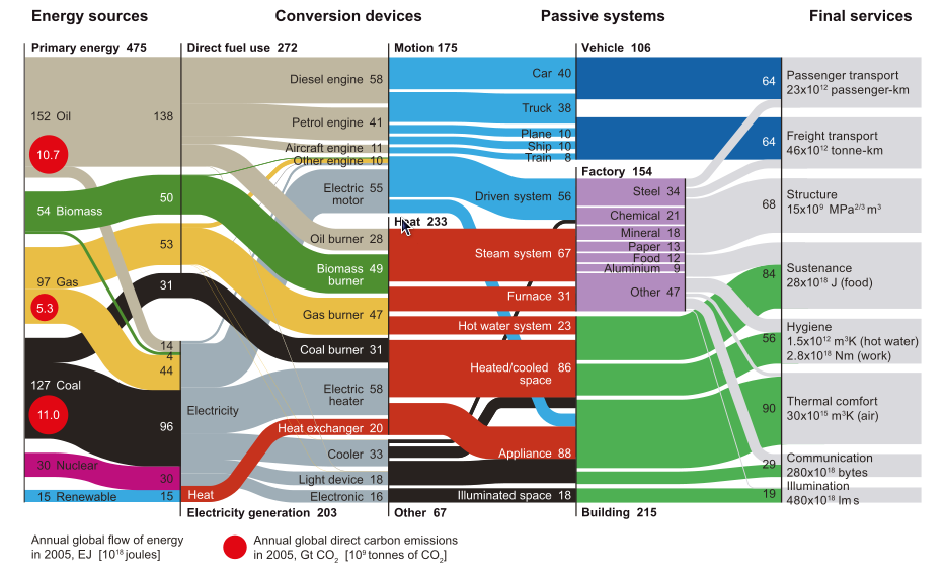
From the same blog post I used as source in my previous post comes this interesting diagram, originally by Cullen & Allwood 2010.

I have presented several similar Sankey diagrams here on the blog for different countries (see Spain, Italy or Austria or browse the tag ‘energy’)

This is a neatly structured and nicely designed example of a energy flow Sankey diagram that could serve as a role model. Primary energy broken down by energy carrier is on the left. Conversion steps are shown in the second tier, as two alternative breakdowns (direct fuel use/electricity generation and motion/heat/other). The line where these two tiers touch don’t always have direct connections, but the overall arrow magnitide matches. The next tier (passive systems) is broken down into vehicle, factory and building. The final services on the right side distinguishes eight different energy use fields.

Flows are in Exajoules (10E18 joules) and values are for the year 2005.

Paper Machine Enthalpy Sankey Diagram

A research project at Technical University Dresden in collaboration with a paper manufacturer aims at detecting and implementing energy saving measures for paper machines.

“Better monitoring of process variables, improvement in the operating point (or range) of the process, installation of heat recovery systems (e.g. at heat exchangers), use of heat pumps and replacement of high energy streams (steam) with waste heat streams. Most of these techniques are standard recipes which are readily available in the market. However they are designed without giving any consideration to the specific aspects of a manufacturing facility and also provide no quantitative evidence of the potential benefits. “

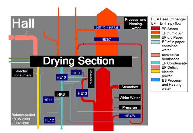
This is why they came up with a mass and energy balance model and are using the following Sankey diagram to visualize where energy could be recovered.


Flows are labeled as enthalpy flows, showing the changes in thermodynamic (heat) energy at each process step, hence losses. The Sankey diagram is for a balance period of six hours. No absolute figures are given. Several heat exchangers are installed along the wet section of the paper machine. In the drying section, a large part of the energy is lost as steam/humid air.

Spain: Energy, CO2, Cost

I am aware that I was kind of ‘Sankey diagram bashing’ with my post on Spain energy flow diagram last December. Now here is another one from the Iberian penninsula that fully makes up for the first one. It is by Observatorio sobre Energía y Desarrollo Sostenible (Observatory of Energy and Sustainability in Spain) at the Universidad Pontifícia Comillas in Madrid. I find it noteworthy that the observatory is part of a BP financed chair at the Escuela Técnica Superior de Ingeniería (ICAI).

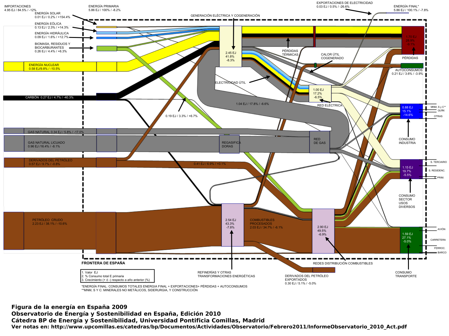
The annual report 2010 includes three Sankey diagrams, two of which are shown below. The first Sankey diagram (p. 16 of the report) has the typical pattern of a ‘national energy consumption, conversion and use’ diagram, similar to the ones presented here on the blog several times already for other countries.

The flows from the left show energy sources, the nodes on the right are the use sectors. A nice feature here is that the node heights are adapted to the magnitude of the Sankey arrow, so that the largest energy consumption can immediately be seen. Flows are in in Exajoule (1 EJ = 1000 Petajoule = 10E18 J). The total primary energy consumption in Spain in 2009 was 5.86 EJ (4.95 EJ of which are from imported fuels). Also shown next to the absolute quantities is the relative share of each flow in percent, and the change in comparison to the previous year.

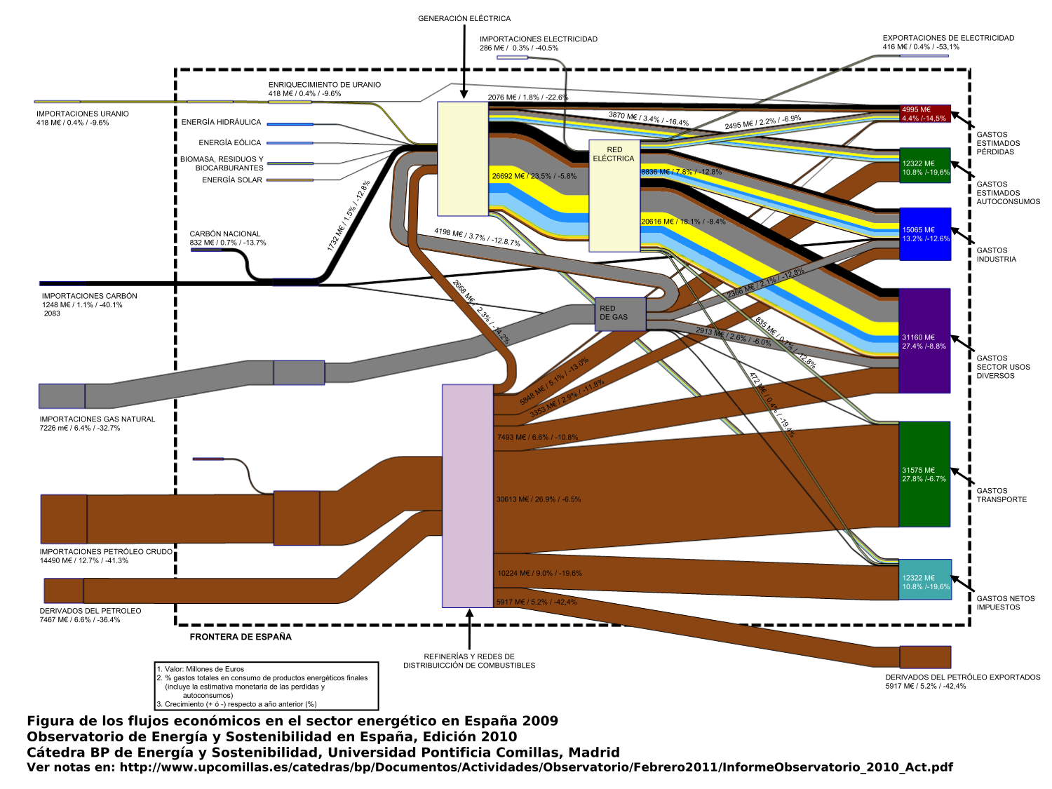
The second Sankey diagram (p.22) is what I would call a value stream Sankey diagram.

This is interesting as the market price for the fuels, as well as for converted energy is used as a weighting factor, so that each Sankey arrow shows the value of the energy flow in millions of Euro. At some nodes you can see that a smaller arrow enters, and a wider arrow leaves: These are the conversion processes where value is added (or energy gets more expensive). This is a compelling concept for a Sankey diagram (another similar example is here), one that somehow could make Sankey diagrams more interesting for economists or controllers, rather than considering them exclusively in the engineering domain.

The third diagram (not shown here, p. 19 in the report) shows the embodied carbon or the greenhouse gas emissions related to the different fuels, broken down by fuel and sector of energy consumption. The embodied carbon in the energy carriers were roughly 285 Mtons in 2009. The Sankey arrows for renewable energy sources as well as for Uranium are not present in the third diagram.

Me gustan mucho estas tres diagramas de Sankey! Merecen elogío.