Tag: energy

Sankey diagrams @ visualign

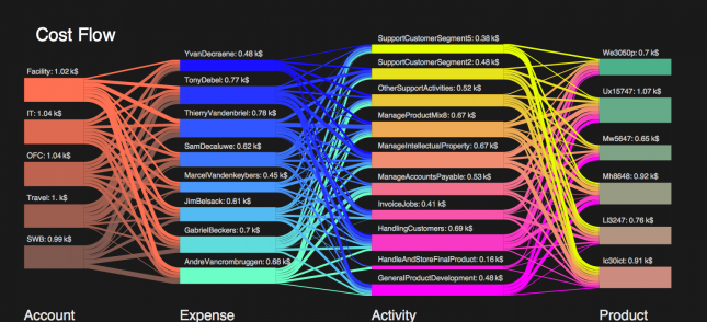
The blog post I mentioned yesterday also has two fine examples of Sankey diagrams done with Mathematica. Nice colorful ones. Black background.

The first one is on cost flows and their distribution onto accounts, expenses, activities, and products (each represented by a column with nodes).
The other is by Sam Calisch (the author of the Mathematica workbook) and visualizes the efficiency of energy use in Australia.
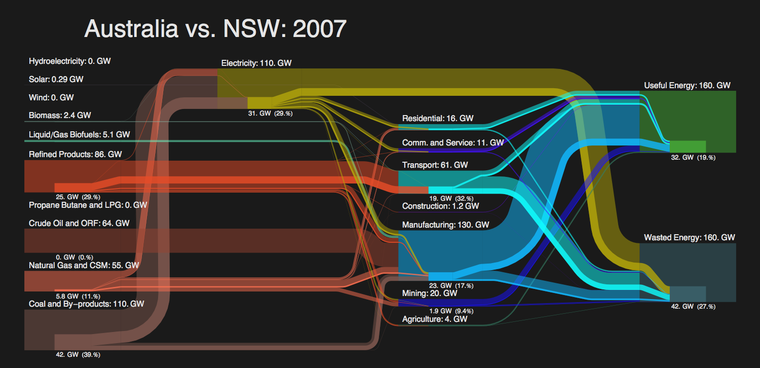
Actually this second diagram is made up of two Sankey diagrams: the main one for Australia, the overlay one with the values for New South Wales. A cool idea to show the share of NSW.

The author of the post at visualign says that he “wouldn’t be surprised to see Sankey Diagrams make their way into modern data visualization tools such as Tableau or QlikView, perhaps even into Excel some day…”. This is of course an idea I like…

US Energy Flows in 2010

Check out NETL January 2012 newsletter. It features a Sankey diagram with the 2010 data on U.S. Energy Flows. Publication details are here.


Download high res version of the Sankey diagram (large PDF) here.

This was prepared by Eric Shuster and is an update to the Sankey diagrams published annually by LLNL. It has the energy carriers on the left, energy conversion in the middle, and energy use sectors on the right. Primary energy consumption in the U.S. in 2010 is estimated to have amounted to 98 quads (quadrillion BTUs).

“NETL energy analysts have produced for the public a set of Sankey diagrams based on data obtained from the Annual Energy Review 2010 recently released by the U.S. Energy Information Administration. Graphically representing both quantity and direction, the diagrams place in perspective the relative contributions of major domestic energy sources as well as the flow of fossil fuels around the world.

The “Estimated U.S. Energy Use in 2010″ flow diagram shows the quantity of fuels used to drive each of the sectors in the United States. Overall, 83 percent of the primary energy consumed in the U.S. is from fossil fuels and downstream, due to conversion efficiencies, 89 percent of the total energy delivered to the end-used sectors is derived from fossil fuels.”

The news item also has a link to another presentation ny NETL featuring global coal and gas related flows as Sankey diagrams. These are interesting as will and I will present them here in the near future. Update: Coal is here, natural gas still to come.

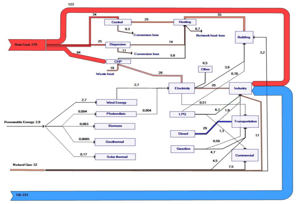
Energy Balance for Urumqi, China

Below is a Sankey diagram representing the energy balance for the city of Urumqi in Northwestern China. This was elaborated in a Sino-German Project on ‘Meeting the Resource Efficiency Challenge in a Climate Sensitive Dryland Megacity Environment: Urumqi as a Model City for Central Asia’ and has been published in the Integrated Heating and Building Energy Efficiency Master Plan for Urumqi in 2010

The Sankey diagram doesn’t sport the energy unit, but the text comment says:

The 2007 energy balance of Urumqi shows that about 541 PJ of primary energy was consumed in the city, accounting for 28% of the Xinjiang total (1,927 PJ). Urumqi used 25% of Xinjiang’s coal, 50% of its oil, 12% of its natural gas, and 4% of its renewable energy, much of it in heavy industry. This results in high energy related per-capita CO2 emissions of 22 tonnes. In 2007, the city consumed 14.7 million tonnes of coal (approximately 51% of its primary energy supply) whereby 30% of the coal consumption was used for the heating of buildings.

Interactive US Energy Sankey

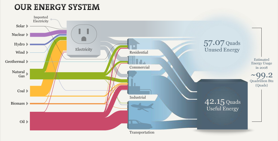
Another interactive Sankey diagram for U.S. Energy Flows (similar to the one by Bloomberg’s David Yanofsky) also based on the LLNL Energy Sankey Diagram can be found on a web page of The National Academy of Sciences. Visitors can explore the energy mix and consumption.

Click here to visit web page and start exploring…

Flows are in quadrillion BTUs or ‘quads’. The footnote reads:

Hydro, wind, and solar electricity inputs are expressed using fossil-fuel plants’ heat rate to more easily account for differences between the conversion efficiency of renewables and the fuel utilization for combustion- and nuclear-driven systems. This enables hydro, wind, and solar to be counted on a similar basis as coal, natural gas, and oil. For this reason, the sum of the inputs for electricity differs slightly from the displayed total electricity output. Distributed electricity represents only retail electricity sales and does not include self-generation. The efficiency of electricity production is calculated as the total retail electricity delivered divided by the primary energy input into electricity generation. End use efficiency is estimated as 80% for residential, commercial, and industrial sectors, and as 25% for the transportation sector.

Nice graphics and a good idea to convey “What You Need To Know About Energy”.

European Energy Flows Sankey

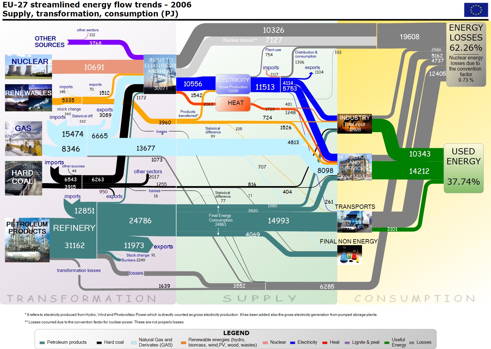
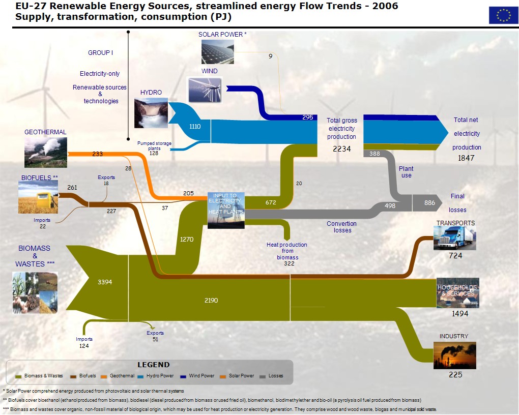
Finally have I run across a European Energy Flow Sankey diagram in a post on Google Groups…

European (EU-27) Energy Usage:

European (EU-27) Energy Usage (renewable energy sources only):

These two images were posted by Herman B. (apparently linked somehow to the European Comission) in reply to an inquiry by Andrew D. I don’t know the original source or publication. Flows are in petajoule (PJ) for the year 2006.

In my optinion they could do without the background image and the photos, but nevertheless, these are fine Sankey diagram examples.

Industrial Compressed Air System

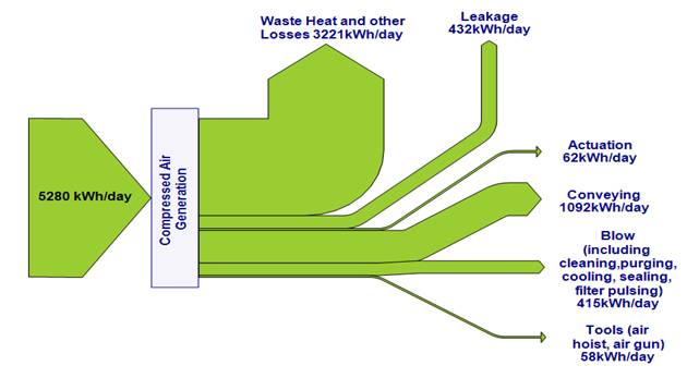
Craig Meskell from Trinity College, Dublin submitted the Sankey diagram below for publication on the blog.


Craig writes:

“here’s a Sankey diagram of the energy balance in an industrial compressed air system. The factory is situated in Ireland (not too far from Co. Tipperary!) [Note from Phineas: this is where Cpt. Sankey was born]. The work is detailed in: Eret, P., C. Harris, G. O’Donnell & C. Meskell, A practical approach to investigating energy consumption of industrial compressed air systems. Proceedings of the Institution of Mechanical Engineers, Part A (Journal of Power and Energy), 2011. DOI: 10.1177/0957650911423173″

A nice, simple, clear diagram. Thank you. If other readers have Sankey diagrams to share, please send them to blog@sankey-diagrams.com

Sankey Use in Energy Management

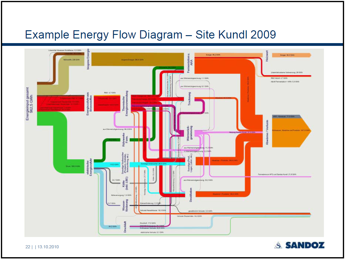
In a presentation given by Jurgen Zettl at the EM2010 conference in Vienna, the author reports about the integrated energy management and reporting at Sandoz’ Kundl site.

Page 22 of the PowerPoint has the following Sankey diagram:

The pic isn’t very clear, and it is difficult to see any detail. The overall energy consumption of the Kundl site comes in from the left (962,5 GWh in 2009). It is broken down to electric energy, energy from fossil fuels and energy from biomass (Note: I was wondering about the latter, but this is explained on page 6 that this is “feed for fermentation, solvents, … “). The streams are further broken down by use area. At the right side the flows join again to visualize useful energy and energy losses.

Good to see that large industries are using Sankey diagrams as an important element of their integrated energy management…

VisualizeGreen.com Free Sankey Template

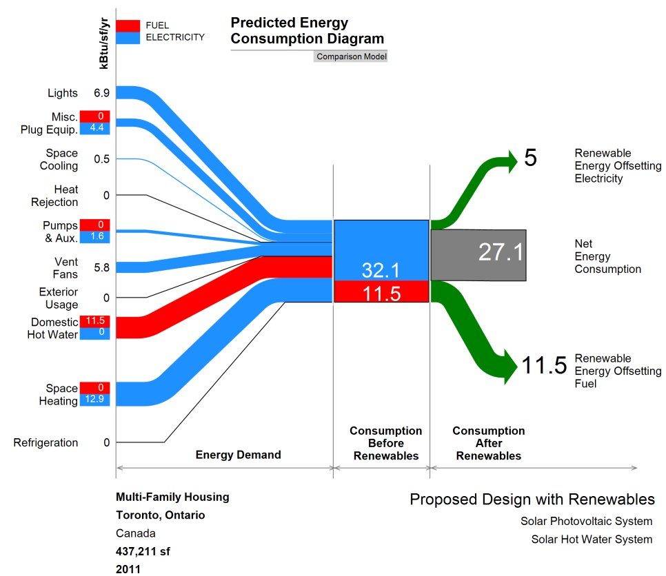
Premnath Sundharam from the Visualize Green blog contacted me to draw attention to a Sankey diagram template he has made and that is available for download on his site.

The diagram is for predicted energy intensity for buildings. An Excel template is provided that allows entering the data. You can use this with the free trial version of e!Sankey (registering required). All elements of the diagram and the entry sheet is explained in detail by Premnath. In regard to the unit (KBtu per square foot per year) he says:

Last but not least, kBtu/sf/yr is becoming the universal (US) unit of communicating building energy consumption. This unit is called the EUI – Energy Use Intensity and since it is a simulation of how your building will perform, it is called PEUI – Predicted Energy Use Intenisty.

Good stuff, Premnath! Thanks for making this available to everyone.

Note November 2011: Also look at Premnath’s Energy Story here.