Tag: energy

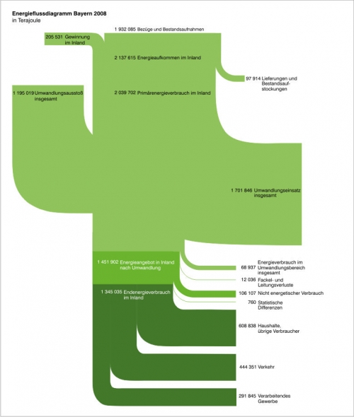
Energy Balance of Bavaria 2008

Found this Energy Flow Diagram for Bavaria (Germany) on the Bavarian Ministry of Economy website.

Flows are in Terajoule (TJ). Flows from top to bottom with different consuming sectors like private houdholds, traffic and industry. Different shades of green… 😉

While I generally welcome the fact that these Sankey diagrams are published for nations, regions or states (as is the case here / more examples can be found here on the blog!), I find that care must be taken to respect the basic principles used for these diagrams.

In that respect the above example looks somewhat quirky to me. The reason for this diagram being spoiled is the fat stream (1.195.019 TJ “Umwandlungsverluste insgesamt” – not sure what that means though) merging into the vertical band from the left, and its counterpart (1.701.846 TJ “Umwandlungseinsatz insgesamt”) branching out to the right at more or less the same height. Are these additional inputs and outputs? But then, why do they cross the main direction of the flow? Not clear to me…

Not a good example. I would have expected better from the state where two of my favourite cars are manufactured.
Grieger Family Personal Energy Balance

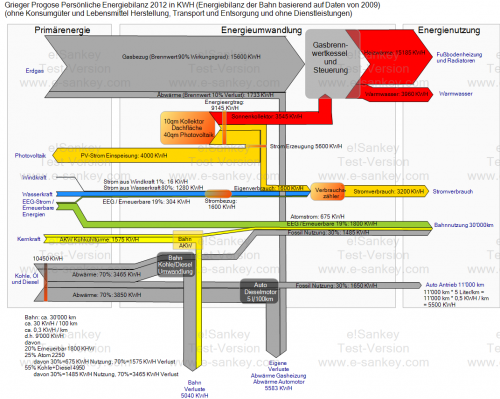
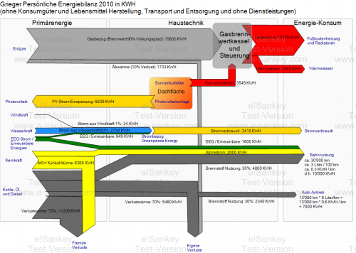
The “personal” energy balance of the Grieger family home for 2010 and a forecast for 2012 were presented in two blog posts here and here on Klaus Grieger’s blog.

All consumptions are traced back to the primary energy demand and include losses (dark rey arrows) in power generation by using efficiency factors.

2010

2012 forecast

The details of these Sankey diagrams are probably most interesting for those who understand German.

A PV system on the roof of the Grieger house permitted to feed back 5930 KWh of electric energy to the grid in 2010. In 2012 some of this energy is used directly (“Eigenverbrauch”), leading to a reduced energy bill for electricity purchased. Note that the Grieger family gets “green power” from hydro, wind and other renewables.

Another change between 2010 and 2012 is an updated mix of energies German Rail use (nuclear, coal and gas fired power plants).

Note that the two diagrams do not have the same scale. The consumption of heat is the same in 2010 and the 2012 forecast, so is primary energy demand from natural gas (grey arrow “Erdgas” at the top). Still, the 2012 Sankey arrows are wider than in the 2010 version. It would be nice to have the two Sankey diagrams side-by-side and be able to compare them by looking at the arrows widths.

Canada Energy Flows

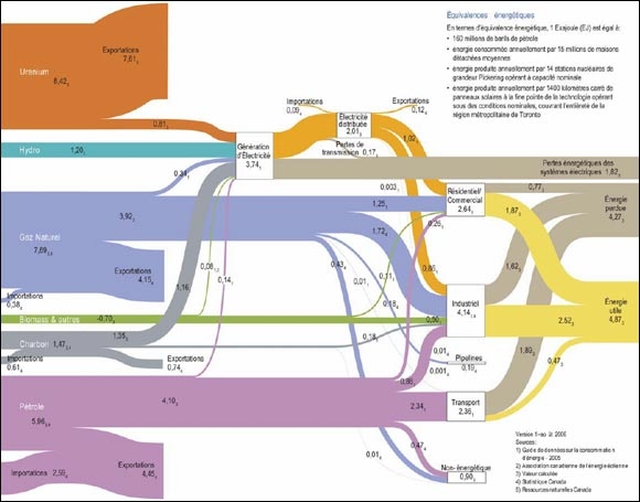
From a briefing document ‘Global and Canadian Context for Energy Demand Analysis – Energy Briefing Note’ (original source: ‘Powerful Connections: Priorities and Directions in Energy Science and Technology in Canada, Natural Resources Canada, 2006’) available on the National Energy Board website comes this Sankey diagram for Canadian Energy Flows in 2008:

Barely legible, but flow quantities are in Exajoule (EJ). The large bands that end about a quarter of the way are ‘exports’. Only the flows that go through to the power generation and consuming sectors represent domestic energy consumption.

GEA Report: Global Energy Flow Sankey

Blog reader Johannes sent an e-mail, advising me that the 2012 GEA Report (GEA, 2012: Global Energy Assessment – Toward a Sustainable Future, Cambridge University Press, Cambridge UK and New York, NY, USA and the International Institute for Applied Systems Analysis, Laxenburg, Austria) has many Sankey diagrams worth checking out. Thanks! I downloaded this 1865 page (!) report (link, caution large 188 MB file!) from the IIASA website.

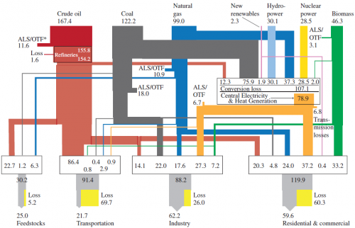
Here is one of the Sankey diagrams featured in the report.

This is a diagram for global energy flows in exajoule (1 EJ = 10E18 joules) “from primary to useful energy by primary resource input, energy carrier (fuels), and end-use sector applications in 2005”.

Similar national energy flow diagrams I have featured here typically are left-to-right oriented, but the structure is similar. Flow quantities are mostly shown as entry flows on the nodes (boxes). Losses displayed in yellow next to the grey exits at the bottom.

Alaska Energy Flows

Dug out a folder on the hard disk of my old computer where I had stored many Sankey diagrams. Great stuff there I had saved years ago. Problem is that at the time I didn’t label the diagrams properly, so that I am now trying to trace where I got them from.

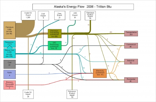
Here is one I like quite a bit. It is featured on p. 24 of the Alsaka Energy Plan (available on the Alaska Energy Authority (AEA) website / directly access large PDF)

Alaska Energy Flows for 2006 in trillion BTU. Forget about the other fuels, this state’s energy is almost entirely based on crude. And – despite being an importer of oil – AK is primarily an exporter of oil. All other energy flows really seem to be insignificant because of the dominance of oil. Losses are not shown with streams, but rather are given as text on the node.

Energy Efficiency in Manufacturing Processes

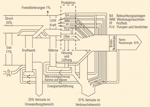
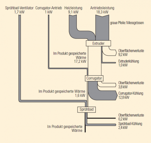
A brochure on efficient use of energy in manufacturing processes in industry was published in 2004 by Bavarian environment agency (LFU). With its catchy title ‘Protect Climate – Reduce Costs’ (German: ‘Klima schützen – Kosten senken’) the brochure targets at small and medium sized companies and aims to raise conciousness about energy efficiency in different areas of a manufacturing company such as pressurized air, air condition, heating/cooling, lighting and others.

On page 6 this Sankey diagram shows an overview of energy flows in the company…

… and on page 7 a detailed view of a process section (extruder, corrugator, spray bath)

The first diagram is in percent of the total energy consumption, directing the interest to the areas that contribute most to energy consumption, losses (and energy costs) in the company. In the second diagram the unit is kW.

Thanks to the blog reader who sent in the brochure and helped out in translating from German.

Summer Time Sankey: Ice, ice, baby!

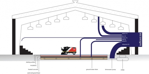
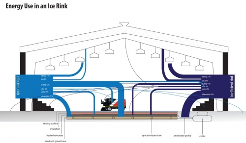
The charchitecture blog is run by a “third year architecture student in Bill Sherman’s Building, Sites and Systems course”. The below Sankey diagrams are from a November 2011 post and covers the topic of refrigeration.

The first Sankey diagram depicts a cross section of an ice rink and shows a breakdown of the energy use in an inefficient ice-rink.

In the second Sankey diagram an efficient and an inefficient ice-rink are compared.

Sankey arrows represent relative shares in percent, not absolute values. Hence in the second figure the height of the stacked Sankey flows (100%) is the same for the inefficient as for the efficient ice-rink. I think that a direct comparison of the energy consumption is not intended here, but only the different distributions.

The original post has more basic information on refrigerations and explains technologies that can be used to save energy.

Now that’s cool… my summer time post for you.

Denmark 2050 Nuclear Free Energy Scenario

Found the below Sankey diagram in an article titled ‘La politique énergétique du Danemark. Vers un scénario 100% renouvelable en 2050’ by Thierry de Larochelambert of Institut FEMTO-ST via sortirdunucleaire.org.

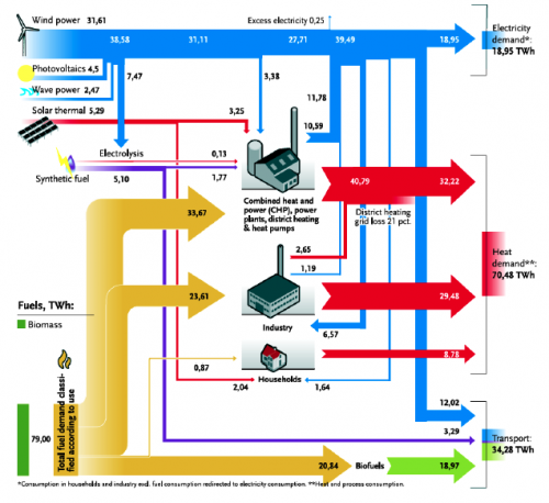
The article says: “Le diagramme de Sankey (synoptique) ci-dessous illustre les flux d’énergie produites, converties et consommées par secteurs dans la structure énergétique proposée par le Plan Climat IDA à l’horizon 2050. [Translation: The synoptic Sankey diagram below illustrates the energy flows that are produced, converted, and consumed by the different sectors, as proposed in the IDA Climate Plan with a time horizon 2050]”

Units are in terawatt hours (TWh) and relate to one year. The primary energy supply is 112.86 TWh. Some tiny flaws in the Sankey diagram, such as overlapping flows, arrow heads that overemphasize large arrows, and an issue with rectangular bends. But overall a very good Sankey diagram that gets the message across. Definitely worth a fav point…

The 2050 scenario by IDA foresees a nuclear free, 100% renewable energy production with biomass and wind power being the main energy souces. As the article explains, the transition from 50% to 100% independence between 2030 and 2050 is an extraordinary technical, scientific and economic challenge (“un défi technique, scientifique et économique extraordinaire”, p. 6) that will require some measures to be implemented, such as a 10% drop in electric energy demand, and a shiftover of 50% of Danish freight transports being moved to rail.

Exciting article. For those of you who read French: here it is. The original ‘IDA Climate Plan 2050 by the Danish Society of Engineers (IDA) where this Sankey diagram was first published is here (in English).