Tag: greenhouse effect

Earth’s Energy Balance

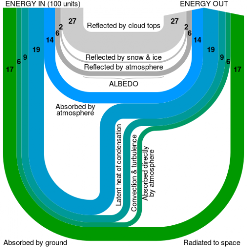
The Wikipedia article on ‘Earth’s energy balance’ has recently been updated with another figure by user ‘Cmglee’.

It shows energy “in” from solar radiation, reflection, and energy “out” as heat into space.

This is a more abstract, yet at the same time brillant and beautiful representation of the greenhouse effect figure, that appears twice in the same Wikipedia article, and that I have presented in posts some years ago (here and here). These more infographic-ish figures are all derived from the original Kiehl and Trenberth (1997) work, if I am not mistaken.

Cmglee’s visualization reminded me of a bundle of ropes suspended at two points. Ropes of different diameter, of course, as it is common in Sankey diagrams. See more of Cmglee’s artwork here.
Another Greenhouse Effect Sankey Diagram

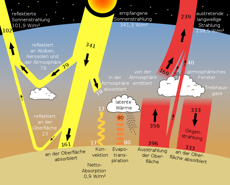
On Wiki Commons I discovered a different Sankey diagram image for the greenhouse effect than the one I presented in a previous post. The diagram is titled ‘sun climate system’, which seems appropriate.

The values are in Watt per square meters. Labels are in German, but if you want to know what they mean, just go to the original Earth Observer (Nov/Dec 2006 Vol. 18 Issue 6) PDF file by NASA and check out page 38.

Greenhouse Effect Explained with Sankey Diagram

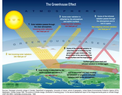
Doing a Google image search on ‘greenhouse effect’ brings up numerous versions of a diagram, that shows solar radiation partially being filtered by the atmosphere, partially hitting earth’s surface. This energy heats the earth, a part is being reflected as infrared radiation, where it is not able to escape fully due to greenhouse gas molecules from man-made emissions’ accumulated in the atmosphere.

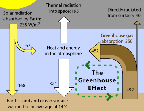
While some of these greenhouse effect diagrams use simple arrows, some of them show the energy levels with Sankey-like arrows.

Wikipedia has one of these as an illustration for the article on the greenhouse effect. Originally designed for Global Warming Art it is also available in the Wikimedia Commons in Finnish and in Japanese.

Many of the “normal” diagrams are very appealing, and I especially like the one’s that target at kids or students. However, the diagram using Sankey arrows conveys more information. Check for yourself by comparing the two examples above.