Tag: software

Sankey Diagrams are Directed Weighted Graphs

For those of you interested in some of the maths behind drawing Sankey diagrams properly, you might want to read this article on ‘Programmatic Rendering of Directed, Weighted Graphs’ submitted for SVG Open 2003 by Philip A. Mansfield and Mark Ambachtsheer of SchemaSoft.

The authors consider Sankey diagrams as directed weighted graphs but they “can be difficult, time-consuming, and uninteresting to render by hand”. However, “Sankey diagrams do add an indisputable expressive power to a standard mathematical rendering of a graph…[and] when professionally constructed, Sankey diagrams represent flow in a manner … can be understood by anyone, instantly.”

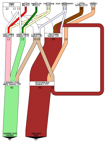
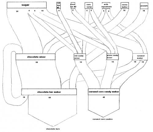
Three diagrams are presented: the first is a simple directed, weighted graph representing a candy factory:

Next, a pen-sketched b/w Sankey diagram of the candy factory…

… and finally the corresponding Sankey diagram in SVG format, created using data in XML format and XSLT style sheet transformation.

They also have some interesting details on graphical problems, such as overlay, edge layout, width of Sankey arrows in curves, etc. Basically all that stuff that developers of professional Sankey software tools have to cope with.

“Sankeyware”

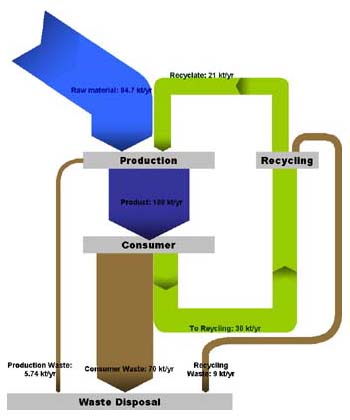
Just back from a short late summer holiday, enjoying a few “Sankey-free” days at the coast. To get going again I am presenting a Sankey diagram you might have seen already. It is Gabor Doka’s sample diagram for his ‘Sankey Helper’ application.

Sankey diagram created with Sankey Helper 2.1 (by G.Doka)

The tool comes as a Microsoft Excel workbook, with a number of macros and a toolbar that allows to create shapes and assignments from the data sheet to these shapes. Of course, graphical layout capacities of this helper tool is limited, however, simple diagrams can be drawn easily once you understand how to handle it.

Sankey Helper 2.1 is freeware – err, sorry! – “Sankeyware”. You must sent the author a Sankey diagram you created, but otherwise there is no cost. Nice idea! Download Sankey Helper from Gabor Doka’s website.

New version of e!Sankey

Good news upon my return from a summer break: e!Sankey 2.0 has been released by German software maker ifu Hamburg on July 15. I had participated in their beta testing in June, so I was well aware of what they would present…

The new version comes in two different flavours: a standard version and a “pro” version, which differs from the standard version by offering a ‘LiveLink’ for Excel files and material stocks visualization.

A full list of new features has been published in their BBS. Some are nice to have, such as the 40+ fill patterns or background colour for the diagram. Others are off real added value (at least in my eyes), such as rotating of labels, or padding at processes.


The implementation of the interface to Microsoft Excel (so-called LiveLink) is a big push and definitely justifies the price difference of 60 Euro (110 US$) for the e!Sankey 2.0 pro version. You can copy & paste values from Excel into the quantity field for a flow, establishing a dynamic reference to the cell in the background (cells should be named, so that their postion can be changed without losing the reference to the e!Sankey diagram). If the value in the Excel file is changed, the flow quantity is automatically updated, and the diagram adapted accordingly. Read more about the Excel LiveLink.

A 30-day trial version can be downloaded here.

I will play around with e!Sankey 2.0 pro (after I have dug through my inbox 🙁 ) and present some more Sankey diagrams within the next days…

Visio Pre-Wired Sankey Diagram Shape

Visio Guy has been “messing around with … Sankey Diagram Shapes for Visio again — because [he] just couldn’t resist”. 😉

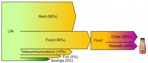
The result is a pre-wired Sankey diagram shape, in which five flows exit from a process box. The flows scale automatically according to the user input.

VG’s example is fun, showing cost of living and what money is being spent on. I just hope his food spendings don’t spread 60/40 on chips and coffee… 😀

Read the full blog post. There is a download link for this Visio shape at the end.

Software Development Bugs Breakdown

This is an interesting one: Saveen Reddy shows a Sankey diagram-like breakdown of bugs in a software development project. The term ‘bug’ is used “…very generically to describe any issue being tracked, not only defects in source code.”.

This does not fully classify as a Sankey diagram, I think, because the arrows don’t seem to reflect any quantities (number of bugs, time spent on bugs, …). But just like the diagram that showed the number of people having been accused and the turnout of the cases I showed here in June 2007, it visualizes a sequence of breakdowns, leading to decisions that are taken (dashed line arrows).

Now, anybody wants to check their bug tracking tool and show a similar diagram but with real numbers?

Software: Energy Flow Sankey for Private Homes

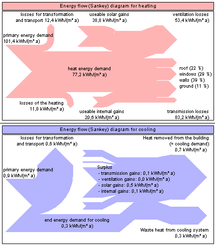
A software with a Sankey diagram feature that I hadn’t noticed before, and only now have added to the list of Sankey Software tools is CASAnova (new house). From what I understand this freeware tool was the result of a research project at a German university that ran from 2000 to 2002.

The program ‘CASAnova – An Educational Software for Energy and Heating Demand, Solar Heat Gains and Overheating Risk in Buildings’ is designed for an easy-to-use handling in order to get an intuitive understanding of the relations between building geometry, orientation, thermal insulation, glazing, solar heat gains, heat energy demand, heating and primary energy as well as overheating in summer.

CASAnova can be used to enter numerous parameters for a building, such as geometry, window and wall areas and types, insulation, heating system, and climate data etc. The tool will eventually produce a generic Sankey diagram of energy flows as the one above. I have just installed it and played around a little bit only to get an impression. CASAnova is available in German and English. Recommended.

Sankey Diagrams with Visio

Chris Roth, the Visio Guy in his latest article focuses on the question whether and how Sankey diagrams can be drawn in Microsoft Visio.

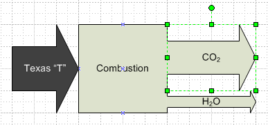
Can Visio do Sankey? While there are no Sankey Diagrams templates that ship with Visio, there are a few in-the-box shapes that can be used to create rudimentary Sankeys.

He identifies some problems with the Visio-supplied arrow shapes, and provides “a new version of the arrow shape which is more suitable to making Sankey diagram” for download. Really cool, Visio Guy!

In one of the follow-up comments Chris states that pre-built shapes can only cater for the most basic Sankey arrows, but “a proper, full-blown solution would utilize at least some code, if nothing else, for decent data-input dialogs, etc.”

Cost Sankey Diagrams show Added Value

While browsing through some of my older bookmarks I discovered this page of what seems to be an information portal of one of a German federal ministry. The Sankey diagram for cost flows they show reminded me of a feature in the Umberto material flow management software, which I always wanted to inspect in more detail.

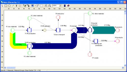
Using their 30-day trial version I worked with one of the simple demo examples they provide. Basically this software is a modeling tool for process systems and analysis of material flows within any kind of process system (production plant, supply chain, region, …). Sankey diagrams in Umberto are not the default view for material flows, but one can switch from the normal “Material Flow Network” view to the Sankey view.

Even though the Sankey diagram feature of the software would need some retouching, I was surprised and extremely pleased to see a “Cost Sankey” feature.

You can enter material direct cost for all materials (in the ‘bucket factory’ example of the demo all materials already have a “market price” property), as well as fixed and variable process costs. The variable process costs are spread over the process throughput using ‘machine hours’ or ‘work hours’ as cost drivers (i.e. to link cost creation to the material throughput). Thus, at every process (shown with blue squares in the flow diagram) the costs -or should I say: the value – increases. Going from left to right along the general flow direction in the Sankey diagram you can see clearly that the growing magnitude of the Sankey cost flows… a kind of ‘Value Added Sankey diagram’.


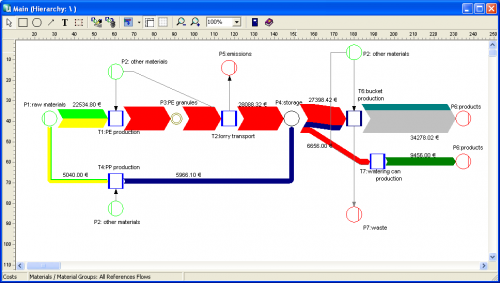
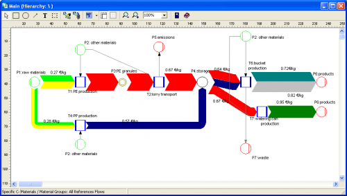
The above screenshots show the overall cost for the three products produced in the bucket factory (Fig.1), the cost per unit for each of the three products of the bucket factory (Fig.2).

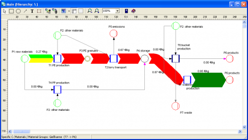
The following two cost flow Sankey diagrams are for the individual costing units ‘plastic bucket’ and ‘watering can’ (Fig.3 and 4). Please note that on theses diagrams a part of the machines is not being used, so they don’t add any process costs to the costing unit (or don’t contribute to the value added). Unfortunately you can only display either mass or energy flows in one Sankey diagram, so the energy costs (from the circle labeled ‘other materials’) are not shown as a Sankey flow, even though they add to the price for each product.