An area of application for Sankey diagrams that has (so far) received little attention here on the blog is waste water treatment. The article ‘Nitrogen Recovery from Wastewater: Possibilities, Competition with Other Resources, and Adaptation Pathways’ by Van der Hoek, J.P.; Duijff, R.; Reinstra, O. In: Sustainability 2018, 10(12), 4605 has two Sankey diagrams that merit being featured here.
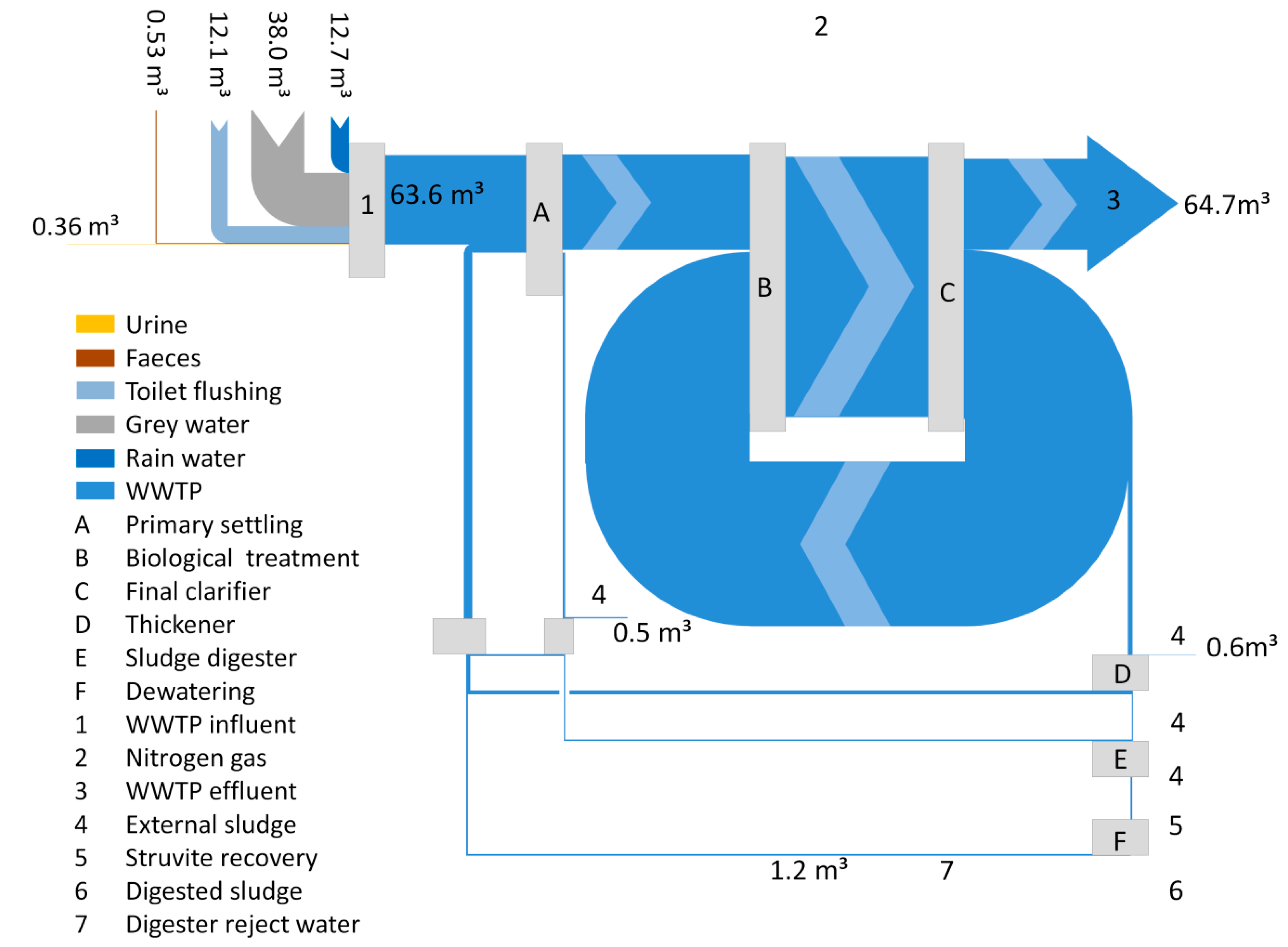
The first one visualizes the absolute flows through the process in mio m³ per year (volume streams). Data is from the Amsterdam-West waste water treatment plant (WWTP). The main loop leads water from the clarification stage back to the biological treatment stage.
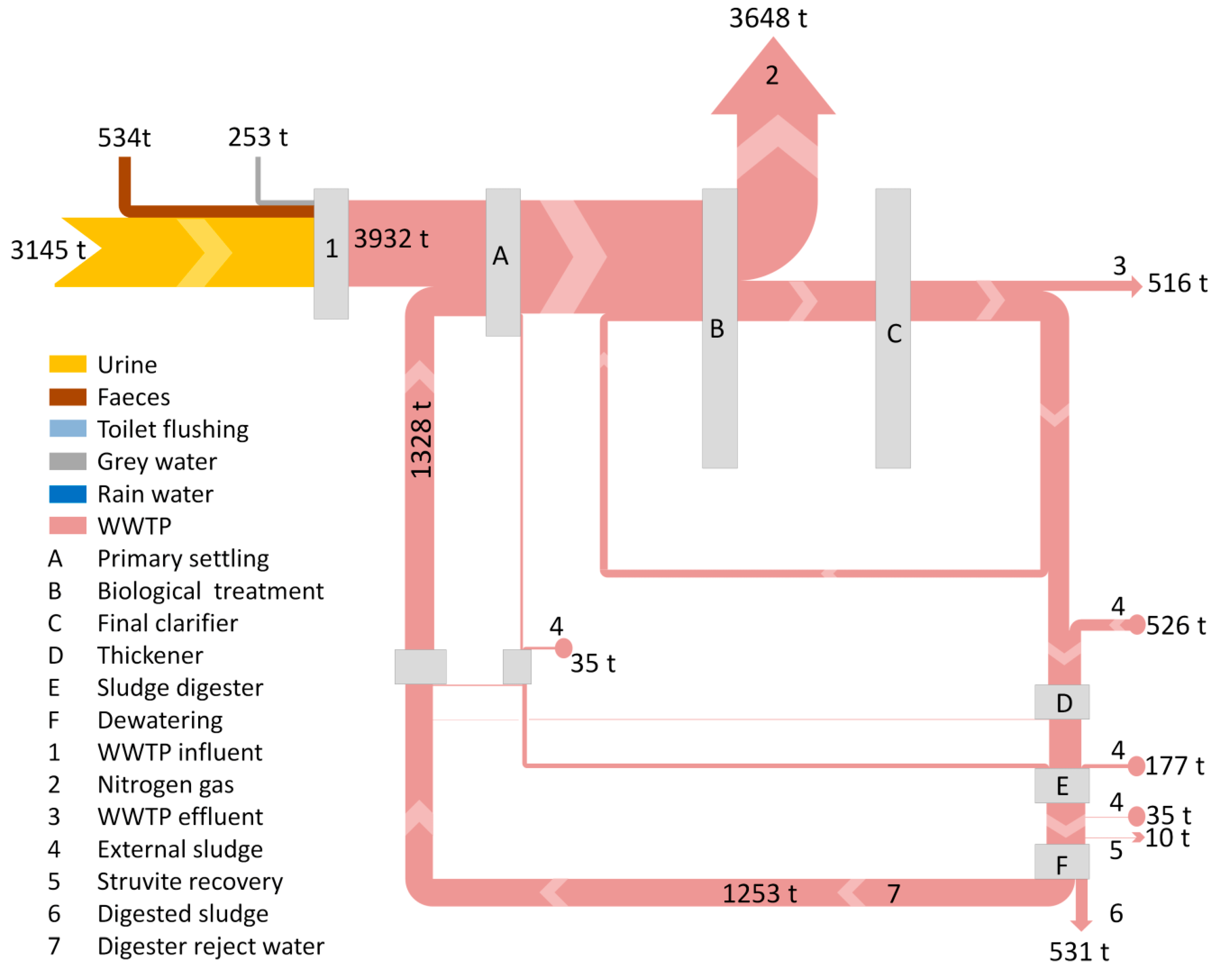
The second Sankey diagram uses exactly the same process structure, but flows are displayed in tons of nitrogen per year. Most of the nitrogen leaves the system as a gaseous effluent. In contrast to the above, the loop of nitrogen loads is in the reject water from the digester fed back to the primary settling stage.
Anyone in for calculating the concentrations? Read the full article here for details.

