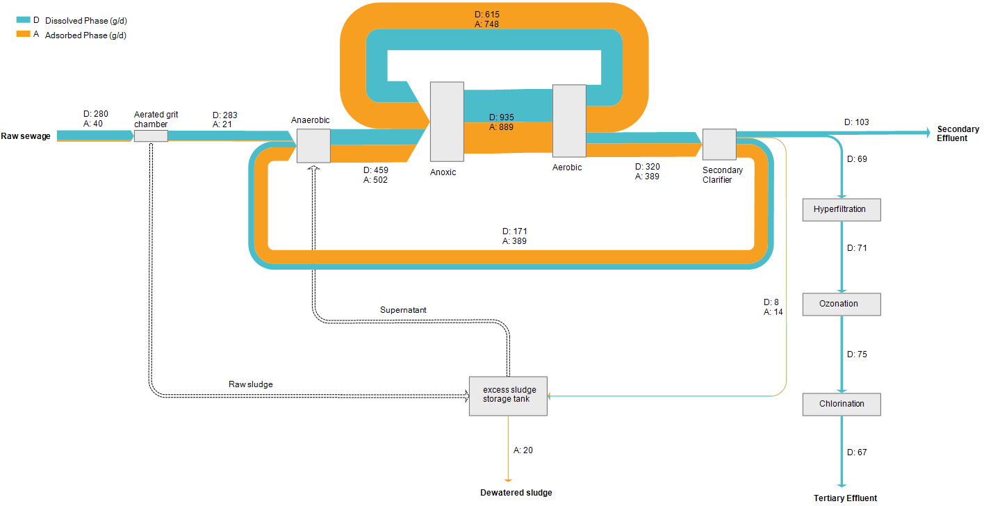
Another Sankey diagram from a waste water treatment plant (WWTP). This one shows concentrations (of organic matter?) in dissolved and adsorbed phases in grams per day. Actual volume streams are not represented.
Waste Water Treatment Plant Sankey
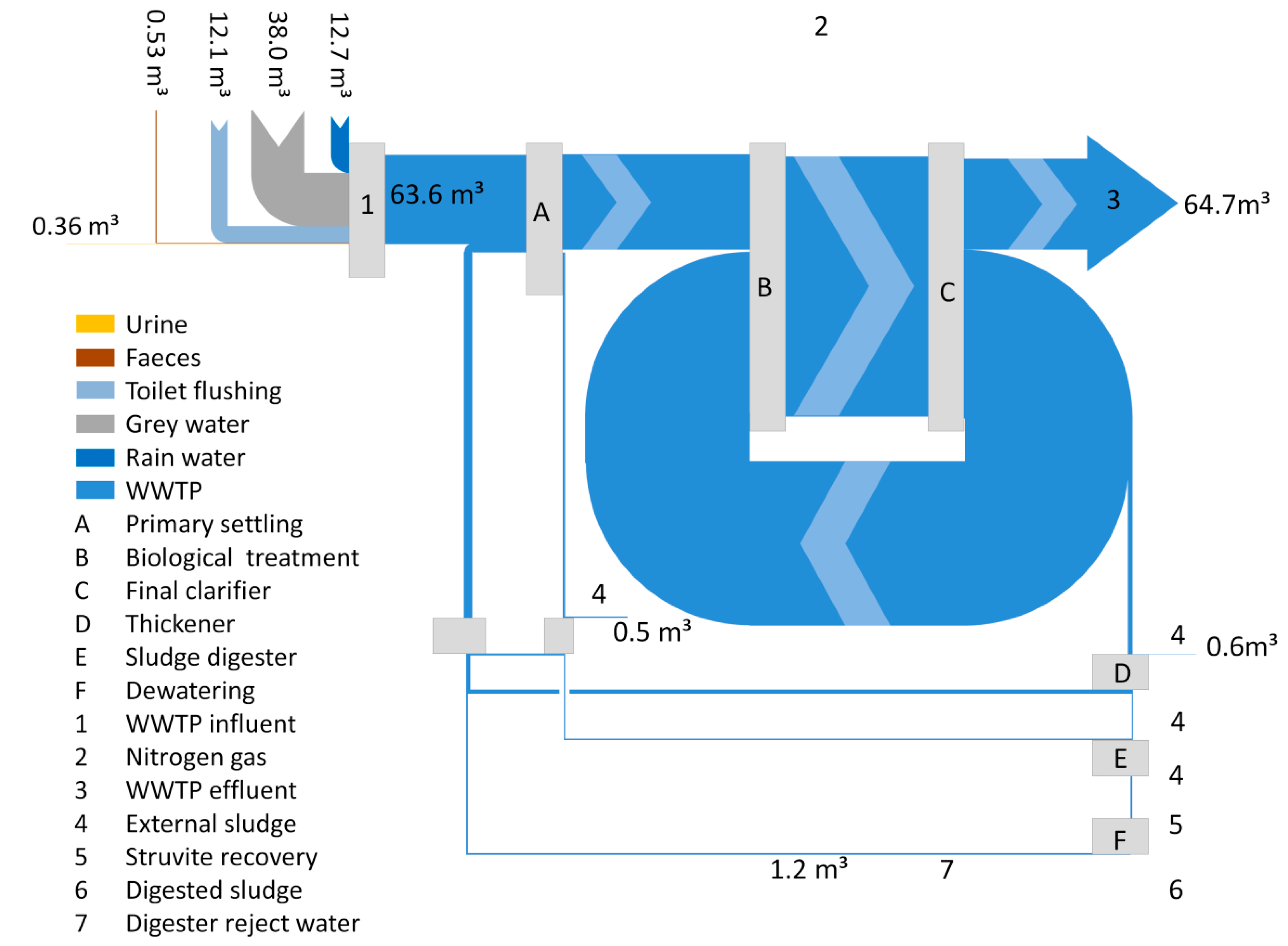
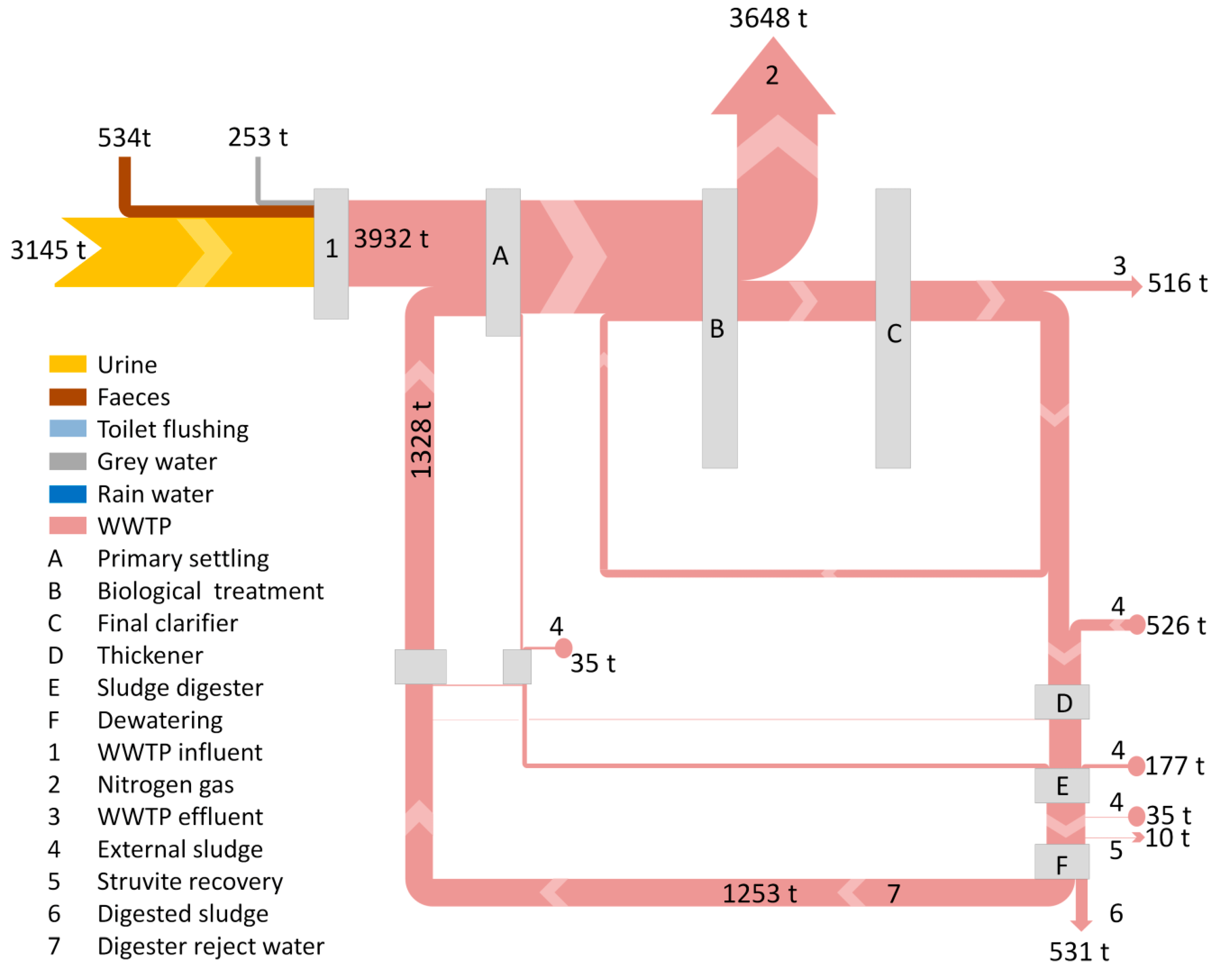
An area of application for Sankey diagrams that has (so far) received little attention here on the blog is waste water treatment. The article ‘Nitrogen Recovery from Wastewater: Possibilities, Competition with Other Resources, and Adaptation Pathways’ by Van der Hoek, J.P.; Duijff, R.; Reinstra, O. In: Sustainability 2018, 10(12), 4605 has two Sankey diagrams that merit being featured here.
The first one visualizes the absolute flows through the process in mio m³ per year (volume streams). Data is from the Amsterdam-West waste water treatment plant (WWTP). The main loop leads water from the clarification stage back to the biological treatment stage.
The second Sankey diagram uses exactly the same process structure, but flows are displayed in tons of nitrogen per year. Most of the nitrogen leaves the system as a gaseous effluent. In contrast to the above, the loop of nitrogen loads is in the reject water from the digester fed back to the primary settling stage.
Anyone in for calculating the concentrations? Read the full article here for details.
Cape Town Water Use Sankey Diagram
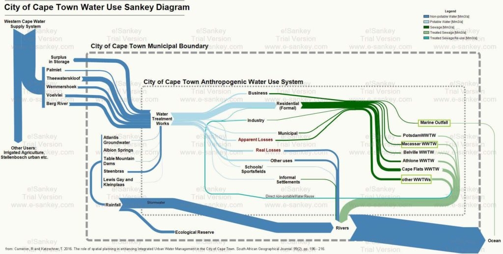
From a post ‘Cape Town’s water crisis : Towards a more water secure future’ on the Future Cape Town blog comes this Sankey diagram on the water use in the city of Cape Town (South Africa).
The author of the diagram, Rebecca Cameron, is with MCA Urban and Environmental Planners and looks at how Cape Town could transition towards a more water secure future. This Sankey diagram was originally published in her article Cameron, R and Katzschner, T. 2016. The role of spatial planning in enhancing Integrated Urban Water Management in the City of Cape Town. South African Geographical Journal. 99(2), pp. 196 – 216.
Absolute flow values are not given in this version of the Sankey diagram. Flows are in million cubic metres per year (Mm³/a). Water from five different sources outside the municipality feed the city of Cape Town, as well as five sources within the city. A breakdown of water supplied by the municipal water works is shown. Additional color coding of the arows indicate water quality (dark green = sewage, light green = treated water).
The author explains:
“This diagram is helpful in that it places all aspects of the water system in to one diagram. Here, water supply, water use, wastewater treatment and stormwater have been considered as a single system where too often the urban water cycle is fragmented when addressed within different sectors. The arrows of flow follow a key to represent the quantity and quality of water. The size of the arrow of flow is proportionally indicative of the quantity of water that flows from one process to one another. The colour of the arrows indicates the quality of the water flow; this includes non-potable, potable, sewage, treated sewage, and treated sewage for reuse. This is important to represent as, to intervene in an urban water cycle, both quantity and quality of water must be considered and used appropriately to move towards a more efficient and sustainable water system.”
From the rivers most of the water goes to the ocean. Through evaporation and precipiation it (hopefully) replenishes the reservoirs again that feed the city (this last part not shown in the diagram).
Paper Factory Wastewater, Patent
Browsing Google Patents can be fun, if you like long sentences… It also sometimes reveals a hand-drawn Sankey diagram, like this one:
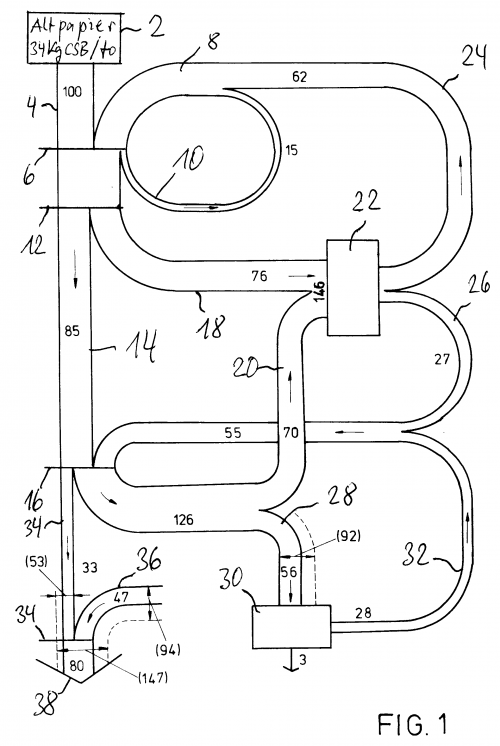
This is from a patent filing EP 0494399 A1 on “Process to direct and treat production waters in a paper factory with installation for treatment of waste paper” by German inventor Wilhelm Menges.
The diagram is for a paper recycling process. The “thickening filtrate arising from the dispersion of waste paper is directly fed to a biological waste water” treatment. This reduces the COD levels.
Flow quantities are shown in printed numbers. A lot of hand-written numbers refer to process elements.
Efficient Water Use in Saudi-Arabia
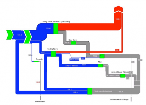
Consumption of water resources in arid and semi-arid areas has become an important issue over the last years. The Wafeer water conservation project is trying to raise awareness and educate people in Saudi-Arabian industry in regard to the efficient use of water. On page 21 of their Water Efficiency Manual, the following Sankey diagram can be found:
The report describes that “Sankey diagrams enable visual representation of both quantitative and qualitative characteristics of water entering and leaving different activities and therefore serve as a good communication aid.”
The above diagram does not show any unit, but presumably is meant to be in cubic metres (per year?). It shows water (blue) and waste water (grey) flows, as well as evaporation losses (red).
More water Sankey diagrams of similar style can be found on pages 19 through 23 in this workshop presentation on ‘The Importance of and Difficulties in Water Accounting’.
More Merry-Go-Sankey Diagrams
After writing about VisioGuy’s radial Sankey diagram idea, I went through my bookmarks and collection of Sankey diagrams in search of further candidates for this special class of circular flow graphs.
Here are two goodies… 😉
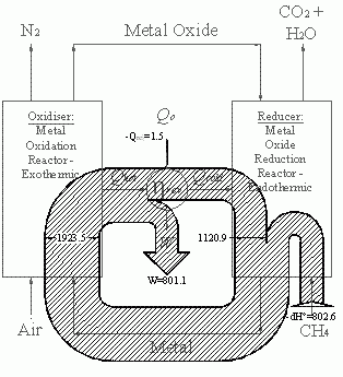
Below is a black/white Sankey diagram of energy fluxes in a chemical loop combustion cycle from an Imperial College website. It is similar to the radial one Chris designed, however it is not exactly circular. Not all of the entries and exits of the cycle are shown as Sankey arrows. The exit of the arrow labeled W is to the center (would one call this anticentrifugal?). The methane input makes a U-turn before entering the loop.
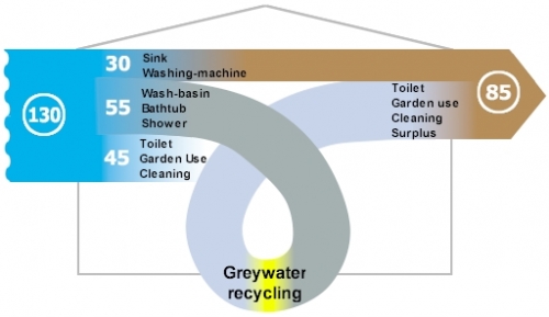
The other Sankey diagram is from this website of a U.K. based company, and shows greywater recycling. The average consumption of freshwater per person / per day in the UK was 130 litres in 1996.
The water from wash-basins, shower and bathtub could go through a recycling stage and be reused for flushing and watering the garden. The designer gave it a roller coaster style loop, which sure doesn’t add to the information content of the graphic, but immediately draws the reader’s attention to the recycling. I am not sure where the third flow coming from the right goes to. It represents the potential savings of 45 litres/day, but kind of disappears behind the loop.
I’ll post more of these as I come across them.
Water Flows in Electro Plating
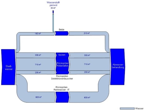
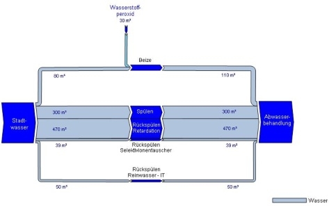
Austrian consulting company Stenum has revamped their Sankey Editor 2008 website a little bit, and they added new sample Sankey diagrams. The ones shown below are for the water flows of an electro-plating factory before and after optimization.
before:
after:
The diagram is in German, but I can understand as much as this: All flows are in cubic metres. Apart from the hydrogen peroxide flow entering from the top the flows shown all run from the source (water supply) to the sink (waste water treatment), the nodes in the middle (flushing, backflushing?) are the actual breakdown of the water flows. These nodes are adapted to the arrow width – a nice feature.
On top of that, blue seems the right choice for both water and H2O2 flows.
COD loads in Wastewater Treatment Plant
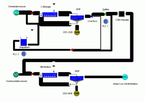
This Sankey diagram shows COD (chemical oxygen demand) in a waste water treatment plant that handles both municipal waste water as well as effluents from a chemical plant.
It was generated using the software package STOAT, which allows for dynamic simulation of wastewater treatment plants. Image with kind permission of Berlin-based EnviaTec GmbH.
The Sankey diagram does not show any flow quantities explicitly, and the values seem to be clustered into five or six fixed arrow magnitudes. The flows have a flat arrow base, and a rounded arrow head, which is uncommon, but still let’s you determine the flow direction. Process clipart icons overlay the nodes, where flows branch off or merge.
I have added the STOAT model to the list of software tools with Sankey drawing capabilities.
