Interesting blog post by Steve Wexler of Data Revelations. Long article, long title: “Circles, Labels, Colors, Legends, and Sankey Diagrams – Ask These Three Questions”.
The really interesting part for the Sankey diagram aficionados is Steve’s advice on when to use Sankey diagrams, and when you should avoid using them.
Steve illustrates his point with the below example by ‘Music Major – Data Miner’ Jeffrey A. Shaffer (original post is here)
A combination of a stacked bar chart with a distribution diagram, nicely decorated with a trumpet … “Within this context, this very creative chart works”, Steve writes.
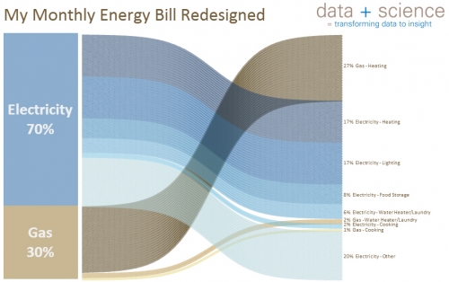
He then goes on and shows another one by Shaffer, also a distribution diagram: the original pie chart data from an energy bill has been redesigned and was presented as a distribution diagram (two stacked bars with bands to link them)
In this case, Steve concludes, the choice of a Sankey diagram is maybe not that wise, since the actual important information (44% of energy cost is for heating) doesn’t really come across quickly and clearly. A bar chart might work better here. Sankey diagrams can create a “cool!” or a “crap!” response, depending on the context. See the original Shaffer post here.
Adding my 2c from a technical perspective I would say that both diagrams have a shortcoming: The bands don’t maintain their width as they cross over the others diagonally. Somewhat acceptable in the trumpet diagram as the right bar on the right side listing the music composers is higher than the one at trumpet bell (sound spreading out). Not acceptable in the second diagram where the two stacked bars have the same height. This is obviously an error in the curve radius calculation (read ‘The Math Behind those Curves’)

