Tag: map

1913 public transport 3D map

Leafing through Brinton’s 1914 book ‘Graphic methods for presenting facts’ I found this example of a 3D map that has elements of a Sankey diagram.

This map (photo taken from an exhibit at a 1913 exhibition) shows passenger numbers on the Frankfurt streetcar lines (back then when trams were still called streetcars!)


Brinton explains that “we have a map presentation in which quantities are represented by building vertically above the various routes laid out on the map … made by strips of wood, alternately black and white, glued carefully above each one of the street-car routes. Each of the strips of wood represents 4,000 passengers carried on the street-car lines in 24 hours” (page 224).

The built up flows showing passenger numbers would, if laid sideways, indeed make a Sankey diagram. Building them up using the third map dimension avoids the issue of dealing with wide Sankey arrows in a dense city center, where passenger numbers are highest.

Brinton’s book, although over 105 years from its publication still makes for a great read (as does his 1939 book on ‘Graphic Presentation’, which is basically a sample book for doing infographics).
Interprovincial Migration Flows Canada

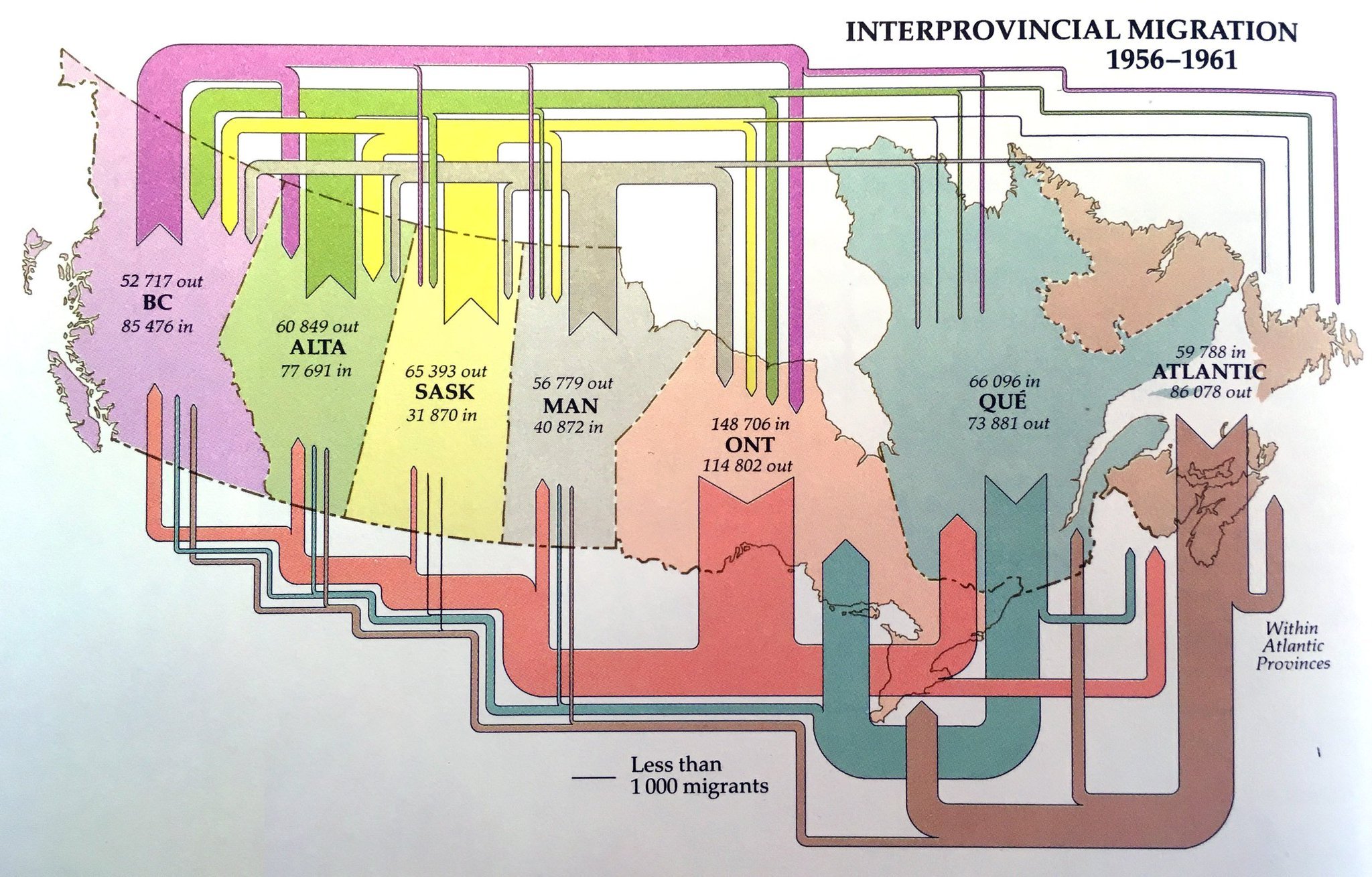
From the museum of Sankey diagrams comes this beautiful visualization of migration flows between Canadian provinces in the years 1956 to 1961. Sorry but I didn’t note the source… still wanted to share it with you.


Unfortunately, flows are not to scale: compare, for example, the exits from the Atlantic provinces in the period (86,078 people) which should have an arrow similar to the inflow of 85,476 to British Columbia. Or look at the exodus from Ontario provice, which seemingly is larger than the influx to the provice (but in fact is smaller).

MapProvision Sankey Overlay

MapProvision is an online service to present data as dynamic layers on an online map. They have now added an Sankey overlay feature.

This screengrab is a from a sample provided by them using World Trade Organization import and export data for 2017.


Here I have selected imports of machinery being imported to Mexico. Flows displayed are based on value of the goods in mio US$ per year. Hovering over the arrows reveals detailed data, a summary of imports for the selected category is shown when hovering over the bracket at the destination.

This comprehensive blog post has more details on how to adapt the Sankey overlay and the different options you have, including color settings and minimum width for Sankey arrows. It also contains an embedded example for fish import to Japan.

Nice work and fun to play around with. Doing Sankey diagrams on a map is particularly challenging in my opinion due to routing issues and because in many cases trade flows between neighbouring countries tend to be high volume, so that the shortest Sankey arrow paths are typically the widest ones (as is the case with the U.S. here).

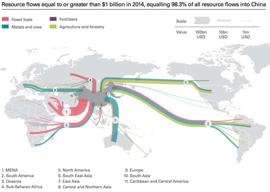
Resource Imports into China 2014

With all the news and discussions about trade balance and tariffs and exports of goods from China to the U.S. we mustn’t forget that China is also a large importer of resources from all over the world.

The below Sankey diagram is a good visualization of the resource dependencies and import such as fossil fuels, minerals and ores, as well as agricultural / forestry products. I found it in an article on the Diálogo Chino blog but it was originally published in a 2016 report ‘Navigating the New Normal: China and Global Resource Governance’ by Wei Jigang et. al. published jointly by Development Research Center (DRC) of the State Council of the People’s Republic of China and The Royal Institute of International Affairs Chatham House. The image from an article ‘Will China’s new Silk Road be green?’ by Lily Pike on Diálogo Chino is republished under a Creative Commons license.

All Sankey arrows run towards China (imports in 2014) and flows are color-coded to show the resource type. There are no absolute numbers, but the value of goods imported in billions of USD is represented with a clustered scale that shows three representatives 100 bn USD, 10 bn USD, and 1 bn USD. The largest (in terms of value) stream is from the Middle East, while Latin America and Australia are the second and third largest regions delivering resources to China.

The original report is here with the image on page 64 and more detail on the data.

World Oil Flows Map

Did a clean up some of my hard disks and came across a number of gems I had saved. Unfortunately I hadn’t noted the sources for all of them.

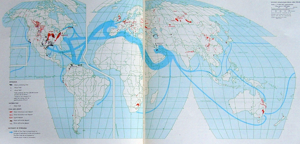
Here is one of these. A photo of two facing pages in a book depicting world oil streams. You can find more Sankey diagrams on maps here on the blog if you search for the tag ‘map’. This one is different though, as it uses a special map projection (probably Goode homolosine) with a cut along the Atlantic and Hawai’i as an inset.


Unfortunately I do not know from which book that was taken. Neither do I know the year of reference or the unit of measure for the flows. We can see the oil shipments mainly starting from the Middle East and Venezuela with Europe and the U.S. as main destination markets. Additionally, areas where coal, natural gas and petroleum are extracted are marked on the land areas.

In the botton left corner the legend reads for “Movement of petroleum”: Width of flow lines is proportional to tonnage of petroleum (crude and products). The flow lines do not necessarily indicate exact routes of movement’

European Energy Transport Capacity 2030

This is an interesting kind-of-a-Sankey figure. Back in August I had posted on Nordic Transport Energy in 2050 with two Sankey diagrams from the ‘Nordic Energy Technology Perspectives 2016’ report published by IEA.

The topic of this diagram (taken from the same report) is the energy transmission or transport capacity between different regions in Europe and covering the area of the European Network of Transmission System Operators (ENTSO-E).


© OECD/IEA 2016 Nordic Energy Technology Perspectives 2016, IEA Publishing. Licence: www.iea.org/t&c

To visualize transmission capacity, Europe has been cut into energy regions, and a gap has been inserted between them to be able to distinguish them better. The width of the “bridges” represent the available energy transport capacity between these regions in 2030.

Some countries are divided into several energy producing regions. For example, if you look at Sweden, it is divided into SE_N1, SE_N2, SE_M and SE_S.

The bands are non-directional, so we do not know which region delivers to which region. And probably the energy transport will be able to go in both directions.

Check out the full report here.

Minerals Exports from Latin America

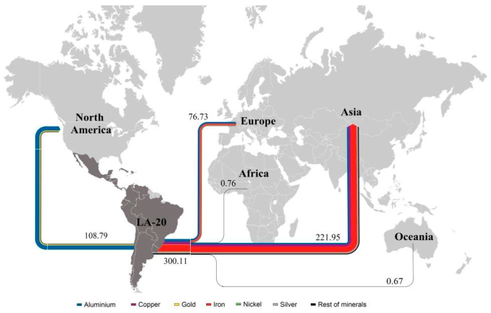
Another Sankey diagram from the article ‘Exergoecology Assessment of Mineral Exports from Latin America: Beyond a Tonnage Perspective’ by Jose-Luis Palacios I discussed in this recent post.

Non-fuel minerals exported in 2013 from Latin America to other continents. Flows are in Mtoe (for the reason why these flows are measured with a typical energy unit and to learn about the ERC approach read the article). Due to the scale, some minerals can not be seen as individual flows in the Sankey diagram and are thus grouped as ‘Rest of Minerals’ (black stream).

US Trade Flows, yet another option

After showing two variants for visualizing the U.S trade balance in my last post, I got aware of yet another option. The first figure (infographic by Spiegel Online) used the length of the arrows to express the value of imported and exported goods. My remake version used the magitude (width) of the arrows, as is typical for Sankey diagrams.

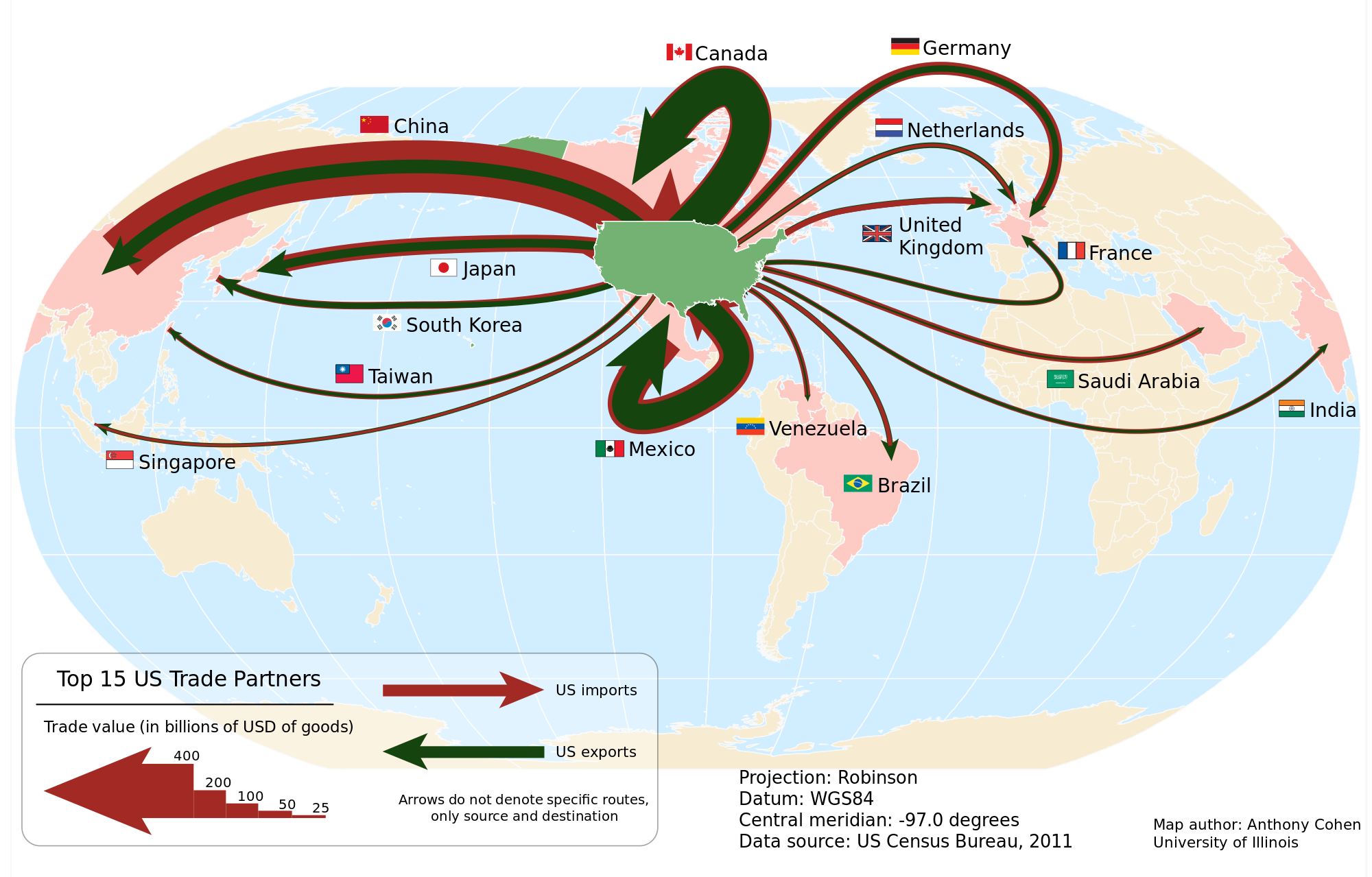
In this figure (by Anthony Cohen, University of Illinois, 2012 / Wikicommons) for US trade in 2011 the arrows for import (red) and export (green) are proportional to the total value of goods, just as we are used to see it in a Sankey diagram. But the arrows are superimposed, with the narrower green export arrow on top of the wider red import arrow. This creates another, somewhat more dramatic impression.

Data shown is for 2011 in billion USD for the 15 most important trade partners. Arrows are not labeled with absolute figures, instead a legend at the bottom indicates the width of five default arrows. The arrow from and to Mexico is a problem (no joke intended!), but the legend clarifies that arrows don’t indicate a specific geographic routing.