Tag: U.S.

Trump’s Twitter Attacks Sankeyfied, Axios

Couldn’t help but laugh, despite the seriousness of the topic.

Lazaro Gamio of Axios, a “new media company delivering vital, trustworthy news (…) with expertise, voice AND smart brevity”, has created this Sankey diagram infographic to illustrate the Twitter attacks by Trump and who they were targeting. Shown in a blog post by Axios’ Stef Knight.


via Dataviz blog

Very comical use of Sankey diagrams. I love the red tie and just imagine how it will continue to move out to the right shoulder as POTUS’ Twitter attacks on the media continue. Great!

Feed-to-Food caloric flux Sankey diagram

Another way to look at energy flows! Here is a Sankey diagram of US feed-to-food caloric flux. This is from a paper by Shepon et.al. titled ‘Energy and protein feed-to-food conversion efficiencies in the US and potential food security gains from dietary changes’ published October 2016 in Environmental Research Letters (Environ. Res. Lett. 11 (2016) 105002 – doi:10.1088/1748-9326/11/10/105002) under Creative Commons CC 3.0

Flows are in Pcal (Peta calories, 1012 kcal). Production figures are based on data from U.S. National Research Council and a “Mean American Diet” (MAD) with an average consumption of 2500 kcal per day is used. We can see energy in three feed classes being transformed into energy in edible animal products. The authors explain:

“On the right, parenthetical percentages are the food-out/feed-in caloric conversion efficiencies of individual livestock categories. (…) Overall, 1187 Pcal of feed are converted into 83 Pcal edible animal products, reflecting a weighted mean conversion efficiency of approximately 7%.”

In light of this, energy conversion efficiencies of 30-40% seem to be fantastic…

Check out the article for another Sankey diagram of protein flux.

US Trade Flows, yet another option

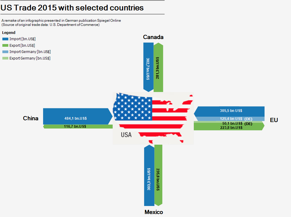
After showing two variants for visualizing the U.S trade balance in my last post, I got aware of yet another option. The first figure (infographic by Spiegel Online) used the length of the arrows to express the value of imported and exported goods. My remake version used the magitude (width) of the arrows, as is typical for Sankey diagrams.

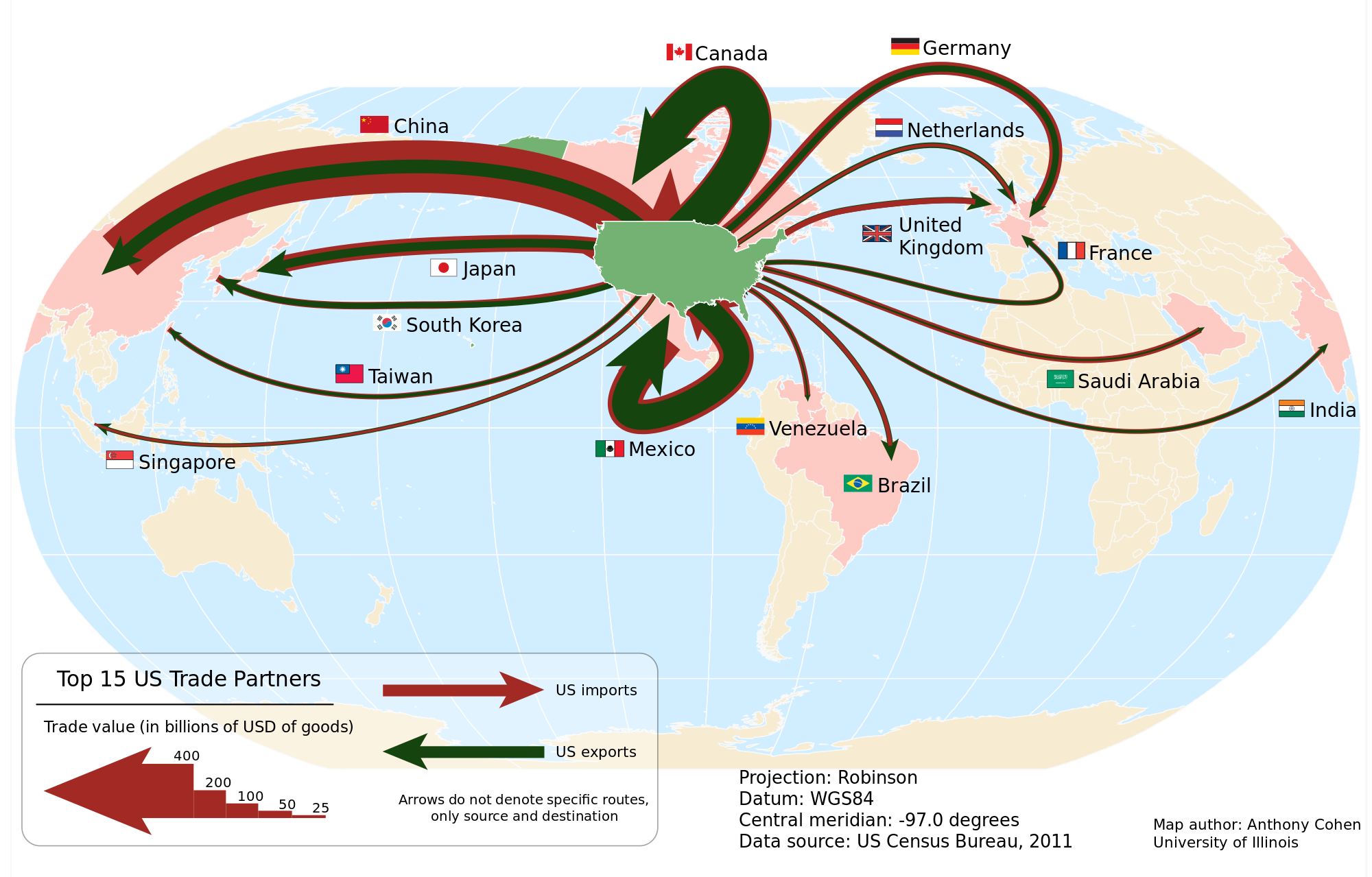
In this figure (by Anthony Cohen, University of Illinois, 2012 / Wikicommons) for US trade in 2011 the arrows for import (red) and export (green) are proportional to the total value of goods, just as we are used to see it in a Sankey diagram. But the arrows are superimposed, with the narrower green export arrow on top of the wider red import arrow. This creates another, somewhat more dramatic impression.

Data shown is for 2011 in billion USD for the 15 most important trade partners. Arrows are not labeled with absolute figures, instead a legend at the bottom indicates the width of five default arrows. The arrow from and to Mexico is a problem (no joke intended!), but the legend clarifies that arrows don’t indicate a specific geographic routing.

US Trade Balance, two versions

When German Chancellor Angela Merkel meets with POTUS today, one topic that’s most likely going to be addressed is the trade deficit between the United States and the EU, Germany in particular.

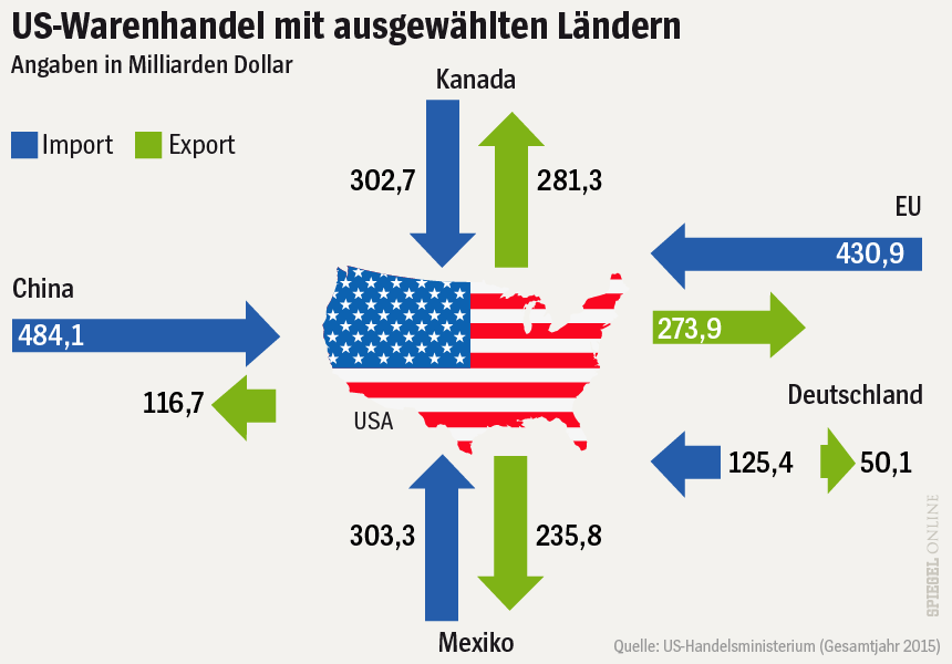
The Spiegel, a major German news outlet, has illustrated recent articles on this subject with the figure below. It shows the volume of trade between the United States and ‘selected countries’ (China, Canada, Mexico and the EU) in 2015. The values indicate the value of goods exported (green arrows) to these countries, and imported (blue) from them into the U.S. in billion US$.


Source: Spiegel Online

The interesting thing in this infographic is that the length of the arrows represents the value of goods traded. For example, the arrow for exports from the US to Europe (274 bnUS$ in 2015) is little over half the length of the blue incoming arrow (431 bnUS$ in 2015). This works fine, with the only exception being the green arrow for exports to Mexico.

This infographic of course invited a remake as Sankey diagram. As you all know, in Sankey diagrams the widths of the arrows represent the quantity.

I did two or three different versions, all very similar to the original infographic in style and color, even using the lower states map icon (sorry Alaska and Hawaii). I was not sure at first whether the separate arrows for Germany were values already included in the EU trade volume, or if they were meant to be on top of it. A quick look into the original data revealed that indeed they are included in the EU figures already. I therefore decided to highlight the German share in the Sankey diagram with a slightly brighter color, but keep those arrows stacked.

Here is my Sankey diagram version of the Spiegel infographic.

Not sure which version I prefer, but using the length instead the widths of the arrows to represent the flow quantity is definitely a unique approach. Worth sharing with you, I think.
Flow of Resources in Large Organizations

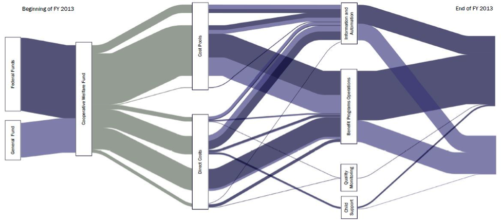
A group of people from Idaho’s Office of Performance Evaluations, an independent agency of the state, have contributed a post to the AEA365 blog – A Tip-a-Day by and for Evaluators back in June 2014.

Rakesh Mohan, Lance McCleve, Tony Grange, Bryon Welch, and Margaret Campbell recommend Sankey diagrams as “A Cool Tool for Explaining the Complex Flow of Resources in Large Organizations”

“Communicating the flow of dollars was the trickiest piece of the study. We considered narratives, tables, and traditional flowcharts. Ultimately, we used Sankey diagrams that helped stakeholders visualize funds moving through the department making them the most useful features of our report.”

The Sankey diagram depicted shows Idaho state funds in FY2013. Although the absolute figures or the total sum are not shown in this figure, the diagram is most likely based on real budget data.

University of Maryland, CHHP system

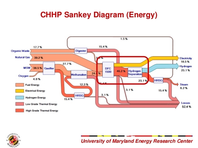
This Sankey diagram is from a presentation by a student team of University of Maryland. They participated in a Hydrogen Student Design Contest in 2011/2012 sponsored by the Department of Energy

The Sankey diagram is for a combined heat, hydrogen, and power (CHHP) system for the UoMD campus.

Flows don’t depict absolute values, but rather how the fuel input (municipal solid waste, organic waste, natural gas) is split into energy outputs (electricity, hydrogen, and steam). Losses (52.4%) at each process stage are shown as red arrows.