Month: May 2008

Article on Sankey Diagrams in JIE

A two-part article on ‘The Sankey Diagram in Energy and Material Flow Management’ was published in the Journal of Industrial Ecology (JIE). The author, Mario Schmidt is a professor at Pforzheim University in Germany. The first part focuses on the history of Sankey diagrams, while the second centers on ‘Methodology and Current Applications’.

Abstracts and links to the full articles are available at the publisher’s website.

Mario Schmidt (2008) The Sankey Diagram in Energy and Material Flow Management. Part I: History Journal of Industrial Ecology 12 (1) , 82–94 doi:10.1111/j.1530-9290.2008.00004.x

Mario Schmidt (2008) The Sankey Diagram in Energy and Material Flow Management. Part II: Methodology and Current Applications
Journal of Industrial Ecology 12 (2) , 173–185 doi:10.1111/j.1530-9290.2008.00015.x

I am not a subscriber, but maybe someone with access to these publications wishes to post a summary comment.
Visio Pre-Wired Sankey Diagram Shape

Visio Guy has been “messing around with … Sankey Diagram Shapes for Visio again — because [he] just couldn’t resist”. 😉

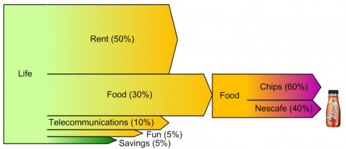
The result is a pre-wired Sankey diagram shape, in which five flows exit from a process box. The flows scale automatically according to the user input.

VG’s example is fun, showing cost of living and what money is being spent on. I just hope his food spendings don’t spread 60/40 on chips and coffee… 😀

Read the full blog post. There is a download link for this Visio shape at the end.

Estimated Budget Chart

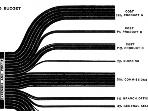
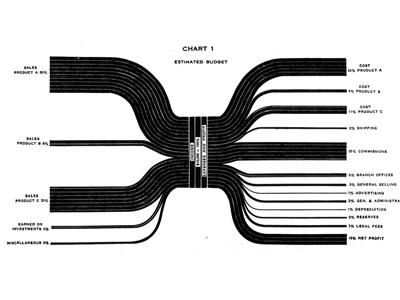
A similar Sankey-style diagram to the one I presented in my last post can be found on the visualcomplexity.com website.

It shows the estimated budgeted costs and earnings and was published by IBM back in 1940 (original source: H. Arkin, Graphs: How to make and use them (Harper & Brothers Publishers, New York, ed. Revised, 1940).

I am not sure if this fully qualifies as a Sankey diagram, since the flows are not directional. The earnings from sales of different products are broken down into arrows of different magnitude from/to the left. Costs for producing the products and overhead costs are on the right side. This chart thus constitutes a graphical representation of an accounting system, with values given in percent rather than as absolute figures.

These distribution diagrams are also known as ‘Spaghetti diagrams’. See this detail:

Manuel Lima’s visualcomplexity website has more interesting diagrams, and one can spend hours browsing the projects. I will be presenting a few more of them that qualify as Sankey diagrams here on the blog in the future.

Monthly Household Income and Spendings

Christian Behrens from the Department of Design at Potsdam University of Applied Sciences in Germany put up a website on Information Design Patterns. It features “design patterns that describe the functional aspects of graphical components for the display, behavior and user interaction of complex infographics”.

The website is modestly called an “application prototype” of a pattern browser, and is part of his Master Thesis titled “The Form of Facts and Figures”.

All patterns are tagged and can be searched. For each type he presents a fact sheet with description, usage, required data, and rationale. Christian provides an own example for each pattern, and a “real-world example” from an external source. Additionally, related diagram types are listed.

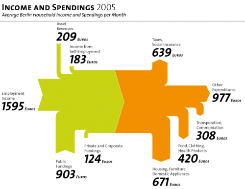
The Sankey diagram is A 5.1. The example shows the average income and spendings of a Berlin household in 2005. Salary, asset revenues and public subsidies make up for the total income, shown in green. The income is spent on taxes, housing, food, clothing and other, shown as orange arrows.

I do miss a number stating the total (3015 Euro, roughly 4500 US$) as a label for the magnitude in the middle, but nevertheless this is a superb example of information presentation with a Sankey diagram. Just try to imagine the same information shown as two pie charts…

Enjoy browsing the Information Design Patterns website.

Energy Sankey of a Fuel Cell

Cummins Power Generation and Versa Power Systems are teaming in the development of a Solid Oxide Fuel Cell (SOFC). The three-phase SECA project, funded by the DOE/NETL (US DOE SECA DE-FC26-01NT41244) has completed its first phase. A prototype (named Mission 1) has been developed that produced 3.2 kW of electrical power over 1500 hours test operation time, with an availability of 99%. The ultimate goal is to built a SOFC power system that provides 10 kW.

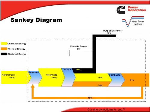
The Sankey diagram below is reproduced (courtesy of the author) from a presentation that summarizes the findings of the first phase of the project.

The Sankey diagram distinguishes chemical energy, thermal energy and electrical energy (as output) and shows the processes reformer, stack and combustor. Some of the heat from combustion can be recovered and used in the reformer. The orange arrow leaving the system at the right should actually be thinner, as 10% branches off. Unfortunately the arrow magnitudes in the diagram are not to scale, as can be seen between stack and reformer, where the magnitude of the chemical energy flow (yellow) is larger than the one of electrical energy (black), even though it is 36 % compared to 39%. The black arrow is also thicker at its tail than at its head.

Still, this is an attention-grabbing Sankey diagram, and an interesting research, which made me read more about fuel cells and solid oxide fuel cells (SOFC) in particular on Wikipedia.

Oil Exports visualized as Sankey Diagram

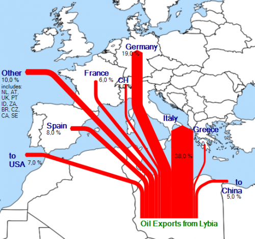
After my posts on visualizing Rotterdam port’s imports/exports and on Internet traffic maps, I have started to experiment with showing the export quantities and destinations for a certain trade good.

I wanted to do a Saudia-Arabia or Irak oil export Sankey map, but couldn’t find good data. I finally came across this summary on Lybian oil exports, and converted the data from the pie chart Lybian Oil Exports, by Destination, 2006 to a Sankey style export flow diagram.

It was new to me that “Libya has the largest proven oil reserves in Africa” with 41.5 billion barrels, and estimated net exports of 1.525 million barrels per day in 2006.

The underlying map is a crop from a World map found on Wikicommons. I think it could be a little more transparent though…