Month: November 2008

Sankey Diagrams for Carbon Footprint

I was pointed to an article on carbon footprint, that used Sankey diagrams to underline a method of carbon accounting along the supply chain. This article was part of the “first virtual global conference on climate change” CLIMATE 2008 that took place, yes, exclusively on the Internet from November 3 to 7, 2008. (I must admit that this event passed largely unnoticed by me, although reading some of the papers now gives me the impression that it would have merited more attention.)

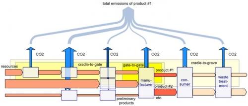
The paper titled “Carbon Accounting and Carbon Footprint – more than just diced results?” by Prof. Mario Schmidt from Pforzheim University describes the various approaches of corporate carbon accounting, carbon footprint of products, and Life Cycle Assessment LCA. Schmidt introduces a method that allows determining “cumulative emissions … at each point of the supply chain up to the POS”, and calls this the CO2 backpack.


The four Sankey diagrams above from the article illustrate the idea. They show (1) the CO2 equivalent emisisons along the supply chain, (2) the value added in a supply chain, (3) the relative CO2 emissions per value of product, and (4) the total emissions of the products along the supply chain with sectoral gate-to-gate, cradle-to-gate or crade-to-grave approaches.

This article is well worth reading, you should do so while it is still available online. Update: the domain has gone offline
Schmidt is an acclaimed expert in Sankey diagrams and has also published on the history and methodology of Sankey diagrams.

Visualizing Social Conditions

Came across densitydesign’s images on flickr and was really fascinated by the visualizations presented there.

Density Design is a research framework and an experimental laboratory, born as a laboratory course in the final year of the Master Degree Course in Communication Design at the Politecnico di Milano.

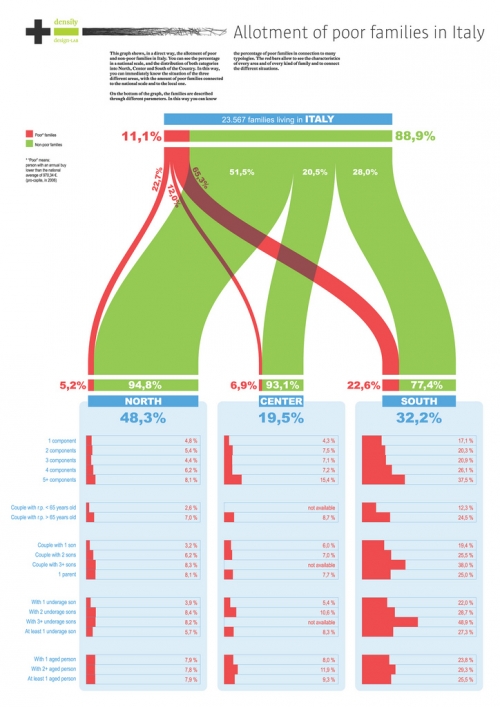
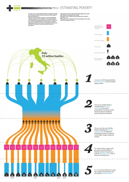
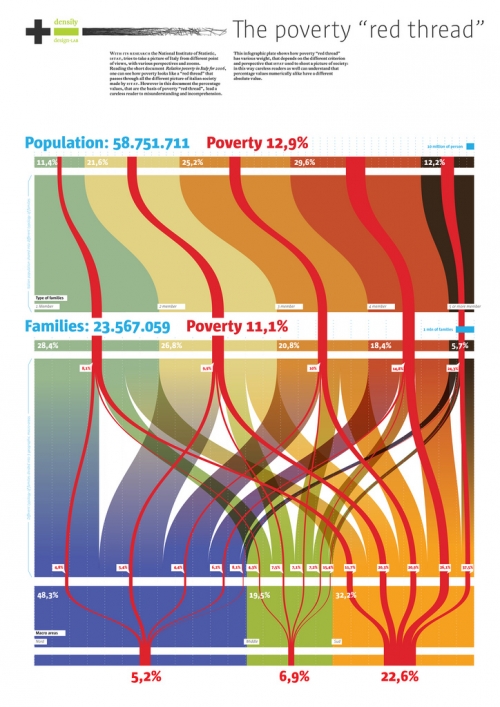
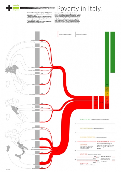
One of their recent projects was on social conditions and poverty in Italy. Some of the visualizations that were created in the course of this project resemble Sankey diagrams, and this is why I thought I should share them with you.


The designers had several dimensions of information they wanted to put into the visualization of statistical data on poverty in Italy. The four shown above chose bands of proportional widths to display the numbers rather than pie charts. In contrast to Sankey diagrams these are not flows, because they are not directed. The works by Luca Rossi (2nd above) and Elena Capolongo (4th above, my personal favourite) try to link the quantities to regions using a map of Italy.

A nice followup project would be to display the migration movements from Southern Italy to the North and abroad due to the social conditions, as previously reported about here.

Density Design has kindly granted permission to show these visualizations here. Read the summary (Project progress report 01. Economic statistic & Communication Design) and learn about their other projects on the Density Design blog. I am adding them to the blogroll too.

Lying with Sankey diagrams (3)

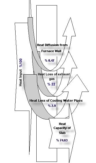
Found this Sankey-like diagram accompanying an abstract submitted for the 2001 International Conference on Thermal Engineering and Thermogrammetry. Posting it here on the blog before this site eventually vanishes. This Sankey diagram is a good example of how not to draw Sankey diagrams, I think. Or, as a Japanese friend would put it politely: “Maybe… [turn head at 30° degree angle, make slight air-sucking noise by inhaling through open mouth] … maybe not so good”.

Here’s the diagram:

The idea was to display heat losses at a slab furnace in a Turkish steel plant. Heat losses were identified in exhaust gases (22 %), at the cooling pipes (2.90 %), and at the furnace walls (0.47 %).

The fact that the widths of the arrows displaying the heat losses were chosen arbitrarily give a completely wrong idea of the proportions. The powerpointish curved arrows don’t really contribute to a better understanding.

All in all, not a very good one. Adding this to my “Lying with Sankey diagrams” mini series (see part 1, part 2), which has been neglected recently.

Sankey Diagram Art

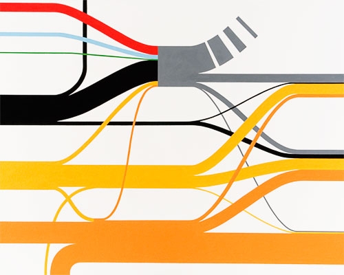
Never thought that Sankey diagrams would inspire artwork, but here you go.

Whitey Flagg (check out the cool ASCII navigation on the front page, based on the NYC subway map!) uses satellite images, maps, info graphics, and the like as a model for his oil on canvas or acrylic paintings.

Here are some Sankey diagram artwork samples: The first is called “Energy Flow” (60.5” x 60”), the second “Water Flow” (42” x 75”), the last one “Carbon Emissions” (64” x 80”).

No. 1

No. 2

No. 3

All artwork is available for sale, so if you want to enjoy a real oil Sankey diagram, and have an appartment big enough to hang it, you can contact the artist. Also, check out the other paintings on his website.