Month: December 2012

Losses Along the Energy Chain

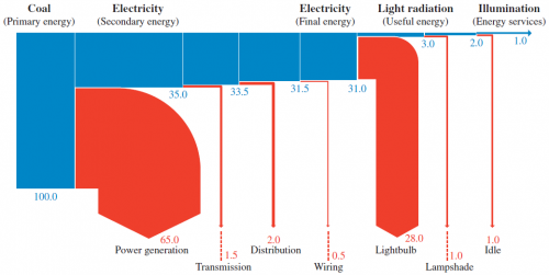
As a followup to last week’s post on a Sankey diagram from the GEA report. here is another one from the very same report (GEA, 2012: Global Energy Assessment – Toward a Sustainable Future, Cambridge University Press, Cambridge UK and New York, NY, USA and the International Institute for Applied Systems Analysis, Laxenburg, Austria).

This one is an example for losses along the energy supply chain.

The description of the diagram on pp. 116/117 says:

“As an example of energy chain efficiency, Figure 1.13 illustrates the energy flows in the supply chain for illumination services (lighting). In this example, electricity is generated from coal in a thermal power station and transmitted and distributed to the point of end-use, where it is converted to light radiation by means of an incandescent light bulb. Only about 1% of the primary energy is transformed to illumination services provided to the end-user.”

The Sankey diagram shows the primary energy as 100% on the left and branches out the losses at each conversion/transmission step. The actual useful energy (the “energy service” of providing illumination) is only 1%. So in this example one unit of energy service requires 100 units of primary energy, clearly pointing to “abundant opportunities for improving efficiency exist at every link in the energy chain” (p. 116).

I have presented a similar Sankey diagram here before, see this 2007 post ‘What it takes to power a bulb’.

GEA Report: Global Energy Flow Sankey

Blog reader Johannes sent an e-mail, advising me that the 2012 GEA Report (GEA, 2012: Global Energy Assessment – Toward a Sustainable Future, Cambridge University Press, Cambridge UK and New York, NY, USA and the International Institute for Applied Systems Analysis, Laxenburg, Austria) has many Sankey diagrams worth checking out. Thanks! I downloaded this 1865 page (!) report (link, caution large 188 MB file!) from the IIASA website.

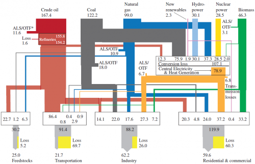
Here is one of the Sankey diagrams featured in the report.

This is a diagram for global energy flows in exajoule (1 EJ = 10E18 joules) “from primary to useful energy by primary resource input, energy carrier (fuels), and end-use sector applications in 2005”.

Similar national energy flow diagrams I have featured here typically are left-to-right oriented, but the structure is similar. Flow quantities are mostly shown as entry flows on the nodes (boxes). Losses displayed in yellow next to the grey exits at the bottom.

U-turn Sankey arrows

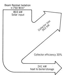
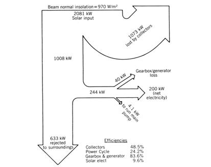
This legacy article on ‘Solar Energy System and Design’ by W.B. Stine and R.W. Harrigan (published in 1985 already) has four Sankey diagrams for energy flows in a solar power system.

The old-school black&white Sankey diagrams depicted have a general vertical orientation, and some flows branch out to the left of the general flow direction. This is OK, but the first branch flow bends with an angle larger than 90° degrees, performing an almost U-turn.

In the next diagram this idea is doomed to fail as the Sankey arrow to the left is wider than the one going straight on, and the initial parallel segment is much too short.

Additionally in this second Sankey diagram the two arrows at the bottom don’t add up with their flow quantities correctly (633 kW + 244 kW is not 1008 kW).