Category: General

Energy Efficiency made in Hesse

An English-language publication ‘A Practical Guide to Energy Efficiency in Production Processes’ published by the Ministry of Economics, Energy, Transport, Urban and Regional Development of the federal German state Hesse (PDF here) describes a structured approach and methodological toolbox to increase energy efficiency in large manufacturing companies. It also contains practical recommendations.

The below Sankey diagrams are based on data from a pilot implementation (“model project”) at a plastics manufacturer.

This is the Sankey diagram for the energy consumption (electricity and gas) in the existing (baseline) scenario

… and for one of the alternatives assessed in the project:

In this alternative scenario, heat is produced from natural gas rather than from electricity, thus reducing transformation losses. Heat recovery measures are also implemented. Flow values are in MWh per year for a given average production volume.

A second alternative scenario with trigeneration is also evaluated (see pp. 43-45 in the report) and potential cost savings and payback time are discussed.

From a design perspective the Sankey diagrams are quite okay, well structured. Some flaws can be noted in arrow segments that run diagonally, where the width of the arrow is not maintained. Overall energy supply and consumption are not shown in the diagram, but only individual values.
A Necessary Disclaimer

I feel it is necessary to tell you about some recent developments…

Earlier this year I was approached by a friendly person from ifu Hamburg. They are the maker of the e!Sankey software. I have been using e!Sankey for many years now for doing most of my own Sankey diagrams. Actually they had been in contact with me before, occasionally commenting on my posts and also asking me to be a beta tester for their version e!Sankey 3 pro back in 2011.

So I was happy that they asked me to become a beta tester for the new version 4 again. That was in summer and I was lucky to be one of the first to use this new software.

At the same time they were offering me a deal to support my blog. They will be paying for a banner ad here on sankey-diagrams.com and have also comissioned a series of Sankey diagrams done with e!Sankey 4. These diagrams will be made available to e!Sankey users for download. I will use the payment I get to cover my ISP and domain fees. I think it is fair to inform my readers about this endorsement, and hope to be able to stay independent and unbiased.

Wikibudgets: Free Sankey Builder Web App

Steve from wikibudgets.org posted a comment calling attention to a new free web app they have launched on their website.

This is a straight-forward drawing tool for simple left-to-right distribution diagrams. On the website just pick a node (called “budget” there) and an arrow (called “transfer”), add amount, choose color. The elements can be dragged freely in the browser window. Easy zooming with mouse wheel or double-click on an element. The ‘Save Image’ command from the browser’s context menu lets you store a PNG file.

The motto of wikibudgets.org is to “Visualise public budgets. Rationalise politics. Tackle Corruption. Eliminate waste. Fight bureaucracy.” The Sankey diagrams everyone can produce with this tool aim at visualizing financial transfers in US$.

According to the wikibudgets.org blog this is a first early release of the open source Sankey app for desktop UI. Touch friendly editing for mobile devices is under development.

Added to the list of Sankey software.

Integration of Sankey diagrams, e!Sankey

Found out via the news feed from ifu Hamburg, maker of e!Sankey that they have released an SDK based on e!Sankey that allows software makers to integrate Sankey visualizations into their application.

Two main features help to achieve this: (1) building Sankey diagrams from an XML file that contains structural and layout information (2) feeding values into a Sankey diagram template by reading ID/value pairs from a CSV file.

From Sankey diagram to infographic

I really liked Will Stahl-Timmins’ article on how he developed an infographic on energy consumption in a city.

Will’s blog is called ‘Seeing is Believing’ and his central claim is that information graphics are “the visual transformation of data into understanding”. I agree: infographics are more than just a diagram and labels. They are much more “visual” and their design elements add to a better understanding. Diagrams convey data, infographics convey information. Typically they also have a broader audience: you would find a diagram in a scientific paper, but an infographic in a daily newspaper.

The article ‘Visualising city energy policies’ gives a very good insight into the reasoning of an infographer/designer when creating an infographic. Will describes how he started out from an ordinary Sankey diagram, to get to an infographic step-by-step. This involved studies of different alternatives, sketches on paper, discussions with colleagues, presentations, and many different versions of the infographic in Illustrator…

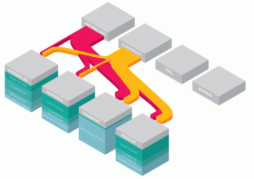
He experimented with an isometric or what he calls a “pseudo-3D” perspective, but also discovered some shortcomings in using them.

Crossing arrows were an issue. So were the stacked nodes (cubes) that hid parts of flows and were difficult to label.

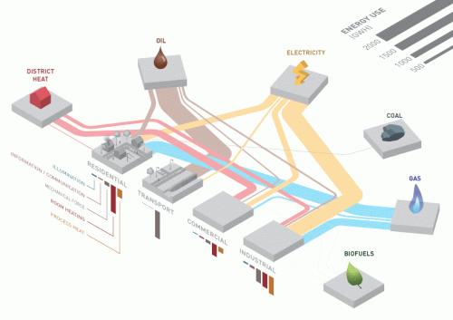
The “intermediate” outcome of his meticulous work was the below infographic. It seemed to have been a long learning process to achieve this result.

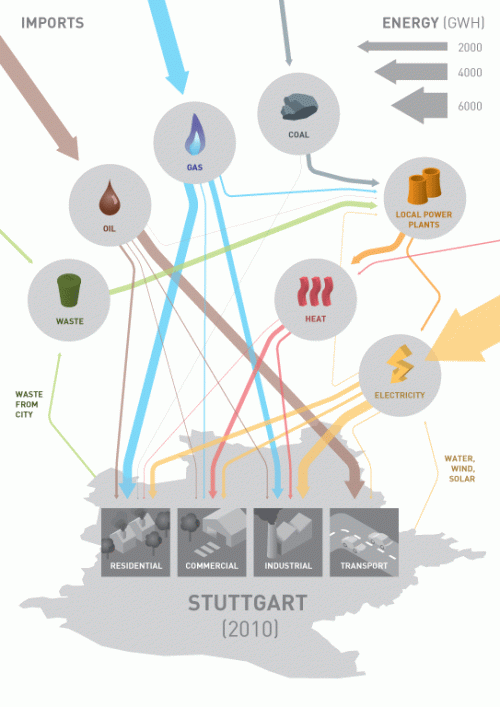
Will went on to include feedback he had gotten from fellow researchers, and decided to add more information on imported energy. At the same time he had to reduce the level of detail. This is the final infographic.

Good work, I think! The resulting infographic is not a genuine Sankey diagram anymore. There are only three arrow widths left, quantities are clustered in these groups. But as I said, an infographic has a different purpose.

It is not mentioned clearly how this infographic will finally be used, and who the target audience is. I imagine it will be used as an illustration in a brochure that summarizes the findings of the URGENCHE project, but to a wider, non-technical audience.

Make sure you read the full blog post at ‘Seeing is Believing’.