Category: Methodology

Making it look nicer…

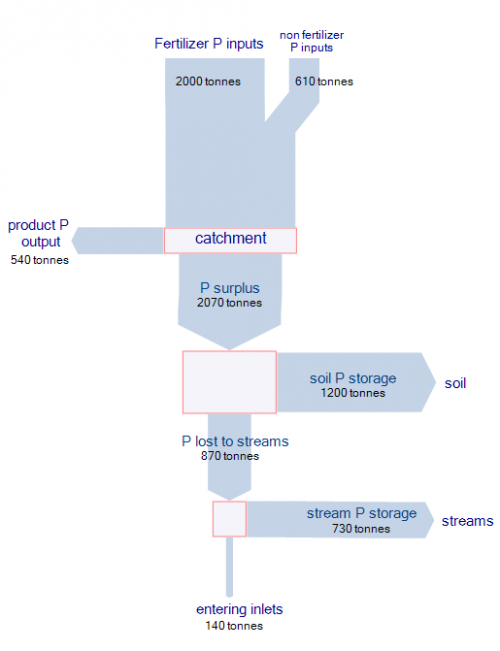
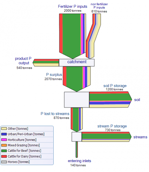
Reading on one of my favorite blogs actually made me take a harder stance on the Sankey diagram I presented in my last post. Following Kaiser’s attitude of making it better rather than only criticizing, I redesigned the Sankey diagram of phosphorus flows in the Peel-Harvey catchment area.

In the first version I didn’t differentiate the various sources of phosphorus, but only used one color for the overall flow quantity. Introducing nodes dramatically improves the comprehensibility and the mass balance check for the flows branching off sideways. There is some redundancy in the labeling of the flows, but I left it to stick as close to the original Sankey diagram as possible.

The second Sankey diagram is even closer to the original one. I tried to match the colors as much, and also introduced a legend. Please note that, since I didn’t have access to the raw data, I just approximated the flow values. Because of the multi flow arrows, I decided to leave a border line at each arrow, and to put heads to the first two input flows (‘fertiliser P input’ and ‘non fertiliser P input’) to better be able to distinguish them.
A different power Sankey diagram…

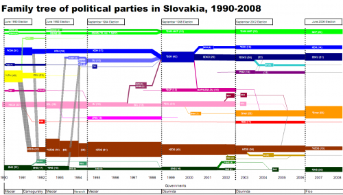
Kevin Deegan-Krause, an Associate Professor of Political Science at Wayne State University has contacted me with a fascinating idea and a unique example of a Sankey diagram. He writes: “I accidentally “reinvented” the Sankey wheel quite awhile ago for a rather odd usage: political party ebb and flow in E. Europe.”

This diagram he presented in a recent post on his Pozorblog shows how parliament seats were allocated to the different parties in the Slovakian parliament from 1990 to 2008, and how seats were shuffled during the six elections that took place during that time.

“As with energy, the number of party seats in parliament is a closed system and there are flows from some to others. This is a highly modified usage, of course, as we do not know in a precise way “where” votes go from one election to the next, so we just fudge at the day of election and just start over (or have invisible reallocations).”

Have a look, for example at the brown brown arrow: The HZDS party has clearly been on the loosing track. On the other hand SMER (shown in orange), a party that emerged as a spin-off from SDL (pink) in 2000, could gain a significant number of seats in the 2002 elections, when SDL couldn’t make it into Slovakian parliament any more. Others pretty much remained stable in their number of seats over the whole observation period.

I am not sure if Kevin uses the “official” colors of the parties (wouldn’t mind tossing my vote for the pink party 😉 ), but a color clustering would also allow to visualize if left, or right, or liberal, or whatever political direction gets stronger or weaker. It would also be a possibility to see, if there is an overall trend in a certain group of countries, such as Eastern Europe, or the apparent growth of socialism in South America.

I am calling for votes on how to name this special type of Sankey diagram. If the first Sankey diagram was for steam power, why not a power Sankey diagram? 😉

Sankey Chart or Sankey Graph?

User ‘taqua’ at jfree.org comments on another topic:

there is a fundamental difference between a *chart* and a *graph* or diagram.

A chart is a map of some data (like a city map, but for mass-data). It is a graphical visualization of tabular data. Charts are used for statistical purposes. Charts may be helpful to make mass data more understandable.

A graph is a graphical representation of a relationship between some objects or concepts. (In other words: A graph is a drawing that explains how something works or behaves.)

It is a common property of human languages, that terms get mixed, so you will find the word ‘chart’ in classical graph types, like ‘flow-chart’. Nonetheless, by sticking to the definitions above, it is easy to see that a flowchart is no chart at all – its a graph.

Taking this into consideration, a Sankey diagram can be considered both, a Sankey chart and a Sankey diagram. The quantities represented by the magnitude of the flow could also be shown as tabular data, the direction of the flow, given by the arrow orientation between two processes indicates a ‘from-to’-relationship.

Cost Sankey Diagrams show Added Value

While browsing through some of my older bookmarks I discovered this page of what seems to be an information portal of one of a German federal ministry. The Sankey diagram for cost flows they show reminded me of a feature in the Umberto material flow management software, which I always wanted to inspect in more detail.

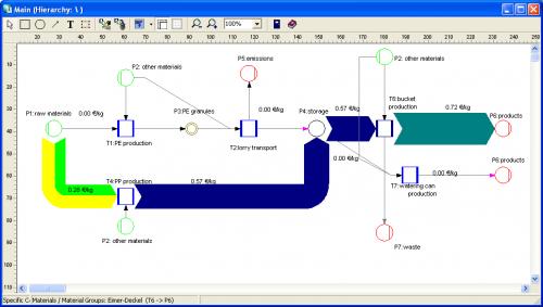
Using their 30-day trial version I worked with one of the simple demo examples they provide. Basically this software is a modeling tool for process systems and analysis of material flows within any kind of process system (production plant, supply chain, region, …). Sankey diagrams in Umberto are not the default view for material flows, but one can switch from the normal “Material Flow Network” view to the Sankey view.

Even though the Sankey diagram feature of the software would need some retouching, I was surprised and extremely pleased to see a “Cost Sankey” feature.

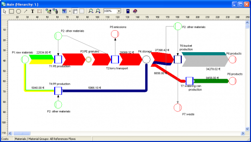
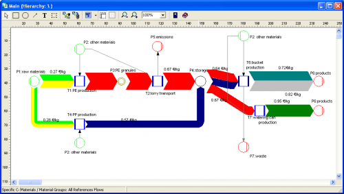
You can enter material direct cost for all materials (in the ‘bucket factory’ example of the demo all materials already have a “market price” property), as well as fixed and variable process costs. The variable process costs are spread over the process throughput using ‘machine hours’ or ‘work hours’ as cost drivers (i.e. to link cost creation to the material throughput). Thus, at every process (shown with blue squares in the flow diagram) the costs -or should I say: the value – increases. Going from left to right along the general flow direction in the Sankey diagram you can see clearly that the growing magnitude of the Sankey cost flows… a kind of ‘Value Added Sankey diagram’.


The above screenshots show the overall cost for the three products produced in the bucket factory (Fig.1), the cost per unit for each of the three products of the bucket factory (Fig.2).

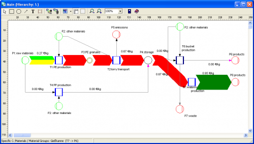
The following two cost flow Sankey diagrams are for the individual costing units ‘plastic bucket’ and ‘watering can’ (Fig.3 and 4). Please note that on theses diagrams a part of the machines is not being used, so they don’t add any process costs to the costing unit (or don’t contribute to the value added). Unfortunately you can only display either mass or energy flows in one Sankey diagram, so the energy costs (from the circle labeled ‘other materials’) are not shown as a Sankey flow, even though they add to the price for each product.

Cardboard and scissors to make Sankey diagrams

The website of Nottingham City Schools offers a variety of materials that can be used by teachers in their courses. One of the key areas in the science field is ‘energy’.

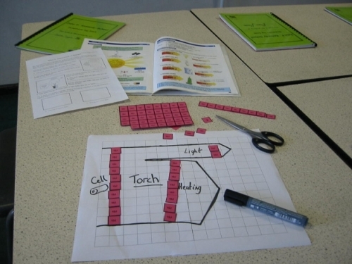
The site has a demonstration of how Sankey diagrams may be used to represent transfer of energy, including a PowerPoint and “stories”, for which pupils can create a Sankey diagram by using tokens cut from cardboard.

I think this is a great idea, as it supports the understanding of the energy topic with a haptic and, very importantly, a visual approach.

Using Sankey diagrams for visualizing web site performance

UK-based Stuart Brown at Modern Life in his latest post (“The Varying Virtues of Site Performance Metrics”) uses a Sankey diagram to visualize web site performance. This is a rather novel idea of using Sankey diagrams, but hey, why not?

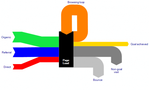
This nicely done Sankey diagram – in this case without any absolute or relative numbers – shows where web site visitors come from (input flows from the left side), and if their visit can be considered successful (that is, meeting the “goal” of the site operator) or not as output flows to the right side. Returning visitors are shown with a “browsing loop” in the Sankey diagram.

I really like this Sankey diagram and I would love to see web site metrics being visualized in this way. It really is a good visualization and can show how a website performs, although Brown acknowledges that “there simply isn’t any single great method of gauging a site’s performance”.

Coming back to the Sankey diagram itself, it does however have a small flaw. Look at the grey arrows for “Bounce” and “Non-goal visit”. The latter does not connect to the “Page Load” node, but rather seems to dive under the “Bounce” flow and appears where this one branches of vertically.

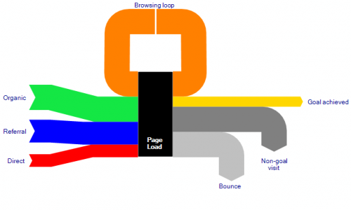
I have created two alternative Sankey diagrams where these two flows set off from the “Page Load” box parallel (stacked), rather than in an overlay manner. The overall quantity represented by the flows on the output side should be equal to the number of visitors on the input side. The first diagram keeps the original idea of the browsing loop coming in from the top, the second one hooks it on the left side of the box.


Alternative version:

As for the colors of the two diagrams above, sorry Stuart, didn’t hit the right values right away…

Sankey Diagrams in Material Flow Accounting

Another field where Sankey diagrams are used widely is Material Flow Accounting, the analysis of material flows on a national or regional level. MFA focuses on bulk materials or individual substances (e.g. zinc, copper, cadmium) and the quantities in which they enter, leave or accumulate in a national economy.

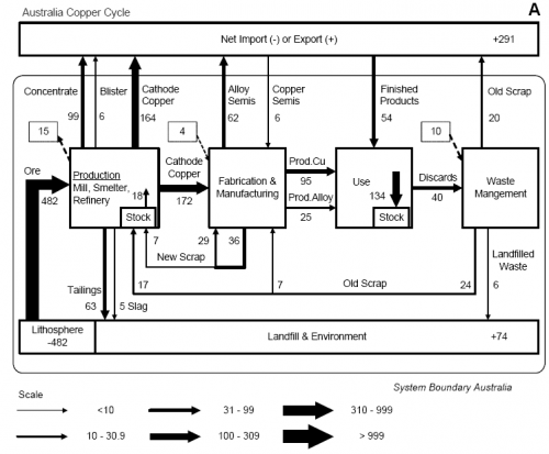
The diagram below is from a peer-reviewed paper presented at the 4th LCA conference in Australia (van Beers, van Berkel, Graedel: The Application of Material Flow Analysis for the Evaluation of the Recovery Potential of Secondary Metals in Australia, 2005). It shows the copper flows within the system boundary of Australia, the unit is Gg/year (= 1000 metric tons per year).

This “clustered” Sankey has six different flow widths, grouping together flow quantities within a specific range (e.g. <10, 10 < 30,9, …). Flows larger than 999 Gg/year are not shown any wider. This avoids that very large quantities “spoil” the whole diagram, as smaller flows become less significant in Sankey diagrams to scale.

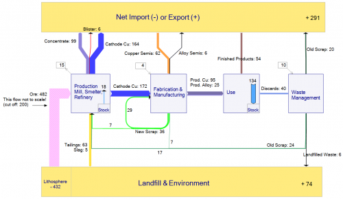
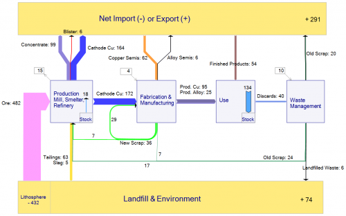
An alternative way to overcome the problem or very wide flows in a Sankey diagram spoiling the chart would be to define a cut-off quantity. Flows that are large than the cut-off quantity are excluded from the scale, and are shown with a hatch or moirée pattern. The two Sankey diagrams below were made based on the data from the above publication. The first one shows the large “Ore” flow with a cut-off level at 300 Gg/year (an additional note warns the reader that this flow is not to scale”, while the second diagram is fully to scale.


Very thin arrows additionally get explicit arrow heads to be able to identify their flow direction.

Feel free to comment

Sankey – the movie. Or: moving Sankey diagrams

Mark Barrett, director of a UK-based energy consultancy Senco, has developed several energy models.

The SEEScen model (Society, Energy and Environment Scenario model)…

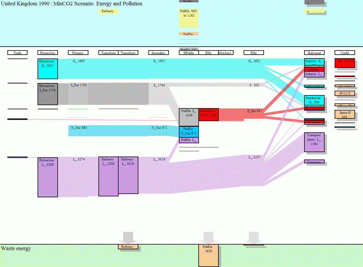
…incorporates 11 energy end uses (motive power, lighting, heating etc.) across 15 sectors. Some of these end uses have physical models; for example, domestic space heating and cooling are estimated with a model of a house which allows the effects of parameters such as insulation and internal temperatures to be examined.

Sankey diagrams for several years have been put together to make a short “film” how energy requirements may change over the years, and what shifts might be expected between different ways of energy generation.

To view this animation click on the image (there are some seconds between the frames, be patient).

To be able to see the details, download the Flash move or the GIF from the SEEScen webpage. Make sure you watch the film in the original size.The website www.senco.co.uk has gone offline (?), go to Mark Barrett’s page instead.

This is a neat idea, and it gives a whole new dimension to Sankey diagrams! On a side note: as far as I am informed, there are only two software tools capable of handling timelines in Sankey diagrams, S.DRAW and SankeyVis.…