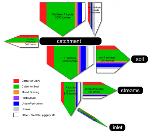
A paper on ‘Guiding BMP adoption to improve Water Quality in various Estuarine Ecosystems in Western Australia’ by Nardia Keipert from the University of Western Australia’s Department of Agriculture and Food shown on the ARWA Ecohydrology website features a Sankey diagram on phosphorus flow in a catchment area.
The stacked Sankey arrows show “the relative contribution from each land use sector”. The origins of the nutrients are cattle for dairy, cattle for beef, mixed grazing, horses, and others. From statistical data on nutrient use efficiency, which ranged from 10 to 50 %, the researchers estimated the accumulation of phosphorus in the soil and streams, and the final delivery into the ocean.
The Sankey diagram does look kind of … errh, how should I say, …. “different”. But this is mainly due to the fact that flows that accumulate in a storage branch off to the side. The arrow magnitudes are actually to scale. To check this, add the horizontal flow to the storage and the vertical flow.
The full report is here, the Sankey diagram is shown on page 8.

1 Comment
Comments are closed.