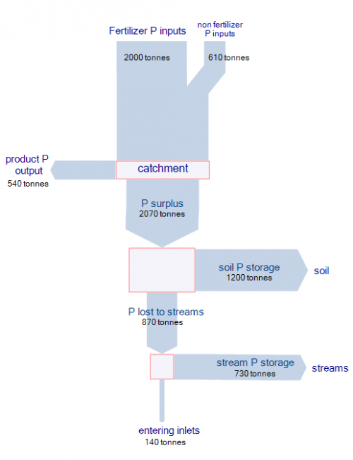
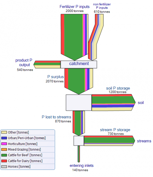
Reading on one of my favorite blogs actually made me take a harder stance on the Sankey diagram I presented in my last post. Following Kaiser’s attitude of making it better rather than only criticizing, I redesigned the Sankey diagram of phosphorus flows in the Peel-Harvey catchment area.
In the first version I didn’t differentiate the various sources of phosphorus, but only used one color for the overall flow quantity. Introducing nodes dramatically improves the comprehensibility and the mass balance check for the flows branching off sideways. There is some redundancy in the labeling of the flows, but I left it to stick as close to the original Sankey diagram as possible.
The second Sankey diagram is even closer to the original one. I tried to match the colors as much, and also introduced a legend. Please note that, since I didn’t have access to the raw data, I just approximated the flow values. Because of the multi flow arrows, I decided to leave a border line at each arrow, and to put heads to the first two input flows (‘fertiliser P input’ and ‘non fertiliser P input’) to better be able to distinguish them.


3 Comments
This is certainly an improvement over the original diagram. However, I have three comments:
1.) I don’t think we should label flows with ‘storage…’. In Sankey diagrams we need to be careful to discern flows (units are mass per time) and reservoirs (units are mass)
2.) What entity do the two lower boxes represent?
3.) On the subject matter: I have a hard time imagining *streams* as a reservoir for phosporus within a *catchment area*. After all streams do flow through the catchment area. They represent a flow. Possibly, stream *sediments* are the intended reservoir. But even so, sediments will not hold phosphorus indefinitely and there should be a flow back into streams (as suspended particles or dissolved P) or maybe even to soil (from flooding).
Thanks for your interesting comments, Gabor.
Please note, that I tried to stick as closely to the original Sankey diagram found in the report (Keipert, et.al.). In this case I used the same labels, flow colors, names, etc. I even left the horizontal arrows, rather then having them exit the node vertically and bending sidewards at a 90° angle.
As for your comment 3) I checked the report once again, and it doesn’t fully clarify. The authors write: “Whilst significant amounts of P were stored in the sandy soils of the catchment each year (~6 kgP/ha/ yr), a catchment scale weighted average of 3.4 kgP/ha was lost from the edge of paddocks. Much of this was stored in the stream network so that a catchment scale weighted average of 0.5 kgP/ha was delivered to the estuarine system.”
So, as far as I understand this [no subject matter expert on this at all!], the P quantities released within a certain area (the ‘catchment’) that don’t end up in the product (the ‘surplus of P’) accumulates in soils and in streams (stream sediments?) and some of it is finally released into the open sea (‘inlets’).
Comments are closed.