Category: Samples

Refurbishment of Thermal Power Plants

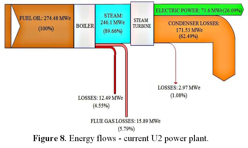
The conference paper ‘Repowering: An option for refurbishment of old thermal power plants in Latin-American countries’ (in: Proceedings of ASME Turbo Expo 2010: Power for Land, Sea and Air GT2010 (June 14-18, 2010, Glasgow, UK). DOI: 10.1115/GT2010-23058) by Irrazabal Bohorquez et al. of the Universidade Federal de Itajubá (UNIFEI) in Brazil has several Sankey diagrams to visualize energy flows in repowered thermal power plants.

Flows are im MWe. The base situation (A) in the power plant built in the 1970ies is shown in this Sankey diagram:
And the situation in one of the six refurbishment scenarios (B to G) for the power plant:
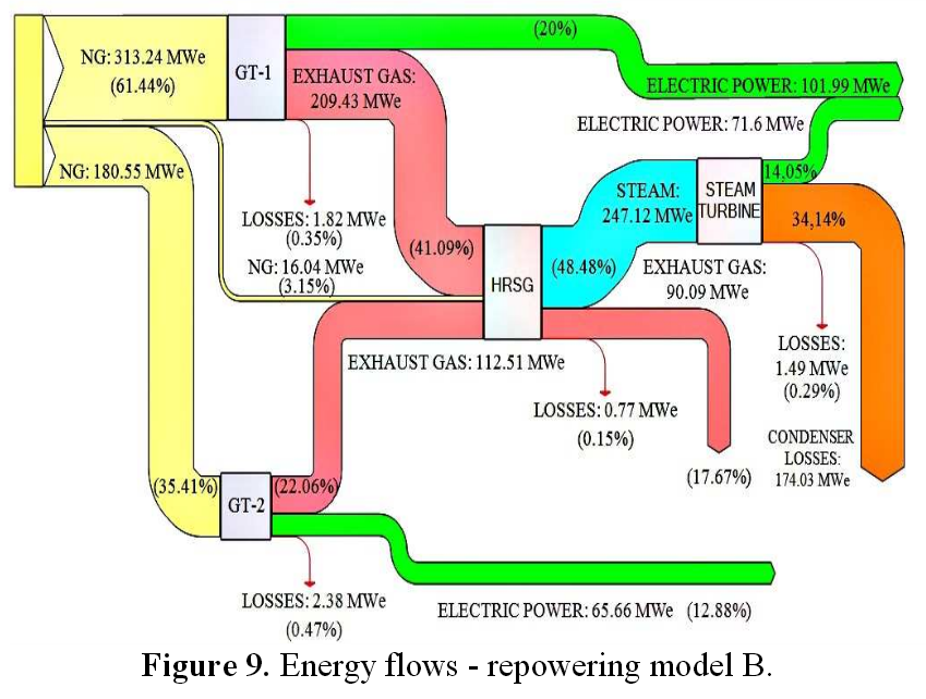
In the refurbishment scenario gas turbines (GT) are being installed. Exhaust gas is recovered and used in a heat recovery steam generation (HRSG).

For each scenatio the cost for generated electricity is assessed as well as the CO2 emissions associated with energy generation.
Check out the paper @ Researchgate for more Sankey diagrams.

Water Use in Coal Power Plant

This presentation on ‘Water Management for Fossil Energy Systems’ by Susan M. Maley, Technology Manager for Crosscutting Research at the U.S. Department of Energy (DOE) / National Energy Technology Laboratory (NETL) gives an overview of the activities and research into ‘Current Activities in Water Management Research and Development’.

On page 9 it features these two Sankey digrams showing water usage in a 500 MW pulverized coal plant.

On the left the situation without CO2 capture, on the right with CO2 capture. Water withdrawal almost doubles (524 gal/MWh to 1049 gal/MWh) when implementing CO2 capture.

Mind that the left and the right Sankey diagram can not be compared directly as they use a different scaling factor.

Sankey Diagram for a Cruise Ship

I have presented several examples of Sankey diagrams in the field of maritime technology before (see here).

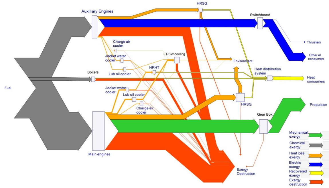
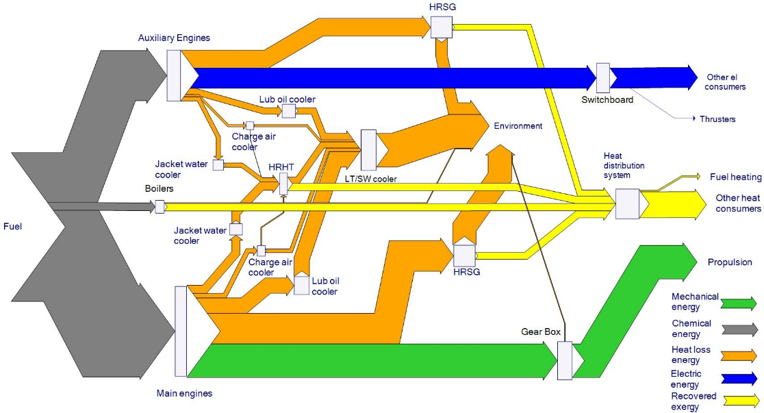
This recent article (Baldi, F., Ahlgren, F., Nguyen, T., Gabrielii, C., Andersson, K. (2015): Energy and exergy analysis of a cruise ship. In: Proceedings of ECOS 2015 – the 28th International Conference on Efficiency, Cost, Optimization, Simulation and Environmental Impact of Energy Systems) confirms that “the complexity of the energy system of a [cruise] ship where the energy required by propulsion is no longer the trivial main contributor to the whole energy use thus makes this kind of ship of particular interest for the analysis of how energy is converted from its original form to its final use on board.”

The authors conduct a thorough energy and exergy analysis for a cruise ship in the Baltic Sea. The ship has different operation modes (sea-going, manoeuvring, port stay). The energy analysis “allows identifying propulsion as the main energy user (41% of the total) followed by heat (34%) and electric power (25%) generation”. Nevertheless, “it can be seen that the energy demand for auxiliary power is comparable in size to that for propulsion.”

The data for this Sankey diagrams in the annex of the paper and shows that flows are in TJ for an operation period of 11 months. Blue, yellow and green arrows depict energy use, while the orange arrows reveal heat losses to the environment.

The study continues with an exergy analysis of the ship, since it reveals more on the system inefficiencies. The exergy analysis is shown as a Grassmann diagram in the paper. This is structured similarly to the Sankey diagram above, but has dark orange arrows representing the exergy destruction. This is mainly from the Diesel engines and the oil-fired boilers.

I recommend this paper not only to naval engineers, but to everyone who wishes to get a better understanding of exergy and Grassmann diagrams. Can we consider Grassman diagrams a subset of Sankey diagrams? What do you reckon?

River Flow Volume and Temperature

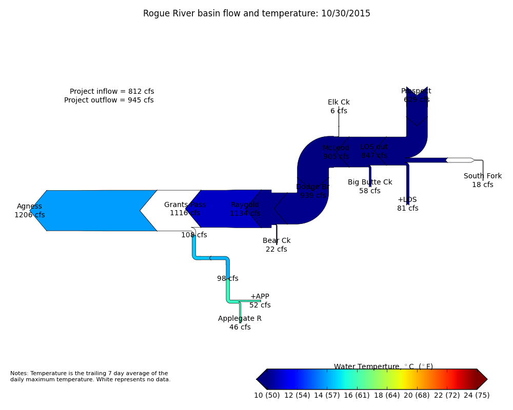
A nice idea for the use of Sankey diagrams can be found on this web page of the U.S. Army Corps of Engineers (USACE) in the Portland OR area.

The diagram shows the flow of the Rogue river and its tributary streams. The fact that the river flows east to west makes this one of the rare examples of a right-to-left orientated Sankey diagrams.

The water volume is represented by the width of the arrow in each segment. Flows are in cubic feet per second (cfs)? At some points along the river the volume seems to increase much more than the feed contributes (e.g. at Bear Creek influx).

As an additional layer of information the color of the Sankey arrows indicates the trailing 7-day average temperature. Temperature color codes shown below.

Energy Efficiency in Food/Beverage Industry

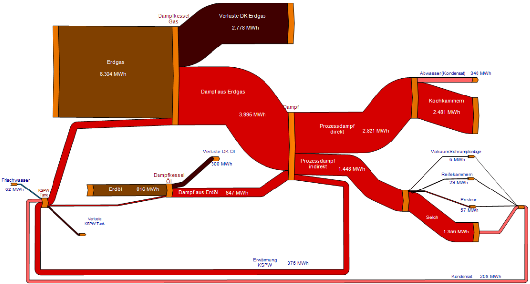
In a presentation on “Low CO2 production in European food and beverage industry” the author Christoph Brunner from AEE – Institute for Sustainable Technologies (AEE INTEC) suggests process flow sheets and Sankey diagrams as tools used for energy efficiency analysis.

This Sankey diagram is used as an example for the creation of mass and energy balances and the visualization of the production process.

The diagram is from Austria and thefore in German. From translating some words I understand this is probably for a food/dairy industry. Flows are in MWh, but without a time span. Two steam generators (one run with natural gas, the other with petroleum) supply heat to different processes. The cooking chambers (“Kochkammern”) require most, followed by “Selch” (?) and heating of a “KSPW Tank”. Some heat is recovered from condensate.

Sankey diagrams can help understanding the energy flows of process systems and detect hotspots for optimization.

Misc Sankey Diagrams Uncommented 11

Still sitting on my hard disk are numerous Sankey diagrams I have yet to describe and post them here. The ‘Miscellaneous (Mostly) Uncommented’ series is a way to get them out to you.

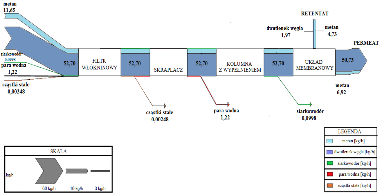
A Sankey diagram from process engineering. This one is from a poster by Monika Szolucha from Warszwaw Polytechnic.

Google Translate tells me this is from a stationary membrane filter equipment that enriches methane content in biogas. Flows show throughput in kg per hour.

Minard’s 1858 Map of World Migration

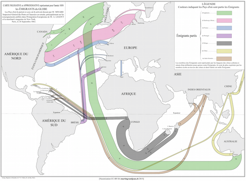
Martin Grandjean digitized and vectorized Charles Joseph Minard’s World Map of Migration from 1862. His recent post reminds us that no too long ago migrants were also moving from Europe to other places of the world.

via martingrandjean.ch – full vectorized image 2 MB here

The map, based on data for the year 1858, “shows migration flows that contrast with the maps of the twenty-first century. That year, 86.000 Englishmen left their country, as 45.300 Germans, 20.000 French and 11.600 Portuguese.”

Read this interesting post from the Cartographia blog for additional detail on the map.

From a technical point of view, the only criticism I have of Minard’s map is that the direction of the arrows is not indicated. It requires the reader to know about origins or destinations of migration.

You can see the original Minard migration map (“Carte figurative et approximative représentant pour l’année 1858 les émigrants du globe, les pays dóu ils partent et ceux oú ils arrivent”) in this 2009 post and at Wiki Commons or directly at the Library of Congress.

You might want to check out another related June 2015 article by Martin Grandjean, where he points out some shortcomings of migration maps.