Category: Samples

4see model: economy data visualized

Back in May 2013 I had reported about the ‘4see model’ developed by ARUP. The model is used to visualize certain data characterizing an economy, such as value streams, jobs or energy.

Browsing for new Sankey diagrams I came across 4see again, this time in an INSEAD Faculty & Research Working Paper titled ‘The 4see Framework: Characterizing an Economy by its Socio-economic and Energy Activities’ by Roberts et.al. (2013).

The model is explained in detail and the report features a number of beautiful diagrams. Here is one of them:
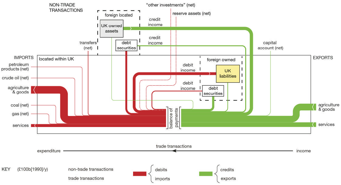
I chose to present this one on financial flows over the others (on transport, energy, employment), since it has some very distinct features.

In the core of the diagram is the balance of payments. The lower part of the diagram (within the frame) has trade flows (i.e. imports to the UK on the left side, exports from the UK on the right side). Interestingly, since this is meant to depict monetary flows, the direction of the arrows is inverted: goods-receiving countries have liabilities, so the flow is from right to-left (upstream). Same holds true for the UK that has to pay for its imports.

The elements in the dotted line rectangles and the linking flows are non-trade items (i.e. the financial system), some of the within the UK, others foreign. Make sure to read the description below figure 8 on page 16 of the report if you want to learn more.

Data is for the year 2010. The key below the diagram shows the default width of a stream representing ‘£100b[2010]/y’, which I read as ‘100 billion British Pounds normalized to base year 2010 per year’. No actual numbers given for each flow, but the different types of monetary flows in relation to each other and their rough dimensions permit to interpret the diagram.

My favourite Sankey diagram in 2015, so far.
Sankey Diagram Video Production Line

Just discovered this new Sankey diagram video via e!Sankey Forum. Apparently just meant as a a show case for the possibilities offered by the e!Sankey software development kit (SDK).

We can see mass flows on a production line with two machines feeding ‘Item A’ and ‘Item B’ into the main production line.

These seem to be hourly flow values over a 30-hour time span. There are some red warnings indicating low buffer, and even one or two times when the production runs dry. Interesting…

Found that there are some more (educational) videos on youtube now that deal with Sankey diagrams.

Circular Economy Sankey Diagrams

Yesterday it became known that the European Commission would shelve their circular economy package of waste, recycling and incineration laws for now, in favour of an even more ambitious legislation to be presented by end-2015 (read here or here).

That led me to browse tweets using the hashtag #circulareconomy, and I ended up unearthing two nice Sankey diagrams…

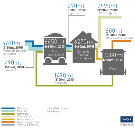
The first one is by WRAP UK, showing the EU-27 material flows estimated in 2020. This is not for a specific type of material, but all material.

Flows are in million tonnes, with the 2020 values in blue, and the current (2010) figures in brackets below for comparison. There are three nodes: ‘Direct Material Input’, ‘Domestic Material Consumption’ and ‘Waste’. Unfortunately the size of the node icons is too large, and the flows are difficult to see. But still, this is a nice idea!

The main message is that in comparison to 2010, Europe could have 350 million tonnes of recycled material in 2020. Check out these Sankey diagrams by WRAP UK that basically convey the same messsage, but are less infographic.

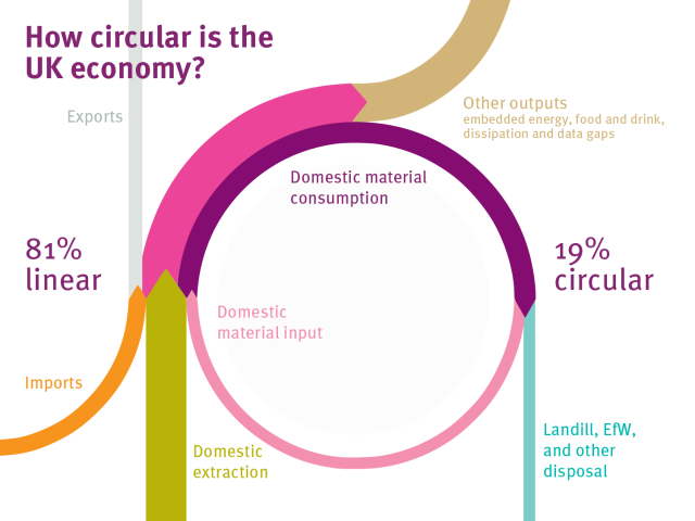
Another Sankey diagram I found when browsing through the tweets was this one below. The title of the diagram is “How circular is th UK?”.

I found it in a blog post ‘Designing Out Waste Consortium’ by Ramon Arratia on Interface’s Cut The Fluff blog on sustainability, but it is originally from this Green Alliance blog post by Julie Hill.

No values shown along the flows in this Sankey diagram, but neatly shaped circular flows. The question raised in the title is answered prominently with the message that 19% of the material in the UK is led in a loop (pink flow).

eco-data.fr: Cereals Sampe

A research group from INRIA Grenoble engineering school has set up a website for visualization of environmental data. Sankey diagrams are one available visualization option. The below is a sample provided on the website.

The Sankey diagram shows flows along the cereals production chain in France from the 2007/2008 harvesting campaign. Quantities are in 1000 tonnes.

Different grains are shown on the left: wheat (‘blé’), hard wheat (‘blé dur’), maize, barley (‘orge’) and others. Two large end nodes for unprocessed grain exports and use as animal feed (‘consommation animale’). There are further exports as intermediate and processed products. Only a comparatively small fraction is consumed by humans in France as bread, pasta, biscuits.

Could not detect use as energy crops, it is maybe hidden in the ‘industrial use’ flow. Anyway, an interesting application case for Sankey diagrams.

Energy Flows in Waste Incinerator

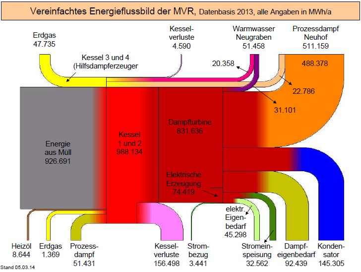
Energy flows in a waste incinerator facility of MVR-HH (‘Mullverwertung Rugenberger Damm’) in Germany are depicted as Sankey diagram on their website.

Flows are for 2013 in MWh per year (MWh/a). The hot red area is the boiler (‘Kessel’), followed by the turbine. Almost half of the energy is used as process steam and for district heating (‘Warmwasser Neugraben’). Losses branch out vertically.

Cobalt Distribution Diagram by Continent

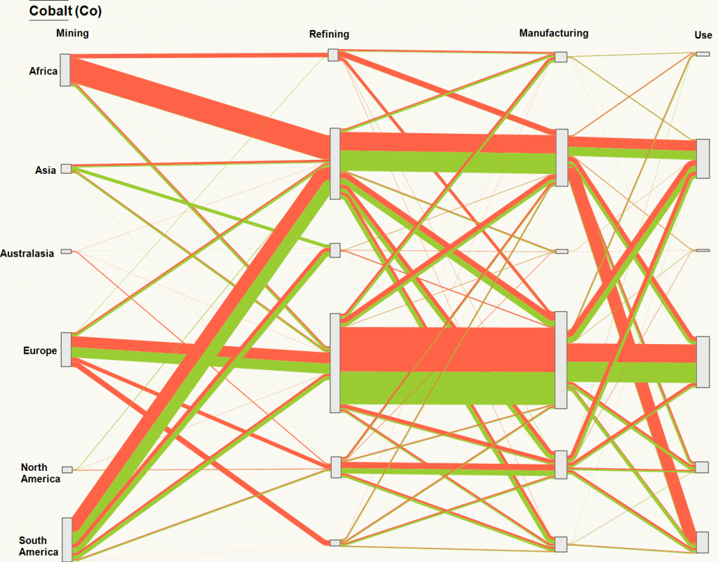
Happy New Year to all followers! Kicking off with a distribution diagram (aka ‘alluvial diagram’) for cobalt (chemical element ‘Co’) by the Geospatial Engineering Research Group at the University of Newcastle, taken from the article ‘Sankey diagram of cobalt life-cycle’ on their blog.

This shows the mining, refining, manufacturing and use stages for cobalt broken down by continent.

Not sure what the orange and green arrows stand for, or what the unit is. Also, there seems to be a mismatch between the input and the output quantitites at some nodes (check, for example, cobalt flows received from mining countries for refining in Europe compared to the deliveries to the manufacturing stage).
This could be due to mismatches in data from the different sources, or caused by changes in cobalt stocks (i.e. Europe mining and importing less but reducing stocks from previous year, thus being able to ship more to manufacturing in the same period). Maybe one of the authors wishes to comment?

Energy Flow in Open Rack Vaporiser

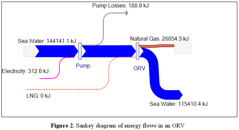
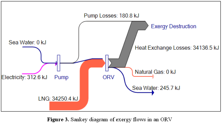
The scientific paper ‘A Sankey Framework for Energy and Exergy Flows’ by Kamalakannan Soundararajan, Hiang Kwee Ho, Bin Su (Energy Studies Institute, National University of Singapore) features these two Sankey diagrams.

Energy flow in an open rack vaporiser (ORV):


Exergy flow in an open rack vaporiser (ORV):

The authors explain that “ORVs regasify liquefied natural gas (LNG) from temperatures below -160°C to room temperature through a heat exchange process with sea water at room temperature and pressure. (…) The Sankey representation of energy and exergy flows here presents a large potential for energy savings that could be realised in the regasification process.”