Category: Samples

The Very Hungry Caterpillar

As a toddler my Mom read ‘The Very Hungry Caterpillar‘ to me, and I noticed that the book is still around today. So I thought you might like the following mini-Sankey diagram I found on an educational website.

Of all the energy contained in the leaves (or apples, pears, strawberries …) the caterpillar eats, half turns into feces, and some 33% is for cellular respiration. Only approximately 17% is for growth of the caterpillar. It seemed more than that to me at the time…
Abundance of Solar Energy

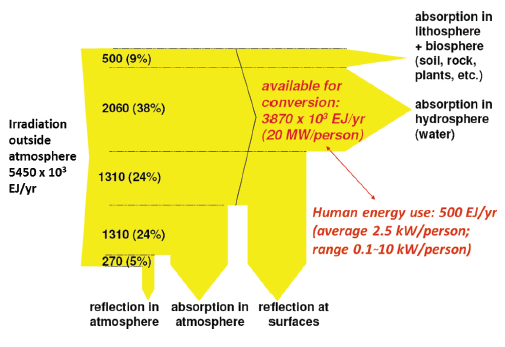
In most parts of Europe, Russia and Northern a partial solar eclipse is observed today. People can feel how temperatures drop and dusk seems to begin even though the day has just begun… Time to remember that the sun powers our planet.

This Sankey diagram from the GEA 2012 report (Global Energy Assessment – Toward a Sustainable Future, Cambridge University Press, Cambridge UK and New York, NY, USA and the International Institute for Applied Systems Analysis, Laxenburg, Austria) page 773 shows that the “amount of solar energy available on Earth (estimated at 3.9 million EJ/yr) is many times the present human energy use (~528 EJ in 2009)”.

DOE Energy Water Nexus

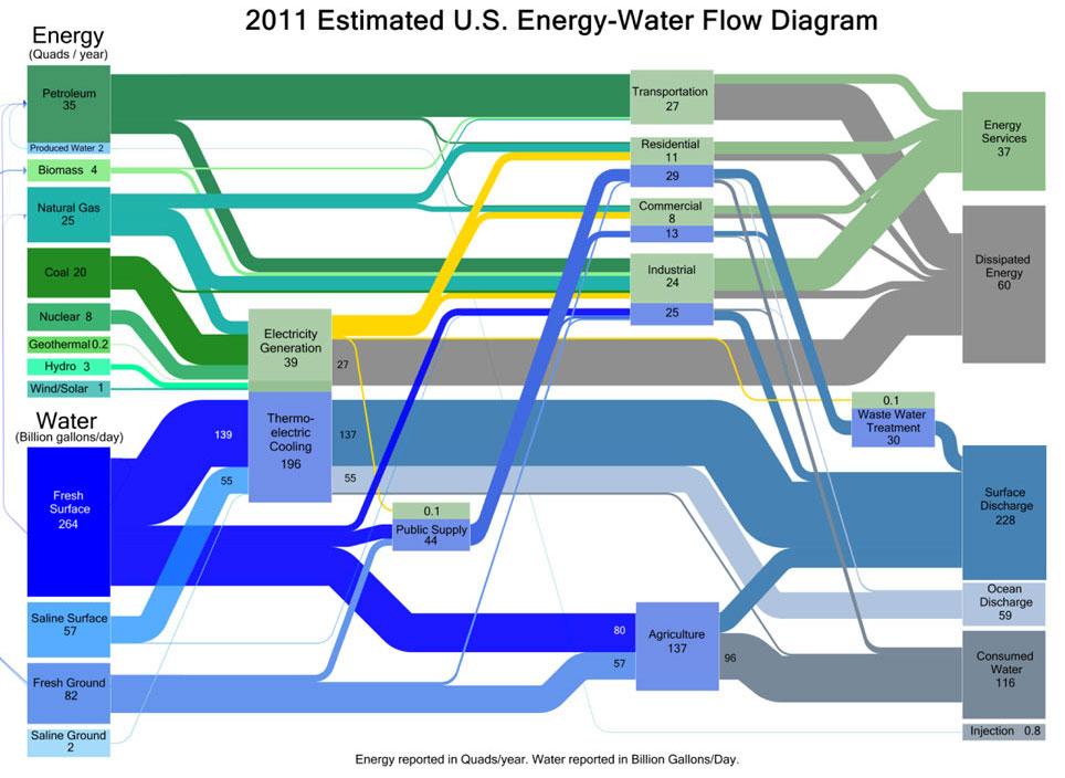
Via the EDF blog (no, not Electricité de France, but Environmental Defence Fund) comes this mixed Sankey diagram for energy and water flows in the U.S. in 2011.

Kate Zerrener explains in the post that energy generation and water consumption are deeply interwoven. The diagram shows which energy production and which consuming sector requires how much water.

“Water is measured in billions of gallons per day (BGD) and energy is measured in quadrillion British Thermal Units (Quads) per year. In the graphic above, water flows are represented in blue, energy in green.”

Infographic: Electricity Production in Portugal

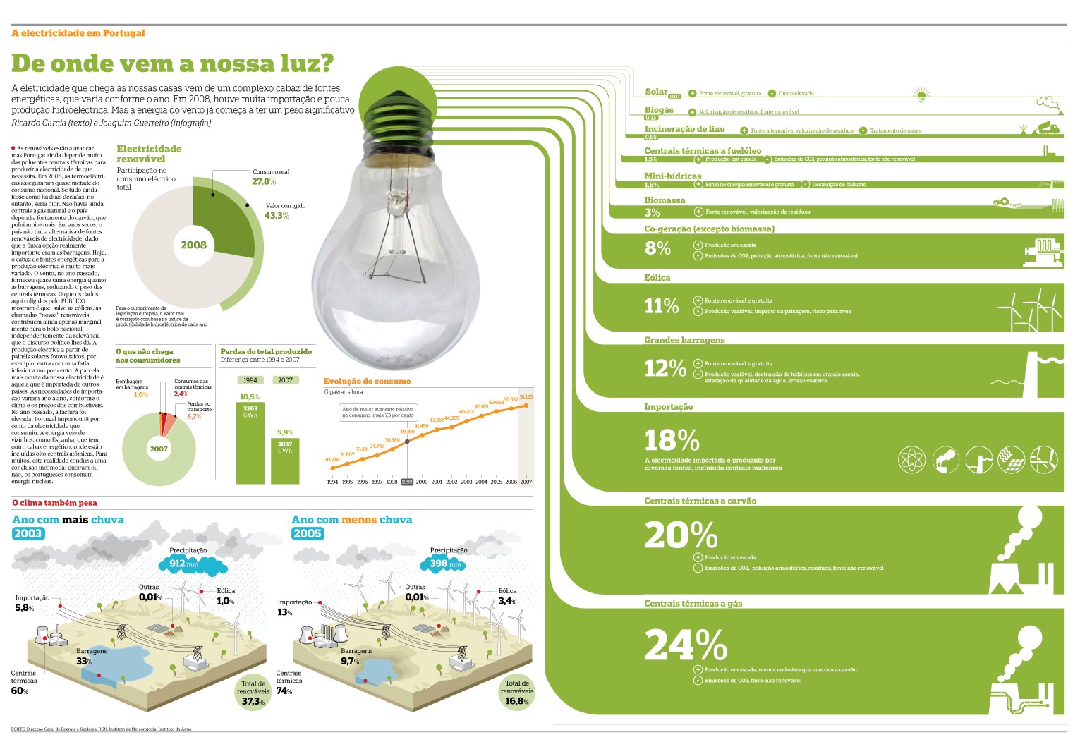
‘De onde vem a nossa luz?’ Where does our electricity come from? The below infographic by Joaquim Guerreiro with text by Ricardo Gurreiro was published on April 22, 2009 in the Portuguese daily ‘Público’ (PDF).

The composition of energy sources is shown with Sankey-like green bands instead of a pie chart. 24% of the energy is from natural gas, 20% from coal. 18% is imported energy and 12% from hydro power.

The other elements of the infographic and the text describe how the production pattern changes from years rich in precipitation, when hydro can be up to 33%, compared to dry years where it accounts for less than 10% of the electricity production.

Data is for 2008. The overall consumption of electric energy is kind of difficult to detect: 51.125 GWh in 2007.

An online version of this infographic (without the Sankey diagram) is available at the Público website too.

Ate your muesli this morning?

I have talked about a cereals Sankey diagram by INRIA Grenoble a couple of weeks ago in this post.

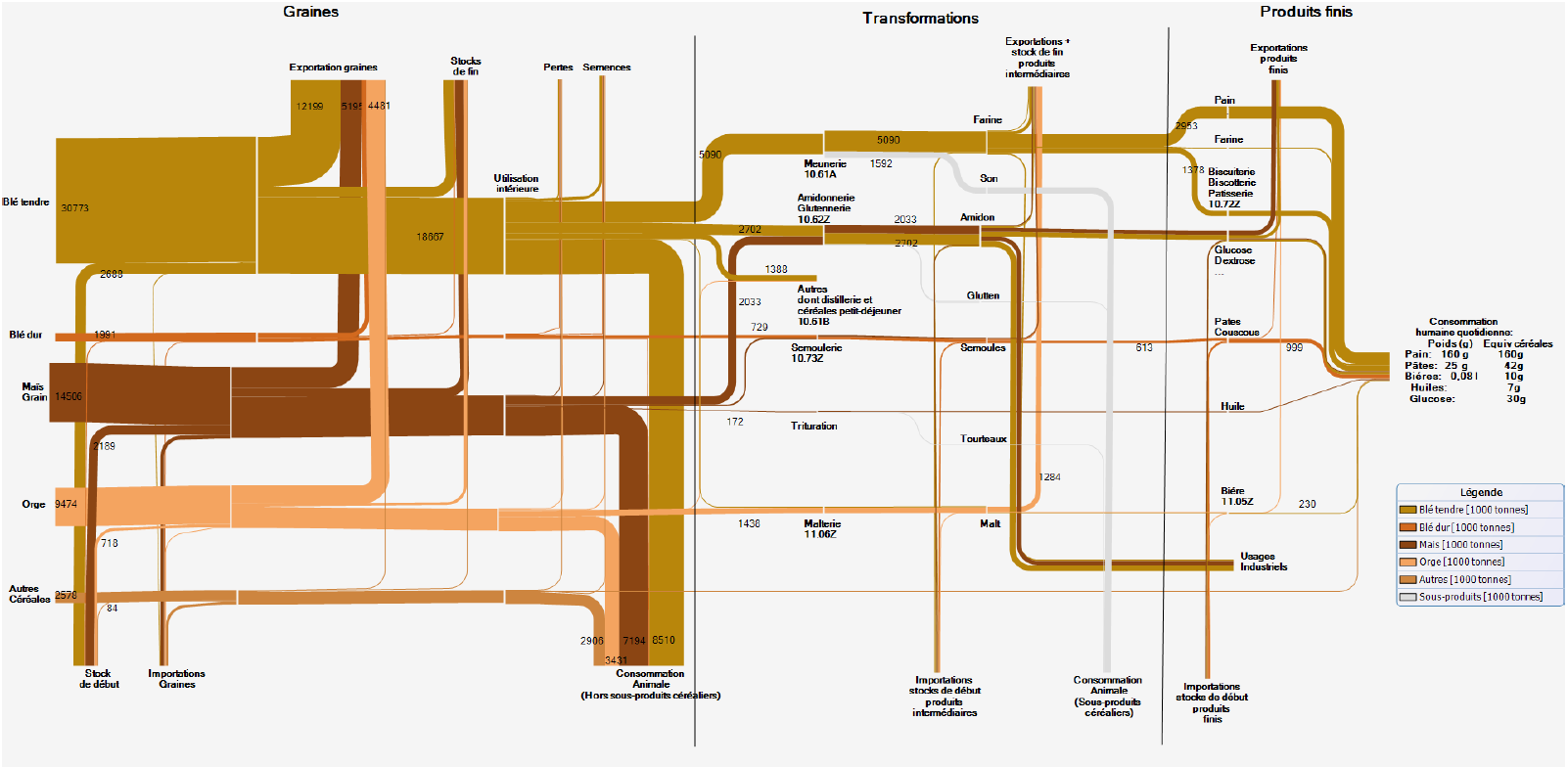
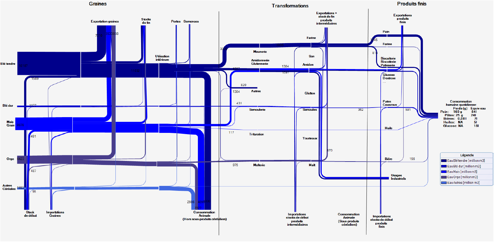
Here are two more Sankey diagrams from the underlying article ‘Etude des flux de céréales à l’echelle locale: Exemples en Rhône-Alpes, en Isère et dans le SCOT de Grenoble’ by J. Courtonne, J. Alapetite, P. Longaretti, D. Dupré.

These are the mass flows for cereals production in France (2007/2008) in Mt (1000 tons)

Here is the same cereals process chain “translated” into a water footprint. Unit is million cubic metres of water consumed.

A very clear structure in both diagrams with three columns: grains production, transformation and final products. Choice of color corresponds to the topic.

Mass Email Response Visualization

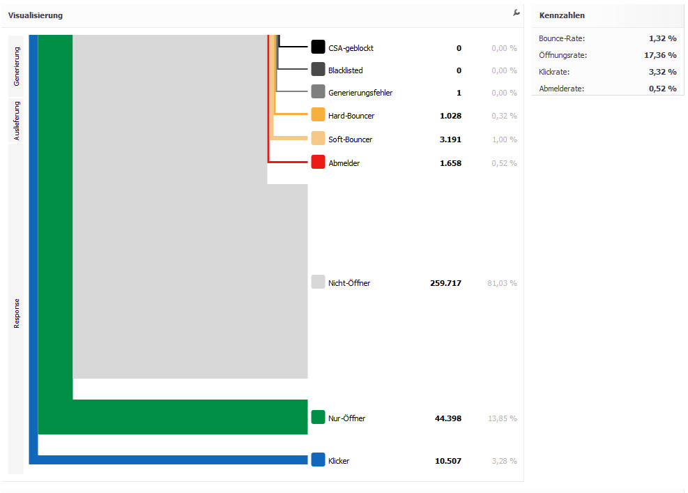
XQueue displays the success of mass e-mail campaigns and the behavior of the recipients in this Sankey-like way.

This could of course also be shown in a pie chart, but the further down the arrow branches out the closer to the goal (getting a click on a link in the e-mail).
Diagram in German but I understand the last three categories as ‘Non-Opener’, ‘Open Only’, ‘Clicks’.

Energy Flows in Wood Gas Process

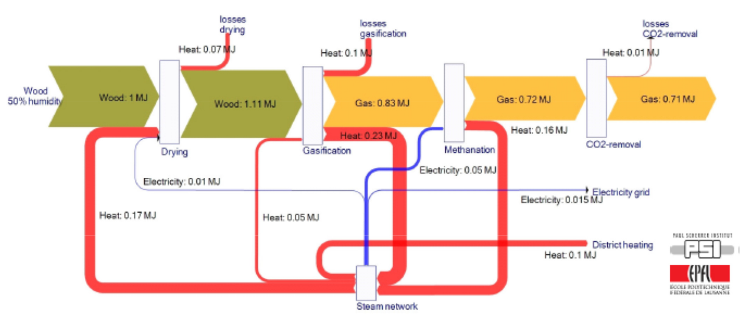
From a presentation by Swiss company CTU Clean Technology Universe AG comes this Sankey diagram for energy flows in a wood gas process.

The diagram is set up for wood with 50% humidity and an energy content of 1 MJ. The process steps drying, gasification, methanation, CO2 removal yield gas with an energy content of 0,71 MJ (71%). Much of the offheat is recovered in the process, excess heat is fed to district heating.

Wood in brown, gas in orange, heat in red and electricity in blue.

Another Sankey diagram for wood gas here.

Recyclability of concrete, timber, steel

Nicely made infographic from steelconstruction.info wiki. What happens to the building materials on demolition, how much of concrete, timber and steel can be recycled?

The three arrows are curved and start at a 7-o’clock position. Used concrete from building demolition is mostly downcycled. Wood from structural frames is mostly landfilled, or re-used. Steel has a very good recyclability and most of the material can be recovered to make new steel.

The view angle and the images of construction machines make it a very attractive infographic.