Category: Samples

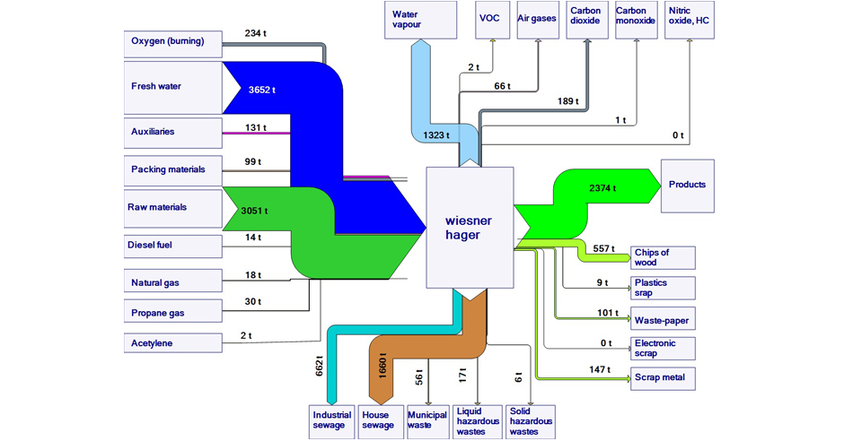
Wiesner Hager: Material and Energy Balance

Austrian office furniture manufacturer Wiesner Hager is looking to increase efficiency in their production system, and to make more sustainable products. To this end they have being doing Life Cycle Assessments (LCAs) and have published Environmental Product Declarations (EPDs).

On their website they feature two Sankey diagrams.

The first is the corporate material balance. Flows are in tons (probably for one year, although not indicated). Raw materials and water constitute the largest inputs, while on the output side vapour and sewage dominate, next to the actual products.

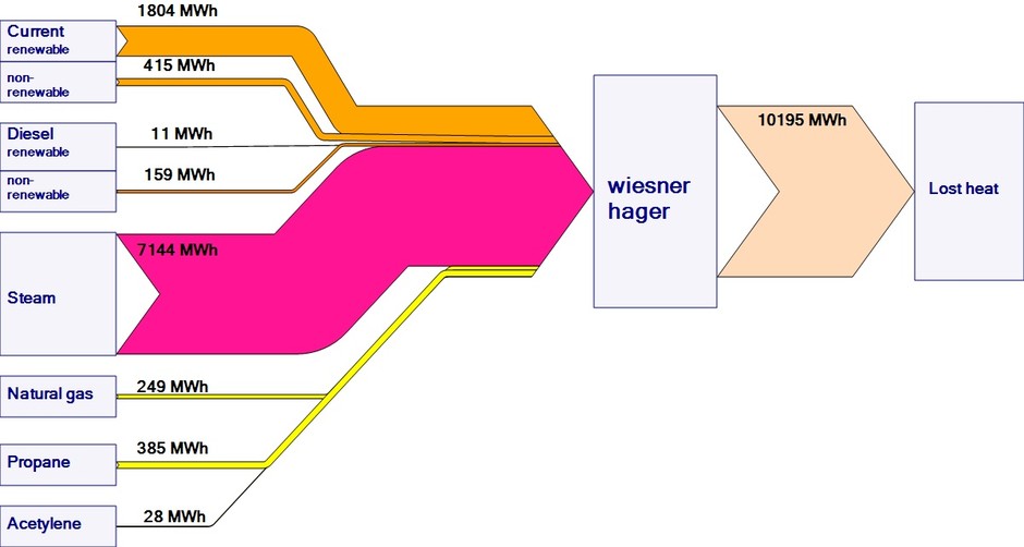
The other is the energy balance. Flows are in MWh. The energy carriers (fuels) depcited also show up (as mass) in the above material inventory. Looking at the steam input, it is not clear what fuel is used to run the boiler.

Québec Energy Flows and CO2 Emissions

The CESAR (Canada Energy Systems Analysis Research) blog at www.cesarnet.ca had been idle for a while, but reopened 2015 with a post on Québec’s energy flows and related carbon dioxide emissions.

The post ‘The State of Energy in Quebec – 2015’ features two Sankey diagrams originally from a report in French language ‘État de l’énergie au Québec’ by HEC Montral (PDF here). Benjamin Israel is the author (should I say artist?) of these Sankey diagrams.

The first Sankey diagram is on Québec’s energy flows in 2012. Flows are in petajoule (PJ). 1 petajoule is described for everybody to understand as “(278 GWh) corresponding to the energy consumption of approximately 10.000 households in Québéc.”

Four columns give a structure to the diagram: energy sources, transformation, use, efficiency of the system. The upper part depicts energy produced in Quebec (“Énergie Produite en Québec”). Energy sources are purely renewable: hydro, wind and biomass. The bottom part shows fuel imports into the province: petroleum, natural gas, uranium, coal. Grey arrows collect the losses. Interesting to see how losses from energy generation and refineries in column 2 dive beneath crossing bands to rejoin the other losses in column 4.

The second Sankey diagram (from p. 27 in the HEC document) is a summary of greenhouse gas (GHG) emissions (in French: ‘émissions de gaz à effet de serre’ short: GES) in Québec in 2012.

Given the information from the above energy diagram, where Québec domestic energy production is 100% from renewable sources, it is not surprsing to see that the carbon emissions are mainly from imported energy. Combustion of fossil fuels makes up for 57 of the total 78 Mt CO2-equivalent emissions. The remaining 21 Mt of CO2-equivalent emissions are from industrial processes, agriculture and waste.

Québec’s per capita GHG emissions ranges lowest with 9,7 tonnes of CO2-eqs compared to other Canadian provinces (see scale in lower left).

Beautifully crafted Sankey diagram. I hope to see more on the CESAR blog in the future.
Malaysia Energy Flows

The article ‘The Use of Energy in Malaysia: Tracing Energy Flows from Primary Source to End Use’ by Chinhao Chong, Weidou Ni, Linwei Ma, Pei Liu and Zheng Li features the two Sankey diagrams below. The article is available open access in Energies 2015, 8(4), pp. 2828-2866.

The first diagram is an ‘Energy Allocation Diagram’ that is structured (from left to right) in columns, fuel, primary energy supply (energy generation), primary energy supply (energy conversion), consumption/use in different sectors. The consuming sectors (transport, commercial, residential, etc.) are further broken down into groups, offering one more level of detail. Flows are in million tonnes of oil equivalents (Mtoe), data is for 2011.

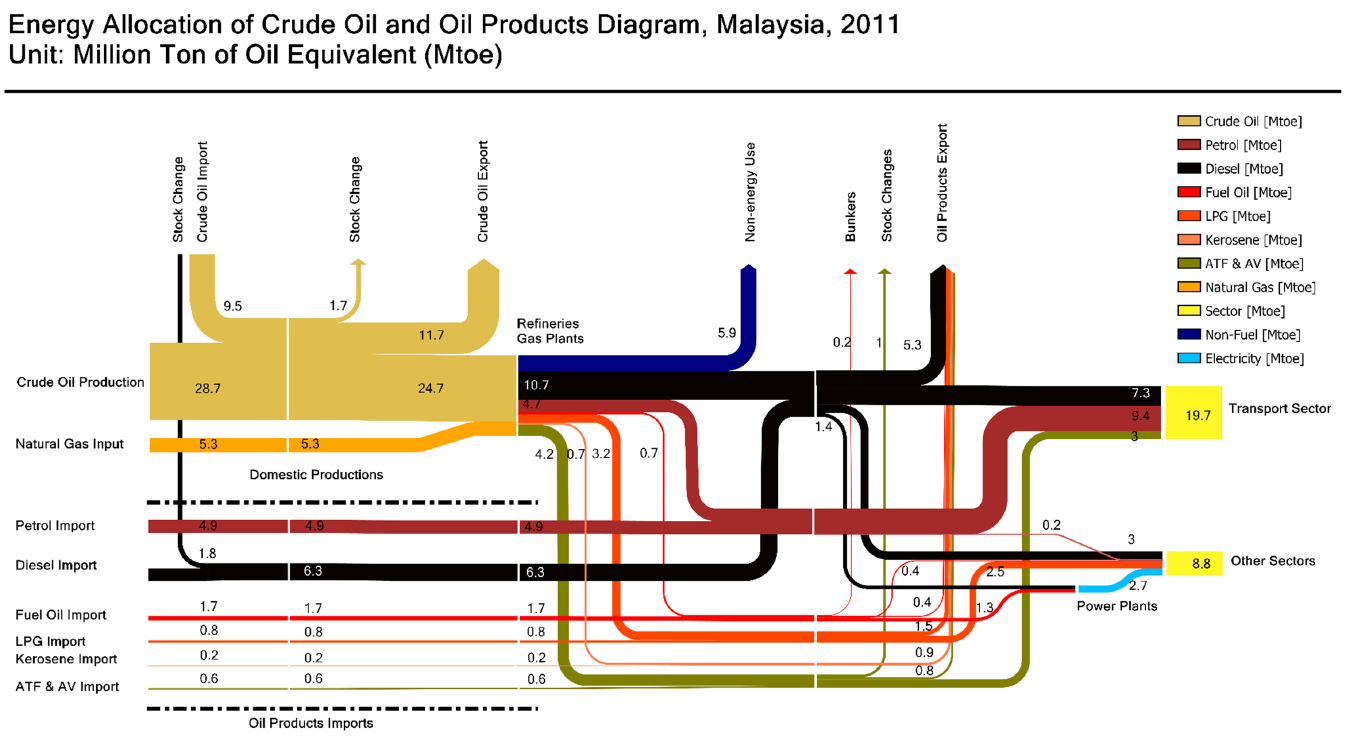
The other Sankey diagrma offers a detailed view of oil and oil products. Flows are also shown in Mtoe, data again for 2011. The upper half is domestic production, the bottom part shows imports. ‘ATF’ could be automobile transmission fuel (machine oil), not sure about ‘AV’. Losses and stock changes branch out vertically to the top.

A nice, really well-structured diagram. Clear and comprehensible.

World Oil Trade Map: GEA Report

The 2012 GEA Global Energy Assessment report (GEA Global Energy Assessment – Toward a Sustainable Future, Cambridge University Press, Cambridge UK and New York, NY, USA and the International Institute for Applied Systems Analysis, Laxenburg, Austria) features five maps showing energy trade in the world on pages 128/129.

These can almost be considered Sankey diagrams, so I am featuring them here on the blog.

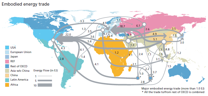
This one is for embodied energy in trade goods.

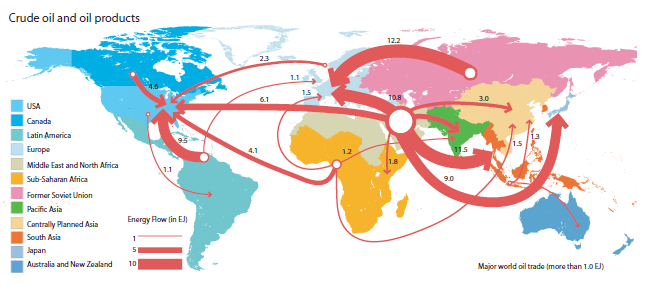
And this one is a classic oil and oil product trade flows map:

Flows lead from a specific color-coded region to another. The quantities are clustered in arrows with three different widths as shown in the legend (1, 5, 10 Exajoule)

Comparison of Swiss Waste Incinerators

Rytec, a Swiss-based consulting firm, is the author of a 2011 report that compares 29 waste incinerators in Switzerland in regard to their energy flows.

The report ‘Einheitliche Heizwert- und Energiekennzahlenberechnung der Schweizer KVA nach europäischem Standardverfahren’ (translation: Uniform heating value and energy indicators calculation for Swiss waste incinerators according to European standard method) was comissioned by Swiss Environment Agency (BFU) and Swiss Energy Agency (BFE).

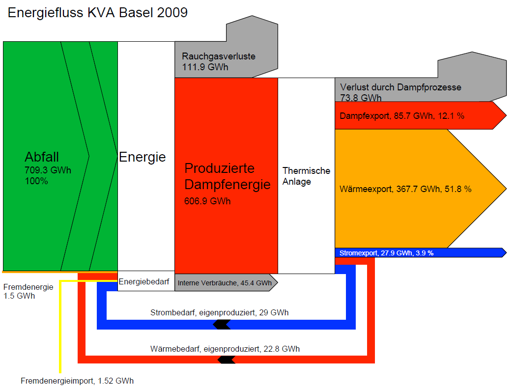
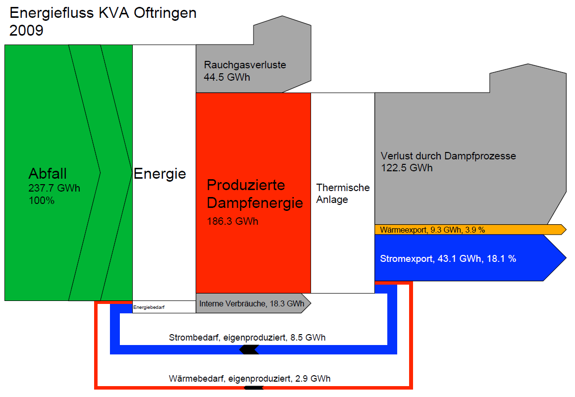
The annex contains 29 Sankey diagrams like the following:

All waste incinerator Sankey diagrams are structured similarly, allowing direct comparison of efficiency and energy output mix. Data is for 2009.

The first diagram is for KVA Basel (waste incinerator Basel), the second for KVA Oftringen (waste incinerator Oftringen, Aargau). Basel is much larger (incinerated waste with energy content of 710 GWh in 2009) and serves an urban area. Oftringen is smaller and seems to be more of a regional waste incinerator (incinerated waste with energy content of 237 GWh in 2009).

Basel apparently sells off the heat to the district heating system or neighbouring industry (yellow arrow ‘Wäremexport’) and converts only a small fraction to electricity. Oftringen on the other hand sells off electric energy (43 GWh) with apparent losses (grey arrow 122,5 GWh).

A lot more to discover when comparing these two (and the other 27) Sankey diagrams.

Lead Flows with Regional Scope

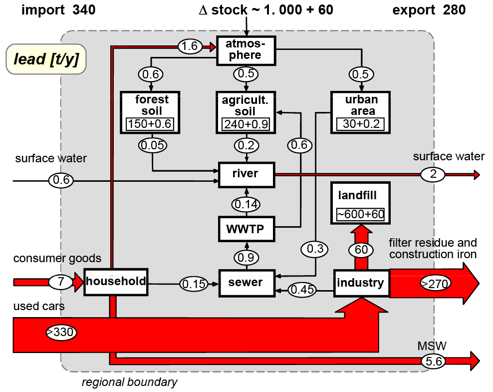
Material Flow Analysis (MFA) looks at substances or materials, often with a regional or national scope. MFA also has a stronger emphasis on stocks and stock changes. From the MFA blog (see blogroll on the right) comes the below diagram on lead flows.

The grey area delimits a region. Lead flow quantities are in tonnes per year. ‘Imports’ (to be understood as contamination or ingression here) to the region are from the left, ‘exports’ to the right. There is a net increase of lead ‘stocks’ in the region (accumulation in landfill).

Flows are on the same scale only for smaller quantities. The two large flows would have to be drawn much wider if they were on the same scale. Instead they have an upper cut-off indicated by the labels “240” and “330”.…