Category: Samples

FIFA financial accounts Sankeyfied

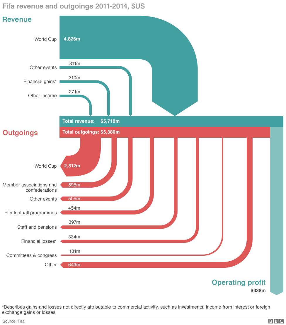
This diagram is by Salim Qurashi and Gerry Fletcher for the May 29, 2015 BBC News article ‘How Fifa makes and spends its money’ by Paul Sargeant.
BBC News via Coffee Spoons blog

The data is based on FIFA financial statements for 2011 through 2014. Flows in US$. The diagram depicts how “the Zurich-based multi-million-[dollar] organisation make its money and what does it spend it on?”.

This is only “sort of a Sankey diagram” as Brendan Barry “the man behind Coffee Spoons” notes. The light blue arrow for “operating profits” represents the balance difference between turquoise incoming and red outgoing flows. The infographic authors chose to set the arrows apart, which make it difficult to verify if arrow widths are to scale.

For the expert eye, some observations:

(1) Why has the sort order for incoming and outgoing flows been reversed? Imagine the red outgoing flow for “World Cup” (2,312m) being located at the right side thus becoming the longest arrow with a stronger emphasis…

(2) Not all flows are to scale: Compare the width of the light blue arrow for “operating profits” (338m) with another flow in the 300m-range such as “Financial Losses” (331m). An unintended flaw?
Compressed Air System

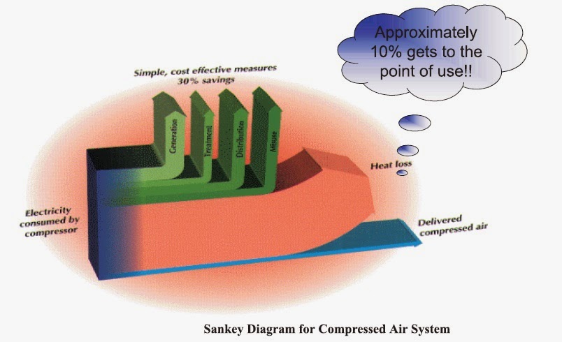
This 3D Sankey diagram for a compressed air system from a Mechanical Engineering blog post is taking it somewhat over the top…

It shows energy efficiency of a compressor. Only a fraction of the energy (electricity) to power the compressor is converted and delivered in compressed air, while the largest chunk is wasted as off-heat.

Yes, the 3D-look is fancy (see other samples of the 3D species here). The elliptic orange backdrop makes it look more dramatic, but doesn’t really contribute to conveying the information. No units are given.

The green arrows represent “simple, cost-effective measures” that could probably increase efficiency of the compressed air system if implemented. The blue arrow that stands for the energy delivered as compressed air is supposedly “approximately 10%” of the energy input, but he height is much less than 1/10th of the stacked arrows.

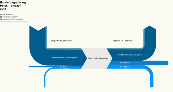
Poland Trade Balance

The ‘Blog Audytorów Sledczych’ had two interesting Sankey-style diagrams.

The first is the trade balance of Poland for the month January 2014. Flows are in Euro (trade volume). There is a trade surplus of 176,4 million Euros. Unfortunately only the legend shows what the arrow colors mean, but it is not legible in this screenshot.

The second one focuses on the five main trade partners of Poland. Here the value of imported goods is higher (8,7 billion Euro) than the value of exported goods (8,5 billion Euro).

Again the legend is somewhat difficult to decipher, but we can see Germany, Czech Republic, UK and Russia. Largest trade partner (both regaring import and export) is Germany (large orange arrows).

Trade imbalance is visually barely noticeable, just by a slight step when looking at the incoming and outgoing arrows.

Amsterdam Energy System Visualized

Tom Van Heeswijk and Changsoon Choi, landscape architecture master students at Wageningen University in the Netherlands have created the below “preliminary Sankey diagram of the Amsterdam energy system”. This is part of the larger project URBAN PULSE described on the research page of the NRG lab website.

Only the top part of a larger Sankey diagram is seen here, the bottom part with fossil fuels apparently cropped. No units or figures shown, so just a schematic visualization.

Nevertheless some interesting features: in contrast to many other Sankey diagrams, nodes are not depicted with outlines but shown as gaps with their name. Electricity is highlighted as red bands while all other flows have a single-hatching fill pattern.

Beauty of simplicity…

Japan Material Flow 2003

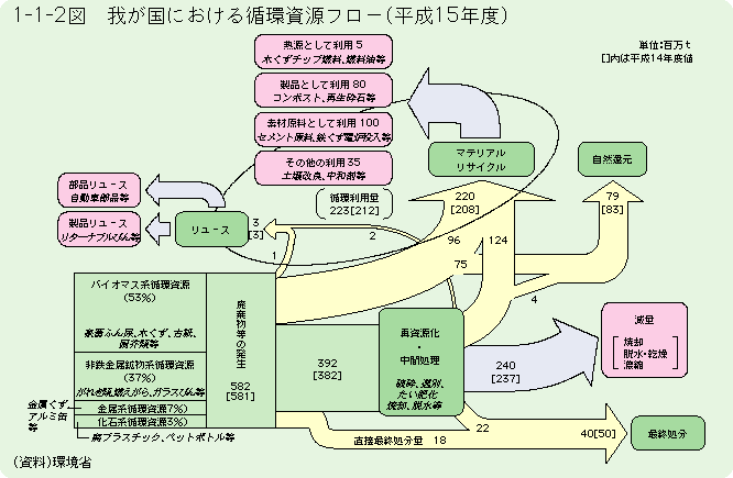
Another wild like-to-be Sankey diagram. Found this on a resources and links list related to ‘material flow’ hosted at Hiroshima University.

The diagram is from a white paper on a ‘Recycling Society’ published 2006 by the Japanese Environment Ministry (HTML version). Data is for the year Heisei 15 (=2003), the book was published in 2006.

The title 平成15年度における我が国の循環資源フロー can be translated as ‘The resource flow cycle in Japan in 2003’ (any other suggestion from a native Japanese speaker out there?).

Flows are in million tons (百万t) per year as indicated in the top right. Values in square brackets relate to the previous year (2002). Flows are not to scale and their width seems to be chosen almost deliberately.

The diagram itself is a very interesting depiction of national material flows. Starting out from the 582 million tons of material (green box lower left), a large portion (220 million tons) is recycled, either directly as rejects from production (96 million tons) or after product use (124 million tons). 3 million tons are reused.

Still trying to figure out some more translations… three more thoughts:
(1) Could this general diagram setup serve as a role model to visualize reuse and recycling in a country. What are the common standards in national MFA accounts for this?
(2) Can I do this more nicely with a modern Sankey diagram software? Would be a nice challenge (mostly for the Kanji characters!)
(3) What would be the picture for Japan in 2015 in comparison to 2003?