Category: Samples

Swiss Energy Balance 2005

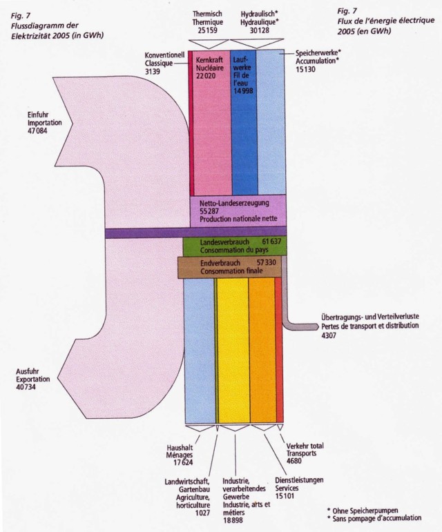
From the Swiss Energy Statistics for 2005 published by BFS comes the following Sankey diagram.

Flows are in GWh. The large pale streams on the left are imports and exports. The vertical bands are domestic energy production (different types of electricity generation) at the top. A breakdown of the consuming sectors is shown in the lower part.

Will try to dig out a more recent energy balance for Switzerland to compare.

1970ies Energy Time Series in 3D

The Energy Education References Wiki has a page on Sankey diagrams. It features many samples, snippets and links directed at teachers.

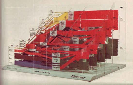
One image in particular caught my attention. This is described as “Energy Display System” created by CSIS in the 70s


(via Energy Education References Wiki)

You all know those national energy flow Sankey diagrams I show here regularly? Now imagine the same type of image as a series consecutive frames for several years. This would produce a kind of animated gif or movie showing changes over time.

The above must be an early 3D version of this. The diagrams are mounted on what seems to be acrylic glass…

Have a Drink

Funny post on German blog “Trinklaune” by Robin Stein. He suggests using Sankey diagrams to control loss of spirits in a pub. Apparently this was kind of a student project.

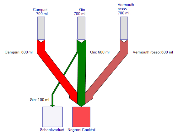
Here we see the Sankey diagram for a Negroni cocktail made up from equal parts of Gin, Campari and Vermouth rosso.

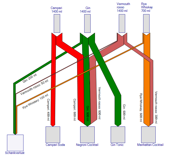
On every bottle a certain quantity is lost. This is probably because bartenders put in more spirit than they should, or offer free drinks, or maybe just drink it themselves…

As we can see in this figure, losses can add up considerably in a bar that serves several drinks.

IPPC Energy Efficiency Report

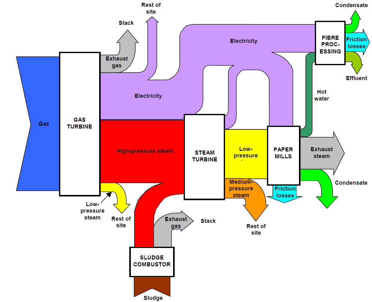
A 2002 Integrated Pollution Prevention and Control (IPPC) report on energy efficiency by UK’s Environment Agency features the following Sankey diagram on page 10.

It shows energy flows in a paper mill. Unfortuntately no values are given nor a unit. So this is to be considered merely as a schematic diagram, not necessarily based on real energy data.

The guidance document explains (p.9):

“It is useful to supplement energy consumption information with energy balances (e.g. “Sankey” diagrams, other flow diagrams or descriptions) to illustrate how energy is used throughout the process (see Figure 2.1). This is particularly relevant where energy conversion is highly integrated within the activities, in order to illustrate any inter-dependencies between energy use and selection of other operational or environmental control measures.”

Energy Embedded in Water

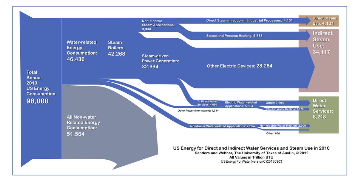
David Wogan at the Scientific American blogs that “Over 12 percent of all U.S. energy consumption is directly related to water”. This was identified in a 2012 study by researchers of UT Austin.

The values in this Sankey diagram are for 2010 in trillion BTU. Energy is used for direct and indirect water services such as steam generation.

The author argues “The study also identifies an interesting policy issue: roughly 25% more energy is used to heat, cool, or pump water than is used for lighting (in the residential and commercial sectors) in the United States – about 5 quads. So why are more efficiency policies and technologies targeted towards lighting and not water conservation?”