Category: Samples

Retrofit for a Maritime Vessel Engine

From what seems to be a 1998 abstract on retrofitting the main engine of the Japanese vessel Fukaemaru come these two Sankey diagrams. Found this on the website of the Kobe University Martime Faculty. Both nice plain black&white.

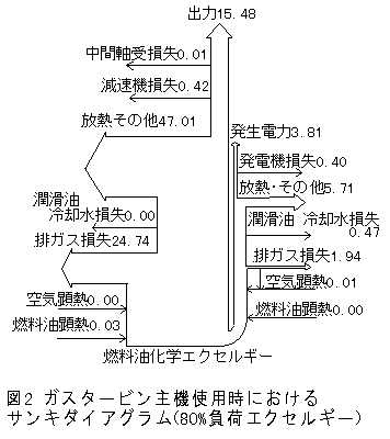
The first one shows energy efficiency of the original gas turbine equipped machine room. The base seems to be 100% energy (the label actually says ‘fuel exergy’) and the useful energy (arrow going straight up, labeled 出力) is 15.48% only. Losses branch out as arrows to the left and to the right.
The other Sankey diagram shows the energy flows for a diesel powered main engine. Efficiency is up to 37.38%

Read the full abstract here (in Japanese).

On a side note: funny to see that in the description of the figure at the bottom the author actually turned “Sankey Diagram” into a “Keysan Diagram”…

Energy Sankey for UCL Campus

The company with the catchy name ‘Useful Simple Projects‘ is “a design led consultancy [that works] with organisations and on major urban development projects to develop sustainability strategies, and identify opportunities for innovation”.

Here is a Sankey diagram they did for an energy strategy study for University College London’s Bloomsbury Campus.

Values are probably for a year. The Sankey diagram shows energy consumption in GW (red and blue arrows). The UCL campus has a cogeneration plant, so heat (green arrow) can be produced and distributed by district heating grid.

The numbers in grey show the carbon emissions in tons of CO2 linked to the energy consumption (most likely using characterization factors for electric energy production in the UK and for provision of natural gas). UCL has a low carbon strategy for the next years and this study helps them to review their goals.

This Sankey diagram is … simple and useful.

New Zealand GHG Emissions Sankey

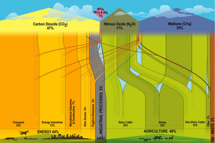
New Zealand’s Ministry for the Environment has the below Sankey Diagram on Greenhouse Gases (GHG) Emissions on their website.

It is interesting to compare this to the U.S. or to the world average. Similar GHG emissions diagrams have been published by the World Resources Institute WRI.

In NZ the main sources of emissions contributing to climate change are from agriculture (48%), while in the U.S. only 6.5% and on a world average this is only 13.2%. (Note: WRI data is for 2003, and there might be methodological differences in the background statistical data. But the proportions should be more or less correct).

Energy consumption accounts for more than 86% of the GHG Emissions in the U.S., and 44% in NZ. Quite a different panorama, and different challenges in New Zealand.

Yet Another ‘Flujo de Energia’ Diagram

The INCyTDE blog article that featured the Energy Balance for Guatemala presented in a post last week also contains two other energy flow diagrams from other Central American countries.

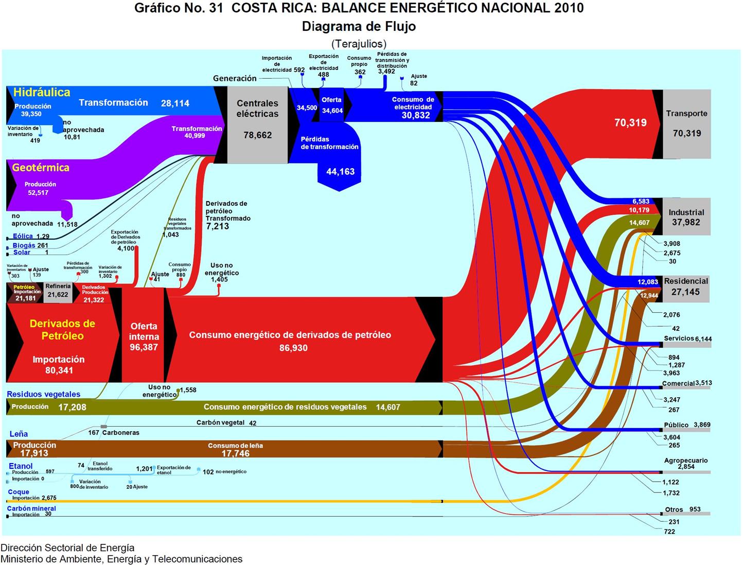
Here is the energy flow Sankey diagram (Balance Energetico Nacional) for Costa Rica for the year 2010.

In contrast to the situation in Guatemala, the dominating fuel is petroleum. The other two important feeds are from hydro and geothermal. Wood is used as heat source in private homes (17,746 TJ), and, with about the same amount, biowaste (residuos vegetales) constitutes an energy source for industry (17,607 TJ).

Flows are in TJ. The diagram is provided by the Ministry for Environment, Energy and Telecommunications.

And this time the diagram is impeccable…

Energy Efficient Technologies, Cogeneration

The following Sankey diagrams are from a report published in 2005 by Austrian Environment Protectionn Agency (UBA). The report is on energy efficient technologies and measures to increase efficiency and features practical examples from industry.

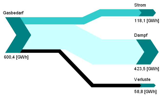
Both Sankey diagrams are from the section on cogeneration (chapter 5, p. 105 and p. 106). The first one shows how natural gas is being used to create 118 GWh electricity and 423.5 GWh steam with an efficiency of 90%.

The second diagram is the breakdown of fuels used in another industrial cogeneration plant. It only features percentage values.

Both sets of data could also be displayed in pie charts, but the Sankey diagrams with directed arrows make an allusion to the output from gas, and to the input feed (in the second diagram).

Waste Sorting Sankey

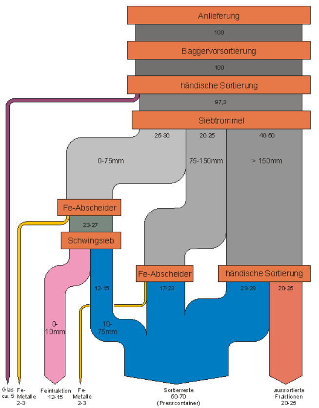
From this presentation by Berlin-based consulting firm UEC comes the below Sankey diagrams on sorting of waste in a waste treatment facility in 2003.

No absolute values are given, only a percentage breakdown of the waste that is being treated.

After the first steps, the drum sieve (‘Siebtrommel’) splits the waste flow in three main fractions based on the size of the shreddered waste. The blue arrow are unsorted remains, the colored ones are recovered materials.

Only apparent flaw of this Sankey diagram is that the arrow labels show ranges for values. An accompanying table in the presentation has the minimum and maximum sorting quotas. Not clear which value was used for determining the arrow widths.