Category: Samples

Where does a family’s tax money go?

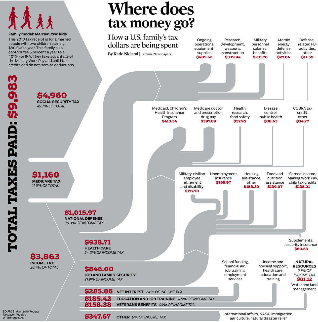
From Katie Nieland’s early bird desgin blog, this Sankey diagram shows an average US family’s tax burden.
Income tax goes to the national budget that is further broken down to show spendings.

More than half of the tax load is social security tax, another 1,016 US$ us medicare. Out of the 9,983 US$ taxes some 1,016 US$ go to national defense.

Data for this average Joe Taxpayer is from ‘Your 2010 Federal Taxpayer Receipt’ by whitehouse.gov

SOPA 2013 Award: Wiring the City

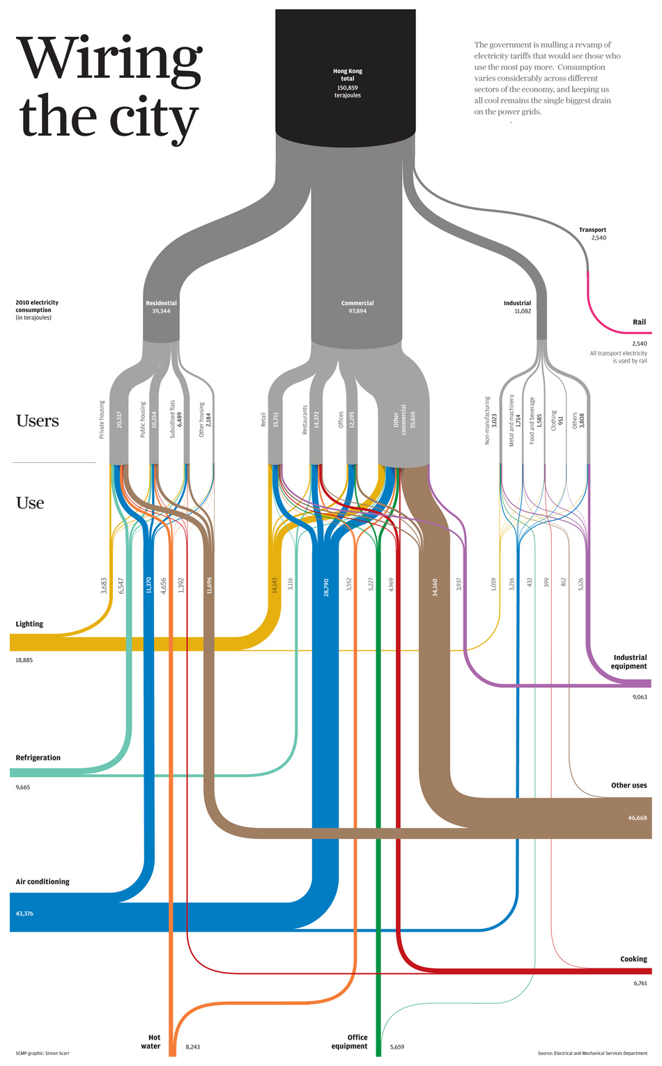
Simon Scarr has won a SOPA 2013 Award for Excellence in Information Graphics (PDF, see p. 13) with this Sankey diagram titled ‘Wiring the City’ originally created for the South China Morning post.

It shows energy flows and energy use in Hong Kong

On his blog he writes: “… we took a look at Hong Kong’s power consumption. Who uses all the electricity in our city and what is it used on? (…) Data set was provided by the government’s Electrical and Mechanical Services Department. (…) This type of chart is known as a Sankey diagram. The thickness of each line reflects a value. In this case, an amount of electricity in terajoules. All of the lines add up to give subtotals and totals by users (grey) and end use (coloured).”

Congratulations, Simon!

Building Energy Measuring and Modelling

This article on ‘A Pilot for Measuring Energy Retrofits’ describes how researchers from the EEB Hub used an old navy building in Philadalphia to “determine detailed system performance”.

EEB Hub researchers outfitted Building 101 with sensors and a data acquisition system to determine detailed system performance, building energy loads, indoor environmental quality (IEQ), and a detailed operation of the building control system. … The sensors read data from 509 sensing points, collecting 1,048 pieces of data at one-minute intervals. These data points track indoor air quality, occupant comfort, and building energy use.

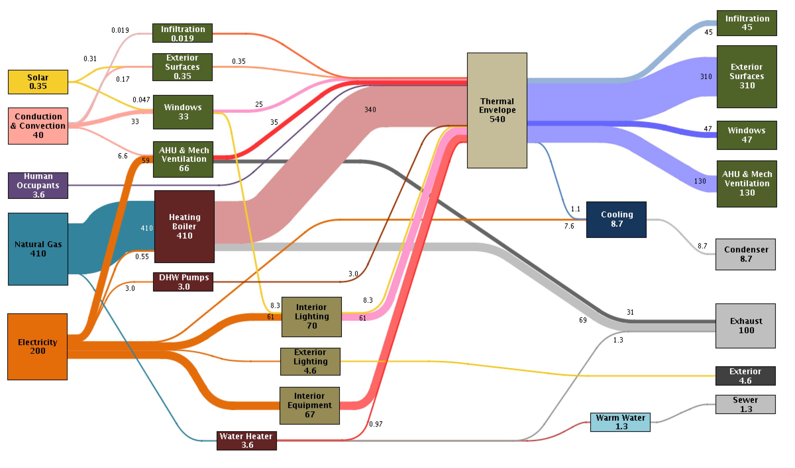
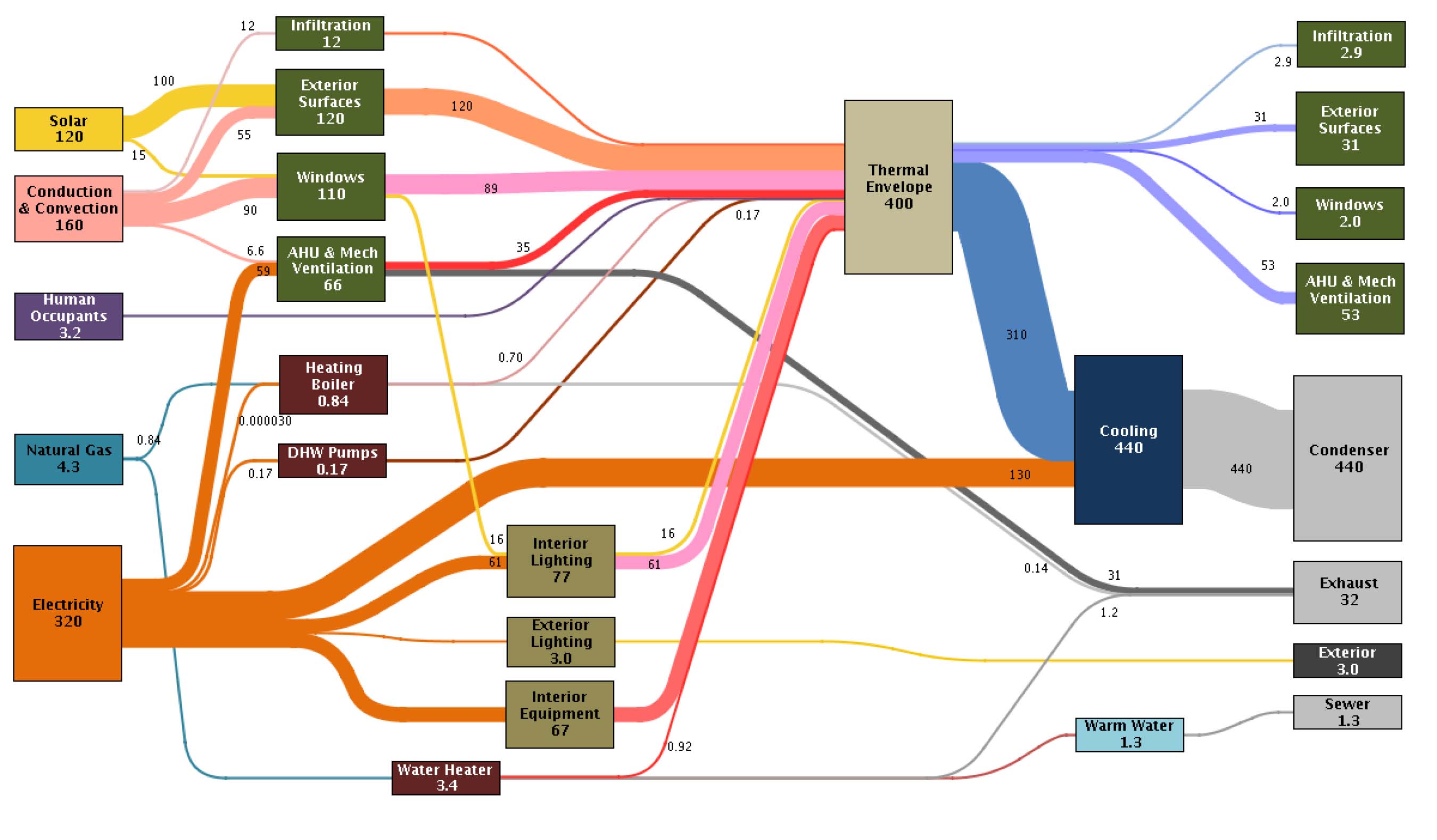
The result of that “inverse modelling” (i.e. measuring) approach are presented in Sankey diagrams and are used “to identify discrepancies in the predicted versus actual energy balance”.

There are significant differences between the January energy use…

… and the energy picture in July

While in winter mainly natural gas is used for heating, the gas consumption in summer is down. In July electricity consumption is significantly higher due to air conditioning.

Unfortunately no unit of measurement is given (it could be kWh), but nevertheless proportions of the energy flows are correct.

Read full article.
IEA’s Energy Sankeys for 100+ countries

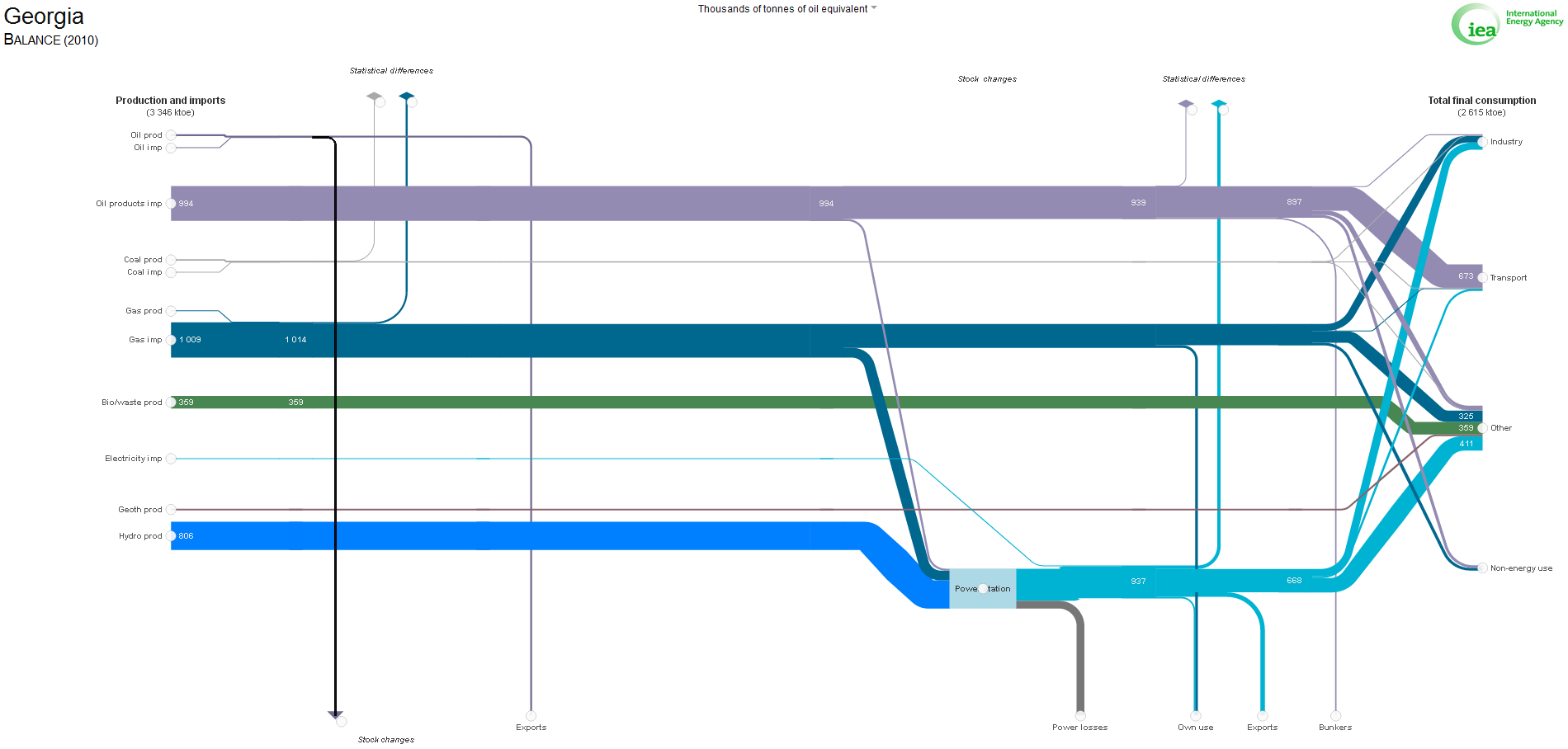
A one stop source for energy balances from all over the world is this International Energy Agency’s (IEA) website. When accessed first time it shows the World Energy Balance for 2010. You can choose to view either the balance (primary energy to final consumption) or a breakdown to consuming sector for more than 100 countries and even for some regions.

Here is a static image deliberately chosen (Georgia 2010). Data in thousands of tonnes oil-equivalent (ktoe).

But the best thing is to actually browse these diagrams and interactively discover and compare them.

You can also watch the Sankey diagram develop over time (movie time line 1973 to 2010 for some countries). Check out, for example, Republic of China’s growing hard coal use for energy generation. Many additional options are available, such as legend, node details as pie chart, dragging nodes.

Great tool IEA is providing to the community, making its vast energy data accessible in a clear, comprehensible and even playful manner.

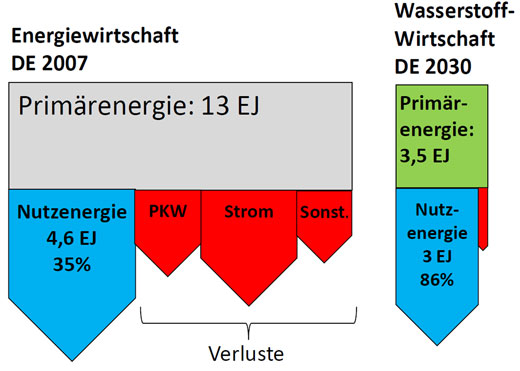
2030 Hydrogen Energy Economy

From a lengthy article in German advocating a hydrogen energy economy in 2030. Losses (“Verluste” ) in red. Quantity labels (absolute/percentage) not used consistently on all arrows.

Comparison current Energy Scenario in Germany with 2030 Hydrogen Energy Economy (right)

Comparison Biomass Methan Energy Scenario in Germany with 2030 Hydrogen Energy Economy

Could also be presented as pie charts, but author opted to do a simple breakdown using Sankey-style arrows.

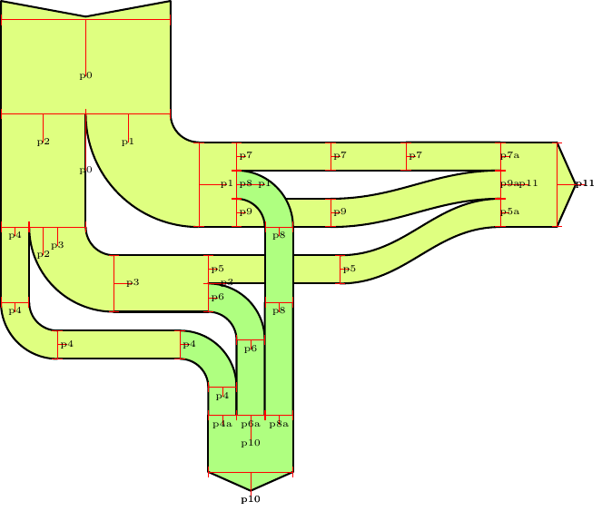
Sankey Diagram using TikZ

Over at the TeX – LaTeX Stack Exchange (a Q&A site for users of TeX and LaTeX) this article explains “How to draw a Sankey Diagram using TikZ”. Okay, its a bit techie, but the results look good.

The original poster wanted to know how to draw a Sankey diagram using the TikZ package (TikZ is a “higher-level drawing language built on top of the PGF graphics framework”).

User Paul Gaborit came up with this example using TikZ and building his own sankeydiagram environment

The interesting thing is that flows can fork and join, and that there is a check that the sum of quantities must be equal to the quantity of sankey node to fork.

This is how the the original sample Sankey diagram looks like with this solution.

Very nice result. So for those out there used to working with TeX/LaTeX out this is actually a good solution.

Don’t miss to read the comments too (there’s one pointing to an alternative (Matplotlib and Sankey module).

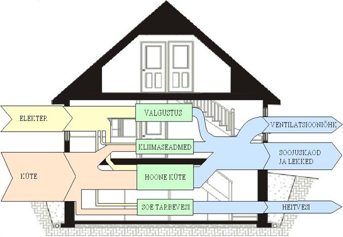
Estonia House Energy Balance

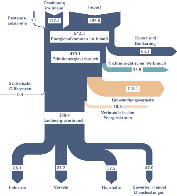
Similar to the Sankey diagram shown in a post last week, the below Sankey diagram also shows the energy balance of a house. Found it on an Estonian blog.

Unfortunately just a schematic Sankey diagram without figures or units. Energy “input” and losses. Looks to me like a hand drawn sketch. Valgustus is lighting, Kliimaseadmed is air conditioning, Hoone Küte is heating, and Soe Tarbevesi is warm water (thanks to Google Translate).

FRED Energy Flow Diagrams

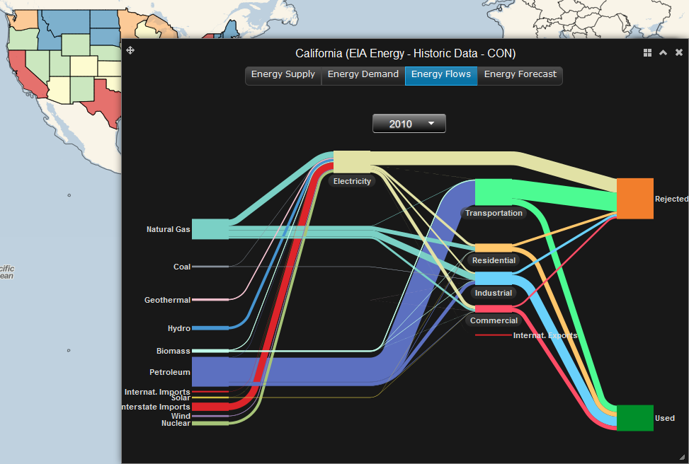
A number of renown partners such as DOE, NREL, Pacific Northwest National Laboratory and more) have created FRED (FRee Energy Data). This interactive website allows visualizing energy data for all U.S. federal states. Here is a screengrab for California 2010:

Go to the website directly to experiment yourself. Here is how to proceed: To start, make sure the layers are turned on (button at the top left), then click on the federal state of your choice. In the pop-up window there are four visualization options: Energy Supply, Energy Demand, Energy Flows, and Energy Forecast. Choose ‘Energy Flows’ to produce the typical production/consumption Sankey diagrams. Hover over the bands to see more detail.

FRED is really intuitive and fun to use. And it is open-access. You have more options when you register. According to the About section, among the future planned developments of FRED are “expanding FRED’s US coverage to global, adding energy expenditures and C02 emissions data, and allow[ing] users to extract FRED data and graphics”. Good!