Category: Samples

Sample Diagrams in e!Sankey

I am subscribed to different newsletters and RSS feeds to keep track of the Sankey diagram software market, trying to stay up-to-date on new software available or updated versions.

The latest release of e!Sankey (v3.2, the second one this year after v3.1 in January) seems to be mainly a bugfixing release. However, what’s nice is that they have included a number of new sample diagrams and templates.

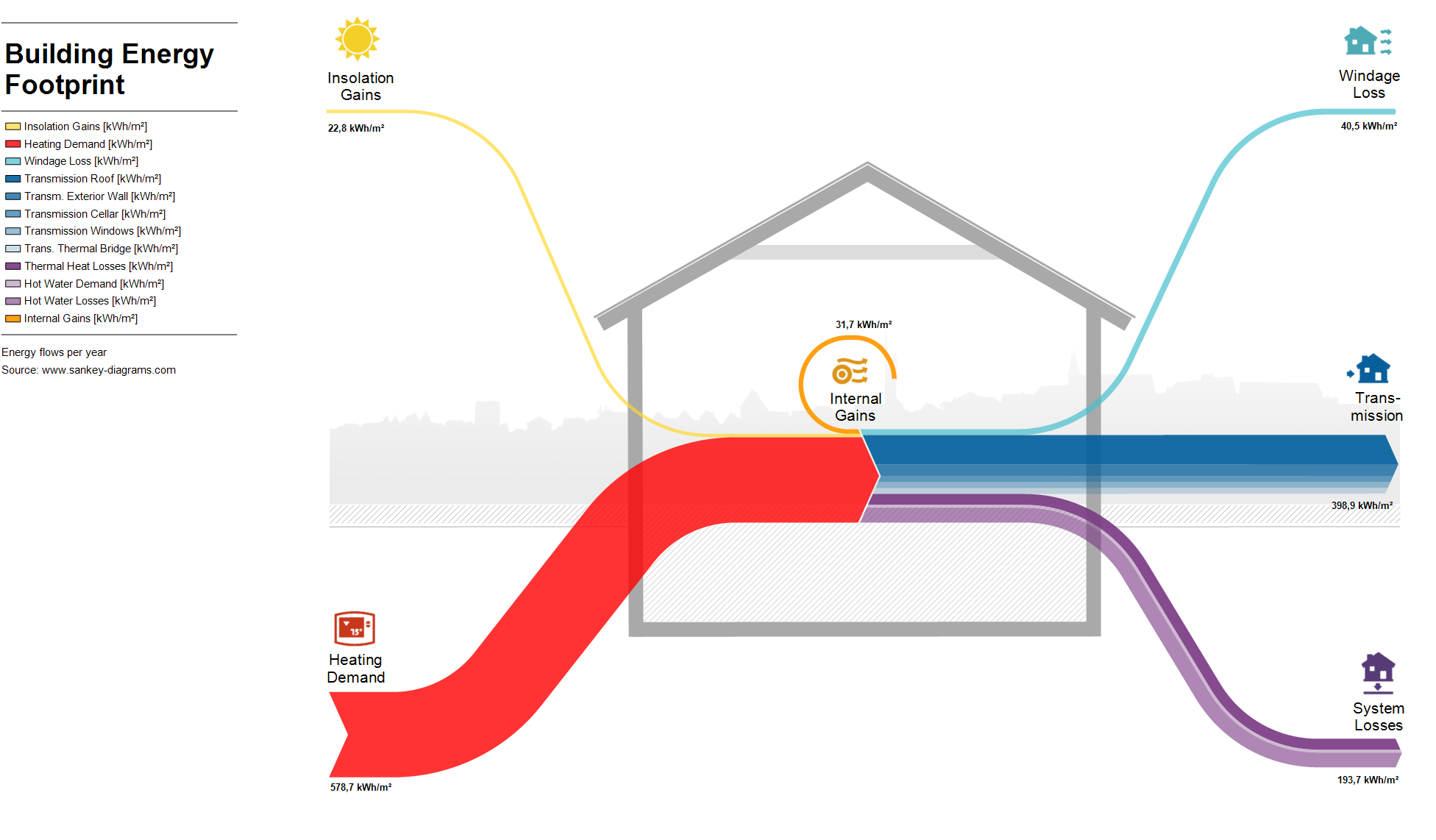
This is a Sankey diagram depicting the energy balance of a family home.

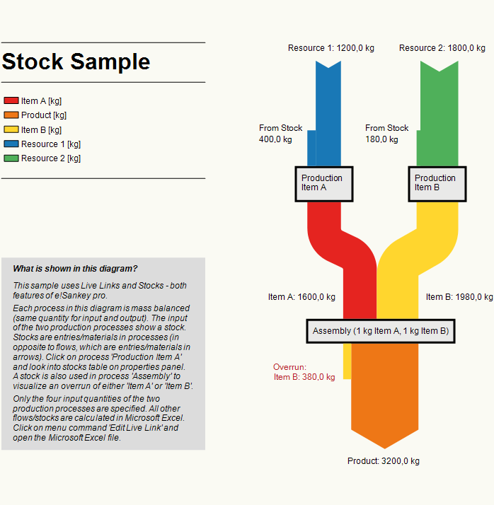
The one below has an interesting feature where balance differences (or as they call it: “stocks”) occur at a process, in a top-to-bottom direction.

Most samples feature a description panel, some of them a color legend for flows. There are more in the trial version. Nice

Energy Flows in a Desalination Plant

From a 2006 EU-funded research project called ADU-RES, here is a Sankey diagram from one of their reports (p. 24).

It features the energy flows of an autonomous desalination unit based on renewable energy. The plant (ITC’s Dessol) where they gathered the data is on the Spanish Canary Islands. “The system is conceived for small settlements (1-1500 inhabitants), since the scale/cost factor of the required investment/land restricts the capacity of production installed to 100 m³/day”.

The figures represent annual average specific energies in kWh per m³ of desalinated water (or pumped seawater?).

World Energy Flows 2012

Browsing through my bookmarks (plenty of Sankey diagrams there waiting to be shared with you) I wonder if I have previously presented this one.

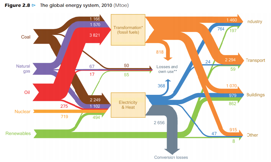
This is a Sankey diagram of the global energy flows 2010 from the ‘World Energy Outlook 2012’ by OECD/IEA. Units are in Mtoe.

via Resources Research but the original post could well be from Peak Oil (Kjell Aleklett: An analysis of World Energy Outlook 2012 as preparation for an interview with Science)

French Négawatt Energy Scenarios

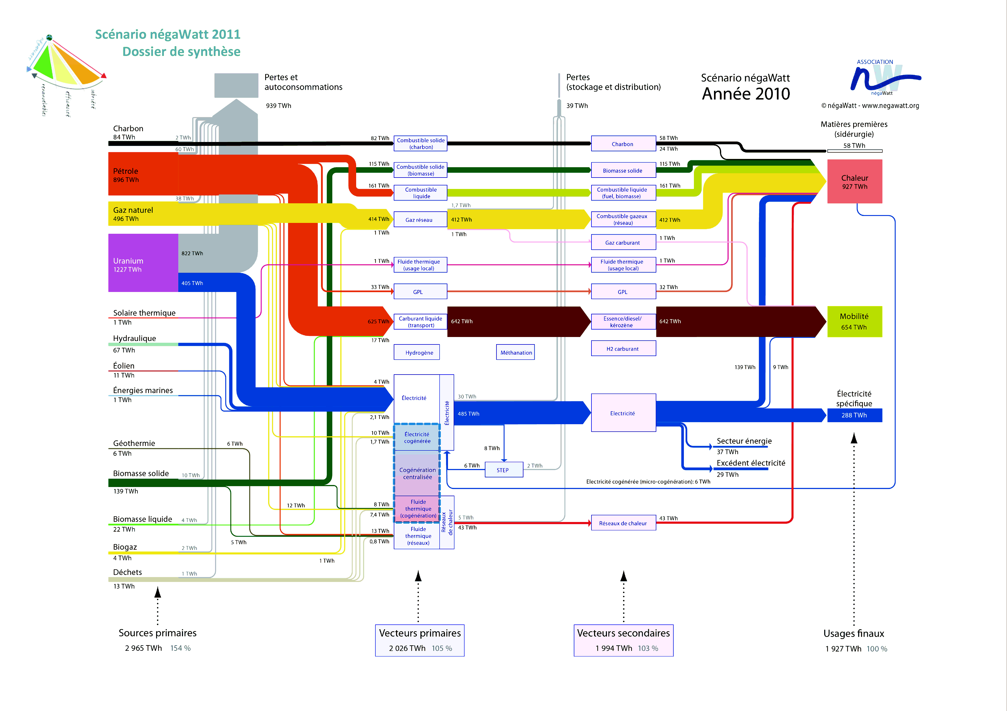
French Négawatt association is advocating a changed attitude towards energy use, expressed in the three words “sobriété – efficacité – renouvelable” (translates as frugalness/modesty, effciency, renewables). On their website they show Sankey diagrams for a 2010 and a 2050 energy scenario. A simplified and a detailed version is available for both years. Below is the detailed 2010 version.


(see a high-res image with magnifying/zoom feature here)

Flows are in TWh. As common in this type of energy flow Sankey diagram they show in a left-to-right orientation the primary energy sources, energy conversion, and final use. Additionally there is a sum for each of the columns that tells us the overall energy efficiency: In 2010, to provide 1908 TWh energy to the users required 3009 TWh of primary energy (1,58:1).

These Sankey diagrams in my opinion are very-well structured, information-rich and don’t lack a certain esthétique

A day in the life of… Victor Hugo

I admire architects for their visionary ideas, for being able to transcend established limits, for pushing things beyond the common … at least when still in early phases of a project.

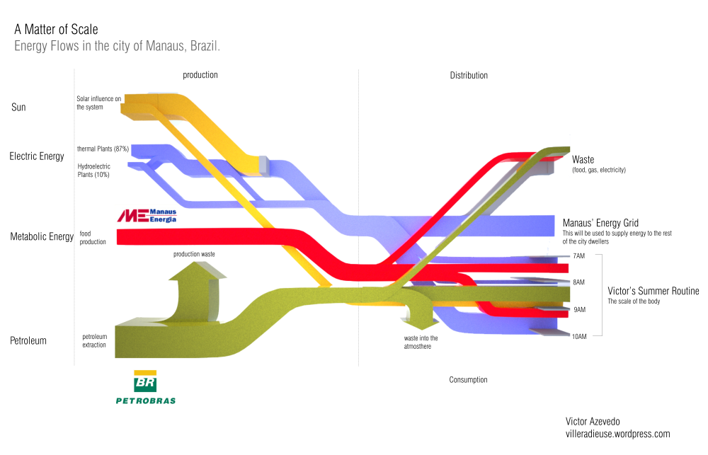
Victor Hugo Azevedo’s blog is called ‘La Ville Radieuse’ (The Radiant City) after a concept by Le Corbusier. It has all kinds of architectural stuff. By mere coincidence I discovered the following Sankey diagram he did in 2011 as class assignment on energy flows…

“This time we were asked to trace the energy flow that directly affect us. I traced the beginning of a common day during my summer in the city of Manaus Brazil. The following diagram shows how the larger infrastructure shape my routine.”

This looks at first sight like one of the classic ‘national energy flow’ Sankey diagrams with fuels (production) on the left, distribution and consumption on the right. But this is only partly true. Look at the right part where the energy flows stack and have a vertical time line.

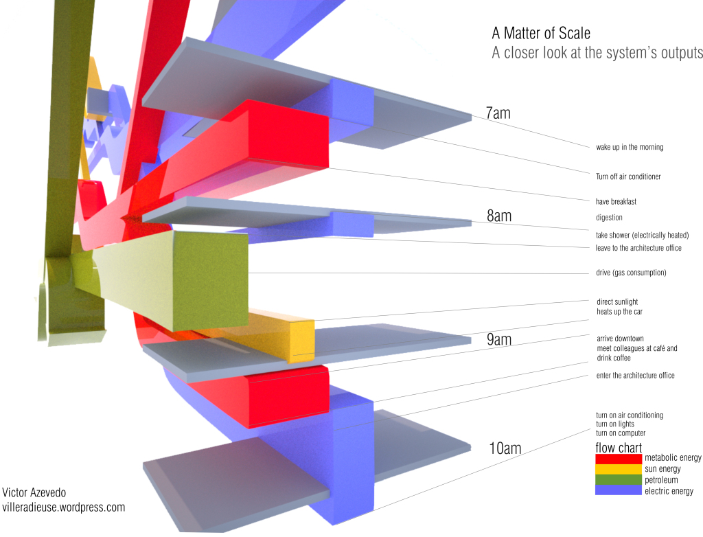
“The next diagram is nothing more than a closer look into one of the ends of the diagram, which is my own routine on a four hour span (from 7AM to 10AM on a regular weekday in June)”

So forget about scale and units here … this is a concept diagram! The Sankey diagram links an individual’s consumption patterns with the bigger picture, thus stressing everybody’s personal share and responsibility in energy consumption (and the possibility to take action). Kudos for this idea!

Apart from that it is of course a fancy 3D rendering, and I love the rotation and close-up of the morning routine. Make sure you post a comment directly at Victor’s post, if you like it as much as I do!

Note: Somewhat related, check out Molly Eagan’s ‘Where is Petroleum in our Daily Lives’ here.
Biomass 2-in-1 flipped Sankey Diagram

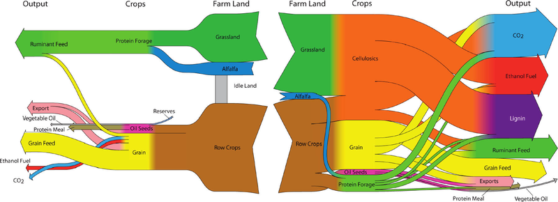
Browsing my previously bookmarked Sankey diagram samples I came across this one which I find interesting. The diagram was shown in a Green Cars Congress blog entry in 2010 and illustrates a study that finds that “large scale biofuel production can be successfully reconciled with food production through the use of land-efficient animal feed technologies and double-cropping”. The authors of the study are Dr. Bruce Dale and colleagues at Michigan State University.

As always I refrain from commenting the underlying content as I am not a domain expert. Rather I would like to focus on what makes this Sankey diagram special.

These are actually two diagrams that are “flipped” over at a vertical center line. The left half of the diagram has a right-to-left orientation and shows the “114 million ha of cropland used now to produce animal feed, corn ethanol, and exports”. Some cropland sits idle and is not used productively. The right half is a second Sankey diagram and shows a different use of the cropland with “major crops and outputs for the maximum ethanol production scenario”. No units in the Sankey diagram but the central columns seems to represent the land area (million ha), while the two outer vertical columns (Crops, Output) show mass (tonnes?) on a different scale.

In contrast to the first scenario it can be observed that “30% of total US cropland, pasture and range, up to 400 billion liters (106 billion gallons US) of ethanol can be produced annually”. Ethanol can be used as an alternative non-fossil car fuel. CO2 emissions are also higher but this is from biogenic sources.

Low Carbon Scotland GHG Sankey

This one is from the report ‘Low Carbon Scotland: Meeting our Emissions Reduction Targets 2013-2027 – The Draft Second Report on Proposals and Policies’ available on the Scottish Government website.

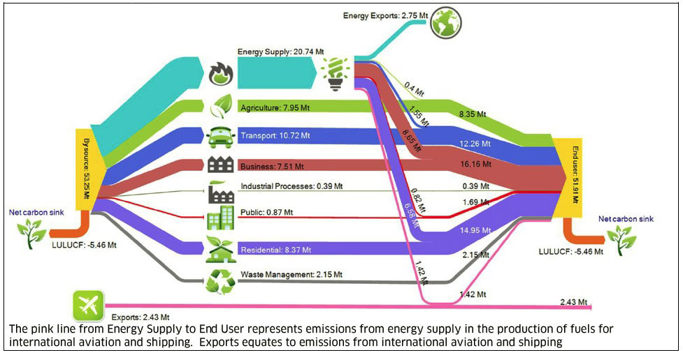
The Sankey diagram visualizes “By Source and End User GHG emissions transfers for Scotland in 2010 (Mt CO2e)”. Data for the diagram from “Greenhouse Gas Inventories for England, Scotland, Wales and Northern Ireland 1990-2010 (Aether and AEA, AEAT/ENV/R/3314)”.
For those wondering (like I did!), ‘LULUCF’ is for ‘Land Use, Land Use Change and Forestry’.

According to the report

“Scotland accounts for only around 9% of the UK’s total energy consumption, but is rich in energy resources and produces a diversity of energy supply. The energy supply sector covers the production of energy, and in particular the generation of electricity, either in power stations or in large industrial process (like refining). Energy supply in Scotland produced 20.7 MtCO2e of greenhouse gas emissions in 2010, which equated to 37% of Scotland’s total in 2010.”