Category: Samples

President’s Budget Revenue/Spendings

In a post on the winners of the SND 31 competition over at the Infographics News Blog I found the below diagram on the President’s Budget. Originally published by the Washington Post it has won an Award of Excellence in the 31st edition of the Society of News Design contest in the Infographics / Breaking News section.

It is not really a Sankey diagram, since the arrows are not explicitly directed. But it has weighted arrows/bands, in this case representing $$$. This infographic was maybe inspired by this one from Spain that was – after lengthy discussion – named a “distribution diagram”.
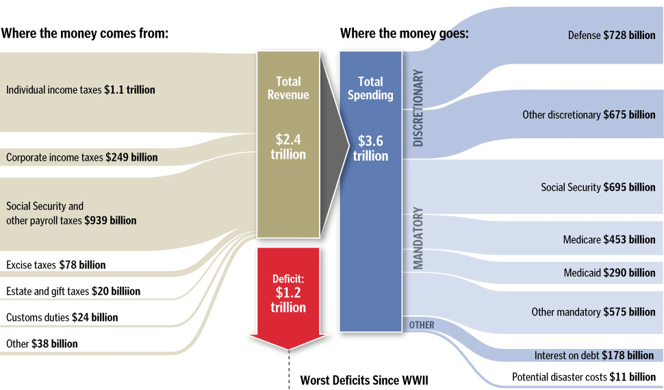
I cropped the lower part of the infographic that had details on the deficit as bar chart. See original, full infographic file here.

Two more infographics in this post have characteristics of Sankey diagrams, and I might post them here on the Sankey Diagrams blog, if I run out of ideas one day…
Cogeneration Visualized – Part 1

I love Google’s image search. This is one of the main sources for new Sankey diagrams on this blog.

The other day I used the Czech term for cogeneration (‘kogenerace’) … and immediately had five new diagrams to share with you. Two of them can be found below…

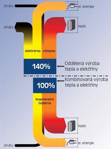
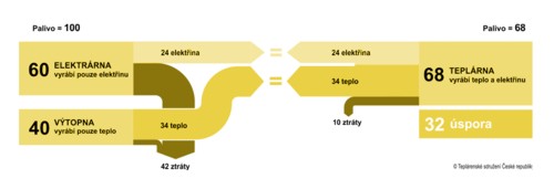
As in most cogeneration schema diagrams, two energy production systems are compared in one diagram. The classic one, and the combined heat and power CHP system. Heat (teplo) and electricity (elektrina) output is set to the same size and primary energy requirement is being compared. Losses (ztráty) branch out to the other side. In the first one these two systems (found on the EkoWATT website) are shown in a vertical orientation:

The second one (from All for Power website) has a horizontal orientation:

The cogeneration system is 1.4 times more efficient (140:100) in the first diagam, the second Sankey diagram has cogeneration 1.47 times more efficient (100:68).

Two or three more to come in another post next time.

European Energy Flows Sankey

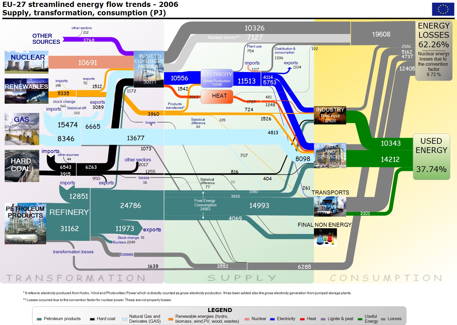
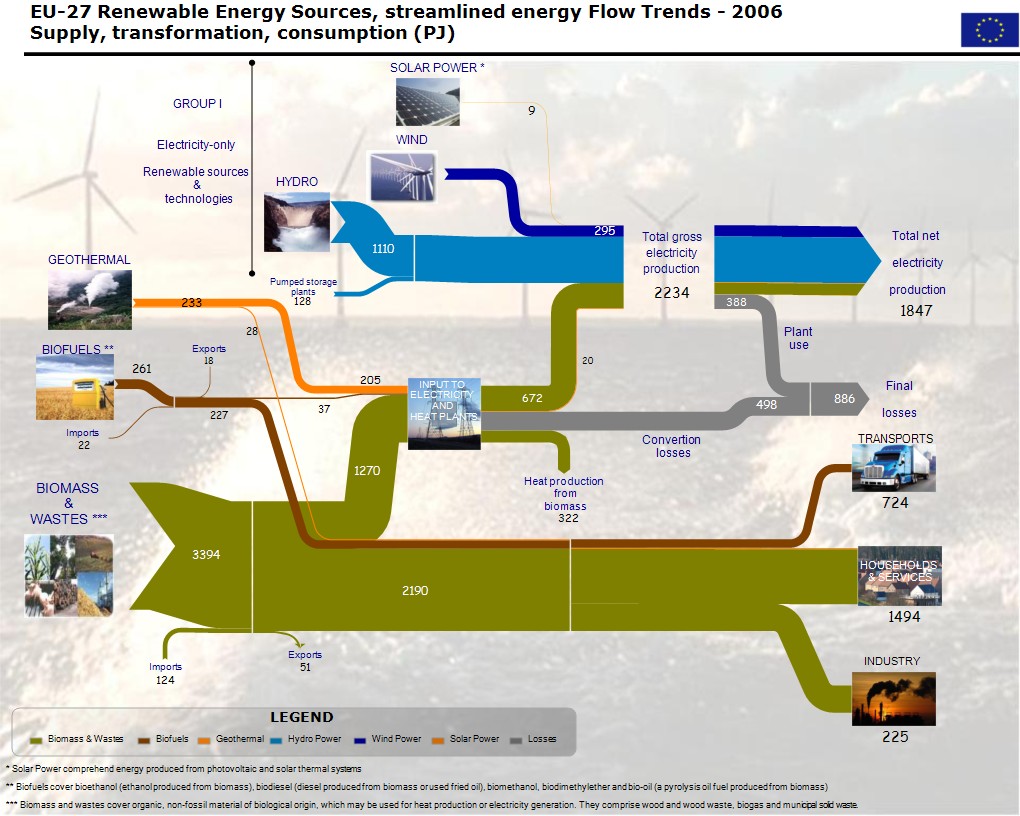
Finally have I run across a European Energy Flow Sankey diagram in a post on Google Groups…

European (EU-27) Energy Usage:

European (EU-27) Energy Usage (renewable energy sources only):

These two images were posted by Herman B. (apparently linked somehow to the European Comission) in reply to an inquiry by Andrew D. I don’t know the original source or publication. Flows are in petajoule (PJ) for the year 2006.

In my optinion they could do without the background image and the photos, but nevertheless, these are fine Sankey diagram examples.

Comparing Power Plant Efficiency

Found this comparison of the efficiency of two power plant technologies on Russian design journal website kak.ru (via jvetrau’s bookmarks on visulize.us)

The Sankey diagram is in German and from the quality of the image I assume it is a scan from a printed publication. This seems to be a comparison of power plant technologies (‘Kondensationskraftwerk’ vs. ‘Heizkraftwerk’). The plant on the left has 63% losses and produces only electric energy, while the one on the right makes use of 88% (of the primary energy?) and produces both heat and electricity. A nice detail is the power plant silhouette sitting at the top.

If anybody has a clue where this vintage-style Sankey diagram has been originally published, please let me know.

Industrial Compressed Air System

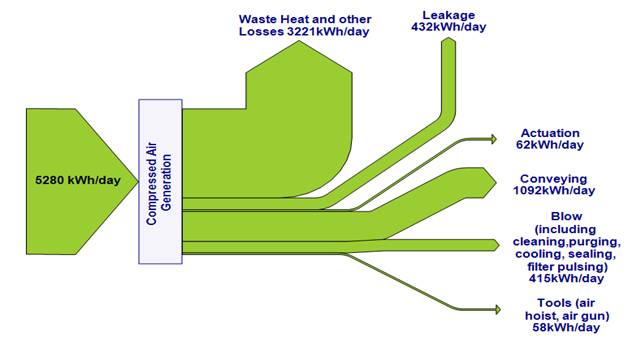
Craig Meskell from Trinity College, Dublin submitted the Sankey diagram below for publication on the blog.


Craig writes:

“here’s a Sankey diagram of the energy balance in an industrial compressed air system. The factory is situated in Ireland (not too far from Co. Tipperary!) [Note from Phineas: this is where Cpt. Sankey was born]. The work is detailed in: Eret, P., C. Harris, G. O’Donnell & C. Meskell, A practical approach to investigating energy consumption of industrial compressed air systems. Proceedings of the Institution of Mechanical Engineers, Part A (Journal of Power and Energy), 2011. DOI: 10.1177/0957650911423173″

A nice, simple, clear diagram. Thank you. If other readers have Sankey diagrams to share, please send them to blog@sankey-diagrams.com

Sankey Use in Energy Management

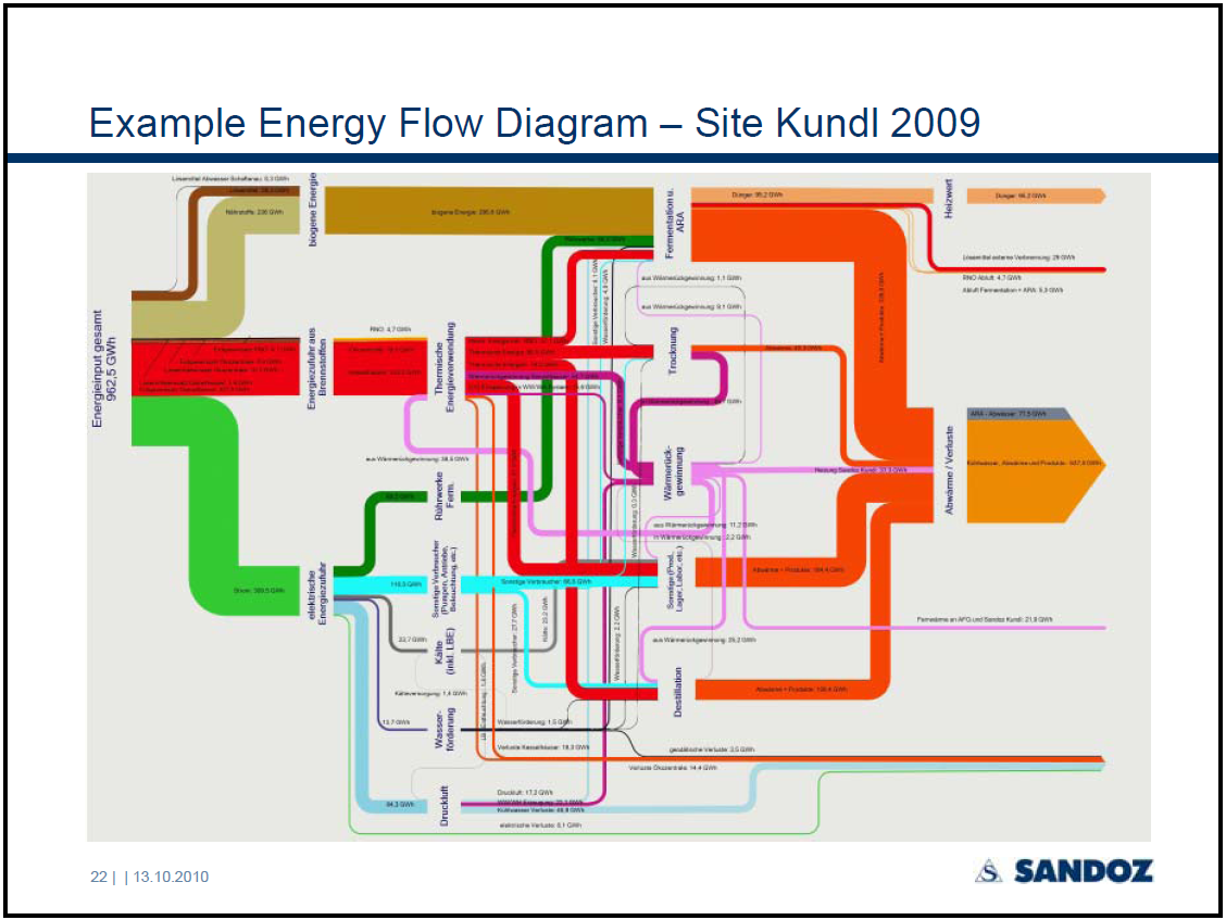
In a presentation given by Jurgen Zettl at the EM2010 conference in Vienna, the author reports about the integrated energy management and reporting at Sandoz’ Kundl site.

Page 22 of the PowerPoint has the following Sankey diagram:

The pic isn’t very clear, and it is difficult to see any detail. The overall energy consumption of the Kundl site comes in from the left (962,5 GWh in 2009). It is broken down to electric energy, energy from fossil fuels and energy from biomass (Note: I was wondering about the latter, but this is explained on page 6 that this is “feed for fermentation, solvents, … “). The streams are further broken down by use area. At the right side the flows join again to visualize useful energy and energy losses.

Good to see that large industries are using Sankey diagrams as an important element of their integrated energy management…

Be sexy, but mind the details

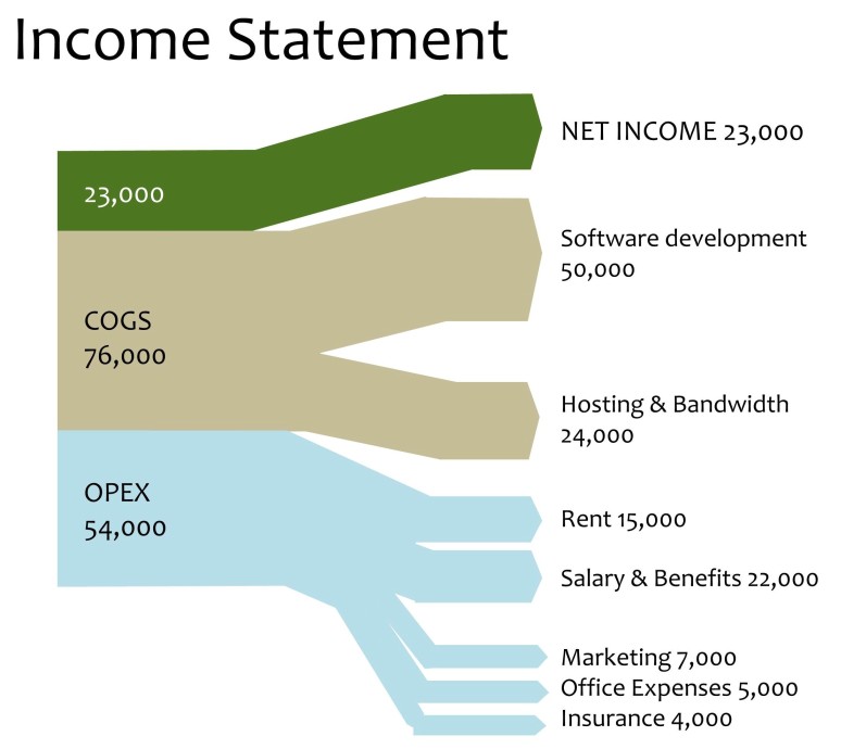
A tiny example, but fun to see: income statement, apparently for a webhosting company. Operational Expenses (OPEX) in light blue, cost of goods sold (COGS) in light brown, net income in green. No currency given, I think this is just to convey the idea of “money flows” and to give an idea how data can be presented other than in tables.

This is from a post called “5 exciting alternatives to boring power points” at Speaking Power Point.

The detail shows though that even if Sankey diagrams are “sexier” than tables, you still need to pay attention to the details when drawing them. This one was apparently made in Power Point by joining shapes and arrows. Which wasn’t all that successful in some places, as the detail shows. Would have been better to use a Sankey diagram software.

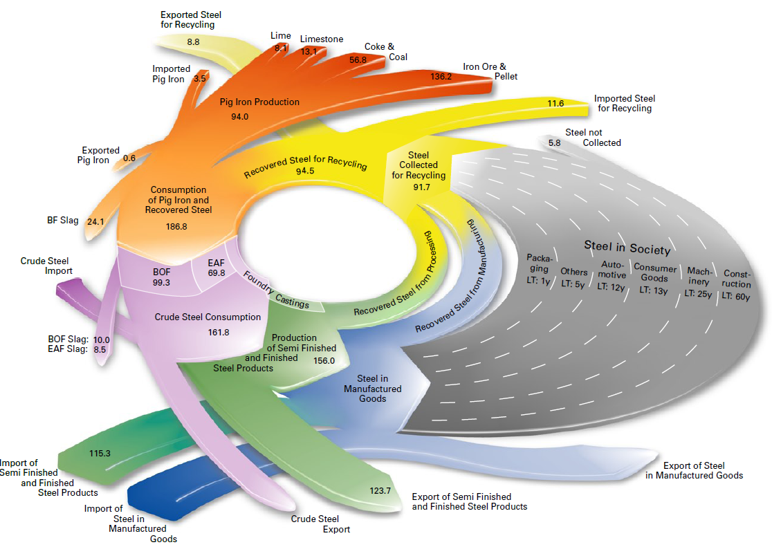
3D circular Sankey ugliness

You might remember the radial Sankey diagrams “invented” by Visio guy (here). This 3-D version below left me speechless… I hope the guys at junkcharts dedicate a critical evaluation to it….


(view the original diagram here)

This is from EUROFER (The European Confederation of of Iron and Steel Industries) and shows steel flows in fifteen European countries (EUR-15) in million metric tons. Values are for 2004. The grey area is supposed to represent steel accumulated in capital goods (machinery, buildings, …) over a certain life time.

Whooo woah, that’s a merry go round, I feel dizzy already!