Category: Samples

Google Analytics use Sankey Diagrams

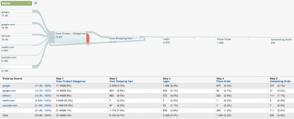
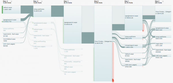
I was advised by a reader that Google Analytics now visualizes web visits with Sankey-style diagrams. On the Google Analytics blog this new instrument was presented.

“Our design team chose not to build individual “path analysis,” which can quickly become complicated. Instead, they took inspiration from a wide range of sources to reimagine approaches for visualizing visitor flow. Our goal is to help marketers and analysts better optimize their visitor experience by presenting the ways that visitors flow through their sites in an intuitive and useful way.”
(via visualisingdata)

The flows look neat, but they are still struggling with the diagonal routing of the arrows where the width of the flow is not maintained. Check the flow that leaves the node in the bottom left corner of the picture below.


(Source: Google Analytics Blog)

All in all a great new tool and this will surely help spread the idea of Sankey diagrams for visualizing flow quantities.
Find the error…

Just back from a short break. A few nice Sankey diagrams and links to interesting diagrams in my inbox. To get into regular blogging mode again, here is one from my bookmark folder. Enjoy. More to come soon…

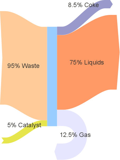
A simple percentage breakdown of mass inputs and outputs. Even though it only has 5 arrows (2 in, 3 out) there is an error in this Sankey diagram. Who can spot it? First commenter to tell the answer will get a honorable mention.

VisualizeGreen.com Free Sankey Template

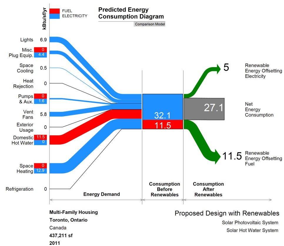
Premnath Sundharam from the Visualize Green blog contacted me to draw attention to a Sankey diagram template he has made and that is available for download on his site.

The diagram is for predicted energy intensity for buildings. An Excel template is provided that allows entering the data. You can use this with the free trial version of e!Sankey (registering required). All elements of the diagram and the entry sheet is explained in detail by Premnath. In regard to the unit (KBtu per square foot per year) he says:

Last but not least, kBtu/sf/yr is becoming the universal (US) unit of communicating building energy consumption. This unit is called the EUI – Energy Use Intensity and since it is a simulation of how your building will perform, it is called PEUI – Predicted Energy Use Intenisty.

Good stuff, Premnath! Thanks for making this available to everyone.

Note November 2011: Also look at Premnath’s Energy Story here.

Misc Sankey Diagrams Uncommented 04

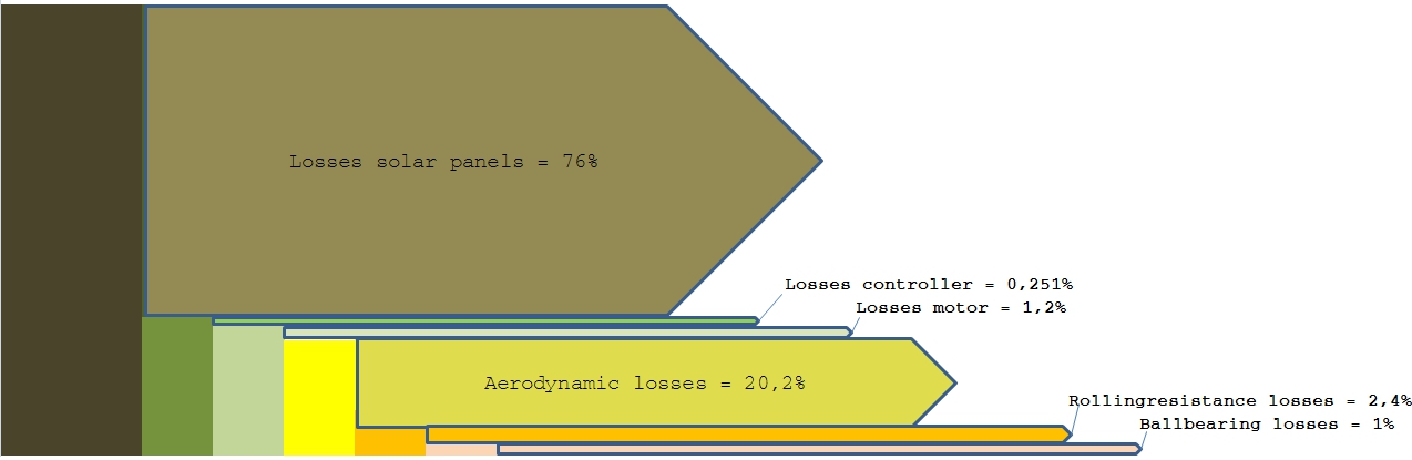
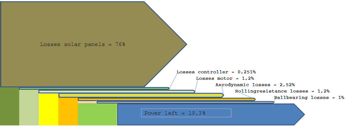
Found these two Sankey diagram on Wikiversity. I think it was somewhere on one of the sub-pages on the small solar vehicle… They show energy losses at the different components of the vehicle, such as at the solar panels or through rolling resistance. Percentage values.

These diagrams are made up from rectangles and simple arrows. Only straight arrows, no curves. The blue color of the border of some of the thinner arrows adds a strange effect…

Sankey Diagrams in Python

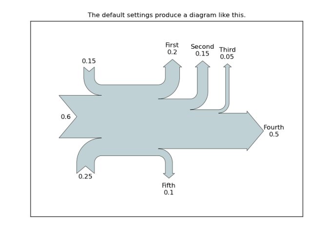
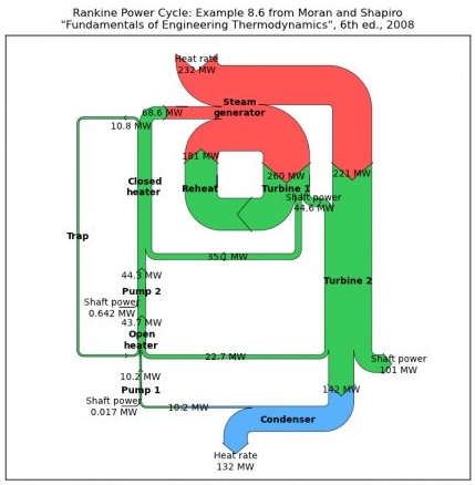
I am impressed by the Sankey diagrams produced with ‘sankeypython’, a new open source project. I first came across this in a discussion forum, where Yannick Copin from France presented his work using matprotlib. The project is now at Sourceforge. This sourceforge link not working any more, check Matplotlib project instead (thanks to commenter Johannes for pointing out the broken link), and several Sankey Diagrams in Python samples can be seen there.


The most important functionality is available, such as labels for flows and units. Diagrams have a basic left-to-right orientation, with vertical arrows branching out on both sides. Color changes seem to be realized by combining several systems. There are apparently no node objects where the flows directly hook to (as is common in other tools), but by interlacing differently colored Sankey arrows a process step becomes kind of implicit.

This has only been up on Sourceforge since June 2011, so it will be interesting to follow further development on ‘Sankey Diagrams in Python’. I have added the project to the list of Sankey diagram software.

Engine Combined Cycle Power Plant Sankey

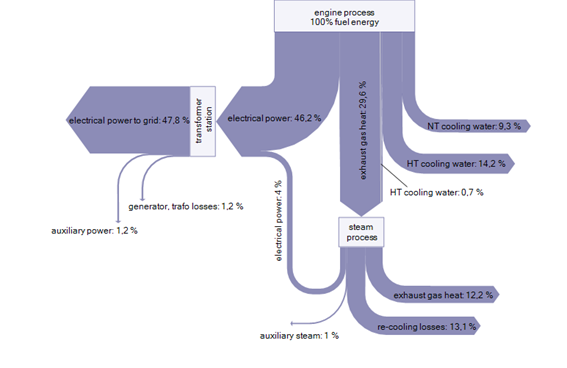
At the Technical University of Munich a project on Engine Combined Cycle (ECC) Power Plants aims at “improving the electrical efficiency of an engine combined cycle plant by using the exhaust gas heat in a steam cycle”.

The following Sankey diagram is shown to illustrate where heat can be recovered.

No absolute values are given, but the Sankey arrows represent the percentage of the primary energy. Four percent of the energy in the steam process can be recovered to add a total of 47.8% efficiency output of electrical power to grid. Losses branch out to the right side and are primarily via the cooling water and condensate at the steam process. The whole Sankey diagram is presented in a simple single-color design.

Efficient Water Use in Saudi-Arabia

Consumption of water resources in arid and semi-arid areas has become an important issue over the last years. The Wafeer water conservation project is trying to raise awareness and educate people in Saudi-Arabian industry in regard to the efficient use of water. On page 21 of their Water Efficiency Manual, the following Sankey diagram can be found:

The report describes that “Sankey diagrams enable visual representation of both quantitative and qualitative characteristics of water entering and leaving different activities and therefore serve as a good communication aid.”

The above diagram does not show any unit, but presumably is meant to be in cubic metres (per year?). It shows water (blue) and waste water (grey) flows, as well as evaporation losses (red).

More water Sankey diagrams of similar style can be found on pages 19 through 23 in this workshop presentation on ‘The Importance of and Difficulties in Water Accounting’.

Misc Sankey Diagrams Uncommented 03

From the Mostly Uncommented Series, here is another one that has been sitting in my collection.

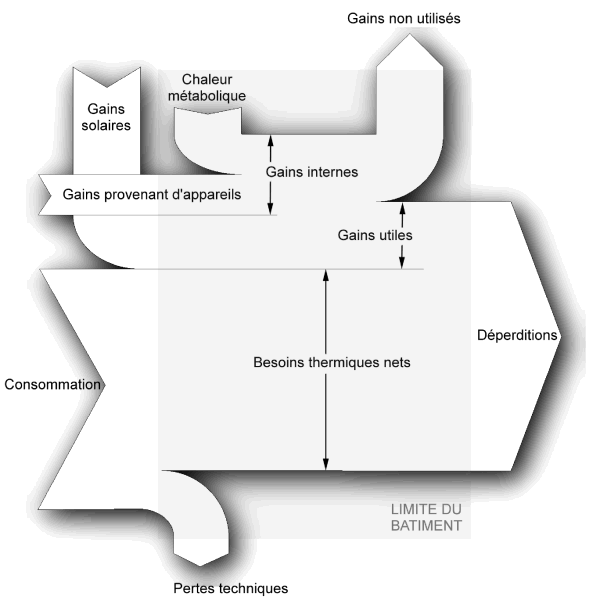
Black/White Sankey diagram for energy gains and losses in a building. Titles in French. Shadow effects. No values given. Unnecessary crossing of Sankey arrows. Not sure where I downloaded this from, will have to check my bookmarks. In the meantime, pls have a nice week-end…