Category: Samples

Global Steel and Aluminium Flows

Checking further on the authorship of the Sankey diagram I presented in this post, I came to the LCMP website at the University of Cambridge. LCMP? Yes … Low Carbon and Metals Processing. The engineering research group around Julian Allwood and Jonathan Cullen have three large research themes: WellFormed, WellMet2050, and WellMade.

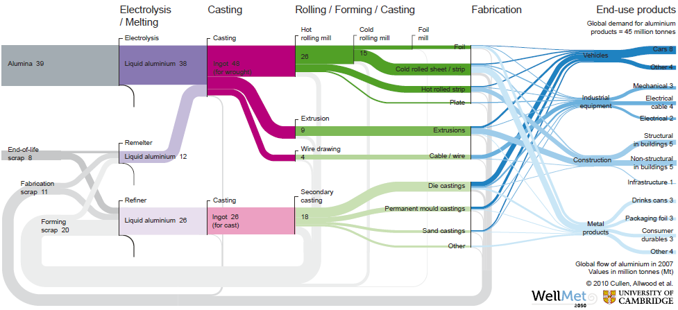
The below Sankey diagrams are from the report ‘Going on a metal diet’ by Allwood, Cullen et.al. published within the WellMet2050 research theme.

The first Sankey diagram shows the global steel flows in 2007

the other the global aluminium flows in 2007:
One page 7 of the report the authors explain

“In our maps, the width of each line is proportional to the mass flow of metal. Values for the major flows are given in Mt (million tonnes). Steel flows less than 1 Mt and aluminium flows less than 0.05 Mt are not shown. Each major process step is shown as a vertical black line, with three possible outputs: useful metal (colored), process scrap (grey) and metal losses (black). Useful metal continues to flow to the next process step, while scrap loops back to the appropriate melting stage where it is recycled. Internal recycling loops, for example from the continuous casting processes for steel are shown small oval loops. (…)The working papers … give more detail about creating the Sankey diagrams

Unfortunately these two mentioned working papers are not (yet?) available on the website. These really fantastic Sankey diagrams have been compiled from different data sources. I thought I’d share them with you. Please visit the LCMP website and read about their other exciting projects.
Balmenach Whisky Distillery Energy Sankey

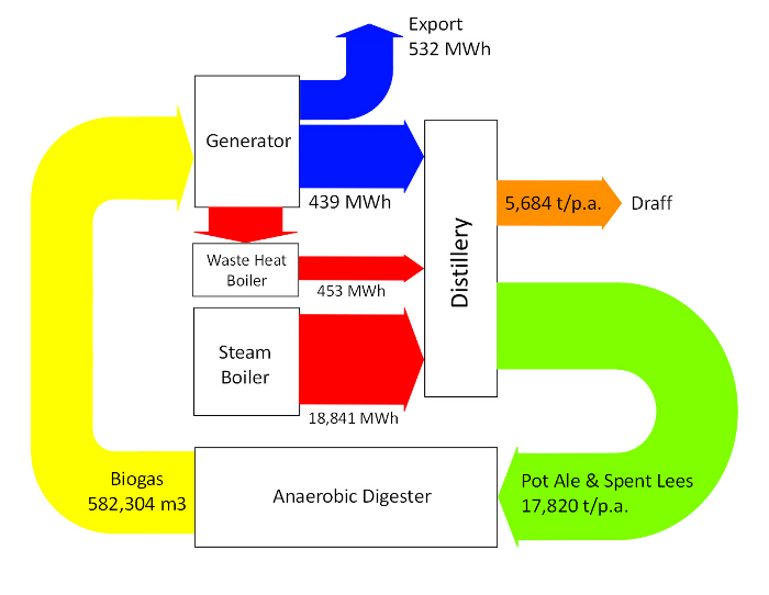
Here is a tasty one … The Scottish whisky distillery of Balmenach has worked with the Energy Systems Research Unit at Strathclyde University in Glasgow to investigate the potential energy production from Whisky distillation co-products (such as draff, pot ale and spent lees). More information on this case study can be found here. Here is the Sankey diagram from this case study.

The study concludes that it would be advisable to feed the liquid co-products to an anaerobic digester to produce methane. A power generator can use this fuel to meet the electricity demand of the distillery, the surplus could be fed to the grid. Exhaust gases from the generator can be utilised by a waste heat boiler to offset the steam requirements of the stills. This would result in an annual economic benefit of £178,450 and a payback period of 5 years.

The Sankey diagram shows electric energy in MWh, co-products in tons per year, and biomass in cubic metres. Hence, these flows must not be compared to each other. I am unsure about the red arrow from the steam boiler to the distillery, which is labelled ‘18,841 MWh’ as it doesn’t seem to be to scale with the other energy flows.

Anyways. I like this one. Here’s tae us, wha’s like us? Damn few, and they’re a’ deid.

Contres Territorial Metabolism Sankey

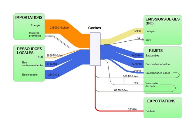
After my last post on the Paris Urban Metabolism I continued to research that topic a little more. I came across another example from France. The below Sankey diagram is from an article on territorial metabolism in the rural village of Contres in France. (“H4 développe une démarche de métabolisme territorial à Contres”).

In this study, the consultant company H4 Valorisation analysed the material and energy flows liked to the villages economic and agricultural activities. Different scenarios were evaluated, focusing primarily on (1) reducing imports and rejects (waste and pollutants), (2) increasing usage of local resources, and (3) looking at reuse of material internally (les rebouclages internes).

The Sankey diagram shows both mass and energy in one diagram, so the inputs and outputs of the central node (representing the village of Contres) are not balanced when summed up. Mass flows are in tons (per year?) in blue and red colors. Energy is in Mwh per year and shown in orange color. Greenhouse gas emissions from energy used is also represented in pale yellow expressed in tonnes of CO2-equivalents.

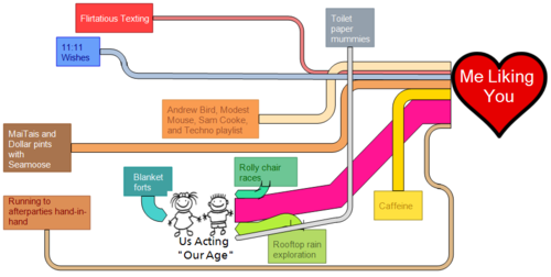
I used to hang out with this guy…

Reblogged from ‘I Love Charts’ blog, an absolute cutie:

I used to hang out with this guy who I thought was really sweet. We always hung out together because we were working on a group project that involved sankey diagrams, so before I had to delete the software, I made this diagram of all our shenanigans which, as you can see, involved us making acting like we were 10. I guess he lost interest so I never had the opportunity to send it to him, but how can I put such a well executed diagram to waste? You did mention once that you don’t get enough Sankey Diagrams 🙂

-jumpingpicturesmodel

Explore U.S. Energy Flows on Bloomberg

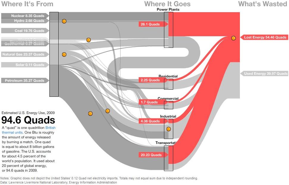
David Yanofsky from the Bloomberg Newsroom advised me of a Sankey Diagram he did on U.S. Energy Flows. The diagram is based on the well-known Lawrence Livermore National Laboratory (LLNL) diagrams and shows the 94.6 quads (1 quad = 1 quadrillion BTUs) estimated energy use in the United States in 2009.

The Sankey diagram has a nice mouse over effect, that let’s the user explore the stream as they are highlighted in different colors. The nodes show the contribution from different carriers. Additional information is available when positioning the mouse over the orange bullets. This makes the diagram fun to explore…

In this image the lost energy is highlighted in red.

In the above screenshot the energy flows based on petroleum are shown in brown color, all other flows in light grey.

These are only two static screenshots, please go over to the Bloomberg site to see more.

Alberta Report full of Sankey Diagrams

A recent report prepared by Kumar, Subramanyam and Kabir of the Department of Mechanical Engineering at the University of Alberta in Edmonton describes “Development of Energy, Emission and Water Flow Sankey Diagrams for the Province of Alberta Through Modeling”. Canada has been underrepresented with Sankey diargams on this blog, I feel. But the numerous Sankey diagrams on water and energy really compensates for this lag: I counted 12 more or less beautiful Sankey diagrams. Here is an example:

This is for the energy consumption in Alberta. Flows are in PJ (not sure which year they refer to). There are also several Sankey diagrams in this report for the water catchment areas of rivers (pp. 27-34).

Download the full report here (caution 6.5 MB PDF)

Energy Flow Charts UK 2009

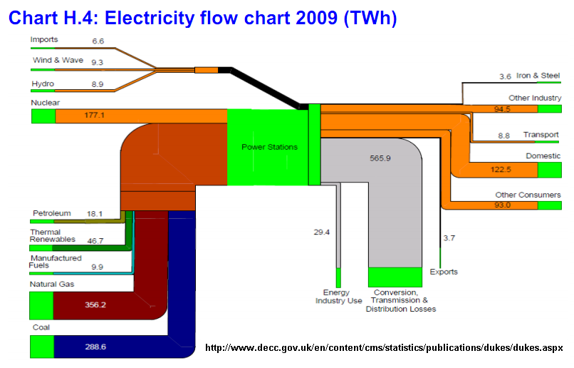
Featured on Jo Abbess’ blog on ‘Energy Change for Climate Control’ recently was this Sankey diagram. It appears in his recent post on ‘The Waste of Power’. It was originally published in Annex H of the 2009 Digest of United Kingdom Energy Statistics (DUKES) published by Department of Energy and Climate Change (DECC).

The report has numerous other Sankey diagrams like this one, similarly structured. They show energy use of coal, petroleum, natural gas, and renewables.

Below is the one on petroleum flows in 2009 in millio tons. A lower threshold has been introduced, so that small quantities don’t fall below a minimum width (see, for example, the flow of 0.7 mio tons to “Rail”, compared to the one of 4.9 mio tons to “Industry”, which would in principal be 7 times wider if it was to scale.

Nice and colorful!