Category: Samples

Molly Eagan’s 100 Days Without Oil

Molly Eagan’s ambitious project ‘100 Days Without Oil’ got some attention in the blogosphere, and even from traditional media. Molly’s dedication to living one hundred days without oil fascinated me, but by putting up the below Sankey diagram on her blog she fully convinced me …

Molly is an Architecture/Sustainable Design graduate student at the University of Minnesota. From August 15 to November 22, 2010 she tried to live a fully-no-oil life style.

By using myself as a research tool I can easily document all aspects of my life and how they might be affected in this not-to-distant world. I’ll be tracking my life in seven categories: Transportation, Food, Waste, Water, Electricity, Health/Hygiene, and Communication/Entertainment.

Her self-set rules were quite strict, and I personally think that the water use part is the hardest constraint. Read more about the criteria of this experiment.
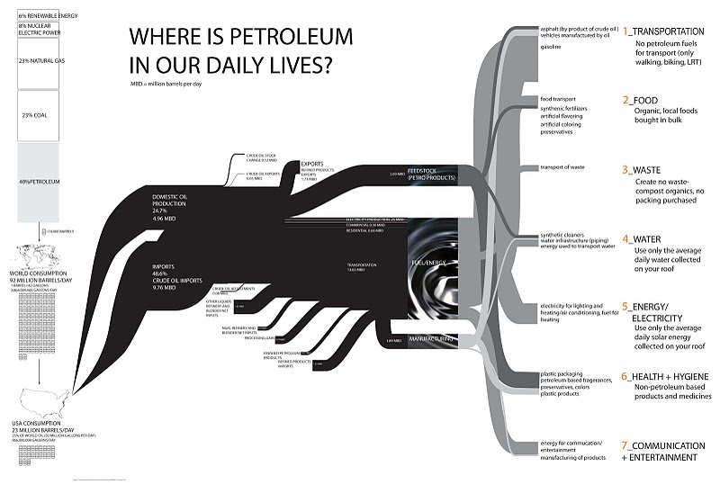
The Sankey diagram is based on data from the Energy Information Administration Annual Energy Review 2008, but has been expanded on the right side with examples for the seven categories she identified for her project.
Primary-to-Use World Energy Flows

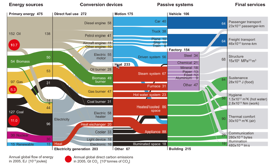
From the same blog post I used as source in my previous post comes this interesting diagram, originally by Cullen & Allwood 2010.

I have presented several similar Sankey diagrams here on the blog for different countries (see Spain, Italy or Austria or browse the tag ‘energy’)

This is a neatly structured and nicely designed example of a energy flow Sankey diagram that could serve as a role model. Primary energy broken down by energy carrier is on the left. Conversion steps are shown in the second tier, as two alternative breakdowns (direct fuel use/electricity generation and motion/heat/other). The line where these two tiers touch don’t always have direct connections, but the overall arrow magnitide matches. The next tier (passive systems) is broken down into vehicle, factory and building. The final services on the right side distinguishes eight different energy use fields.

Flows are in Exajoules (10E18 joules) and values are for the year 2005.

Paper Machine Enthalpy Sankey Diagram

A research project at Technical University Dresden in collaboration with a paper manufacturer aims at detecting and implementing energy saving measures for paper machines.

“Better monitoring of process variables, improvement in the operating point (or range) of the process, installation of heat recovery systems (e.g. at heat exchangers), use of heat pumps and replacement of high energy streams (steam) with waste heat streams. Most of these techniques are standard recipes which are readily available in the market. However they are designed without giving any consideration to the specific aspects of a manufacturing facility and also provide no quantitative evidence of the potential benefits. “

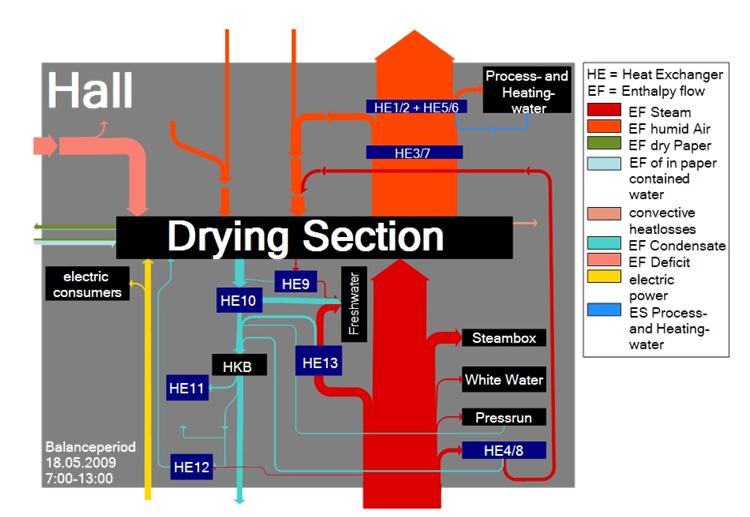
This is why they came up with a mass and energy balance model and are using the following Sankey diagram to visualize where energy could be recovered.


Flows are labeled as enthalpy flows, showing the changes in thermodynamic (heat) energy at each process step, hence losses. The Sankey diagram is for a balance period of six hours. No absolute figures are given. Several heat exchangers are installed along the wet section of the paper machine. In the drying section, a large part of the energy is lost as steam/humid air.

Spain: Energy, CO2, Cost

I am aware that I was kind of ‘Sankey diagram bashing’ with my post on Spain energy flow diagram last December. Now here is another one from the Iberian penninsula that fully makes up for the first one. It is by Observatorio sobre Energía y Desarrollo Sostenible (Observatory of Energy and Sustainability in Spain) at the Universidad Pontifícia Comillas in Madrid. I find it noteworthy that the observatory is part of a BP financed chair at the Escuela Técnica Superior de Ingeniería (ICAI).

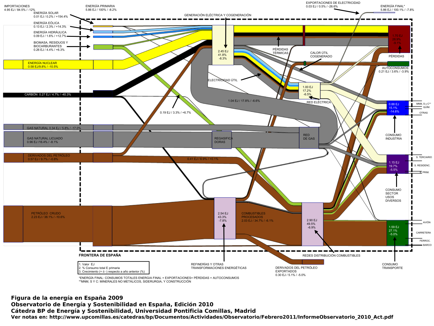
The annual report 2010 includes three Sankey diagrams, two of which are shown below. The first Sankey diagram (p. 16 of the report) has the typical pattern of a ‘national energy consumption, conversion and use’ diagram, similar to the ones presented here on the blog several times already for other countries.

The flows from the left show energy sources, the nodes on the right are the use sectors. A nice feature here is that the node heights are adapted to the magnitude of the Sankey arrow, so that the largest energy consumption can immediately be seen. Flows are in in Exajoule (1 EJ = 1000 Petajoule = 10E18 J). The total primary energy consumption in Spain in 2009 was 5.86 EJ (4.95 EJ of which are from imported fuels). Also shown next to the absolute quantities is the relative share of each flow in percent, and the change in comparison to the previous year.

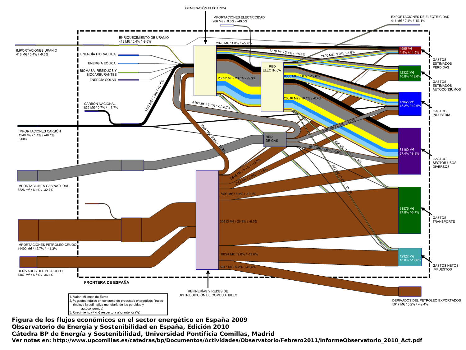
The second Sankey diagram (p.22) is what I would call a value stream Sankey diagram.

This is interesting as the market price for the fuels, as well as for converted energy is used as a weighting factor, so that each Sankey arrow shows the value of the energy flow in millions of Euro. At some nodes you can see that a smaller arrow enters, and a wider arrow leaves: These are the conversion processes where value is added (or energy gets more expensive). This is a compelling concept for a Sankey diagram (another similar example is here), one that somehow could make Sankey diagrams more interesting for economists or controllers, rather than considering them exclusively in the engineering domain.

The third diagram (not shown here, p. 19 in the report) shows the embodied carbon or the greenhouse gas emissions related to the different fuels, broken down by fuel and sector of energy consumption. The embodied carbon in the energy carriers were roughly 285 Mtons in 2009. The Sankey arrows for renewable energy sources as well as for Uranium are not present in the third diagram.

Me gustan mucho estas tres diagramas de Sankey! Merecen elogío.

Colorado River Water Accounting Sankey

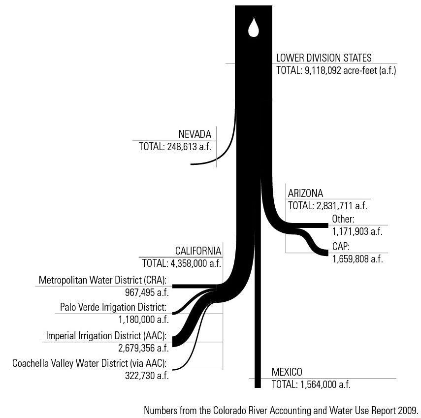
From Fei-Ling Tseng’s design blog comes this Sankey diagram. Her post is on some visualizations and infographics done for a project on water economies/ecologies of the Colorado River water system.

The diagram shows the distribution of water from the Colorado river to different lower basin states (Nevada, Arizona, California), “export” to Mexico and a breakdown to irrigation areas within California. The quantities are in acre feet (a.f.). Underlying data is from the Colorado River Accounting and Water Use Report 2009.

Simple, beautiful, conveying the message … and a single white water-drop as catchy design element.

Embodied Carbon Sankey Diagram

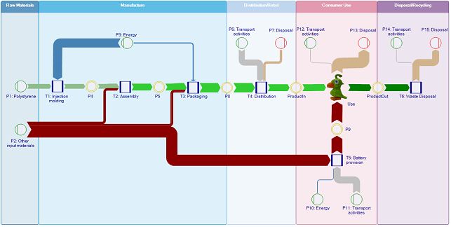
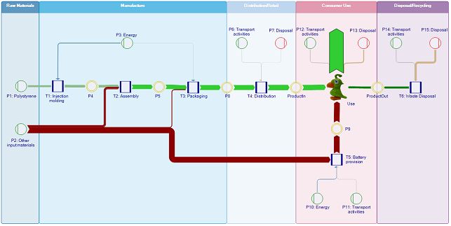
I found the idea behind the below Sankey diagrams quite compelling. Both are from the user manual of the ‘Umberto for Carbon Footprint’ software by ifu Hamburg. They are also the makers of e!Sankey, and it seems as if most of the e!Sankey software features are also included in this new software for modeling and calculating product carbon footprints.

I played with the demo models included in the trial version, one of which is for a toy parrot. The product life cycle is modeled from cradle-to-grave with the raw materials, assembly, distribution, use, and end-of-life phases. Using embodied carbon data from an LCI database for the raw materials and energy used along the life-cycle, a carbon footprint is calculated. The material and energy flows related to the product manufacturing and use are then shown as a Sankey diagram.

The Sankey view can be switched to an ’embodied carbon’ or carbon load view, which shows the ‘carbon rucksack’ of the product as it cumulates along the supply chain.

In this second Sankey diagram the arrows representing the greenhouse gas burdens caused by the waste disposal phase are turned around, so that both the upstream supply chain as well as the downstream processing after the product use are visually added. They form one large Sankey arrow (shown in green here) for the product’s carbon footprint.

This is of course not a Sankey diagram drawing software, but rather a modeling or calcalation tool for carbon footprints. Still, I think, this is a fine use case where Sankey diagrams unfold their full visualization power. It can be immediately grasped which stage of the life cycle, or which raw material or energy supply contributes most to the carbon footprint.

Note: Have added this to the software list.

Italy Energy Flows 2004

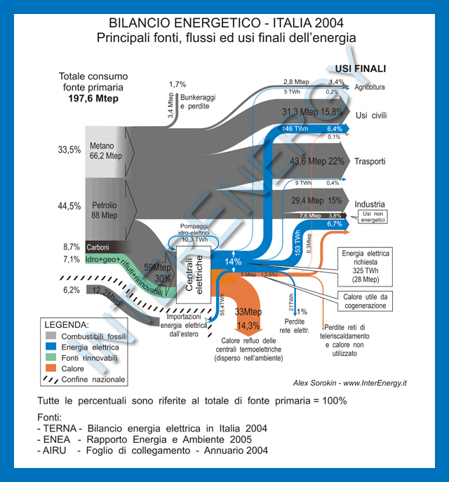
Came across the below Sankey diagram showing the energy balance for Italy in 2004. This diagram is from the website of the Italian company InterEnergy.

The setup of the Sankey diagram is similar to the other national energy flow diagrams I have shown in previous posts here on the blog, such as this one for Spain, these two for the United Kingdom, or here for the United States.

The breakdown on the left side shows the fuel types: natural gas (‘Metano’), oil (‘Petrolio’), coal (‘Carboni’), and the renewable energy sources in green. The separate grey flow shows energy imports. Both, percentage values in reference to the primary energy content, as well as absolute figures (in Mtep – million tons of petroleum equivalents, ‘milioni di tonnellate equivalenti di petrolio’ in Italian) are given. Part of the fuels is consumed directly in the different final use sectors (‘usi finali’), a part is used to generate electric energy (blue), and heat (orange). Some of the heat is used through cogeneration, but the major part is lost.