French Négawatt Energy Scenarios

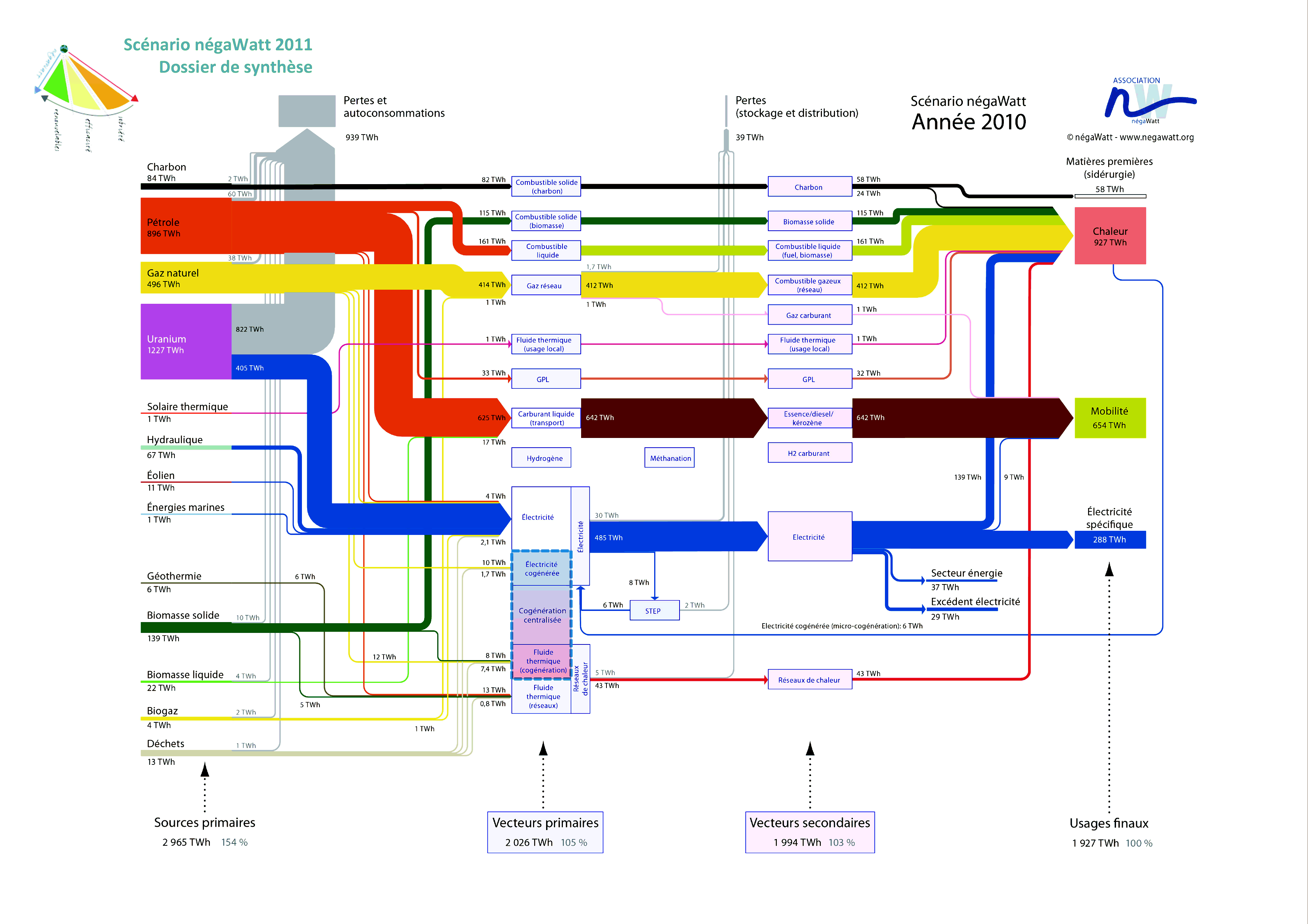
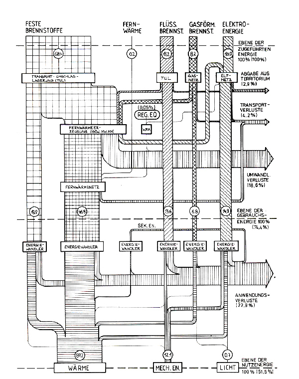
French Négawatt association is advocating a changed attitude towards energy use, expressed in the three words “sobriété – efficacité – renouvelable” (translates as frugalness/modesty, effciency, renewables). On their website they show Sankey diagrams for a 2010 and a 2050 energy scenario. A simplified and a detailed version is available for both years. Below is the detailed 2010 version.


(see a high-res image with magnifying/zoom feature here)

Flows are in TWh. As common in this type of energy flow Sankey diagram they show in a left-to-right orientation the primary energy sources, energy conversion, and final use. Additionally there is a sum for each of the columns that tells us the overall energy efficiency: In 2010, to provide 1908 TWh energy to the users required 3009 TWh of primary energy (1,58:1).

These Sankey diagrams in my opinion are very-well structured, information-rich and don’t lack a certain esthétique

A day in the life of… Victor Hugo

I admire architects for their visionary ideas, for being able to transcend established limits, for pushing things beyond the common … at least when still in early phases of a project.

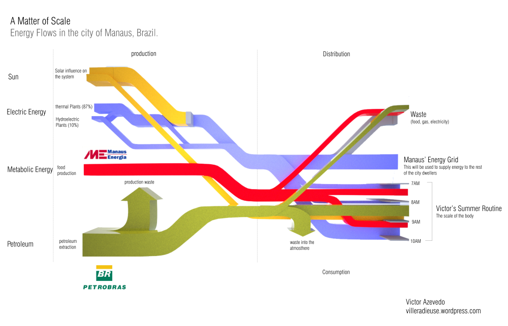
Victor Hugo Azevedo’s blog is called ‘La Ville Radieuse’ (The Radiant City) after a concept by Le Corbusier. It has all kinds of architectural stuff. By mere coincidence I discovered the following Sankey diagram he did in 2011 as class assignment on energy flows…

“This time we were asked to trace the energy flow that directly affect us. I traced the beginning of a common day during my summer in the city of Manaus Brazil. The following diagram shows how the larger infrastructure shape my routine.”

This looks at first sight like one of the classic ‘national energy flow’ Sankey diagrams with fuels (production) on the left, distribution and consumption on the right. But this is only partly true. Look at the right part where the energy flows stack and have a vertical time line.

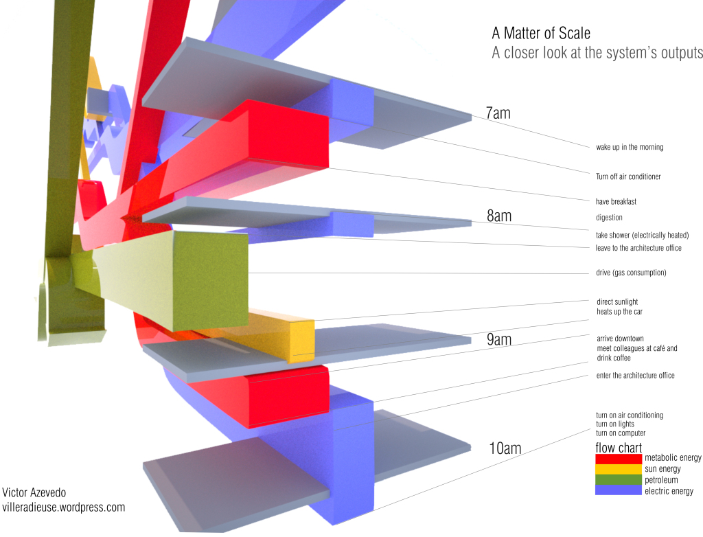
“The next diagram is nothing more than a closer look into one of the ends of the diagram, which is my own routine on a four hour span (from 7AM to 10AM on a regular weekday in June)”

So forget about scale and units here … this is a concept diagram! The Sankey diagram links an individual’s consumption patterns with the bigger picture, thus stressing everybody’s personal share and responsibility in energy consumption (and the possibility to take action). Kudos for this idea!

Apart from that it is of course a fancy 3D rendering, and I love the rotation and close-up of the morning routine. Make sure you post a comment directly at Victor’s post, if you like it as much as I do!

Note: Somewhat related, check out Molly Eagan’s ‘Where is Petroleum in our Daily Lives’ here.
Biomass 2-in-1 flipped Sankey Diagram

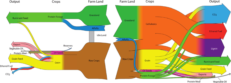
Browsing my previously bookmarked Sankey diagram samples I came across this one which I find interesting. The diagram was shown in a Green Cars Congress blog entry in 2010 and illustrates a study that finds that “large scale biofuel production can be successfully reconciled with food production through the use of land-efficient animal feed technologies and double-cropping”. The authors of the study are Dr. Bruce Dale and colleagues at Michigan State University.

As always I refrain from commenting the underlying content as I am not a domain expert. Rather I would like to focus on what makes this Sankey diagram special.

These are actually two diagrams that are “flipped” over at a vertical center line. The left half of the diagram has a right-to-left orientation and shows the “114 million ha of cropland used now to produce animal feed, corn ethanol, and exports”. Some cropland sits idle and is not used productively. The right half is a second Sankey diagram and shows a different use of the cropland with “major crops and outputs for the maximum ethanol production scenario”. No units in the Sankey diagram but the central columns seems to represent the land area (million ha), while the two outer vertical columns (Crops, Output) show mass (tonnes?) on a different scale.

In contrast to the first scenario it can be observed that “30% of total US cropland, pasture and range, up to 400 billion liters (106 billion gallons US) of ethanol can be produced annually”. Ethanol can be used as an alternative non-fossil car fuel. CO2 emissions are also higher but this is from biogenic sources.

Low Carbon Scotland GHG Sankey

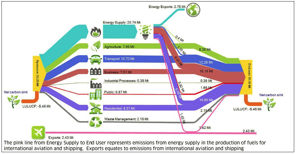
This one is from the report ‘Low Carbon Scotland: Meeting our Emissions Reduction Targets 2013-2027 – The Draft Second Report on Proposals and Policies’ available on the Scottish Government website.

The Sankey diagram visualizes “By Source and End User GHG emissions transfers for Scotland in 2010 (Mt CO2e)”. Data for the diagram from “Greenhouse Gas Inventories for England, Scotland, Wales and Northern Ireland 1990-2010 (Aether and AEA, AEAT/ENV/R/3314)”.
For those wondering (like I did!), ‘LULUCF’ is for ‘Land Use, Land Use Change and Forestry’.

According to the report

“Scotland accounts for only around 9% of the UK’s total energy consumption, but is rich in energy resources and produces a diversity of energy supply. The energy supply sector covers the production of energy, and in particular the generation of electricity, either in power stations or in large industrial process (like refining). Energy supply in Scotland produced 20.7 MtCO2e of greenhouse gas emissions in 2010, which equated to 37% of Scotland’s total in 2010.”

Video: 4see-TW Sankey diagram of economy, jobs and energy

Just came across this video featuring a “Sankey diagram of the Taiwan economy, jobs and energy in 2010” by ARUP (uploaded to vimeo by user Simon Roberts).

The underlying model is called “4see-TW” framework and has been created to “investigate the structure and function of an economy in a resource-constrained world”.

This is certainly exciting… howevever one must be warned that the Sankey diagram includes different “dimensions”: energy flows, value streams (money flows) and jobs. These three perspectives probably have different unit types and units (such as, e.g. TJ for energy, Euro or US$ or New Taiwan Dollar TWD for values, and persons or workplaces for jobs). Hence the width of the Sankey arrows mustn’t be compared to each other across the unit types.

Haven’t found the time yet to dig more into the 4see-TW model, but here is one starting point (edit: link doesn’t work any more) for those interested.

Colorful Energy Sankey Diagram

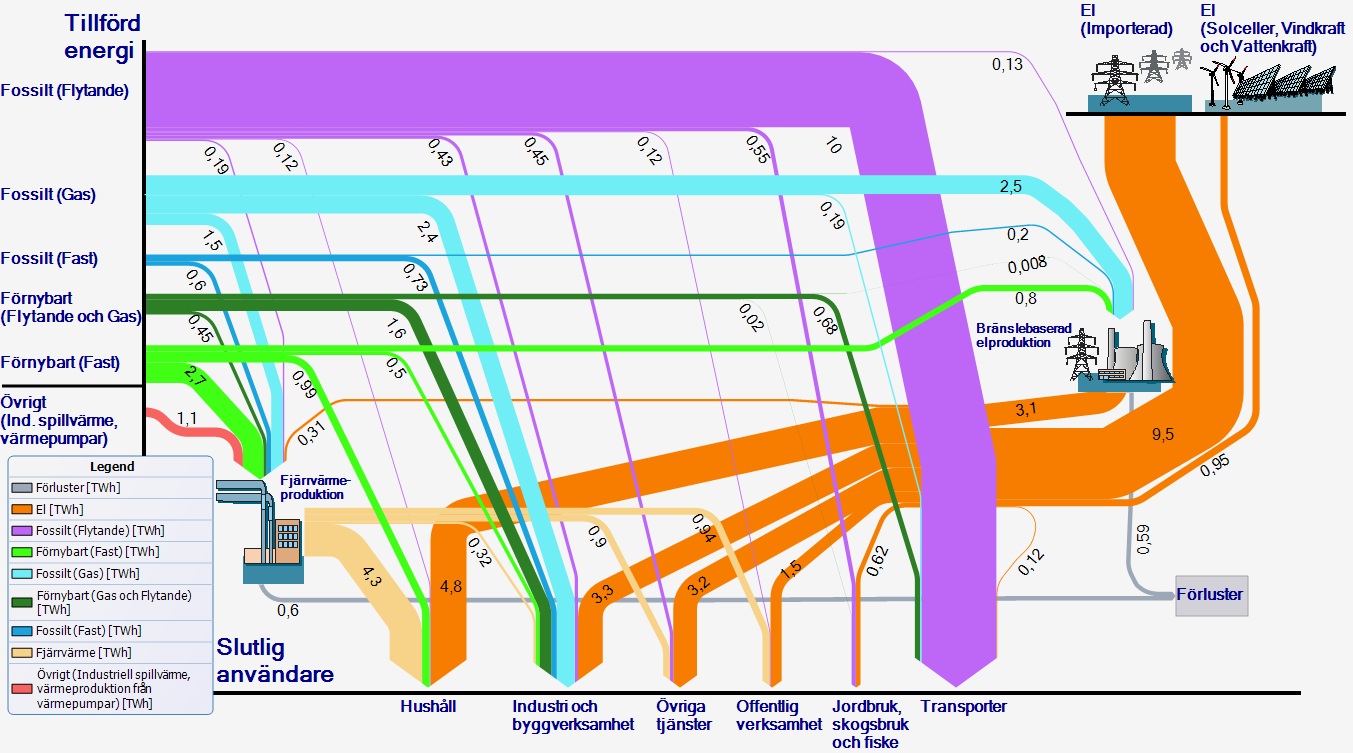
A colorful Sankey diagram for energy flows from Sweden. Found this one on the web page of Länsstyrelsen Skåne (please don’t ask me to read this out loud…) in an article titled ‘Skånska hushåll i fronten för mindre fossilberoende’

Unit of flows is TWh. The orange arrows are imports, the other arrows from the left apparently domestic production, with the majority of energy being from fossil fuels (“Fossilt”). Consuming sectors are at the bottom – in contrast to the typical layout of this kind of energy balance diagrams.

Anyone from Sweden who wishes to comment and explain a little bit?