Coffee Sankey Diagram

After all these Sankey diagrams for energy flows, flows of carbon, phosphorus, and the like here is a special one for all those of you, who are coffee addicts – like me. Saman Zomorodi on his blog ‘Saman’s System, Sites and Buildings’ features a coffee flow Sankey diagram in this post.
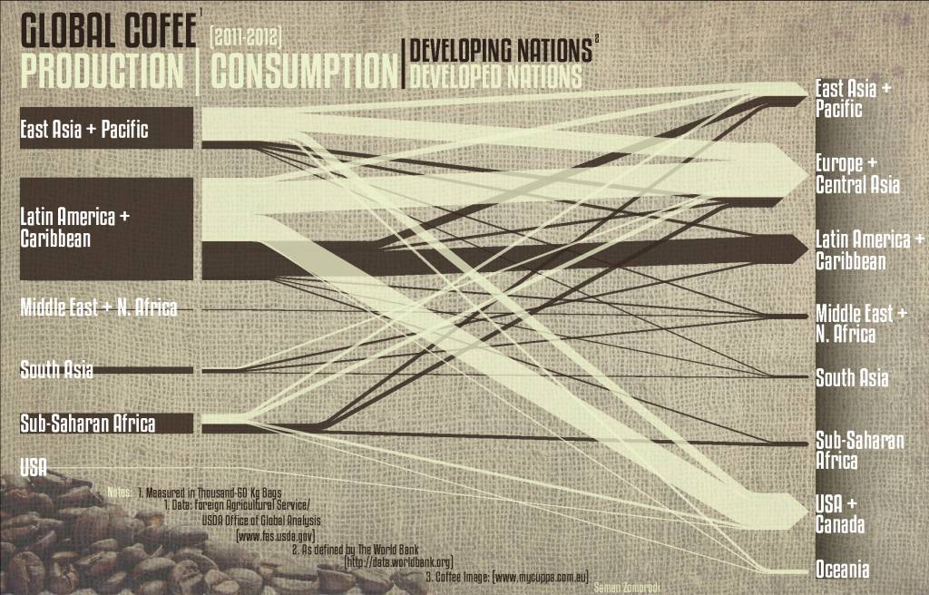
This is an infographic for global coffee production. Producers are on the left side, coffee consumers are on the right. The dark brown flows are for developing nations, while the milk coffee color ones are for developed nations. No quantities given in the diagram, so we don’t learn the actual absolute figures.

However, “this allows the reader to actually see where coffee is being made and how far it actually travels to another world region. As evident in the diagram, almost all coffee is produced in the developing nations, while the majority of it is consumed in the developed nations. This relationship underscores the unproportional amount the developed world consumes, while the developing nations have to pay many hidden costs.”

The original image is 2MB and I had to resize it with a loss in quality. Visit Saman’s blog to download a highres version of the diagram.…
Sankey for Energy Mass Balance

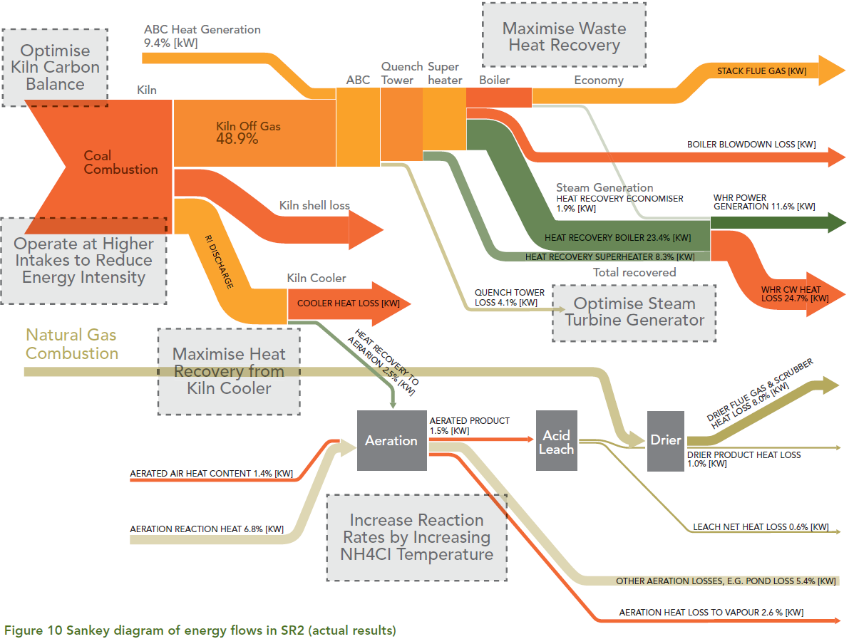
From a collection of case studies on Energy Efficiency found on the website of the Australian Department of Resources, Energy and Tourism (RET) comes the following Sankey diagram.

This is from a synthetic rutile plant of Iluka Resources Ltd. in Western Australia.

Iluka used the output from the energy and mass flows model to generate a Sankey diagram to represent the results in a visually effective and concise manner. The Sankey diagram illustrates where energy is supplied to the process, how it is transformed and where it leaves the process. … The width of the arrows is in proportion to the amount of energy associated with each part of the process. The Sankey diagram is an effective and intuitive way to communicate the energy flows at the plant. The diagram was used extensively during Iluka’s opportunity workshops. The diagram assisted the staff at the workshop to focus their attention on where the largest energy flows exist and identify where the main areas for improvement lie.

Flows are in percent of the energy input. Possible improvement measures are given in the grey boxes.

Full case study here (PDF).

APM Inbound/Outbound Traffic Visualization

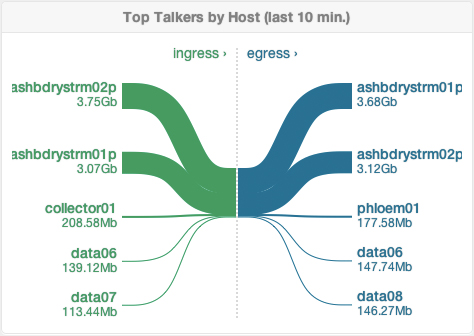
Nice to see that more and more applications now use Sankey diagrams rather than pie charts to visualize distributions. In this case it is a widget available in the dashboard of Boundary, a real-time application performance measurment (APM) suite.

Inbound traffic is on the left side in green, outbound traffic to the right in blue. Only the top five connected hosts by traffic are shown. Inbound and outbound traffic is about the same size, so they have the same height in the stacked part in the middle.

Similar to the cargo traffic Sankey diagram I did here, but in this case the traffic is not traffic of physical goods…

Phosphorus Flows in the U.S.

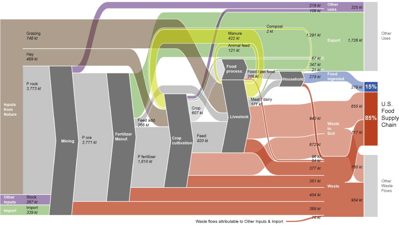
Following up to my last post, here is another Sankey diagram for phosphorus flows. This one is by Jason Pearson, TRUTHstudio and can be found in the ‘Visualization’ section of his website. Jason is also the designer of the Economy Maps (see this March 2012 post).

Jason says that “the diagram demonstrates the key point: that only 15% of the phosphorous in the US food supply chain is ingested, with the remainder ending up as waste. The diagram also shows the proportion of phosphorous used or wasted in non-food supply chains”

This one is more colorful than the Dutch one. Flows are in kt (kilotons). It has a left-to-right orientation (the other was vertical) and is very compact with almost no space betweend the bands, almost like in a block-style diagram. As a concession to this dense style, diagonal arrows don’t maintain their width.

Phosphorus Flows in the Netherlands

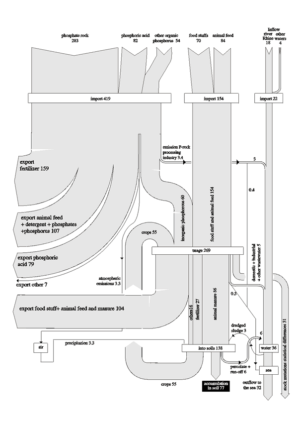
A recent visit to an organic farm and a chat with one of the staff on peak phosphorus made me search for Sankey diagrams on phophorus flows. Managed to find two, one of which is shown below. It is from an article ‘Phosphate recovery from animal manure the possibilities in the Netherlands’ by Van Ruiten Adviesbureau / Projectbureau BMA, for CEEP (November 1998) and shows phosphorus flows in the Netherlands in 1995 in million kg-P.

“It can be seen that 84 million kg P are imported in cattle feed alone (roughly 1/3 of the amount of P that is imported in phosphate ore). The excretion of phosphorus in animal manure is 86 million kg P according to the chart (about 197 million kg P2O5) … Moreover the figure shows that discharges of household and industrial waste water contain 10 million kg P. This is about 1/10 of the amount of P in animal manure.”

OK, this ia black/white retro style, but nevertheless a good Sankey diagram with flows to scale. Three vertical “columns” are for actual phosphorus imports: The largest quantity is direct imports (from phosphate rock, as phopshoric acid, and other organic phosphorous). The middle import column is for phosphorus embodied in food stuffs and animal feed. The third import pathway into the Netherlands is in waterways, such as the Rhine river, but this fraction remains unused. A large quantity of phosphorus is exported again (flows branching out to the left). 77 million kg-P per year accumulate in the soil. Another interesting detail is the flow labeled “stock mutations and statistical differences” branching out to the right.

Also see this post with a nitrogen flow Sankey diagrams from the Netherlands.

I will dig out the other phophorus Sankey and present it here in the near future…