More Austrian Energy Sankey

Kris commented on my last post, that there is an updated version of the Sankey diagram on energy flows in Austria in 2006 to be found in the Statistical Yearbook Austria 2009 on page 360 (page 6 in this PDF).

I also checked out some other Austrian sites and found one for Austrian Energy Flows 2005 (Energieflussbild Österreich 2005) on the Austrian Energy Agency website. It is a little more colorful, and has more information too.

Flows are in TJ. The diagram is divided into four sections, namely “Aufkommen” (emergence?), “Umwandlung” (transformation), “Sonst. Verwendung und Verluste” (other uses and losses), and “Endenergieeinsatz” (final energy use). The color code for the energy types is as follows: oil (pale orange), electric energy (red), coal (dark grey), gas (yellow), renewables (dark green), distance heating (light green), hydro (blue). On the right side useful energy is shown in purple, and losses are displayed as light grey arrows. (Thank you to my friend Leo for the translations…).

Yet another national energy flow Sankey diagram, and indeed a very beautiful one. Hope to see updates of it every year.

Energy Flow Austria 2002

Found this Sankey diagram displaying the energy flows in Austria in 2002 on a web page with didactic material from that country.

Unfortunately this copy of the diagram isn’t very large, and I have trouble reading and translating everything. Flows are in petajoule (PJ), source given is Statistics Austria.

On the left are imports, withdrawl from stocks, and domestic production. Losses branch off in black to the top. The diagram differs fundamentally from the ones I have presented for other coutries (such as for New Zealand, the United Kingdom, or the U.S.) in two ways:
First, it doesn’t show the energy use by sectors, but instead a breakdown by energetic end use (985 PJ), non-energetic end use (101 PJ), exports (150 PJ), stock increase (18 PJ), as well as energy use within the energy sector itself (81 PJ).
Second, the colors of the flows are used to differentiate between liquid fossil (dark blue), gaseous fossil (medium grey) and solid fossils (light bluegrey) rather than specific energy carriers. Furthermore biogenic energy flows are shown in medium blue, renewables in very light blue. Converted electric energy is in dark grey.

Sankey Diagram Overlay to Show Changes

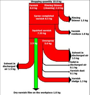
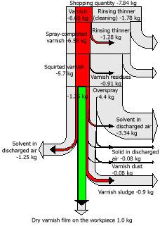
Found the following Sankey diagrams in an educational presentation by UNIDO on Cleaner Production (CP).


This is actually quite a nice idea to show the improvements resulting from a technical measure. The diagram on the left represents the original situation, while on the right it is seen in grey. The flow diagram for the new situation overlays the “old” diagram. Both are scaled to 1 kg of varnish applied to a workpiece (the green Sankey arrow), so the reductions in input quantity and emissions show the actual savings achieved.

Energy Efficiency Analysis in Finland

Motiva is a state owned limited company from Finland offering energy efficiency analysis and energy audit for companies. Motiva also developed audit guidelines and models, and engages in training and authorisation of the energy auditors.

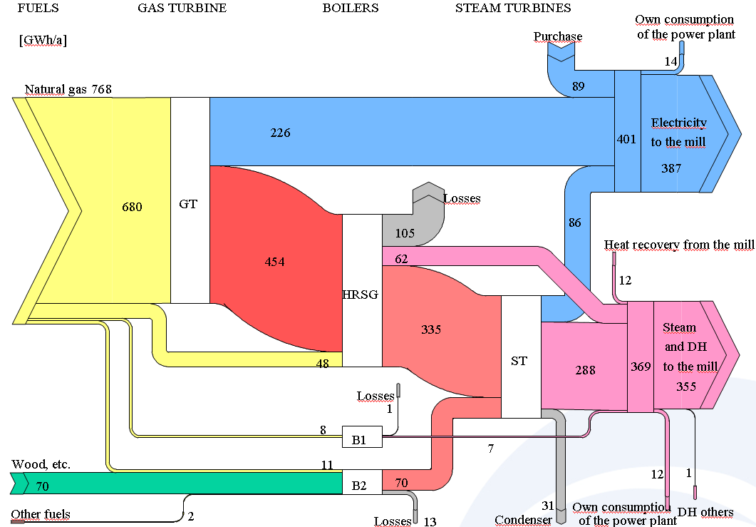
In their energy audit reports, they always include a Sankey diagram in the very first chapter. Here is an example:

Other consulting companies, such as Pöyry (not sure how to pronounce this) haven taken on their approach and are also producing Motiva style Sankey

Both Sankey diagrams designed in PowerPoint. Not bad at all, but probably quite a time-consuming task.

40 years from now: UK 2050 energy flows

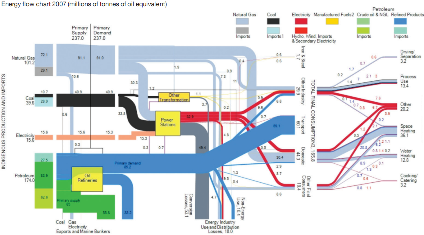
A reader of the blog alerted me about a new report that contains Sankey diagrams for the United Kingdom’s 2007 and 2050 energy flows. Thanks, Neil!

The report is about heat demand and CHP (Building a roadmap for heat. 2050 scenarios and heat delivery in the UK) and was prepared by University of Surrey and Imperial College for the Combined Heat and Power Association (CHPA). [Account is dead in 2018, access the report here instead]. On p. 18 it has the following Sankey diagram. I have shown a similar diagram for the UK in this post.

Data is from the Digest of UK Energy Statistics. All flows are in millions of tonnes of oil equivalent (MTOE). Primary energy demand in 2007 was 237 MTOE.

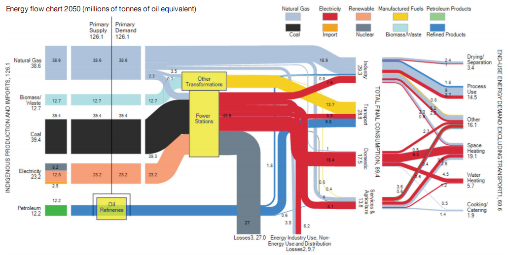
The second Sankey diagram presented (on page 23) is a scenario for 2050. It was calculated using the MARKAL model.

One must read all the assumptions made for the model to be able to interpret it, but you can see immediately that the “energy system in 2050 is signifcantly altered under the common assumptions presented in all-electricity scenarios. In particular, final energy consumption in 2050 will be reduced by 46% against 2007 figures under the assumptions used in the CCC 80% CO2 reduction scenario”.

I invite you to read chapters 3.3. and 3.4 of the report to better understand the 2050 Sankey diagram. Note that the overall primary energy demand is significantly lower, but power generation almost doubles compared to the current situation. Losses from oil refineries are omitted in this scenario due to lack of data.

A great Sankey diagram by the research group made up from researchers from ICEPT (Imperial Centre for Energy Policy and Technology) and Centre for Environmental Strategy at the University of Surrey.

Madrid spendings in culture 2009

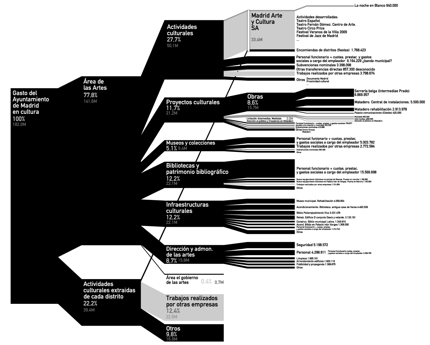
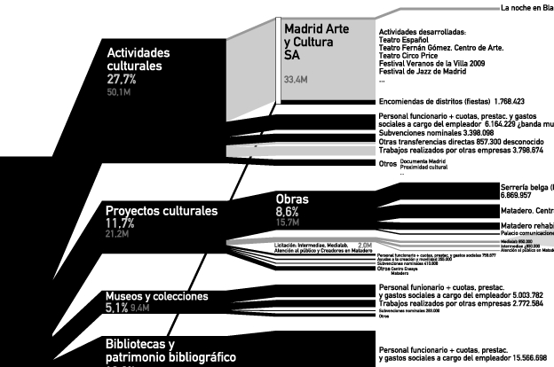
kulturometer.org presented a fantastic diagram that shows the municipality of Madrid’s spendings in cultural activities in 2009. By compiling data from numerous tables, tender calls, and administrative bulletins, they managed to stunningly visualize what one commenter called an ‘information overload’ (‘apagón informativo’). Click on the diagram to enlarge.

This is a breakdown diagram, or ‘diagrama de brazos’, that shows the distribution of the overall cultural budget (182 Mio Euros in 2009) by sectors, sub-sectors, and even into individual types of activities or projects.

It somewhat reminds me of Nicholas Rapp’s AIG bailout diagram, even though less colorful…

Each branch of the diagram is labeled with the relative weight in percent, as well as the absolute value in millions of Euros. The color scale indicates the reliability of the data, either non detailed estimate (light grey), published estimate (grey), or published budgeted data (black).

Here is the full diagram in large scale (PDF) with an additional breakdown of one particular section (Medialab) at another scale and full legend and annotations
Watch a slide show to learn more about the diagram (starting p 19)
– And finally, a blowup detail of a diagram section: